While it's entirely possible to create a lumen print on non-traditional surfaces by using liquid photo emulsion or an alternative process like cyanotype or salt printing, most lumen prints are made on photographic darkroom paper.
Darkroom photo paper comes in two forms: Resin-Coated (RC) and Fiber-Based (Fiber or FB). There are pro's and con's of both for normal darkroom printing that have been covered in-depth by dozens or hundreds of different photographers. Lumen printing, however, is not traditional darkroom usage. There are some different reasons you may want to work with either RC or FB papers for your lumens.
First off, remember that lumen color profiles vary by the type of paper and, yes, that includes a difference like RC vs FB. Not always significantly different, but different. Some brands might vary to a considerable degree, but all of them will vary at least a bit. So one thing you have to consider when making your choice is simply if you care. Maybe the specific colors you want don't come from RC, or can't be produced on Fiber. In that case, this guide will just help you deal with the downsides of that particular material.
Showing posts with label papers. Show all posts
Showing posts with label papers. Show all posts
Friday, August 1, 2014

Friday, July 25, 2014
Blogging for Freya: Salting Spiders, Part 2
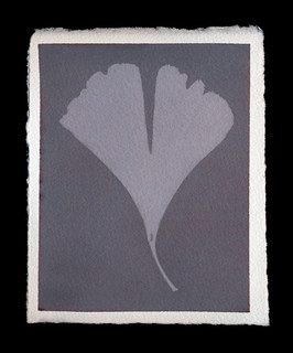 |
| Print made with lite salt |
Set-up
You can do this process almost anywhere, but you're going to need a flat area to work. If it's an area you care about, first cover it in a plastic tablecloth or protective sheeting. The plastic prevents the nitrate from soaking through a towel and getting on anything important. However, the nirate can slide around on plastic, so to be extra super careful you could put towels or a cloth down on your plastic.
Make sure you have your gloves (to avoid black spots on your nails and hands) and your protective glasses (to avoid eye damage) in place. You don't need to actually put them on until you take out the silver nitrate. I don't 'suit up' until I'm ready for the silver nitrate coating, because the gloves make my fingers clumsy. I always wear my glasses, because without them, I can't see. I have little plastic additions to my glasses that clip on to provide extra eye protection. Goggles just fog up on me and hurt my face. Whatever method you use to protect your eyes is up to you, but it is kinda important.
And that's it, you're ready to go. Protect the area, protect yourself, and get ready for some printing!
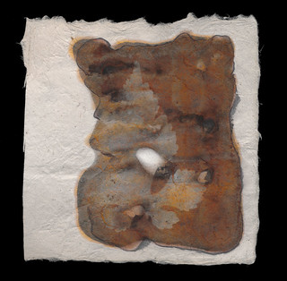 |
| Print on Lokta Fiber Paper |
Select your paper. As with most alternative processes, you want a high-quality printmaking or watercolor paper. I've had great luck with Arches Aquarelle and Rives BFK. Others have recommended Crane Kid Finish, Bienfang or pretty much any cotton rag paper. If it works for cyanotypes, anthotypes, van dykes or other alternative processes, it's probably great for salt prints.
Personally, I prefer smooth surfaces with just a bit of tooth. Too much texture in the paper and it starts removing detail from your print. Too smooth a surface just looks bland to me. I like a nice medium. Hot press papers are generally great for this.
You generally don't need to size your paper, but a simple gelatin sizing may be helpful if you are experiencing significantly less contrast than you expect or desire. To do a gelatin sizing, simply mix up unflavored gelatin (Knox seems the most common brand around here) in hot water and soak the paper in it. Allow to dry completely, then proceed to the next step.
Small note: handmade papers or exotic papers may be too absorbent to use for this process without sizing. I attempted to use some Nepalese lokta fiber paper and it's basically just a rag made of cellulose. I wasn't able to spread the silver nitrate at all and ended up using way too much of the chemical because it had to absolutely saturate the paper. If I experiment again with this paper, I'll be using sizing. I had similar issues with cyanotypes and anthotypes on hand-made paper using dryer lint and shredded recyclables.
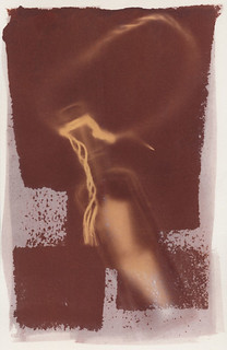 |
| Print made with sea water |
You'll need to make some salt water. The amount of salt in the water is entirely up to your discretion. It's perfectly viable to use seawater. Normally I add about 2 teaspoons of salt to a liter of water. Less than a 2% salt solution doesn't give very much of an image at all. That's basically the minimum required. I have been told that the more salt you add, the more contrast you'll see in the final image. I have not seen a significant difference myself.
You can use chemical grade sodium chloride (additive-free salt) and distilled water. There's no need to use pure chemistry, though. I don't use distilled water. I generally use tap water that I know is absolutely not pure. The pH is on the basic side, it's hard water with a lot of calcium and iron. It works fine. Sea water works fine too and who knows what's wrong with that stuff. Rainwater is fine. The type of water you use, as long as it's not actually contaminated with heavy metals or something, won't produce a big difference in your prints. Minor differences, sure, but not huge ones.
The type of salt you use will dramatically affect your prints. I like using "lite" salt. That's a mixture of 50% sodium chloride and 50% potassium chloride. The important part of the salt is chloride, since you're using it to convert the silver nitrate to silver chloride. Silver chloride is far more reactive to light and produces a much stronger image than silver nitrate. How you get the chloride in your paper isn't important to the light-sensitivity, but it is important to the color. I haven't experimented with ammonium chloride, but I know it can also be used for salt prints.
Lite salt produces violet images that, when fixed, turn pale yellow. I have not bothered tracking down any pure potassium chloride to test what it does, but I imagine it has a slightly different effect. My kosher salt images are red to brown before fixing and turn brown or black after being fixed. Prints made with sea water from the Florida coast have produces a nice middle ground
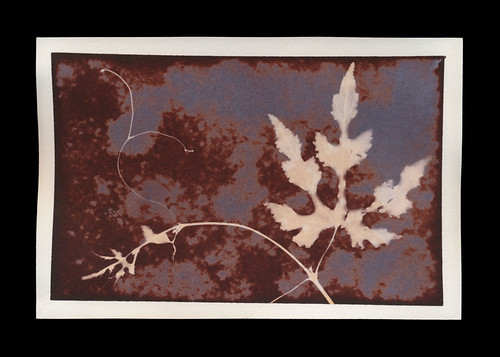 |
| Print made with both lite and kosher salt |
The basic step here is to mix up your salt water and then soak your paper in it. As a faster alternative, you can simply paint the salt water onto the paper with a brush. Either way is fine!
Silver Nitrate
It's time to put on that protective gear! Get your gloves and glasses firmly in place. Once your salted paper is bone dry, paint on your silver nitrate. Do this in low light to avoid fogging the paper or the jar of silver nitrate. I know it's in amber glass, but better safe than sorry. When not in use, the glass of nitrate should be stored in a dry, dark place. I work at night, with a dim lamp or computer monitor as my light source.
Use an eyedropper, pipette or other method to drag a thin line of the 15% silver nitrate liquid across the top of your sheet of paper. Then you can spread it out into an even coating using a foam brush, hake brush, glass puddle pusher or even just a regular flat paint brush.
Getting an even coating can be tricky, because until it exposes, the silver nitrate solution is clear. It can be very difficult to see if you've left any streaks, brushmarks or spots behind. I recommend simply doing two or three light, even coats across the entire surface going in different directions. If you want an especially dark image, you can apply two heavy coats of silver.
Exposure
As with most of my guides, I simply suggest using a picture frame to expose your prints. It's cheap and easy to obtain. Head to your local art supply store, or even the local Target, and grab some inexpensive picture frames that have a hard back. Don't get the really cheap ones with the hinged cardboard back, they're just not sturdy enough to provide good contact between your negative (or object) and the coated paper. I'm going to go into extreme detail on different methods of exposure in a future post.
Since the salt printing process is a "printing out process", it develops while it exposes. You can test exposure simply by looking at a portion of the exposed silver that isn't covered by your negative or objects. When it reaches a density you're happy with (generally dark rusty red or brown), you're done!
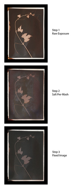
Now, it is possible to simply treat a salt print like a lumen print and avoid fixing it. However, that isn't traditional and the salt print is a very traditional process. It's also a lot more tactile than the lumen print, so I do generally fix my salt prints. An unfixed salt print, like most unfixed prints, will continue to darken and expose in even standard interior lighting.
To fix a salt print, you can mix your own fixer (difficult and annoying) or use standard photo fixer. Guess which approach I favor? That's right, the standard photo fixer. I use Sprint Rapid Fixer, because that's what I can borrow from the university. It's also what I've used for my entire photographic career. I dilute it heavily, about 20ml of concentrate to a liter of water, meaning it's at 20% of the regular working strength. You do not want stronger fix; it will bleach your prints. Even using the weakened fixer, only fix for 1-2 minutes at most. That's more than enough to fix the image. Again, over-fixing will bleach your prints.
Spiders, you should be aware that fixing a salt print does cause a potentially dramatic color shift. I mentioned earlier that the violet images produced by "lite" salt will fix to a pale yellow. The ruddy reds of kosher or regular salt will fix to a duller, darker red or (with high levels of silver) to an almost black brown. I generally prefer the pre-fix image, but not always. So I scan both before and after fixing.
That's all I've got, Spiders. Between this post and the last one, you should be ready to sally forth and print as long as you've got sun, salt and silver!
Monday, June 30, 2014
Blogging for the Moon: Lunar Caustic
 |
| Unfixed Salt Print on Fotokemika Varycon |
Well, as I've been forced to hear repeatedly in recent days, all you can do once you've made a mistake is learn from it and move on, trying your best not to repeat the mistake. I know that I'll be late to blog again, but I'm really trying to get better. I might even try to write my blogs early and schedule them to automatically post on Thursdays. That'd be pretty novel!

I soaked two sheets of Fotokemika Varycon fiber-base paper in a simple solution of filtered tap water and kosher salt, the same kind of solution I'd use to soak normal paper before making a salt print. I used quite a lot of salt, getting the water up to the saturation point. Then, I allowed both sheets to dry completely overnight before coating one sheet in the same 15% silver nitrate solution used for salt prints. I allowed that sheet to dry for several hours as well, then exposed them both as I would normal lumens, for 1 hour each.
Overall, I did not see a big difference between a salt-soaked lumen print and a regular lumen print, at least not on the Fotokemika Varycon paper. They look about the same, the only significant difference being that the salted print had less color and was overall less vibrant. I'll be testing other brands of paper to see if I can achieve different results. I think Mr. Fobes' use of albumen also contributed to the color shifts he saw, not just the application of chloride.
Using the silver gelatin paper as a base for a salt print proved effective. The paper doesn't take coating as evenly as something more porous would, but I think that can be solved with multiple coats of silver nitrate, or just more careful application. The image looks very similar to a traditional salt print, but carries strong undertones of the paper color. The unfixed image carries much more of these tones, but that's because fixing destroys most of the color in Varycon paper. I plan to experiment with a more vibrantly colored paper, maybe Collodio POP or Harman Direct Positive, but the concept proved itself. You can make a salt print on silver gelatin paper, and doing so does affect the final image.
Thursday, May 29, 2014
Blogging for Thor: In Soviet Russia...
 |
| So many stamps! There's just so many! |
The paper itself is decidedly... less awesome. First off, all three types of paper I got are designed for color processing. Generally, I do not find color photo paper to be as well-suited to lumen printing as black and white paper. It tends to take longer to expose and often has less dramatic colors. I've found that certain Kodak types of color paper have an odd reversal effect when exposed to moisture, producing a positive image instead of a negative image. That can be cool, but the colors are still generally just not as bright and fun as black & white paper can produce.
One frustrating thing about this Soviet paper is that it doesn't have any kind of brand or identification. It's just labelled "Photo Paper" with the sub-label "PhotoColor-2". Soviet Communism appears to have been boring as shit in addition to all its other faults. I approached the Alternative Photographic Processes group on Facebook to see if anyone could help translate the Russian information on the envelopes. Special thanks to Galja Karpova and Anton Orlov especially for translating some of the information. It appears at least some of this of paper dates from the 1970s and was produced in Leningrad. I believe it also has a glossy surface.
I purchased two sizes of the USSR FotoTsvet-2 (8x12 and 18x24), along with one bag of Fortecolor Type 3 paper (13x18) from Hungary. The Forte paper may be newer than the USSR paper, but not by much.
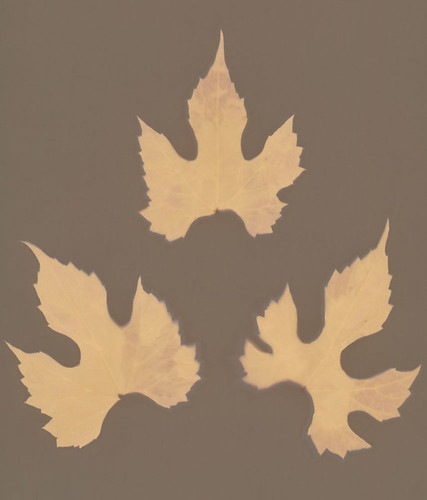 |
| 3 wet wild grape leaves |
The 18x24 size of FotoTsvet-2 appears to have distinctly different characteristics from the smaller size. I got two 20-sheet packets of it. Overall, I'm not impressed with the paper. It's boring and dull, but I am continuing experiments to see if there might be something that can be done with it to produce more interesting results.
Color Palette: Brown field and light brown images. There seems to be very little range in this paper. I've done only two exposures, both for fairly long times (6+ hours) but I don't anticipate anything interesting happening at shorter exposures. The paper is very slow to expose at all. It starts off as a cream color, either naturally or as a result of its extreme age and fog.
Moisture Response: Almost none. There is a tiny visible halo of lighter brown, but it is extremely difficult to see even on the physical print.
Reaction to Fixing: Unknown as yet. I am not enthusiastic, given the rather dull colors that this paper presents prior to fixing. My previous experience with fixing color paper is that it virtually destroys the image.

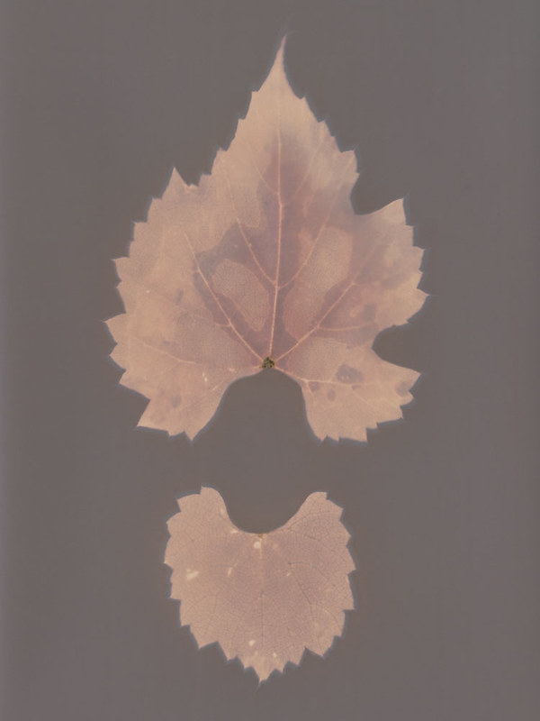
I only have one 20-sheet pack of this size of paper, so I'm trying to be a bit cautious with it. I'm enjoying it more than the 18x24 size. It's still limited to earth tones, but there's some variation.
Color Palette: Violet-brown seems to be the color of the field, no matter what else changes. Objects can take on different tones depending on moisture and length of exposure, but generally all within a yellow-orange to red-orange range. The paper is very slow to expose at all. It starts off as a cream color, either naturally or as a result of its extreme age and fog.
Moisture Response: Unlike the larger size of FotoTsvet-2, this version does have a notable reaction to moisture. The example image shows two leaves exposed on the same sheet. The upper leaf was dry, the lower leaf had been soaking in water for a few days, so it was full of moisture and damp on the surface. Further experiments have revealed that fresh leaves and water produce deeper, redder colors and better contrast on this paper. Very little in the way of a halo effect, but there is a minor darkening around the edge of wet subjects.
Reaction to Fixing: Unknown as yet. I am not enthusiastic, given the rather dull colors that this paper presents prior to fixing. My previous experience with fixing color paper is that it virtually destroys the image.
I enjoy modern, black and white papers produced by Forte quite a bit. Fortecolor Type 3, though, is not one of my favorites. So far, results have been very bland.
Color Palette: Browns, mostly. The paper has an overall tint of violet, but generally the colors produced can be described best as shades of brown. The field is dark brown, the objects are light brown. It isn't quite as starkly boring as FotoTsvet-2 (18x24), but it's close.
Moisture Response: Again, very little. There is some response to direct liquid application, which produces a darkening with more purple than brown in the affected areas, but simple moisture from fresh or even wet leaves is not enough to cause a dramatic effect. I may experiment with immersion during exposure, just to see what happens.
Reaction to Fixing: Unknown as yet. I am not enthusiastic, given the rather dull colors that this paper presents prior to fixing. My previous experience with fixing color paper is that it virtually destroys the image.
As always, you can check out my Flickr for further experiments. "FotoColor-2" and "Fortecolor" are the keywords for these new papers!
Tuesday, May 20, 2014
The Importance of Numerals

Kodak Polymax (no numerals) is a much older formulation of that type of paper. Like I mentioned, it tends to produce cream to brown fields with orange to red (sometimes violet) objects. I've found nothing that gets close to the same delicacy and lightness of Polymax, though some other Kodak papers will produce the same brown/red scheme, they can't match the lighter shades that Polymax can render.
Unfortunately, Polymax II doesn't seem to be even remotely connected to Polymax. I did a test print as soon as the paper arrived and, much to my dismay, the paper began turning indigo once struck by sunlight. Not brown, cream, tan or beige. Indigo. There are several papers that produce similar colors, so the indigo isn't anything I haven't seen before. It's nothing particularly arresting. Which sucks. I was hoping for a replacement for a very hard to find paper that gives amazing results... and I didn't get it. Not even a moderately nearby substitute.
Lame. At least it isn't a big loss, since the Polymax II isn't ugly. It wasn't even that expensive, which is part of why I was so excited. It was cheaper than even buying newly made photo paper, which is actually refreshing. Most expired and outdated photo papers are extremely expensive. I'm not exactly sure why, because such old papers aren't really that useful for printing. They tend to be fogged or unpredictable in their printing because of their age. I guess some folks are willing to pay for their old favorite papers, even at an unbelievable markup, and even when the papers may not actually work any longer. There can't be that big a market for old papers to use in lumen printing.
Kodak Polymax II RC
I've mentioned before that Kodak has not produced any new photographic papers since 2005, which is nearly a decade now. So even Polymax II isn't easy to obtain. It's much easier to get than the original Polymax, but as described above (at length), it isn't as nice.
Color Palette: Field starts out as indigo blue, then shifts with sufficient (2+ hour) exposure into a dark violet-brown. Objects will start out a very soft baby blue, developing into a very nice mixture of red, violet and blue. Interestingly, these remain separate instead of simply blurring into a continuum.
Moisture Response: There is a reaction, but not a huge one. The moisture creates a darker halo around objects, with a bit of a shift towards red.
Reaction to Fixing: Untested, but Kodak products in general do not react well to being fixed. I will be testing this soon, though.
Friday, May 16, 2014
Blogging for Thor: Playing Favorites
I've used many different papers (and non-papers) for lumen printing. I generally try anything I can get my hands on, really. Admittedly, I don't have the deep pockets to chase down much in the way of discontinued or expired paper types. Occasionally I'm able to get samples of old papers from friends, co-workers or stockpiles at work (I always try to use old paper for demos, since the old paper is worthless for printing). I prefer buying smaller quantities, because quite honestly most papers I've tested for lumen prints are kinda boring.
There are some exceptions, and those exceptions are my favorite types of lumen papers. The ones that stand head-and-shoulders above the rest, laughing at their dull, boring colors while they strut around flashing their giant tails at everyone. My top three at the moment are APP Collodio-Chloride POP, Kodak Polymax II RC and Adox Fine Print Variotone Warmtone. Shall we talk about why?
APP Collodio-Chloride POP
This one's still being made, just not being made commercially. It's individually coated by one guy up in New York and it's expensive: $6 a sheet for 8x10s. Sometimes he has "test quality" sheets that he sells for $3, but as he improves his techniques for production, that's becoming less commonly available. Its lumen characteristics are amazing. It has two distinct tonal phases and even fixes in a gorgeous way. I love working with it, but am forced to do so only for the most interesting subjects and compositions due to scarce supply. I tend to make fairly small prints (4x5, 3x3 or 2.5x3) because of the expense.
Color Palette (Short Exposure): For very short exposures (15 minutes or less) the paper turns scarlet red, with objects remaining white or shifting towards golds and creams.
Color Palette (Long Exposure): Eventually (generally 2-3 hours) the paper works its way through and ugly brown color and clears to reveal a deep green that ranges from olive to emerald. At this stage, objects have shifted to the earlier pinks and reds. I often use extended exposures (5+ hours) to create deep emerald fields with scarlet subjects.
Moisture Response: The paper reacts very well to moisture, creating blue-silver metallic highlights that shine brilliantly in the light. Collodio-Chloride POP even fixes well. Once fixed, the paper will generally move from a smooth texture to a varigated surface that highlights even the tiniest flaws, scratches, fingerprints and smudges. The visual effect works out a lot better than the description, I promise.
Reaction to Fixing: When fixed, Collodio-Chloride prints tend to become even more metallic, taking on weathered copper and tarnished bronze shades. This is my very favorite lumen surface to work with, but my least used because of how costly the paper is.
Further Flickr Examples: One, Two, Three
Kodak Polymax RC
Since Kodak no longer makes any darkroom papers at all, this paper is hard to find. It wasn't discontinued very long ago, I'm still able to find papers from 2005. It can be found on eBay, though, and occasionally it's even fairly cheap. At one point it was an extremely common paper. That's where I get my supply of it. With a gorgeous color palette and an often reasonable price, this is my "old reliable" favorite paper.
Color Palette: As with most Kodak papers, the general range is warm, with a very distinct split between objects and the field. The field will start off light, a kind of creamy almond that can eventually darken down to a chocolate brown. Objects start from an initial flaming orange, then develop into scarlet reds with hints of red-violet or more pure maroon. It's a very striking paper.
Moisture Response: Very little, actually. Halos do form, but they tend to have little color effect. If the paper is saturated with moisture during the exposure, though, there is a complete palette shift from tan field and red object to green fields with yellow-orange objects. A similar response to Fomalux RC Contact paper, with slightly more muted colors.
Reaction to Fixing: Again, this paper is typical of Kodak products. It does not react well to fixing. It fades away, losing almost all color and shifting to a dull, greyish orange-tan. It's extremely unpleasant and I have ceased any fixing of prints made on this paper.
Further Flickr Examples: One, Two, Three
Adox Fine Print Variotone Warmtone FB
While Ilford's Warmtone FB paper has similar characteristics, this Adox paper has much brighter colors and more subtle tones.
I only recently discovered it, but I have fallen in love with it. It produces fairly boring results with dry subjects, so I strongly recommend using it only with fresh-cut plants. It is still being produced commercially, and is easily available from Freestyle. The only downside is that it's not cheap, and comes only in small packages. No where near as bad as the APP Collodio-Chloride, but still not cheap. I'm currently in love with the 25-pack I purchased as part of a new paper exploration splurge, but I still try to control myself and use it only for interesting leaves and well-composed images.
Color Palette: Without moisture, this paper tends to produce simple images. Predominately grey-blue-violet fields with brighter red-violet objects. It isn't ugly, but it is nothing compared to the moisture response.
Moisture Reaction: Once you involve moisture, Adox FB Variotone Warmtone really comes alive. The moisture creates highlights of orange and yellow in the red-violet objects, making them stand out dramatically against the field, which can occasionally take on slight shades of green among the grey-blue-violets.
Reaction to Fixing: Untested. Warmtone paper normally fixes pretty well, but tends to change its appearance completely, shifting to a whole new palette of colors. I'll experiment with this soon, since I got some fixer to play with over the summer instead of having to drive down to work.
Further Flickr Examples: One, Two, Three
There are some exceptions, and those exceptions are my favorite types of lumen papers. The ones that stand head-and-shoulders above the rest, laughing at their dull, boring colors while they strut around flashing their giant tails at everyone. My top three at the moment are APP Collodio-Chloride POP, Kodak Polymax II RC and Adox Fine Print Variotone Warmtone. Shall we talk about why?
APP Collodio-Chloride POP
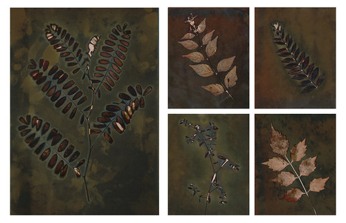 |
| Multiple fixed images, all with fresh leaves. |
Color Palette (Short Exposure): For very short exposures (15 minutes or less) the paper turns scarlet red, with objects remaining white or shifting towards golds and creams.
Color Palette (Long Exposure): Eventually (generally 2-3 hours) the paper works its way through and ugly brown color and clears to reveal a deep green that ranges from olive to emerald. At this stage, objects have shifted to the earlier pinks and reds. I often use extended exposures (5+ hours) to create deep emerald fields with scarlet subjects.
Moisture Response: The paper reacts very well to moisture, creating blue-silver metallic highlights that shine brilliantly in the light. Collodio-Chloride POP even fixes well. Once fixed, the paper will generally move from a smooth texture to a varigated surface that highlights even the tiniest flaws, scratches, fingerprints and smudges. The visual effect works out a lot better than the description, I promise.
Reaction to Fixing: When fixed, Collodio-Chloride prints tend to become even more metallic, taking on weathered copper and tarnished bronze shades. This is my very favorite lumen surface to work with, but my least used because of how costly the paper is.
Further Flickr Examples: One, Two, Three
Kodak Polymax RC
 |
| Dry wild carrot blossom |
Color Palette: As with most Kodak papers, the general range is warm, with a very distinct split between objects and the field. The field will start off light, a kind of creamy almond that can eventually darken down to a chocolate brown. Objects start from an initial flaming orange, then develop into scarlet reds with hints of red-violet or more pure maroon. It's a very striking paper.
Moisture Response: Very little, actually. Halos do form, but they tend to have little color effect. If the paper is saturated with moisture during the exposure, though, there is a complete palette shift from tan field and red object to green fields with yellow-orange objects. A similar response to Fomalux RC Contact paper, with slightly more muted colors.
Reaction to Fixing: Again, this paper is typical of Kodak products. It does not react well to fixing. It fades away, losing almost all color and shifting to a dull, greyish orange-tan. It's extremely unpleasant and I have ceased any fixing of prints made on this paper.
Further Flickr Examples: One, Two, Three
Adox Fine Print Variotone Warmtone FB
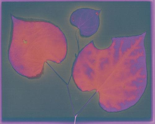 |
| Fresh-cut Judas Tree leaves |
Color Palette: Without moisture, this paper tends to produce simple images. Predominately grey-blue-violet fields with brighter red-violet objects. It isn't ugly, but it is nothing compared to the moisture response.
Moisture Reaction: Once you involve moisture, Adox FB Variotone Warmtone really comes alive. The moisture creates highlights of orange and yellow in the red-violet objects, making them stand out dramatically against the field, which can occasionally take on slight shades of green among the grey-blue-violets.
Reaction to Fixing: Untested. Warmtone paper normally fixes pretty well, but tends to change its appearance completely, shifting to a whole new palette of colors. I'll experiment with this soon, since I got some fixer to play with over the summer instead of having to drive down to work.
Further Flickr Examples: One, Two, Three
Thursday, April 24, 2014
Blogging for Thor: Scanning the Surface, Captain!
As I've mentioned many times before, one of the final stages in most of my alternative process work is scanning the print to create a permanent, digital record of the image. Many of my prints are unstable for various reasons, so the digital record is often the only way to get a permanent end product. Anyone that wants to be an active part of the artist community in this day needs to scan or somehow digitally image their work, regardless of medium. It's just a fact of life. Your digital images can travel far better than your prints can.
There are some drawbacks to scanning prints, though. The first is one I've already addressed: dust. You have to clean and spot the digital image before using it. It's time-consuming and difficult, but no more so than having to clean and prep a physical print for display. That's kind of a wash, really. What I really want to address today is the difficulty with recording and reproducing surfaces through digital means.
Now, what do I mean by that? Well, a few things, but kinda one thing. Surface matters a great deal to any printed medium. Photographic papers (inkjet or darkroom) come in a wide variety of surfaces. Matte, semi-matte, satin, pearl, luster, semi-luster, gloss, high-gloss, super-high-gloss, etc. That's just a fairly standard range. There are ultra-mattes, watercolor surfaces, cotton rag surfaces, etc. Alternative processes expand that even further by allowing access to essentially the full range of all possible paper surfaces. Even just exploring high-quality fine-art papers offers dozens or hundreds of different levels of surface smoothness, texture and feel. The choice of what surface you print on has a tangible impact on how your image feels to the viewer.
Basically, if you're going to be reproducing your work digitally, the original substrate's texture is largely lost. What remains just becomes visual, losing the tactile quality. If your original print was on watercolor paper, you can't recapture that texture perfectly; even printing on watercolor paper won't work. The tactile texture has been translated to visual noise by the scanner or camera and will be translated into ink by the printer. It's generally not a pleasant result. The original texture, translated into the digital image, looks like nothing more than distortion. It doesn't have nearly the same effect as actual, physical surface texture with true dimensionality.
There are other problems with scanning images. Certain things just don't photograph well. Metallic reflections, fabric textures, anything that shifts appearance based on perspective... some of my favorite lumens look disappointingly dull and disinteresting in their digital forms because the strongly reflective metallic highlights created by silver deposits in the paper brought to the surface by moisture just don't show up. They show up as blue or grey, with no shine at all. Chromoskedasic sabattier, which forms similar highly metallic deposits in a variety of oil-on-water shimmers, scans even worse. The results often appear as dull black shadows instead of glittering patches of light.
I've tried printing on different surfaces to reproduce the original surface, but the problem is the secondary visual texture created by the scan. My only real solution to this issue is to use smooth-textured original surfaces so there is no transfer. Then whatever texture I want to integrate can be applied when I print from the digital file, by printing onto a textured surface. Only one layer of texture, see? It works, but it isn't ideal. That offers no way to deal with metallic surfaces like chromo prints or collodion-paper lumens. It offers no way to help with cyanotypes or other alternative processes printed on leather, parchment, cloth or heavy, textured paper.
The only suggestion I have for those is just not to even attempt to reproduce the image as itself, but rather accept that the digital 'copies' aren't copies. They're documentation of a unique original, just like prints of a Van Gogh or photographs of a sculpture.
There are some drawbacks to scanning prints, though. The first is one I've already addressed: dust. You have to clean and spot the digital image before using it. It's time-consuming and difficult, but no more so than having to clean and prep a physical print for display. That's kind of a wash, really. What I really want to address today is the difficulty with recording and reproducing surfaces through digital means.
Now, what do I mean by that? Well, a few things, but kinda one thing. Surface matters a great deal to any printed medium. Photographic papers (inkjet or darkroom) come in a wide variety of surfaces. Matte, semi-matte, satin, pearl, luster, semi-luster, gloss, high-gloss, super-high-gloss, etc. That's just a fairly standard range. There are ultra-mattes, watercolor surfaces, cotton rag surfaces, etc. Alternative processes expand that even further by allowing access to essentially the full range of all possible paper surfaces. Even just exploring high-quality fine-art papers offers dozens or hundreds of different levels of surface smoothness, texture and feel. The choice of what surface you print on has a tangible impact on how your image feels to the viewer.
Basically, if you're going to be reproducing your work digitally, the original substrate's texture is largely lost. What remains just becomes visual, losing the tactile quality. If your original print was on watercolor paper, you can't recapture that texture perfectly; even printing on watercolor paper won't work. The tactile texture has been translated to visual noise by the scanner or camera and will be translated into ink by the printer. It's generally not a pleasant result. The original texture, translated into the digital image, looks like nothing more than distortion. It doesn't have nearly the same effect as actual, physical surface texture with true dimensionality.
There are other problems with scanning images. Certain things just don't photograph well. Metallic reflections, fabric textures, anything that shifts appearance based on perspective... some of my favorite lumens look disappointingly dull and disinteresting in their digital forms because the strongly reflective metallic highlights created by silver deposits in the paper brought to the surface by moisture just don't show up. They show up as blue or grey, with no shine at all. Chromoskedasic sabattier, which forms similar highly metallic deposits in a variety of oil-on-water shimmers, scans even worse. The results often appear as dull black shadows instead of glittering patches of light.
I've tried printing on different surfaces to reproduce the original surface, but the problem is the secondary visual texture created by the scan. My only real solution to this issue is to use smooth-textured original surfaces so there is no transfer. Then whatever texture I want to integrate can be applied when I print from the digital file, by printing onto a textured surface. Only one layer of texture, see? It works, but it isn't ideal. That offers no way to deal with metallic surfaces like chromo prints or collodion-paper lumens. It offers no way to help with cyanotypes or other alternative processes printed on leather, parchment, cloth or heavy, textured paper.
The only suggestion I have for those is just not to even attempt to reproduce the image as itself, but rather accept that the digital 'copies' aren't copies. They're documentation of a unique original, just like prints of a Van Gogh or photographs of a sculpture.
Friday, April 4, 2014
Blogging for Thor: 200 Lumen Slog

Liquigrams as I've been calling them, are a great amount of fun. The only downside is that in order to prevent the stuff on the paper from dripping, sliding and melting all kind of different directions, they have to be exposed to sunlight while kept flat. Since my house is on a hill and halfway surrounded by trees, that's quite a challenge. There's really only three places I can put them, and I only have a few of the plastic trays I make them in (keeps things cleaner). So my production of liquigrams is much slower than my production of regular lumen prints.
On that note, I've got to make a minor note: I'm really slow at lumen prints. I know a few others that work with the process and they tend to have exposures only a few minutes long. They can churn out a dozen or more prints in a day, whereas I'm happy with doing maybe 4 in a day, if I'm lucky with sunlight and at home the whole time. I generally have exposure times that run upwards of 2 hours.
Mid-Post Note: Dammit! I got distracted watching TV and didn't finish this post in time. Oh well, I started it on Thursday!
I'm going to compile a list of which papers I've done Lumens with at some point this weekend, which will be another post. It's my first step towards creating a lumen paper compendium. I also plan on discussing in more detail the results of lumen printing on ortho-litho film, and get into some lumens on regular film, like 4x5 and 35mm.
Thursday, March 6, 2014
Blogging for Thor: My Discontent with Winter
Much to my discontent, it remains firmly winter here in the South. Near-freezing temperatures, grey skies and cold liquids falling from space. It all sucks, my spiders. Get working on the NASA satellite weather-control thing, will you?
Tonight's blog will be brief. I haven't been entirely unproductive recently. Teaching a darkroom class has actually had me in the darkroom. I'm not a big fan, especially since I was basically just watching my students do their thing until I was able to change the policy to get them an open-door lab. One of the advantages of just sitting around while my students worked was that I had time to mix myself up a batch of fixer and test some more lumen papers.
 |
| Before and after: Ilford Warmtone |
As normal, warm-tone paper (I got a pack of Ilford Warmtone for my birthday back in December) continues to be really awesome when fixed. The relatively boring purple of pre-fixer changes to a nice gradient of red-golds. So far, since everything is dead and dry, I have not been able to test the effects of moisture on the Ilford Warmtone, but I look forward to doing that during spring.
The second paper I tested was the Harman Direct Positive, which is bubblegum pink when taken out of the pack and exposes down to a dull slate-grey. It takes forever to expose, several days which is unheard of for a lumen print. When fixed, anything that stayed pink just washes right off and goes to pure white, but the grey areas turn a very soft, pastel peach. I think it might be worth pushing this paper further to see what can be achieved there.
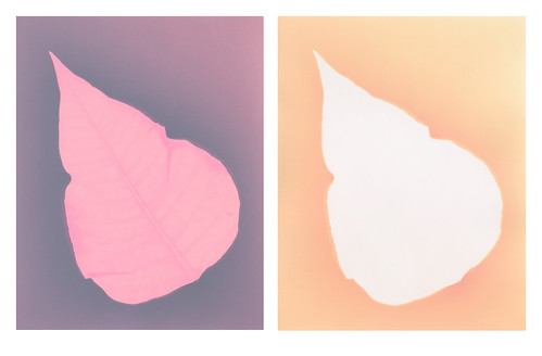 |
| Before and after: Harman Direct Positive |
I also experimented with fixing some of my Liquid Light lumens that were made on metal, glass or animal skin. The results weren't as cool as I hoped. When fixed, Liquid Light goes from a dull purple-grey to a dull tan. It's not very exciting. I'm having trouble scanning them, because the fixer bath and rinse left them very delicate and extremely warped. I may have to photograph them.
Friday, December 20, 2013
Blogging for Freya: Life's Hard

Anyway, that's over. I've been finding it harder and harder to get myself to experiment and actually do art, which makes it harder and harder to write this blog since I have nothing exciting and amazing to report. Part of that is the weather and the season. I work with plants and there aren't a lot of plants around in the winter. A few, yes, but not many. The sunlight is also duller, the days colder and typically cloudier. Exposures take a lot longer, and since it gets dark earlier, I have less time to do them anyway. It's just a bad season for my chosen type of work.
Now, all that said, I have been doing some experiments. Slowly, painfully, but they're happening. For my Birthday (woo?) I was given two packs of very cool lumen paper. Harman Direct Positive paper and some Ilford Warmtone RC. I'd been wanting to try another warm-tone paper for a while. They tend to have really cool effects when fixed, as opposed to neutral-tone papers that generally have very disappointing effects when fixed.
I may also save some of the Ilford Warmtone and try chromoskedasic sabatier once I get back into the university darkroom in January. This is a really fun process that makes for some awesome chemigrams, or can be combined wit regular contact printing! I discovered that process in a workshop with Angela Wells, from ECU, back at SPESE '13. It was very fun, but it DOES need a darkroom and certainly isn't as home-friendly as my favored processes are. Still, pretty cool stuff!

When the Direct Positive paper finally does start changing, it isn't that dramatic. The bubblegum-pink shades into Barney-purple and finally into a dull blue. Moisture seems to cause it to bleach back to white, which may be interesting when spring rolls around and there are fresh plants to use again. I'll probably put further Direct Positive experiments on hold until spring, honestly. See what it does with better light, heat and subject matters.
That's all for now folks! Hopefully I can get moving on all the many things I have to do before January 15th and make some of my dreams come true. Oh, crippling fear of change, you're so crippling.
Thursday, November 7, 2013
Blogging for Thor: Getting It Together

Bah. That isn't what I hoped for. So now I've had this other idea! I can actually mix-n-match brands of paper. Since each type of paper produces different colors when working with lumens, I can create a single lumen image that displays different color profiles. That'll be fun!
I also want to try not making all the exposures at once, but instead making them sequentially. Basically, instead of arranging four (or however many) tiles of paper under a single object and exposing them together, I'll expose one tile at a time. The minor variations in exposure time, weather conditions and alignment will make each image slightly unique. That will also be fun!
The biggest challenge facing me, I think, is making each one of my tiles an interesting visual experience all by itself. I have some ideas there, too, since I've been able to create some pretty wild backgrounds on my lumen prints using water and debris before. I'm going to try that again, this time combined with an object. Really going to be taking my lumens to the next level, on multiple levels! Know what that means? All The Fun.
Cheers! And hey, look, I blogged in time to appease the Wrath of Thor!
Friday, November 1, 2013
Blogging for Thor: I'm Bad At This
Man, cold medicine really messes with you! I can also attribute my failure to blog on Thursday to my recent discovery that AmazonPrime offers the entire first season (which is the best season) of The Real Adventures of Jonny Quest for free streaming. So, that's pretty awesome.
For this week, I don't have anything about teaching or about lumens, anthotypes or cyanotypes to report. Instead, I have something to admire. At SPE this year, I was introduced to S. Gayle Stevens who works with wet plate collodion. One of the most interesting things I saw in her presentation was a simple way of combining multiple small tintypes together into diptychs, triptychs or even larger mosaic-like compositions. I then ran across more of a similar idea on Flickr, finding some work by an artist named Michelle Smith-Lewis.
This mosaic style of image creation could help bypass some of the limitations I work with, like a scanner that can't handle paper bigger than 10x13 and the small size of my contact printing frames. Working like this will also make for some more flexible ways to deal with the rare and expensive papers that I like to use. Instead of devoting entire sheets to large images, I can create multiple images, each able to stand on its own, that fit together into a greater whole. That's pretty awesome!
I'll leave you viewing one of S. Gayle's portfolios that focuses on the mosaic technique: Allegory.
Hopefully the weather will cooperate (and my cold will go away) so that next week I can get some examples of this type of work up!
For this week, I don't have anything about teaching or about lumens, anthotypes or cyanotypes to report. Instead, I have something to admire. At SPE this year, I was introduced to S. Gayle Stevens who works with wet plate collodion. One of the most interesting things I saw in her presentation was a simple way of combining multiple small tintypes together into diptychs, triptychs or even larger mosaic-like compositions. I then ran across more of a similar idea on Flickr, finding some work by an artist named Michelle Smith-Lewis.
This mosaic style of image creation could help bypass some of the limitations I work with, like a scanner that can't handle paper bigger than 10x13 and the small size of my contact printing frames. Working like this will also make for some more flexible ways to deal with the rare and expensive papers that I like to use. Instead of devoting entire sheets to large images, I can create multiple images, each able to stand on its own, that fit together into a greater whole. That's pretty awesome!
I'll leave you viewing one of S. Gayle's portfolios that focuses on the mosaic technique: Allegory.
Hopefully the weather will cooperate (and my cold will go away) so that next week I can get some examples of this type of work up!
Thursday, September 19, 2013
Blogging for Thor: Writing is Hard, Bergger is Weird
As I mentioned recently, I'm staring on an index of lumen printing papers. What color palettes you can expect from a paper, any special effects it has if exposed under different conditions (wet, underwater, fresh vs dried plants, etc), that sort of thing. The most extensive testing so far has been on Bergger because of one reason: Bergger is poorly labelled.
Now you, being the web-crawling spider-drone that you are, may question what Bergger is. Bergger is a fairly common brand of photo paper, owned by a French company. I've got two types of Bergger paper. The packs were a gift from a friend who wasn't going to be doing anymore darkroom work after she graduated ECU. Thanks, SexyMama! She gave me a pack of 11x14 Prestige Variable NB fiber paper and one of 8x10 Prestige Variable CB fiber paper. NB stands for "neutral base" and CB stands for "cream base". The only place this essential difference is noted is in small print on the front label. Two little letters and that's the difference between warm tone and regular paper. No different packaging, no different brand name, just two letters. Super Annoying.
Both of these types of paper have demonstrated some fairly significant range in their possible colors. Mostly the other paper brands I've worked with are at least vaguely consistent. There are variables if you get moisture involved, yes. Some of the papers give a radically different color if you work with extremely short exposures. Bergger is fairly unique in that the difference between a short exposure and a long exposure isn't just a deepening of color, it's a complete tonal shift. Whole new palettes of color will show up.
Bergger Variable NB has at least two distinct phases. A short exposure, under 20 minutes, will give you a pale butter-yellow in the highlights and a rich amethyst purple in the shadows. It's a very nice, very strong contrast. Medium exposures, from 40 minutes to 2 hours will turn the yellows to red-oranges and the purples to maroon and brown. True long exposures on Bergger Neutral Base haven't been tested yet, but the difference between a 40 minute exposure and 90 minute exposure suggests that the orange starts to darken to red and the background goes from maroon to greenish-brown. No moisture tests so far, but that's on my to-do list.
The Cream Base paper is entirely different. Extended exposures (4+ hours) are extremely monochromatic, basically pale blue and white. The blue is deeper in shorter exposures, which is a bit strange. Shorter exposures have a slight violet cast to the blue. Generally, I've found the CB paper rather boring. When exposed to moisture, it turns bright red or maroon. Now, when you fix the CB Bergger, the print takes on very different qualities. The shadows turn into a brilliant combination of soft orange and violet, while the highlights are bright gold. The colors, once again, are brighter on a short exposure than they are on a long exposure. Kinda weird.
When I start formatting things properly, I'm going to organize this information more fully. Think of this as a preview of the sort of information that will be in my catalogue once I get it assembled. It's slow going, articulating what I've learned in a formal, simple way. That's never easy for me. I'm so much better at stream of consciousness with interwoven smart-assery. After all, I write my blog as if talking to imaginary readers and sentient web-spiders. Yeah, being serious and straight forward isn't my strength, but I feel like the catalogue should be simple to read and access. It's a challenge. But it's one I can beat. I'll probably post a sample spread in the next few weeks.
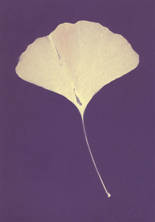 |
| Bergger NB - 10 minutes |
Both of these types of paper have demonstrated some fairly significant range in their possible colors. Mostly the other paper brands I've worked with are at least vaguely consistent. There are variables if you get moisture involved, yes. Some of the papers give a radically different color if you work with extremely short exposures. Bergger is fairly unique in that the difference between a short exposure and a long exposure isn't just a deepening of color, it's a complete tonal shift. Whole new palettes of color will show up.
Bergger Variable NB has at least two distinct phases. A short exposure, under 20 minutes, will give you a pale butter-yellow in the highlights and a rich amethyst purple in the shadows. It's a very nice, very strong contrast. Medium exposures, from 40 minutes to 2 hours will turn the yellows to red-oranges and the purples to maroon and brown. True long exposures on Bergger Neutral Base haven't been tested yet, but the difference between a 40 minute exposure and 90 minute exposure suggests that the orange starts to darken to red and the background goes from maroon to greenish-brown. No moisture tests so far, but that's on my to-do list.
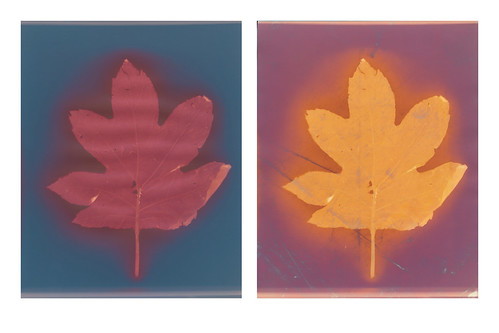 |
| Bergger CB pre- and post-Fixer comparison |
When I start formatting things properly, I'm going to organize this information more fully. Think of this as a preview of the sort of information that will be in my catalogue once I get it assembled. It's slow going, articulating what I've learned in a formal, simple way. That's never easy for me. I'm so much better at stream of consciousness with interwoven smart-assery. After all, I write my blog as if talking to imaginary readers and sentient web-spiders. Yeah, being serious and straight forward isn't my strength, but I feel like the catalogue should be simple to read and access. It's a challenge. But it's one I can beat. I'll probably post a sample spread in the next few weeks.
Sunday, September 15, 2013
A Fixing Follow-Up
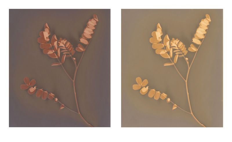
 Quite recently, I talked about my views on fixing lumen prints. Yesterday while I was at the Light Factory I did some more experimentation on some lumens that I wasn't particularly thrilled with. In all but one case fixing them removed detail, color and vibrance from the images. So, here's the side-by-sides.
I got some feedback on the Collodio lumens I showed last time, with the general feeling of 'why are you complaining, the fixed ones look better!'. Well, that isn't really the point. The point is they look different and drastically so. Better or worse, a fixed lumen print is distinct and unpredictably different from its unfixed version. The change is also permanent and irreversible.

In the end, my advice isn't "Never fix lumen prints" but rather "Make sure you have multiple high-quality, large-size digital copies before fixing any lumen." Sometimes fixing your lumen print will create a lovely, fascinating image. Mostly not, in my experience. Mostly my experience tells me your fixed prints will be flatter, have less color, less contrast and less detail. Some papers, like the Collodio and (apparently) Bergger Prestige NB take the fixer fairly well. They seem to be an exception. The main thing is: even if you like your fixed lumen print, keep print-quality records of the pre-fix stage because that will be a different image.
Oh, and these do look crappier than the unfixed prints, all except for the last one that I quite like. If only the hot press I was using hadn't decided to attack the prints and leave them scarred with vile black residue and strange white streaks. Oh well, that is why I used prints I wasn't particularly fond of. If anyone wants full details on these prints, including larger versions and information about the paper, exposure and all that jazz, you should check them out on my Flickr. So here's a link to that!


Monday, September 9, 2013
An Illumenated Manuscript
 |
| Kodak Ektacolor Ultra II |
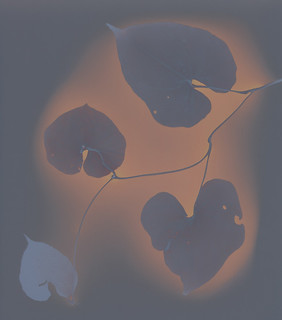
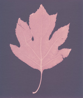
The result is a cabinet full of donated paper tends to be full of old paper. Expired paper, paper that has been discontinued, paper from brands no longer in existence and other exciting types. The Light Factory only has a little bit of Ilford and Kentmere, but they have a lot of old Kodak paper, some Agfa, a few types of old Bromide-based paper and some brands I've never heard of before like Luminos.
 |
| Luminos Portrait Delux |
Now that I have these test samples, I've begun thinking. What else can I do with them? It's hard to set up a simple table of "use X paper for Y result" because lumens don't really work that way. The resulting colors are dependent on exposure time, humidity, type of object used to make the print and (apparently) magical faeries. Still, there are general trends. So while I can't do a simple 1:1 table, I can write some notes about what to generally expect from each type of paper. Not just for the paper from the Light Factory, but from the dozen or so brands of paper that I've used on my own.
 |
| Agfa Multicontrast Classic |
If you want to see all the lumen tests from Light Factory paper, you can check my Flickr Set: Lumen Prints. Anything done on Light Factory paper is marked as Lumen # LF. Currently, that's 102-113. I still have test sheets to work with, but all the different brands have been tested at least once. Here's the Link.
Wednesday, July 24, 2013
Pressing Paper Problems
In an earlier post, I talked about substrates that can be used for anthotypes. I stand by the advice given in that post, except for one detail. At the very end, I mention that largely what goes for anthotypes also goes for cyanotypes.
Whelp. That's not quite correct because you don't have to develop anthotypes. They don't get washed or anything, you just paint on the pigment and let 'em expose. That's it. Cyanotypes do have to be developed. They require at the very least a water bath of several minutes to clear the excess chemistry and expose the image. In fact, this should be a fairly extended bath to make sure there's no hidden chemistry lurking in the paper fibers. When you start wanting to tone a cyanotype, you're looking at even more baths. Generally at least four more: a bleaching bath, a rinse to remove the bleaching agent, a toning bath and then a final wash to remove extra toner. All that water is going to be hell on your paper unless you're using the right kind of paper.
If you're just printing a regular cyanotype, you're probably still clear to use most of the types of paper I covered in the anthotype substrate post. The cheapest types of alternative process paper (you want at least 100 pound) is going to be watercolor paper. It can be Canson, Arches or even a store-brand. I've had quite decent results on generic, store-brand 100-pound watercolor paper when printing ordinary, one-coat, one-wash cyanotypes.
However, if you want to get complex with your cyanotypes and start bleaching or toning them, you need better paper. You're going to want to start looking at heavy-weight (150 lbs+) papers designed for wet media and printmaking. Rives BFK, Copperplate, Stonehenge, Hahnemühle, etc. These are papers intended to be washed and soaked. They feel like cloth, not stiff and hard like a watercolor paper. Printmakers often soak them overnight before printing on them. Water won't hurt them at all. These are the kind of papers you want to use for cyanotypes you intend to tone.
So, why am I saying all this? Well, because I bought a block of Arches Hot Press Watercolor paper (140 lbs) and I had an old block of Arches Cold Press Watercolor paper (also 140 lbs). When I tried using these papers for my cyanotype toning test sheets, the results were sometimes good, but I had numerous difficulties. Bleeding around the edges, strange splotches showing up during extended washing, odd starburst effects. These weird things didn't happen every time, but I'm not happy with them happening any times. I want predictable, repeatable results each time I make a cyanotype. If I want weird, unpredictable behavior, I'll print my cyanotypes on vellum because, holy crap, vellum never acts predictable or regular. The skin itself is irregular and splotchy, so trying to get a consistent result is automatically futile. Fabric tends to be the same way for me, though if you carefully handle fabric you can get pretty nice prints off it, depending on the fabric itself. It might be that I'm using raw silk for most of my cyanotype prints (I love it soooo much), and raw silk is... uh, raw. Not fully processed, so it's got its own irregularities.
Anyway! To summarize: if you're going to be toning your cyanotypes, you have to splurge a bit on the paper. You want something that is intended to be soaked thoroughly and takes water really well. These are going to be your heavy-weight printmaking papers for the most part. Watercolor paper is designed for wet media, but only on the surface. It isn't designed to be submerged fully in water for extended periods of time and doesn't always react well to that.
You most certainly can use watercolor paper to save money if you're working with anthotypes or regular cyanotypes. You can get awesome results! I am not putting watercolor paper out of the picture. It just won't work in all circumstances. Sometimes, you gotta pay.
Oh! Wait! A last word! See, the expensive paper? It's gunna be what you want to use for archival prints. Part of the process in making a cyanotype truly archival is extended washing during and after development. This becomes triple true for toned cyanotypes. If you're not too concerned about archival properties (I rarely am), then you can get away with short washes for your watercolor paper cyanotypes. If you want the cyanotypes to be around in 2525 so that Cleopatra can be awed by your artistry, get the expensive paper.
 |
| Speckles on Arches 140 lbs |
If you're just printing a regular cyanotype, you're probably still clear to use most of the types of paper I covered in the anthotype substrate post. The cheapest types of alternative process paper (you want at least 100 pound) is going to be watercolor paper. It can be Canson, Arches or even a store-brand. I've had quite decent results on generic, store-brand 100-pound watercolor paper when printing ordinary, one-coat, one-wash cyanotypes.
 |
| Bleeding Edges on Arches 140 lbs |
 |
| Extreme speckles on Arches 140 lbs |
Anyway! To summarize: if you're going to be toning your cyanotypes, you have to splurge a bit on the paper. You want something that is intended to be soaked thoroughly and takes water really well. These are going to be your heavy-weight printmaking papers for the most part. Watercolor paper is designed for wet media, but only on the surface. It isn't designed to be submerged fully in water for extended periods of time and doesn't always react well to that.
You most certainly can use watercolor paper to save money if you're working with anthotypes or regular cyanotypes. You can get awesome results! I am not putting watercolor paper out of the picture. It just won't work in all circumstances. Sometimes, you gotta pay.
Oh! Wait! A last word! See, the expensive paper? It's gunna be what you want to use for archival prints. Part of the process in making a cyanotype truly archival is extended washing during and after development. This becomes triple true for toned cyanotypes. If you're not too concerned about archival properties (I rarely am), then you can get away with short washes for your watercolor paper cyanotypes. If you want the cyanotypes to be around in 2525 so that Cleopatra can be awed by your artistry, get the expensive paper.
Saturday, May 11, 2013
The Sun Will Come Out Tomorrow!
I think I mentioned recently that my long hiatus was due to a bunch of stuff. First, late fall and winter are terrible times to do anthotypes or lumen prints and I haven't been working on much illustration lately. I've got some ideas there, mostly inspired by some great bands, but currently still straightening those ideas out in my brain. I hope to be deep into an illustration project sometime in the next month, though.
Anyway. I also had my largest set of students this spring semester, so I was adjusting to that. But now it's summer and while I've got some camps and workshops to keep me teaching, I have a lot more free time (and light!) to experiment with. So, I figure I'll bring y'all (no one reads this blog, I'm talking to myself) up to date on what I've been working on.
 Stumps!: Over the winter, my Dad had to get rid of a tree in his front yard and after cutting it down, discovered it was a cedar tree. In case you don't know, cedar trees have a rusty red, almost purple, heartwood and pale, tan sapwood. He saved the resulting logs for me and I turned a couple slices into some nifty coasters. It only recently occurred to me that I could coat the untreated slices of cedar with anthotype dye and use them to expose on! So, right now I have some blackberry covered cedar sitting in my workshop, drying. It's supposed to rain all weekend, but I should have some results from those wood prints in a couple days. At least, I'm hoping for days, but realistically it might take two or more weeks since the wood just loves to suck up the dye and hold onto it. We'll see what happens!
 Paper!: I tried making my own! It's messy and annoying, but the project was successful. I used shredded documents and some dryer lint to mix up my slurry, screened it with an old picture frame and dried it in the microwave because I have no patience. The resulting paper is blue, because I wear a lot of jeans. Next time I'll skip the lint and just add in some wool that I have laying around. I'm not the biggest fan of the blueness of the paper (which is weird, I love blue things), but the texture is great! See? Isn't it great? I think it's great. Normally I deckle the edges of the paper I use for 'finished' anthotypes (as opposed to dye-tests), but since I made this paper myself, the deckle is just a product of the imperfect production process. I like that a lot. The other nice thing is that the resulting print is mine. I mixed the dye, I made the paper, I did pretty much all of it. I might be selfish, but I enjoy making things that are mine from start to finish when I can.
 Wool!: As I mentioned, I have wool laying around. A few pounds of it, actually. In college I took a textiles class and loved dyeing and manipulating the chemistry involved. That knowledge and experience has been invaluable in working with anthotypes, so I started to wonder about combining them. This whole thing was inspired by my friend Deanna Januzzi, who did some great work combining textiles and alternative photography to make cyanotype pillows and furnishings. I'm taking raw wool, felting it into cloth by hand, dyeing the felt and then going to use the dyed felt to print anthotypes on. The resulting felt is way too thick for me to fit into a picture frame like I normally use for anthotype exposures. So, I've come up with this incredibly sleek and sophisticated solution: put a glass-only frame on top of everything and hold it down with spare weights.
The really nice thing about using this wool felt? Madder root dye may not work on paper very well, and it's only so-so on muslin, linen and silk... but dayum it's awesome on wool. The felt soaked the madder up like a sponge and turned a bright, bloody red. I can't wait to see the results!
Anyway. I also had my largest set of students this spring semester, so I was adjusting to that. But now it's summer and while I've got some camps and workshops to keep me teaching, I have a lot more free time (and light!) to experiment with. So, I figure I'll bring y'all (no one reads this blog, I'm talking to myself) up to date on what I've been working on.
 Stumps!: Over the winter, my Dad had to get rid of a tree in his front yard and after cutting it down, discovered it was a cedar tree. In case you don't know, cedar trees have a rusty red, almost purple, heartwood and pale, tan sapwood. He saved the resulting logs for me and I turned a couple slices into some nifty coasters. It only recently occurred to me that I could coat the untreated slices of cedar with anthotype dye and use them to expose on! So, right now I have some blackberry covered cedar sitting in my workshop, drying. It's supposed to rain all weekend, but I should have some results from those wood prints in a couple days. At least, I'm hoping for days, but realistically it might take two or more weeks since the wood just loves to suck up the dye and hold onto it. We'll see what happens!Paper!: I tried making my own! It's messy and annoying, but the project was successful. I used shredded documents and some dryer lint to mix up my slurry, screened it with an old picture frame and dried it in the microwave because I have no patience. The resulting paper is blue, because I wear a lot of jeans. Next time I'll skip the lint and just add in some wool that I have laying around. I'm not the biggest fan of the blueness of the paper (which is weird, I love blue things), but the texture is great! See? Isn't it great? I think it's great. Normally I deckle the edges of the paper I use for 'finished' anthotypes (as opposed to dye-tests), but since I made this paper myself, the deckle is just a product of the imperfect production process. I like that a lot. The other nice thing is that the resulting print is mine. I mixed the dye, I made the paper, I did pretty much all of it. I might be selfish, but I enjoy making things that are mine from start to finish when I can.
 Wool!: As I mentioned, I have wool laying around. A few pounds of it, actually. In college I took a textiles class and loved dyeing and manipulating the chemistry involved. That knowledge and experience has been invaluable in working with anthotypes, so I started to wonder about combining them. This whole thing was inspired by my friend Deanna Januzzi, who did some great work combining textiles and alternative photography to make cyanotype pillows and furnishings. I'm taking raw wool, felting it into cloth by hand, dyeing the felt and then going to use the dyed felt to print anthotypes on. The resulting felt is way too thick for me to fit into a picture frame like I normally use for anthotype exposures. So, I've come up with this incredibly sleek and sophisticated solution: put a glass-only frame on top of everything and hold it down with spare weights.
The really nice thing about using this wool felt? Madder root dye may not work on paper very well, and it's only so-so on muslin, linen and silk... but dayum it's awesome on wool. The felt soaked the madder up like a sponge and turned a bright, bloody red. I can't wait to see the results!
Straight Up Substrates
Anthotypes are pretty awesome. Why else would I blog about them so much? Well, boredom and an enjoyment of hearing myself.. type, I guess. But, they're pretty awesome, that's the point. One of the reasons they're awesome is that you have a huge amount of flexibility in how you make them. There are dozens or hundreds of possible dyes, each one can be diluted or applied in many different ways to create just buttloads of potential colors. But, under all that, there's even more choice! You get to choose what you put the dye on! There are many possibilities and each category breaks down even further.
Because of the sheer number of things you can put dye onto and let it fade back off, I'm only going to cover a few types of substrates, the ones that are most commonly used for anthotypes. Don't let that stop you from experimenting! Anything that takes a stain can theoretically be used to make an anthotype.
Paper: The most common substrate to use for anthotypes is paper. It's obvious, since that's what most photographs are produced on and an anthotype is a type of photograph. There are a wide variety of papers and choice does matter. I don't recommend using anything lightweight such as copy paper because it won't hold up well under the dye and it will wrinkle as it dries. You want a heavy-weight paper that's designed to take lots of liquid. Printmaking paper, watercolor paper and even sketch paper meant for use with inks will do alright.
There are many sources telling you about what kind of papers are best for this and that alternative process. Some of my favorite brands are Crane Kid Finish, Rives BFK, Stonehenge, Arches Watercolor and Canson Watercolor. I don't have as much experience with the printmaking papers, because they're rather expensive, but Rives and Stonehenge are both extremely durable, cotton-rag papers that will happily soak up your dye without deforming or tearing. They're my personal favorites for anthotypes. However, again, they're kinda expensive. So, for tests and experiments I prefer to use Canson or Arches, neither of which is very pricey. When you're just starting out, or using particularly weird dyes that you don't expect much from, Canson is the cheapest paper of the brands I've listed. It's often comprable to store-brand generic watercolor paper. Arches is much heavier, which is nice for durability.
A short note about watercolor paper: it comes in Cold Press and Hot Press. What those mean are that cold press paper has a tooth, or texture, on the surface. Hot press papers are extremely smooth. I'm a much bigger fan of smooth paper for anthotypes because it lets the most detail shine through in the print itself. You may like the texture of the paper itself, so you should probably try both.
If you're adventurous and don't mind getting dirty, you can even make your own paper. It's pretty simple, and comes out with a great finish. If done correctly and your paper mash is reinforced with some lint or fibers, you can get very, very sturdy papers. I especially like that when you make your own paper, it puts more of the process in your hands. You make the paper, you make the dye, you make the image. It's all yours. That's a nice feeling sometimes.
Fabric: After paper, the next level of advancement in substrate experimentation is normally fabric. I'll say that your best bets here are going to be natural fibers. I've used linen, muslin, wool and silk. All have given decent results. Linen has done the best for me so far. Silk doesn't like to absorb the dye as easily. Wool tends to snarl on the leaves and plants I use, though it's great at absorbing the dye. The linens I use tend to be fairly thick and heavy, with good texture. On paper, I like a smooth surface, but with fabric, I prefer texture because it helps add contrast. You won't get as much detail on fabric as you will on paper, so keeping to a smooth surface doesn't have much benefit.
I encourage experimentation with fabric, and I'm eager to hear the results of others trying fabric anthotypes. If you try them, please let me know what results you get!
Wood: Yep, you can use wood as a substrate. I wouldn't suggest plywood, but pretty much any solid wooden surface will take a dye pretty well. Wood likes to hold onto stains, so don't expect full fading. It'll be up to you if you want to surface the wood before applying your dye. Wooden panels or blocks used for painting, even gesso blocks, work just fine. A lot of your dye will slide off gesso, so be aware of that. You may need to lightly sand the gesso to get enough texture to hold your dye. Since gesso wont absorb much of your color, it's much harder to work with than untreated wood.
Parchment: Real parchment is animal hide sliced quite thin and was originally a paper-like writing surface. It's not cheap, but it has the texture and feel of the hide it was made from. Staining it with your dye will bring such textures to the foreground and can produce some truly unique anthotypes. However, vellum is a type of leather and it's not waterproof. It shrinks in water unless stretched and once wet will become stiff as it dries again unless you know how to handle it properly. I do not, so all my projects on vellum have lost their original elasticity and flexibility.
Leather: It's just as possible to use regular leather as it is to use vellum, but I have only heard of people using it for cyanotypes. I've seen leather used for anthotypes, but I don't know that the dye absorbs very well. Again, this is a place for experimentation. But, rest assured, leather is a possibility. I'd think the kind with a suedey surface would work best, since the suede will absorb the dye better than a slick surface.
Others: According to people I've spoken with working with cyanotypes, it's possible to print on just about anything. Unglazed clay and even bones will take a stain directly. It's even possible to print on plastics, glass and metal. To do so, you'll need to mix some gum-arabic or another gel agent into your dye to create a thick, sticky paste that can be applied to slicker surfaces. Just be sure whatever gel you're using has no opacity and no resistance to UV, or it'll slow the process of the dye breaking down.
Just as a note? Virtually all of this applies to cyanotypes as well as anthotypes.
Because of the sheer number of things you can put dye onto and let it fade back off, I'm only going to cover a few types of substrates, the ones that are most commonly used for anthotypes. Don't let that stop you from experimenting! Anything that takes a stain can theoretically be used to make an anthotype.
Paper: The most common substrate to use for anthotypes is paper. It's obvious, since that's what most photographs are produced on and an anthotype is a type of photograph. There are a wide variety of papers and choice does matter. I don't recommend using anything lightweight such as copy paper because it won't hold up well under the dye and it will wrinkle as it dries. You want a heavy-weight paper that's designed to take lots of liquid. Printmaking paper, watercolor paper and even sketch paper meant for use with inks will do alright.
There are many sources telling you about what kind of papers are best for this and that alternative process. Some of my favorite brands are Crane Kid Finish, Rives BFK, Stonehenge, Arches Watercolor and Canson Watercolor. I don't have as much experience with the printmaking papers, because they're rather expensive, but Rives and Stonehenge are both extremely durable, cotton-rag papers that will happily soak up your dye without deforming or tearing. They're my personal favorites for anthotypes. However, again, they're kinda expensive. So, for tests and experiments I prefer to use Canson or Arches, neither of which is very pricey. When you're just starting out, or using particularly weird dyes that you don't expect much from, Canson is the cheapest paper of the brands I've listed. It's often comprable to store-brand generic watercolor paper. Arches is much heavier, which is nice for durability.
A short note about watercolor paper: it comes in Cold Press and Hot Press. What those mean are that cold press paper has a tooth, or texture, on the surface. Hot press papers are extremely smooth. I'm a much bigger fan of smooth paper for anthotypes because it lets the most detail shine through in the print itself. You may like the texture of the paper itself, so you should probably try both.
If you're adventurous and don't mind getting dirty, you can even make your own paper. It's pretty simple, and comes out with a great finish. If done correctly and your paper mash is reinforced with some lint or fibers, you can get very, very sturdy papers. I especially like that when you make your own paper, it puts more of the process in your hands. You make the paper, you make the dye, you make the image. It's all yours. That's a nice feeling sometimes.
Fabric: After paper, the next level of advancement in substrate experimentation is normally fabric. I'll say that your best bets here are going to be natural fibers. I've used linen, muslin, wool and silk. All have given decent results. Linen has done the best for me so far. Silk doesn't like to absorb the dye as easily. Wool tends to snarl on the leaves and plants I use, though it's great at absorbing the dye. The linens I use tend to be fairly thick and heavy, with good texture. On paper, I like a smooth surface, but with fabric, I prefer texture because it helps add contrast. You won't get as much detail on fabric as you will on paper, so keeping to a smooth surface doesn't have much benefit.
I encourage experimentation with fabric, and I'm eager to hear the results of others trying fabric anthotypes. If you try them, please let me know what results you get!
Wood: Yep, you can use wood as a substrate. I wouldn't suggest plywood, but pretty much any solid wooden surface will take a dye pretty well. Wood likes to hold onto stains, so don't expect full fading. It'll be up to you if you want to surface the wood before applying your dye. Wooden panels or blocks used for painting, even gesso blocks, work just fine. A lot of your dye will slide off gesso, so be aware of that. You may need to lightly sand the gesso to get enough texture to hold your dye. Since gesso wont absorb much of your color, it's much harder to work with than untreated wood.
Parchment: Real parchment is animal hide sliced quite thin and was originally a paper-like writing surface. It's not cheap, but it has the texture and feel of the hide it was made from. Staining it with your dye will bring such textures to the foreground and can produce some truly unique anthotypes. However, vellum is a type of leather and it's not waterproof. It shrinks in water unless stretched and once wet will become stiff as it dries again unless you know how to handle it properly. I do not, so all my projects on vellum have lost their original elasticity and flexibility.
Leather: It's just as possible to use regular leather as it is to use vellum, but I have only heard of people using it for cyanotypes. I've seen leather used for anthotypes, but I don't know that the dye absorbs very well. Again, this is a place for experimentation. But, rest assured, leather is a possibility. I'd think the kind with a suedey surface would work best, since the suede will absorb the dye better than a slick surface.
Others: According to people I've spoken with working with cyanotypes, it's possible to print on just about anything. Unglazed clay and even bones will take a stain directly. It's even possible to print on plastics, glass and metal. To do so, you'll need to mix some gum-arabic or another gel agent into your dye to create a thick, sticky paste that can be applied to slicker surfaces. Just be sure whatever gel you're using has no opacity and no resistance to UV, or it'll slow the process of the dye breaking down.
Just as a note? Virtually all of this applies to cyanotypes as well as anthotypes.
Thursday, July 5, 2012
New I-lumen-ation!
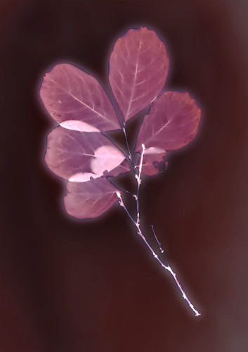 |
| Test #1, Crepe Myrtle |
So far, in both my tests, the Polycontrast has produced a brown-red background with violet-maroon images, VERY pretty. One print, left out in light after exposure, has darkened to a blue-violet in the image, with an almost black field.
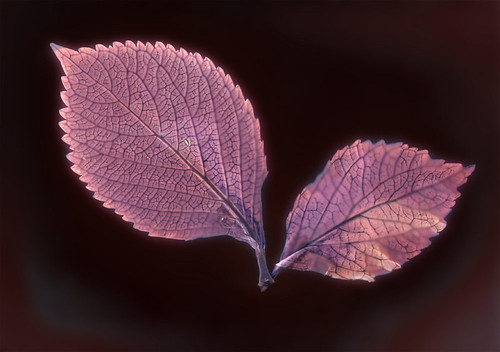 |
| Test #2, Hydrangea |
My scanner isn't doing a very good job of capturing these lumens acurately. I may need to buy a new one; there's some kind of horrible, streaky residue that seems to be between the two sheets of glass that make up the scan-plate. I've cleaned both sides of the scan-plate, but the residue remains the same. The scanner hasn't got any problems capturing my cyanovellums or anthotypes, the residue only shows up when scanning the large, blank backgrounds of the lumen prints. It's very distressing. I may need to start imaging them with a camera.
Subscribe to:
Posts (Atom)