Friday, May 30, 2014

Both is Better

Original Print
I took a small supply of fixer home with me this summer, to avoid the 45-minute drive to a darkroom. I mixed some up for my salt prints and decided, hey, why not use this for what I actually planned on? So I've been doing some tests of how different lumen papers respond to fixing. Most of them don't respond well, as I've noted multiple times before.

However, I got a bit of a surprise when I did a fix test on a sheet of Adox MCC 110 Premium FB paper. The image was nice enough before fixing, with a grey field and rusty orange highlights. The fixed image was much softer, with a grey-brown field and more golden highlights. The weirdness was that in the fixed image, shades of maroon appeared in areas that had formerly been just bland grey. The leaves, the stem and the border all became much more visually interesting in the fixed print than they had been in the original.
Post-Fix Print

That was pretty cool. It wasn't perfect, because the fixer had reduced the contrast with the background and taken some of the drama away from the roots by softening the colors. It also lightened everything, even the dark shadows. Looking at the two images side-by-side on my screen, I realized something: I could just put them together.

In a traditional photograph, I could bracket to get the sky properly exposed in one shot, and the foreground properly exposed in the next. There was no reason that I couldn't do the same thing here, with this lumen print. I've digitally modified lumens before to enhance contrast, clean up the scan, repair damage or make a pale print more vibrant. I've never really taken it that far, because I tend to treat my lumens as a process rather than a final product. There's really no reason to do that,
Final Composite Print
though.

So I dropped the Post-Fix file into the Original Print file as a layer, slapped a black mask onto it and cut holes so the leaves, stem and parts of the border would show the extra colors created in the Post-Fix file. A little bit of blending finished the merge, and I got a single image with the best aspects of both the Original Print and the Post-Fix print. A digital hybrid that shows a single image in its best light.

I think there's a lot more room to explore here.

Thursday, May 29, 2014

Blogging for Thor: In Soviet Russia...

So many stamps! There's just so many!
Thanks to the wonders of eBay, I was recently able to purchase some Soviet-era photographic paper from a seller in Lithuania. I'm not sure why they needed 44 stamps to send it to me, but apparently they did. I'm keeping this envelope forever. I asked a Lithuanian friend if such an abundance of stamps was ordinary or reasonable, but he assures me it is neither. He was at a loss to explain the stamp-splosion that arrived in my mailbox. Whatever, it's awesome.

The paper itself is decidedly... less awesome. First off, all three types of paper I got are designed for color processing. Generally, I do not find color photo paper to be as well-suited to lumen printing as black and white paper. It tends to take longer to expose and often has less dramatic colors. I've found that certain Kodak types of color paper have an odd reversal effect when exposed to moisture, producing a positive image instead of a negative image. That can be cool, but the colors are still generally just not as bright and fun as black & white paper can produce.

One frustrating thing about this Soviet paper is that it doesn't have any kind of brand or identification. It's just labelled "Photo Paper" with the sub-label "PhotoColor-2". Soviet Communism appears to have been boring as shit in addition to all its other faults. I approached the Alternative Photographic Processes group on Facebook to see if anyone could help translate the Russian information on the envelopes. Special thanks to Galja Karpova and Anton Orlov especially for translating some of the information. It appears at least some of this of paper dates from the 1970s and was produced in Leningrad. I believe it also has a glossy surface.

I purchased two sizes of the USSR FotoTsvet-2 (8x12 and 18x24), along with one bag of Fortecolor Type 3 paper (13x18) from Hungary. The Forte paper may be newer than the USSR paper, but not by much.

3 wet wild grape leaves
FotoTsvet-2 (18x24)
The 18x24 size of FotoTsvet-2 appears to have distinctly different characteristics from the smaller size. I got two 20-sheet packets of it. Overall, I'm not impressed with the paper. It's boring and dull, but I am continuing experiments to see if there might be something that can be done with it to produce more interesting results.

Color Palette: Brown field and light brown images. There seems to be very little range in this paper. I've done only two exposures, both for fairly long times (6+ hours) but I don't anticipate anything interesting happening at shorter exposures. The paper is very slow to expose at all. It starts off as a cream color, either naturally or as a result of its extreme age and fog.

Moisture Response: Almost none. There is a tiny visible halo of lighter brown, but it is extremely difficult to see even on the physical print.

Reaction to Fixing: Unknown as yet. I am not enthusiastic, given the rather dull colors that this paper presents prior to fixing. My previous experience with fixing color paper is that it virtually destroys the image.

FotoTsvet-2 (8x12)
I only have one 20-sheet pack of this size of paper, so I'm trying to be a bit cautious with it. I'm enjoying it more than the 18x24 size. It's still limited to earth tones, but there's some variation.

Color Palette: Violet-brown seems to be the color of the field, no matter what else changes. Objects can take on different tones depending on moisture and length of exposure, but generally all within a yellow-orange to red-orange range. The paper is very slow to expose at all. It starts off as a cream color, either naturally or as a result of its extreme age and fog.

Moisture Response: Unlike the larger size of FotoTsvet-2, this version does have a notable reaction to moisture. The example image shows two leaves exposed on the same sheet. The upper leaf was dry, the lower leaf had been soaking in water for a few days, so it was full of moisture and damp on the surface. Further experiments have revealed that fresh leaves and water produce deeper, redder colors and better contrast on this paper. Very little in the way of a halo effect, but there is a minor darkening around the edge of wet subjects.

Reaction to Fixing: Unknown as yet. I am not enthusiastic, given the rather dull colors that this paper presents prior to fixing. My previous experience with fixing color paper is that it virtually destroys the image.

Fortecolor Type 3
I enjoy modern, black and white papers produced by Forte quite a bit. Fortecolor Type 3, though, is not one of my favorites. So far, results have been very bland.

Color Palette: Browns, mostly. The paper has an overall tint of violet, but generally the colors produced can be described best as shades of brown. The field is dark brown, the objects are light brown. It isn't quite as starkly boring as FotoTsvet-2 (18x24), but it's close.

Moisture Response: Again, very little. There is some response to direct liquid application, which produces a darkening with more purple than brown in the affected areas, but simple moisture from fresh or even wet leaves is not enough to cause a dramatic effect. I may experiment with immersion during exposure, just to see what happens.

Reaction to Fixing: Unknown as yet. I am not enthusiastic, given the rather dull colors that this paper presents prior to fixing. My previous experience with fixing color paper is that it virtually destroys the image.


As always, you can check out my Flickr for further experiments. "FotoColor-2" and "Fortecolor" are the keywords for these new papers!

Thursday, May 22, 2014

Blogging for Thor: Halo There!

I had a lot of fun today playing salted paper prints, but that isn't what this blog is about. That's because I had this thing to talk about first, and also because the salt print blog is going to take a while to write and it's 10:45 right now, as I start this. I wouldn't make the midnight deadline if I did the salted print post. Plus, in all fairness to this post, I did have the idea for it first. Mostly.

You know what, spiders, just read the blog. This post is actually informative and useful, while the salt print one is just kinda cool and fun. So there's that, too. Not sure what else there was.


Pre-exposed print with emphasized halo
One of the really cool things about lumen prints is that if you use fresh plants to make your contact prints, there will often be a "halo" around your subject. The moisture in the fresh plant material sweats out under the sunlight and heat, soaking into the paper. The wet paper reacts differently to light than the dry paper does, creating a different hue or value depending on what kind of paper you're dealing with.

This week's fun fact is that you can dramatically enhance the appearance of such halos by leaving your lumen print out to "pre-expose" under indirect light or interior lights. The low amount of light is enough to begin the exposure of your paper, and start the moisture reaction, but not enough for a big dramatic tonal shift that will produce a vibrant lumen. So the halo has time to creep outward with the moisture while the exposure is still happening fairly slowly and subtly.

Once your halo has been established in a few minutes to a few hours, take your print outside and let it expose in direct sunlight. Now, all at once, the halo and the background will darken dramatically, creating a very stark, very visible halo in your image. That's because the low light allowed it to form first, then expose. When you just expose a lumen normally the halo is struggling to form while exposure is already happening all around it. The moisture doesn't have time to sink in and affect the paper as much, because more of the paper is being exposed before the moisture can spread out.

Regular print with faint halo
A pretty cool trick, and one I can't take credit for. I learned it from John Fobes, who is another enthusiastic lumen printer with far more experience than I have. He discusses the idea a little bit here, in this particular image. Here's the relevant quote:
Polycontrast is capable of producing a nice halo if you prepare the specimen [and] first let the prepared print sit for a few hours under weak room light before you expose it to sunlight.
Mr. Fobes is referring specifically to one type of paper (Kodak Polycontrast II), but it holds true for many types of papers since the underlying mechanic of the halos is the same. Note that this technique works best in hot places, because the heat will wither the plant material faster, releasing more of that lovely moisture onto and into your paper. That's another reason why spring and summer are the best times to work with lumen printing.


Whelp, that's all Spiders!

Tuesday, May 20, 2014

The Importance of Numerals

I was extremely excited to find a 100 sheet pack of Kodak Polymax II RC paper (glossy) for sale on eBay. As I mentioned last week, Kodak Polymax RC is one of my favorite types of paper for lumen printing. It did not occur to me that Kodak Polymax II and Kodak Polymax would be entirely different papers. They are totally different papers.

Kodak Polymax (no numerals) is a much older formulation of that type of paper. Like I mentioned, it tends to produce cream to brown fields with orange to red (sometimes violet) objects. I've found nothing that gets close to the same delicacy and lightness of Polymax, though some other Kodak papers will produce the same brown/red scheme, they can't match the lighter shades that Polymax can render.

Unfortunately, Polymax II doesn't seem to be even remotely connected to Polymax. I did a test print as soon as the paper arrived and, much to my dismay, the paper began turning indigo once struck by sunlight. Not brown, cream, tan or beige. Indigo. There are several papers that produce similar colors, so the indigo isn't anything I haven't seen before. It's nothing particularly arresting. Which sucks. I was hoping for a replacement for a very hard to find paper that gives amazing results... and I didn't get it. Not even a moderately nearby substitute.

Lame. At least it isn't a big loss, since the Polymax II isn't ugly. It wasn't even that expensive, which is part of why I was so excited. It was cheaper than even buying newly made photo paper, which is actually refreshing. Most expired and outdated photo papers are extremely expensive. I'm not exactly sure why, because such old papers aren't really that useful for printing. They tend to be fogged or unpredictable in their printing because of their age. I guess some folks are willing to pay for their old favorite papers, even at an unbelievable markup, and even when the papers may not actually work any longer. There can't be that big a market for old papers to use in lumen printing.

Kodak Polymax II RC
I've mentioned before that Kodak has not produced any new photographic papers since 2005, which is nearly a decade now. So even Polymax II isn't easy to obtain. It's much easier to get than the original Polymax, but as described above (at length), it isn't as nice.

Color Palette: Field starts out as indigo blue, then shifts with sufficient (2+ hour) exposure into a dark violet-brown. Objects will start out a very soft baby blue, developing into a very nice mixture of red, violet and blue. Interestingly, these remain separate instead of simply blurring into a continuum.

Moisture Response: There is a reaction, but not a huge one. The moisture creates a darker halo around objects, with a bit of a shift towards red.

Reaction to Fixing: Untested, but Kodak products in general do not react well to being fixed. I will be testing this soon, though.

Friday, May 16, 2014

Blogging for Thor: Playing Favorites

I've used many different papers (and non-papers) for lumen printing. I generally try anything I can get my hands on, really. Admittedly, I don't have the deep pockets to chase down much in the way of discontinued or expired paper types. Occasionally I'm able to get samples of old papers from friends, co-workers or stockpiles at work (I always try to use old paper for demos, since the old paper is worthless for printing). I prefer buying smaller quantities, because quite honestly most papers I've tested for lumen prints are kinda boring.

There are some exceptions, and those exceptions are my favorite types of lumen papers. The ones that stand head-and-shoulders above the rest, laughing at their dull, boring colors while they strut around flashing their giant tails at everyone. My top three at the moment are APP Collodio-Chloride POP, Kodak Polymax II RC and Adox Fine Print Variotone Warmtone. Shall we talk about why?

APP Collodio-Chloride POP 
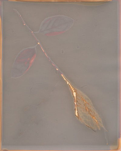
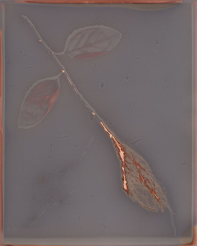
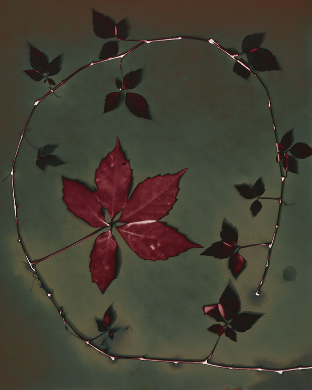
Multiple fixed images, all with fresh leaves.
This one's still being made, just not being made commercially. It's individually coated by one guy up in New York and it's expensive: $6 a sheet for 8x10s. Sometimes he has "test quality" sheets that he sells for $3, but as he improves his techniques for production, that's becoming less commonly available. Its lumen characteristics are amazing. It has two distinct tonal phases and even fixes in a gorgeous way. I love working with it, but am forced to do so only for the most interesting subjects and compositions due to scarce supply. I tend to make fairly small prints (4x5, 3x3 or 2.5x3) because of the expense.

Color Palette (Short Exposure): For very short exposures (15 minutes or less) the paper turns scarlet red, with objects remaining white or shifting towards golds and creams.

Color Palette (Long Exposure): Eventually (generally 2-3 hours) the paper works its way through and ugly brown color and clears to reveal a deep green that ranges from olive to emerald. At this stage, objects have shifted to the earlier pinks and reds. I often use extended exposures (5+ hours) to create deep emerald fields with scarlet subjects.

Moisture Response: The paper reacts very well to moisture, creating blue-silver metallic highlights that shine brilliantly in the light. Collodio-Chloride POP even fixes well. Once fixed, the paper will generally move from a smooth texture to a varigated surface that highlights even the tiniest flaws, scratches, fingerprints and smudges. The visual effect works out a lot better than the description, I promise.

Reaction to Fixing: When fixed, Collodio-Chloride prints tend to become even more metallic, taking on weathered copper and tarnished bronze shades. This is my very favorite lumen surface to work with, but my least used because of how costly the paper is.

Further Flickr Examples: One, Two, Three

Kodak Polymax RC 
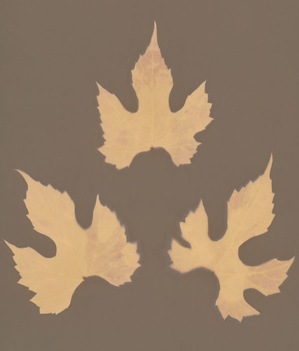
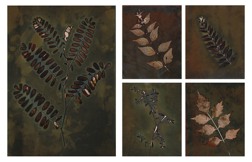
Dry wild carrot blossom
Since Kodak no longer makes any darkroom papers at all, this paper is hard to find. It wasn't discontinued very long ago, I'm still able to find papers from 2005. It can be found on eBay, though, and occasionally it's even fairly cheap. At one point it was an extremely common paper. That's where I get my supply of it. With a gorgeous color palette and an often reasonable price, this is my "old reliable" favorite paper.

Color Palette: As with most Kodak papers, the general range is warm, with a very distinct split between objects and the field. The field will start off light, a kind of creamy almond that can eventually darken down to a chocolate brown. Objects start from an initial flaming orange, then develop into scarlet reds with hints of red-violet or more pure maroon. It's a very striking paper.

Moisture Response: Very little, actually. Halos do form, but they tend to have little color effect. If the paper is saturated with moisture during the exposure, though, there is a complete palette shift from tan field and red object to green fields with yellow-orange objects. A similar response to Fomalux RC Contact paper, with slightly more muted colors.

Reaction to Fixing: Again, this paper is typical of Kodak products. It does not react well to fixing. It fades away, losing almost all color and shifting to a dull, greyish orange-tan. It's extremely unpleasant and I have ceased any fixing of prints made on this paper.

Further Flickr Examples: One, Two, Three

Adox Fine Print Variotone Warmtone FB
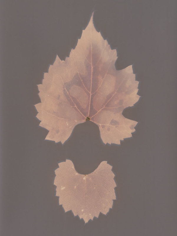
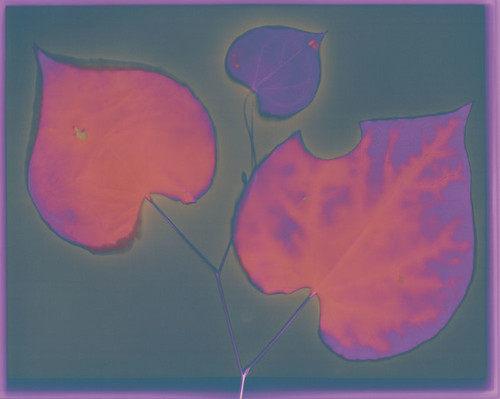
Fresh-cut Judas Tree leaves
While Ilford's Warmtone FB paper has similar characteristics, this Adox paper has much brighter colors and more subtle tones. I only recently discovered it, but I have fallen in love with it. It produces fairly boring results with dry subjects, so I strongly recommend using it only with fresh-cut plants. It is still being produced commercially, and is easily available from Freestyle. The only downside is that it's not cheap, and comes only in small packages. No where near as bad as the APP Collodio-Chloride, but still not cheap. I'm currently in love with the 25-pack I purchased as part of a new paper exploration splurge, but I still try to control myself and use it only for interesting leaves and well-composed images.

Color Palette: Without moisture, this paper tends to produce simple images. Predominately grey-blue-violet fields with brighter red-violet objects. It isn't ugly, but it is nothing compared to the moisture response.

Moisture Reaction: Once you involve moisture, Adox FB Variotone Warmtone really comes alive. The moisture creates highlights of orange and yellow in the red-violet objects, making them stand out dramatically against the field, which can occasionally take on slight shades of green among the grey-blue-violets.

Reaction to Fixing: Untested. Warmtone paper normally fixes pretty well, but tends to change its appearance completely, shifting to a whole new palette of colors. I'll experiment with this soon, since I got some fixer to play with over the summer instead of having to drive down to work.

Further Flickr Examples: One, Two, Three

Friday, May 9, 2014

Blogging for Freya: Light in the Suck

One of my Featured Entries
I'm actually pretty steamed right now, spiders. As you know from gathering my private information and selling it to advertising companies, I am a professor. I've got mad drama going on right now and it's gone from feeling bad to just feeling mad. I won't go into it further, but it's been a rough week.

However, there has been a pretty damn bright spot. Several weeks ago, Joshua White shared with me a call for entries from Plates to Pixels, asking for artists working with lumen prints. Obviously I was all over that! It was free to enter, so why not, says I? Then I forgot about it for a while, until I got an email from the gallery that the exhibition was up. I skimmed the list of accepted photographers and didn't see myself. That's because I was looking in the "Group Show" section. I wasn't there. I was selected as a Featured Artist!!

I'm truly honored, especially since the other Featured Artists are some amazing folks. I've talked with John Fobes on Flickr, sharing comments and experiences with different types of paper and different exposure techniques. He's very knowledgeable, and he has thousands of lumen prints. While I'm not familiar with any of the other artists selected, I am going to reach out to some of them, because they have obtained some absolutely gorgeous colors and techniques, which I'd like to learn more about. Erin McGuire, for example, has some great blue and deep scarlet tones I want to ask about.

Being a featured artist means the all 13 of my submitted photos were shown in a private gallery, I got top billing and a link to my website. I wish I'd gotten my revised, updated website online before that went live, but I'm working through how to remap my domain name and now I have even more reason to get it up and live.

To sum things up, this week hasn't been great, but this news sure was!

Here's the link to the show: Lumen Eyes.

Thursday, May 1, 2014

Blogging for Thor: Luminous Chroma

My best chromo-lumen!
Hello spiders! It's 4 AM and I'm really tired. You're not, I know, because you're just bundles of code scattered through a series of tubes. Whatever. You don't understand me, spiders. But you get me, you know? I love you, spiders.

So anyway. As you know, I love lumen prints and recently I've been experimenting with the chromoskedasic sabatier technique. Oh, actually I just reviewed the blog to provide a link to me talking about chromo (so much shorter to call it that), but didn't find anything. So you don't know that I've been experimenting with that process! I'll have to devote a blog to talking about it! Cool. Anyway, I totally have been doing that. And lumens. Back at SPESE 2013, when I was taking Angela Wells' great workshop on chromo, I asked her if she'd even combined the technique with lumen printing. She had not, since she had not heard of lumen printing. Another guy there, Joshua White who teaches up at App State, is very much into lumens but was just learning about chromo and had never combined them. I did some research online and I can't find any results of anyone that does combine the techniques.

I like the contrast!
Anyone except me! WOO. Turns out you totally can combine them. All you need to do is take a lumen print, dip it in very dilute developer (or it'll just vanish because lumens are massively overexposed by their nature) for a few seconds, wash it off in water and then proceed to chromo all over it as normal. It turns out pretty awesome, actually. I find that it's a great way to add visual interest to empty areas of a lumen print, creating a much more dynamic figure-ground relationship than most lumens tend to have. It also brings more of a personal, organic touch to the lumen process. There is a lot of potential to explore, especially for artists that have fine manual dexterity and some skill at painting. Chromo is basically painting with chemistry, so this combination of techniques can effectively be used as a very alchemical form of hand-coloring. Hand-coloring with metallic deposit precipitation. The best kind of hand-painting, obviously.

The puke-green is actually
oil-on-water shiny metal.
I'll be updating my Chromo-Lumen Flickr Gallery with future images for you lovely spiders (and any humans, lovely or not) to check out. So far I just have four, but I have a lot of boring lumens to attack with this technique!

My only regret is that chromo prints still need to be fixed. Just like lumens, they lose a great deal of saturation and vibrance when fixed, but it's pretty much necessary. As I lament in my last post, the intensely reflective, metallic nature of chromo prints just can't be scanned or photographed. It needs to be seen physically. That means the print needs to be the final product, not a digital reproduction, and that... means fixing the prints. Le suck, but what can you do?