Dear Internet Spiders That Read My Blog,
I failed today. I was doing so well, and then bam. Failure. I got distracted today, didn't have a blog lined up and by the time I remembered today was Thursday... Thursday became Friday. So, this is the first time I've missed by Blog for Thor. Probably going to get struck by lightning or something. Darn. Oh well, maybe he'll forgive me if I blog before I go to bed. It's still "Thursday" if I haven't been to sleep yet, right? Right. It's just really late Thursday night.
So lets level, Internet Spiders. This hasn't been a great time lately.
A bunch of workshops and classes that I'd like to run don't have enough interest to get off the ground. I don't know anything about promoting anything. I'm terrible at social media, and worse at, uh, whatever the real-life equivalent of that is. Society, I guess. Yeah, bad at that. I don't really know anything about raising awareness of art courses and getting people excited about them and willing to pay money to learn things. That probably makes me a terrible teacher, but maybe I'll be lucky and it just makes me a terrible promoter.
Some of my recent experiments have come out crap. I already talked about how I managed to burn the butts off some of my prints with a dry-mount press. Then instead of fixing the problem, I just tried again and got more burnt prints. So that actually was kinda depressing, even if I made sure to use prints I wasn't a big fan of.
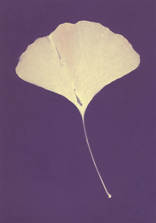
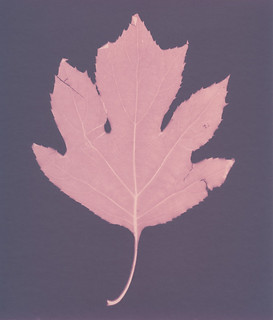
I tried getting some chlorophyll prints to work, but apparently chose the wrong kind of leaf? I had a negative on this leaf for three days and it shows almost no fading at all. It did manage to impress the faint outline of a rectangle on the leaf, meaning that now when I want to use that leaf for a lumen print, it has a ghostly rectangle on it. I don't like that. I'm gunna have to get a new leaf, which is a bummer cause it's a gorgeous leaf.
A recent batch of lumen test prints ran into issues when it decided to go all murky and cloudy in the middle of my exposures and stay that way for the rest of the day, and then rain the next morning. Even some of my expensive collodio paper was out getting tested and came back iffy. There was so little sunlight that even a 14-hour exposure (full afternoon and full morning) shows less detail and development than some 4-hour exposures I've done on sunny days. That's useful data, I suppose, but not really encouraging results.
With autumn finally arriving, there's going to be less and less sun. Not to mention less heat and humidity. Attempting to print cyanotypes or anthotypes during the winter has always been a losing proposition for me, since I don't have an indoor UV unit to do the cyanotypes and the exposure times for anthotypes can jump up to a month or more. Hopefully I can keep working on lumen prints, I'll just have to take into account the weather conditions more carefully.
Not everything has been bad. It's almost time to send in applications for graduate school, and I'm excited about that. I did get some very useful results on my latest experiments with Kodak Polycontrast IV RC paper. Not very interesting results (the paper is kinda boring), but useful ones. Next semester I get a third course to teach at the university. Not only does that mean more money, but it's a whole new challenge and I'll get to work with photo majors for a change.
So, you know, life. Challenges, failures, successes and progress. I'm going to keep blogging for Thor (seriously, I won't miss next week!) and I'm going to keep working on my experiments and notes. I'm going to keep teaching as often as people will pay me to do it, and keep looking for new places and new people that want to learn.
Incidentally, if you want to pay cashy money to learn esoteric and archaic photo-reactive image-making techniques, let me know.
Friday, September 27, 2013
Thursday, September 19, 2013
Blogging for Thor: Writing is Hard, Bergger is Weird
As I mentioned recently, I'm staring on an index of lumen printing papers. What color palettes you can expect from a paper, any special effects it has if exposed under different conditions (wet, underwater, fresh vs dried plants, etc), that sort of thing. The most extensive testing so far has been on Bergger because of one reason: Bergger is poorly labelled.
Now you, being the web-crawling spider-drone that you are, may question what Bergger is. Bergger is a fairly common brand of photo paper, owned by a French company. I've got two types of Bergger paper. The packs were a gift from a friend who wasn't going to be doing anymore darkroom work after she graduated ECU. Thanks, SexyMama! She gave me a pack of 11x14 Prestige Variable NB fiber paper and one of 8x10 Prestige Variable CB fiber paper. NB stands for "neutral base" and CB stands for "cream base". The only place this essential difference is noted is in small print on the front label. Two little letters and that's the difference between warm tone and regular paper. No different packaging, no different brand name, just two letters. Super Annoying.
Both of these types of paper have demonstrated some fairly significant range in their possible colors. Mostly the other paper brands I've worked with are at least vaguely consistent. There are variables if you get moisture involved, yes. Some of the papers give a radically different color if you work with extremely short exposures. Bergger is fairly unique in that the difference between a short exposure and a long exposure isn't just a deepening of color, it's a complete tonal shift. Whole new palettes of color will show up.
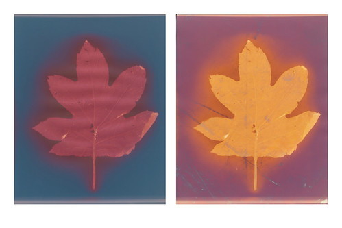
Bergger Variable NB has at least two distinct phases. A short exposure, under 20 minutes, will give you a pale butter-yellow in the highlights and a rich amethyst purple in the shadows. It's a very nice, very strong contrast. Medium exposures, from 40 minutes to 2 hours will turn the yellows to red-oranges and the purples to maroon and brown. True long exposures on Bergger Neutral Base haven't been tested yet, but the difference between a 40 minute exposure and 90 minute exposure suggests that the orange starts to darken to red and the background goes from maroon to greenish-brown. No moisture tests so far, but that's on my to-do list.
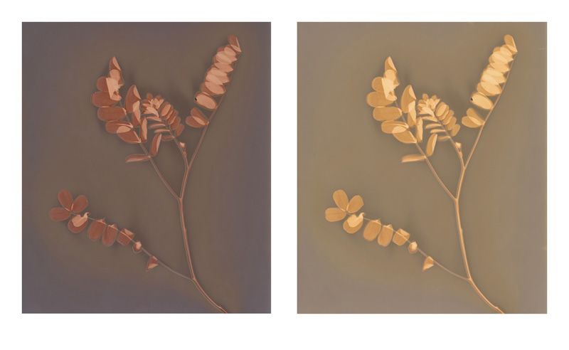
The Cream Base paper is entirely different. Extended exposures (4+ hours) are extremely monochromatic, basically pale blue and white. The blue is deeper in shorter exposures, which is a bit strange. Shorter exposures have a slight violet cast to the blue. Generally, I've found the CB paper rather boring. When exposed to moisture, it turns bright red or maroon. Now, when you fix the CB Bergger, the print takes on very different qualities. The shadows turn into a brilliant combination of soft orange and violet, while the highlights are bright gold. The colors, once again, are brighter on a short exposure than they are on a long exposure. Kinda weird.
When I start formatting things properly, I'm going to organize this information more fully. Think of this as a preview of the sort of information that will be in my catalogue once I get it assembled. It's slow going, articulating what I've learned in a formal, simple way. That's never easy for me. I'm so much better at stream of consciousness with interwoven smart-assery. After all, I write my blog as if talking to imaginary readers and sentient web-spiders. Yeah, being serious and straight forward isn't my strength, but I feel like the catalogue should be simple to read and access. It's a challenge. But it's one I can beat. I'll probably post a sample spread in the next few weeks.
 |
| Bergger NB - 10 minutes |
Both of these types of paper have demonstrated some fairly significant range in their possible colors. Mostly the other paper brands I've worked with are at least vaguely consistent. There are variables if you get moisture involved, yes. Some of the papers give a radically different color if you work with extremely short exposures. Bergger is fairly unique in that the difference between a short exposure and a long exposure isn't just a deepening of color, it's a complete tonal shift. Whole new palettes of color will show up.
Bergger Variable NB has at least two distinct phases. A short exposure, under 20 minutes, will give you a pale butter-yellow in the highlights and a rich amethyst purple in the shadows. It's a very nice, very strong contrast. Medium exposures, from 40 minutes to 2 hours will turn the yellows to red-oranges and the purples to maroon and brown. True long exposures on Bergger Neutral Base haven't been tested yet, but the difference between a 40 minute exposure and 90 minute exposure suggests that the orange starts to darken to red and the background goes from maroon to greenish-brown. No moisture tests so far, but that's on my to-do list.
 |
| Bergger CB pre- and post-Fixer comparison |
When I start formatting things properly, I'm going to organize this information more fully. Think of this as a preview of the sort of information that will be in my catalogue once I get it assembled. It's slow going, articulating what I've learned in a formal, simple way. That's never easy for me. I'm so much better at stream of consciousness with interwoven smart-assery. After all, I write my blog as if talking to imaginary readers and sentient web-spiders. Yeah, being serious and straight forward isn't my strength, but I feel like the catalogue should be simple to read and access. It's a challenge. But it's one I can beat. I'll probably post a sample spread in the next few weeks.
Sunday, September 15, 2013
A Fixing Follow-Up
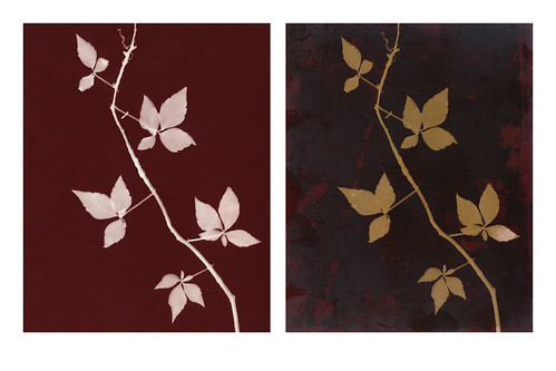
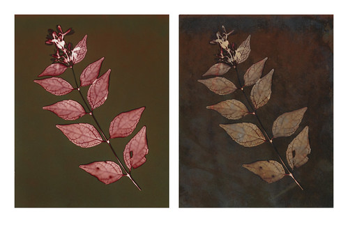
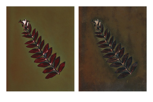
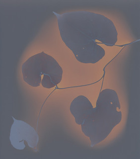
 Quite recently, I talked about my views on fixing lumen prints. Yesterday while I was at the Light Factory I did some more experimentation on some lumens that I wasn't particularly thrilled with. In all but one case fixing them removed detail, color and vibrance from the images. So, here's the side-by-sides.
I got some feedback on the Collodio lumens I showed last time, with the general feeling of 'why are you complaining, the fixed ones look better!'. Well, that isn't really the point. The point is they look different and drastically so. Better or worse, a fixed lumen print is distinct and unpredictably different from its unfixed version. The change is also permanent and irreversible.

In the end, my advice isn't "Never fix lumen prints" but rather "Make sure you have multiple high-quality, large-size digital copies before fixing any lumen." Sometimes fixing your lumen print will create a lovely, fascinating image. Mostly not, in my experience. Mostly my experience tells me your fixed prints will be flatter, have less color, less contrast and less detail. Some papers, like the Collodio and (apparently) Bergger Prestige NB take the fixer fairly well. They seem to be an exception. The main thing is: even if you like your fixed lumen print, keep print-quality records of the pre-fix stage because that will be a different image.
Oh, and these do look crappier than the unfixed prints, all except for the last one that I quite like. If only the hot press I was using hadn't decided to attack the prints and leave them scarred with vile black residue and strange white streaks. Oh well, that is why I used prints I wasn't particularly fond of. If anyone wants full details on these prints, including larger versions and information about the paper, exposure and all that jazz, you should check them out on my Flickr. So here's a link to that!


Thursday, September 12, 2013
Blogging for Thor: Going Green
An anthotype works by using natural pigments that break down under light. Where your pigment is protected from light, it remains dark; where it is exposed to light, it fades to a paler shade. This creates a positive image. Normally anthotypes are made by taking these pigments out of their natural source, purifying them, and applying them to a substrate. That isn't technically necessary. One of the early ancestors of the anthotype process was a technique popular in 19th century France where fruit intended for table settings was placed in sunlight behind intricately cut stencils. The stencils would shape the light, and the surface of the fruit would fade, producing patterned surfaces.
So, really, there's not a need to remove the pigment from its original source. That idea has been developed to extremely high levels by artists like Binh Danh, who his process a chlorophyll print. What he does is take a leaf (or many leaves) and places a negative on top of them. The sunlight breaks down the chlorophyll in the leaf (only works if the leaf is removed from the tree, obviously) and you end up with the green color preserved where the light was blocked; everywhere else the leaf fades and turns pale creamy yellow.
Chlorophyll printing is a cool, fun process. It actually tends to be pretty fast for an anthotype process; it prints in just a few hours if you use the right kind of leaf. If you use the wrong kind of leaf, it can take days and hardly show up at all. So far I've only tried a few kinds of leaves and my best results are from big, thin leaves like hosta and caladium. Thicker, fuzzier leaves don't tend to fade as well. It can record detail very nicely. I've been able to see some pretty decent tonal range in the leaf prints, but the results are more dramatic with strong contrast and easily identified shapes. If your negative relies heavily on subtle textures and delicate shading, it probably won't return a great result. You are, after all, not dealing with a traditional photo-sensitive metal salt process.
Chlorophyll prints are something I plan to experiment with further. I really like Danh's idea of using multiple blades of grass together as a mat to create a large area for exposure. He preserves his chlorophyll prints by casting them in clear resin. I have no idea how that would affect fading, since the resin is still transparent. Then again, I have no idea how archival the chlorophyll prints are in the first place. Dried leaves can keep their color for a fairly long time, after all.
As a final note: I am almost certain this process won't work on evergreen foliage or on autumn leaves or already-dead leaves that have lost all their green. I'm pretty sure the chlorophyll needs to be intact to make this type of print work. Who knows, this fall might prove me wrong!
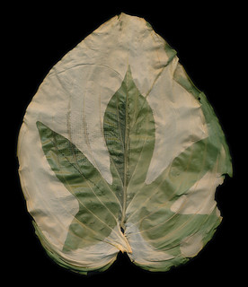 |
| Sweet Potato Vine leaf imprinted on a Hosta Leaf |
Chlorophyll printing is a cool, fun process. It actually tends to be pretty fast for an anthotype process; it prints in just a few hours if you use the right kind of leaf. If you use the wrong kind of leaf, it can take days and hardly show up at all. So far I've only tried a few kinds of leaves and my best results are from big, thin leaves like hosta and caladium. Thicker, fuzzier leaves don't tend to fade as well. It can record detail very nicely. I've been able to see some pretty decent tonal range in the leaf prints, but the results are more dramatic with strong contrast and easily identified shapes. If your negative relies heavily on subtle textures and delicate shading, it probably won't return a great result. You are, after all, not dealing with a traditional photo-sensitive metal salt process.
Chlorophyll prints are something I plan to experiment with further. I really like Danh's idea of using multiple blades of grass together as a mat to create a large area for exposure. He preserves his chlorophyll prints by casting them in clear resin. I have no idea how that would affect fading, since the resin is still transparent. Then again, I have no idea how archival the chlorophyll prints are in the first place. Dried leaves can keep their color for a fairly long time, after all.
As a final note: I am almost certain this process won't work on evergreen foliage or on autumn leaves or already-dead leaves that have lost all their green. I'm pretty sure the chlorophyll needs to be intact to make this type of print work. Who knows, this fall might prove me wrong!
Tuesday, September 10, 2013
If It Ain't Broke, Don't Fix It
There's a bit of a debate in the (admittedly small) lumen printing community when it comes to your prints. The two sides are "Fix 'Em" and "Don't Fix 'Em". I'm decidedly in the "Don't Fix 'Em" camp, and I have strong opinions on why. Since this is a fairly common issue facing people that are just starting to explore lumen printing, I'd like to address both sides, the pro's and con's, then sum up my position and the justifications I have for it. Here goes!
Why is this even an issue? If you don't fix a silver gelatin print, the image is destroyed by light. Same thing, right? But no one argues against fixing silver gelatin prints. The different is that in the lumen process, fixing has a drastic and sometimes unpredictable effect on the appearance of the print. Fixing a silver gelatin image doesn't work that way. An un-fixed silver gelatin print looks exactly the same as a fixed one. Lumen prints can lose detail, bleach or even change their color palette completely during the fixing process. It's entirely possible to remove a print from the fixer that bears only a passing resemblance to what you put into the fixer minutes earlier. So by fixing a lumen print, you're not just ensuring that print can be displayed and maintained archivally, you're may be totally altering the appearance of the image.
I will say that the change is not always drastic. There are certain brands of paper that show only a slight to medium amount of fading in the colors after fixing. However, there are others that shift to an almost entirely new image. The only way to check what will happen to your specific print is... to fix it. And there's no going back, of course. No undo button, and no "cancel process" command. Unless you have a high-quality scan or photograph from before fixing, your lumen's original post-exposure appearance can be forever lost.
"It's Broke! Fix it!"
This may actually be the more common opinion. I haven't done any polls on the subject, but it comes up quite often in online guides for how to do lumen prints, and appears fairly often as questions ("Is this fixed?") in online communities for alternative processes. The reasoning behind this position is that your print isn't finished until it's fixed. Until a lumen has been fixed, just as with any silver gelatin print, it will continue to expose and degrade under light. Unfixed lumen prints aren't just non-archival, their lifespan is measured in hours.
As I've mentioned before, possibly briefly, I've encountered a strong feeling among alternative process printers that the final result of any alternative process is the physical print, which needs to be made as archival as possible. For folks that view the print as the final product, that's totally understandable. I've always gotten a strong impression that a big part of the appeal of alternative processes for lots of folks is that they're so far removed from the digital age where everything can be reproduced and recreated. It's a process of craftsmanship and handiwork as much as it is one of image making. I get that. So, yeah, of course people who view alternative processes as a kind of physical craft will want a solid, long-lasting physical product at the end of their printing.
So that's why they want to fix their lumen prints. Some online guides I've read basically say that lumen isn't finished until it's been fixed. The 'original' appearance that you see when you take the image out of the exposure frame isn't finished anymore than a cyanotype that hasn't gone into the water bath. It's basically a latent image that needs to be fixed before you can see what it "really" looks like.
"It Ain't Broke! Don't Fix It!"
And here's my side of the argument. Let me preface it by saying that I do not consider the end result of alternative processes to necessarily be a physical product. For me, alternative processes are another set of tools to create an image. That image, not any single piece of paper, cloth, skin or metal is the final product. As a result, I am far more concerned with keeping the integrity of the image, through whatever means necessary, than I am about keeping the integrity of the physical print. I don't care if my print turns black and crumbles into ash so long as I have high-quality photographs and scans of it recorded first. With those scans and photographs, I can make as many copies of my original image as I want. Photography, after all, is a reproductive medium. It's designed to make multiple copies of images. That's basically the whole point of photography.
I have no specific problem with fixing lumen prints, but I do not believe that fix is a necessary step in the process of creating a lumen. As with all images, traditional, digital or alternative, I believe the image is the final product and whatever number of steps are required to achieve the desired visual appearance of your image is the correct number. If you want to fix a lumen print, do it! If you want to keep its pre-fix appearance, scan or photograph it! Or take the best of both worlds and do both. First scan and/or photograph the image, then fix the image. Now you have both a print and your original image! Woo! This is my preferred approach for certain lumens and other alternative processes. If there are specific traits of the physical print I want to display (texture, metallic surfaces, unique feel of the material, etc) then I make a scan to preserve the image at my preferred stage, then treat the final physical object as a second image entirely.
In the "Fix It" camp section, I briefly mentioned latent cyanotypes. I should not that I also consider pre-development cyanotypes fair game for scanning and recording. Sometimes the bright green image on an undeveloped cyanotype can be particularly arresting. I don't see any reason to treat that image, however transitory, any differently from a lumen print. You can take this as further evidence of my craziness, if you disagree, or nod along sagely if you're in my camp.
So, Is It Broke?
It all comes down, really, to deciding what your desired end result is. An image? Or a product? If you want your image, then at whatever stage in the process your image looks like you want it to, stop there and use whatever means needed to record the image in a permanent fashion. If you want a product, follow whatever steps are needed to make your print as archival as possible and simply acknowledge that the earlier stages of the image will not be permanent.
Why is this even an issue? If you don't fix a silver gelatin print, the image is destroyed by light. Same thing, right? But no one argues against fixing silver gelatin prints. The different is that in the lumen process, fixing has a drastic and sometimes unpredictable effect on the appearance of the print. Fixing a silver gelatin image doesn't work that way. An un-fixed silver gelatin print looks exactly the same as a fixed one. Lumen prints can lose detail, bleach or even change their color palette completely during the fixing process. It's entirely possible to remove a print from the fixer that bears only a passing resemblance to what you put into the fixer minutes earlier. So by fixing a lumen print, you're not just ensuring that print can be displayed and maintained archivally, you're may be totally altering the appearance of the image.
 |
| Pre (left) and Post (right) fix versions of the same print |
I will say that the change is not always drastic. There are certain brands of paper that show only a slight to medium amount of fading in the colors after fixing. However, there are others that shift to an almost entirely new image. The only way to check what will happen to your specific print is... to fix it. And there's no going back, of course. No undo button, and no "cancel process" command. Unless you have a high-quality scan or photograph from before fixing, your lumen's original post-exposure appearance can be forever lost.
"It's Broke! Fix it!"
This may actually be the more common opinion. I haven't done any polls on the subject, but it comes up quite often in online guides for how to do lumen prints, and appears fairly often as questions ("Is this fixed?") in online communities for alternative processes. The reasoning behind this position is that your print isn't finished until it's fixed. Until a lumen has been fixed, just as with any silver gelatin print, it will continue to expose and degrade under light. Unfixed lumen prints aren't just non-archival, their lifespan is measured in hours.
 |
| Pre (left) and Post (right) fix versions of the same print |
So that's why they want to fix their lumen prints. Some online guides I've read basically say that lumen isn't finished until it's been fixed. The 'original' appearance that you see when you take the image out of the exposure frame isn't finished anymore than a cyanotype that hasn't gone into the water bath. It's basically a latent image that needs to be fixed before you can see what it "really" looks like.
"It Ain't Broke! Don't Fix It!"
And here's my side of the argument. Let me preface it by saying that I do not consider the end result of alternative processes to necessarily be a physical product. For me, alternative processes are another set of tools to create an image. That image, not any single piece of paper, cloth, skin or metal is the final product. As a result, I am far more concerned with keeping the integrity of the image, through whatever means necessary, than I am about keeping the integrity of the physical print. I don't care if my print turns black and crumbles into ash so long as I have high-quality photographs and scans of it recorded first. With those scans and photographs, I can make as many copies of my original image as I want. Photography, after all, is a reproductive medium. It's designed to make multiple copies of images. That's basically the whole point of photography.
 |
| Pre (left) and Post (right) fix versions of the same print |
In the "Fix It" camp section, I briefly mentioned latent cyanotypes. I should not that I also consider pre-development cyanotypes fair game for scanning and recording. Sometimes the bright green image on an undeveloped cyanotype can be particularly arresting. I don't see any reason to treat that image, however transitory, any differently from a lumen print. You can take this as further evidence of my craziness, if you disagree, or nod along sagely if you're in my camp.
So, Is It Broke?
It all comes down, really, to deciding what your desired end result is. An image? Or a product? If you want your image, then at whatever stage in the process your image looks like you want it to, stop there and use whatever means needed to record the image in a permanent fashion. If you want a product, follow whatever steps are needed to make your print as archival as possible and simply acknowledge that the earlier stages of the image will not be permanent.
Monday, September 9, 2013
An Illumenated Manuscript
 |
| Kodak Ektacolor Ultra II |
The result is a cabinet full of donated paper tends to be full of old paper. Expired paper, paper that has been discontinued, paper from brands no longer in existence and other exciting types. The Light Factory only has a little bit of Ilford and Kentmere, but they have a lot of old Kodak paper, some Agfa, a few types of old Bromide-based paper and some brands I've never heard of before like Luminos.
 |
| Luminos Portrait Delux |
Now that I have these test samples, I've begun thinking. What else can I do with them? It's hard to set up a simple table of "use X paper for Y result" because lumens don't really work that way. The resulting colors are dependent on exposure time, humidity, type of object used to make the print and (apparently) magical faeries. Still, there are general trends. So while I can't do a simple 1:1 table, I can write some notes about what to generally expect from each type of paper. Not just for the paper from the Light Factory, but from the dozen or so brands of paper that I've used on my own.
 |
| Agfa Multicontrast Classic |
If you want to see all the lumen tests from Light Factory paper, you can check my Flickr Set: Lumen Prints. Anything done on Light Factory paper is marked as Lumen # LF. Currently, that's 102-113. I still have test sheets to work with, but all the different brands have been tested at least once. Here's the Link.
Saturday, September 7, 2013
Work, Work: My Favorite Thing!
Yesterday I went to visit UNCC as a Visiting Artist. Holy. Freakin. Crap. I was a Visiting Artist. That blows my mind. Seriously. It didn't actually click until I was walking around their Fine Arts building with Aspen (the awesome photo professor who invited me, go look at her stuff) and she had to take a call. She told the phone-person she couldn't talk because she had a "Visiting Artist" there doing a workshop.
Seriously, my whole month improved at least 4 points. Not sure what that means, since I don't have a monthly scale of goodness that works on points. Still, probably a big improvement. That's one of those moments where you stop and realize, "Bejabbers, I'm doing art. Like an adult." It's great and crazy and it made me so happy. Well, actually it took a while to fully sink in and some of the happy might just be sleep deprivation. But still it was super-exciting.
Aside from me Visiting-Artist-Real-Life-Grown-Up-Professional excitement, the workshop went really well. Aspen's students were very interested, totally awesome ladies. And there was a dude there too, but he wasn't a student or something. He was just there to hang out and see what was up. Like a photography groupie, I guess? He seemed cool anyway. I had great questions, all very reasonable and proving that they were listening to what I had to say. Questions about potential sources for dye, possible objects for exposures, alternate substrates, all that good stuff. Some very cool large-scale anthotypes on sketch pads, using all kinds of items. Some big sections of lace, even one young lady with a bird skeleton. Whoever you are, bird-bone-lady, I like you. You make me feel not so weird for having a bag of assorted bones on my desk.
Aspen and I are even trying an experiment to see if we can get an anthotype print from one of her wet collodion glass negatives. That'll be interesting to see in a few days, especially since the negative had shattered and we're exposing the pieced-together fragments. That print is being made on hand-made paper (tinted blue from jean-lint) coated in a medium-dilution sandalwood dye.
Because anthotypes don't expose in a few hours, I wasn't able to see any of the results from the workshop. I'm hoping that the ladies get some awesome results and I can see them after they scan/shoot the images. They're working with turmeric, sandalwood, annatto and blackberry dyes, both pure and mixtures between the different colors. Some are even doing round anthotypes, and someone had an oblong, hurricane-shaped anthotype. I know all the pigments should give decent results in a few days, so I'm pretty sure they'll all get something.
And also amazing? The Light Factory (thanks to Laurie) is now holding open Darkroom Saturdays, and I'm heading in later today (dammit, it's today, isn't it? Why can't I sleep?) to do another demonstration of easy, at-home alternative processes for the open darkroom students. People can come in to develop film or print normal, boring silver stuff and while they're washing or drying, learn about awesome alternative processes like lumen prints and anthotypes. We're gunna see how things go for a few weeks and if they're doing well, this might become a regular thing. I really, really hope so.
There's so much great stuff going on. I might even be headed back to UNCC in a few weeks to show Aspen's students some special techniques for cyanotype toning that aren't exactly well-explained in their textbook. I do lurve me some cyanotype toning.
Anthotypes And Your Little Dog, Too!
Most alternative process books only devote a few pages to Anthotypes. Of those few pages, the majority of the space tends to be taken up with images. Part of that is the simplicity of the process: combine dye and booze, set in sun, wait. Very simple, yes? There isn't a lot of explanation required. But, the other reason is that the anthotype just isn't very popular. It never achieved the same status as a "mainstream" alternative process like the gum print, cyanotype, Van Dyke, platinum/palladium print, salt print or albumen print. At best it's a curiosity and not "real" photography.
Well, there are points there. Certainly, the anthotype is very different from 'standard' alternative processes. The anthotype isn't capable of producing the same range of detail that's seen in the processes that are based on light-sensitive metal salts. That's just fact. Another fact is that, even for contact printing processes, they take a long time. The fastest anthotypes you'll come across, chlorophyll prints, take hours in hot, bright sun. Even the densest cyanotype negative will print in an hour or so.
Permanence is another problem for many printers. A lot of alternative process printers are very attached to the physicality of their processes. They want a print that they can mat and frame. The physical object is of utmost importance for a lot of folks. Well, the anthotype doesn't, won't and can't produce a permanent print. The only way to make a truly archival anthotype is to scan or photograph the original print, then reproduce the print digitally. That's not acceptable for many alternative process printers, who want an original print as their final product.
All these things add up to making the anthotype a rather unpopular process. Generally it gets the short end of the stick, and is treated as basically a gimmick. Fun for kids, but not for 'real' art.
I don't know if you, dear fictional reader, have been following the rest of my blog. I will assume you have, since you're just a construct of my imagination. That means you already know I don't care about archival permanence. We can make stuff archival.
So, why do I like the anthotype process? Well, for one, it's slow. That's actually perfect for someone like me, with an attention span that may require special one-dimensional mathematics to measure. It seems counter-intuitive. Wouldn't people with a short attention span just forget about their anthotypes and run off to do something else, never to return? Well, yes. That's the point. You can prep a dozen or so anthotypes, put them in their frames and let them sit to expose. Since it's almost impossible to over-expose an anthotype, if you forget them for an extra few days, it's no matter. By the time your anthotypes are done exposing, your attention span has wondered away from whatever it was busy with while you had the anthotypes in the sun. You're ready to spend a few hours disassembling your frames, scanning your prints and recording your notes. Then it starts all over again.
That's why I tend to refer to my anthotypes in 'crops'. I prepare a whole sheaf of papers, sometimes a few dozen in one go. Normally this is during a busy, busy day when I'm also making a bunch of new dyes. Making dyes always gets me in a semi-manic state, so I'm more than happy to sit around in gloves and maybe goggles, coating paper like a crazy person. With my buttloads of coated paper, I'm ready to gather a few frames, prep the prints and set the crop out to bake in the sun for a few days or a few weeks.
Then if I get caught in a funk, or busy with something else, I can wander away and come back when the crop's ready to harvest. One more long day of work scanning and taking notes and that crop's processed. Generally, the manic surge of art-ness from a new anthotype harvest gets me ready to spend the next day excited and setting up a new crop. But, if not, it doesn't really matter. I sometimes take breaks of months between crops, especially if I get really into some other project. And guess what? It doesn't matter. Not one bit. I have coated paper from a year ago that's still just as good as it was the day I coated it. The paper, if you keep it in a dark place and out of extreme heat, it keeps for a nice long time.
I mean, there is the other stuff. Getting to play mad science with the different dyes, how I enjoy the process of experimentation and documenting my findings to share what I learned with other people, bringing my love of history into the present by using primitive dye techniques and materials, getting to learn so much about plants and chemistry (the fun chemistry, not the stuff with math)... well. There are a lot of reasons that I enjoy anthotypes. And I'm going to keep researching, keep experimenting and keep documenting. Because when I write about them, it's not going to be one pathetic chapter in a book about 'real' processes. And you can bet that I'm going to show just how amazing anthotypes can be.
Permanent or not, commercial or not, anthotypes are every bit as viable a form of artistic expression as encaustic painting, platinum printing or glass blowing.
Thursday, September 5, 2013
Thor Demands Blogs!
I've decided to take a more active blogging stance. Meaning that I'm going to blog on a regular basis. It's hard to have an audience for your blog when you don't update regularly, but it's hard to make yourself update regularly when you know that you're just talking into a void. Well, screw the void! I talk to myself all the time. So this blog is becoming a personal challenge to myself: blog once a week, every Thursday, or be smote by Thor. I don't wanna get smote with lightning, so that's motivation, yes?
I could have gone with Saturday and feared the macabre humor of Baron Samedi... but I like to do stuff on Saturday. I also considered Monday because then I could call my weekly blogs the Mandatory Monday Mumble Marathon and I like alliteration. But I work on Mondays and I'd end up tired and forget to blog, or make excuses. Thursday? I don't do anything on Thursdays.
So, here it is, from me to you (you don't exist, really, you're just a construct of my imagination since I know no one reads my blog): I am going to write a post every Thursday. It might not be long, and it might not be inspiring, but it Will Happen. So says Thor.
Ozone-scented hugs to you all!
Subscribe to:
Posts (Atom)