EDIT: Faaaarts! This blog post took way longer to write than I expected. I swear, I started writing at 11:15! Don't smite me, Thor!
Today, for those web-spiders crawling my blog from servers based in the USA, is Thanksgiving. It's vaguely traditional that today Americans remember things we are thankful for, then tell the internet how thankful we are for them. It's kind of a way to show off the things we have, so other people can admire how much we have and how thankful we are for them.
I personally am thankful that I get to be a teacher. I'm an adjunct professor most of the time, and the rest of the time I teach at local art centers and do my own private classes. I
love teaching eager students about photography, design, art and how they all come together to make the world a better place. Every time I go to work, I'm thankful that I was able to be in the right place at the right time and
know the right people to get my job. In all honestly, I am not qualified for my job. I don't have a Master's degree so I'm
literally not qualified. I lack the appropriate scholarly qualification. I still do a great job, don't get me wrong, but it's a minor miracle of the sentient universe that I have my position, and I am
incredibly grateful to whatever agent of destiny was responsible for arranging things thus.
Instead of just saying all that, I'm going to show it. Today kicks off a new segment of the blog: Teaching Spiders. And today, my digital arachnids, I'm going to teach you how to make lumen prints. I'll be doing more of these Teaching Spiders posts, sometimes as part of my Blogging for Thor series and sometimes by themselves. Use the tag system to find them all, hopefully there will be a bunch at some point! I'm going to do general how-to's like this one, and also more specific question-and-answer. I've already done some of these (way before Teaching Spiders was a thing) for Anthotypes. I'll adjust tags so you can find them!
Now, I some time today shooting pictures to illustrate this process. Way more time than you'll think, once you see them. Partly, that's because I did it at night when it's dark and my workroom is (intentionally) poorly lit. Partly, it's because I don't have much practice at illustrative photography. Mostly, it's because I realized these steps are so simple that a monkey could follow them. Since you're all hyper-intelligent code-spiders from the interwebs, you'll be fine.
Before we start, let me make a very important note:
You Can Do All Of This In Regular Light.
Lumen Printing Does Not Require A Darkroom Or Light Closet Of Any Kind. Though, if you plan on using a specific pack of paper for darkroom
and lumen printing, you will want to open it and remove some paper while in the dark, obviously. However, lumen printing works just fine on exposed, expired and otherwise ruined paper. I keep
all my lumen paper in a box in the kitchen. I never use a darkroom for it at all. It's all been totally exposed and is worthless for darkroom printing. I care not even the tiniest bit.
Step 0: Gather the Materials
You need three things to make a lumen print: a picture frame, an object to make a print from and a sheet of photographic enlarging paper. You
can have more things, some very helpful, but those are the basics. In fact, the whole 'picture frame' bit is optional. You just need something to hold your object in place on top of your photo paper. That can take a lot of forms, but we're doing a very basic lesson here. So, use a picture frame.
Step 1: Choose Your Paper
The brand of paper you choose will determine the colors of your print. Each brand has a slightly different cocktail of chemistry in the emulsion and in the paper base. These react to light differently and produce the colors of your image. Some papers are blue, others are pink, red, brown, violet, green, indigo, or orange. Pretty much any color you want, there's
some brand of paper out there that will produce that shade. The best way to find out what papers you enjoy is
experimentation!
Step 2: Choose Your Object
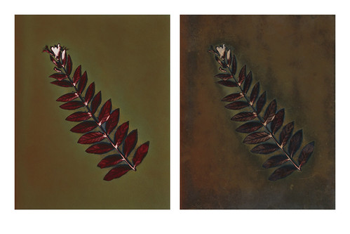
This is pretty simple. We're doing a basic lesson here, remember that Spiders, so go with something flat that will fit in your picture frame. Feathers, coins, keys, jewelry, lace, cut paper, negatives, plants, flowers, leaves, bits of string, etc. Plants tend to produce particularly interesting lumens because the moisture inside them leeches out and onto the paper. When moisture interacts with the chemistry in the paper, it makes new colors. Remember that, it can be super fun!
Step 3: Load your Frame
 |
| Front-Glass Regular Frame |
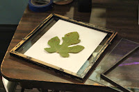 |
| Double-Glass Frame |
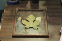
Ok, this gets a
tiny bit tricky. How you load the frame depends on what kind of picture frame you have. Some picture frames have two sheets of glass and no real "back" at all. These are actually my favorite kind, because then I can put the paper down first, face up, and arrange my objects on the paper easily before laying the covering sheet of glass down. I've included a photo of that, for reference. For contrast, there's also a photo of a traditional frame being loaded. Those are a bit harder, since you have to arrange your objects
on the glass and then put the paper down
behind them, and close the whole thing up while hoping you don't accidentally nudge anything out of place. On my regular frames, unless they have a
very tight fit already, I fill the back in with paper towels or some sheets of cheap craft store felt. This ensures full contact between my object and my paper.
Full contact is
very important for detail. Anywhere there is light or no contact between your object and your paper, light creeps in. This results in blurry, fuzzy areas around the edges. You may like this, since it can give the appearance of 3D form to your prints, but you should probably start off with keeping everything nice and flat. Get crazy and experimental with partial contact later.
Step 4: Place In Sunlight
I'll actually update this later with a photo, because I like using the back of my car for this and it's kinda fun. Honestly, it doesn't matter
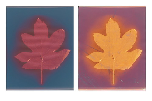
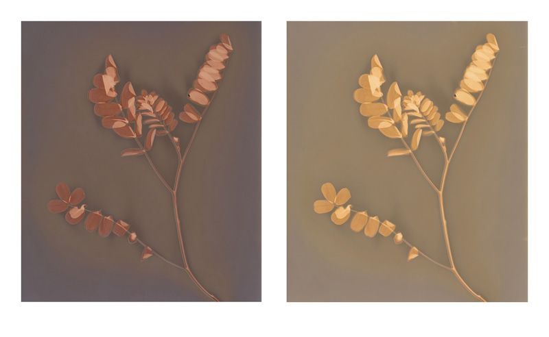
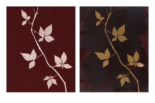
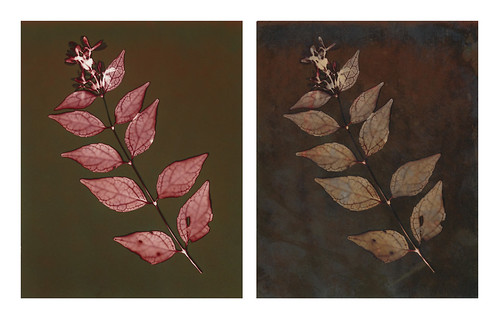
where you put your lumen print to expose, it just needs sunlight. Exposures can range from a few seconds to several hours. This is a bit frustrating for rule-oriented people who want a hard time limit so they know the print is "done", but there isn't one. A lumen print is "done" when you like the color it has turned. The longer you leave a print out, the more it will change. Some papers turn totally different colors as they expose more and more. I have a favorite paper that starts off gold, then turns ruby red, muddy brown, neon green and finally a deep emerald. It's pretty awesome, and I decide on a case-by-case basis which color I want.
So, basically, stick your lumen print in sunlight and then wait until it looks pretty. Remove from sunlight and...
Step 5: Remove from Frame
Uh, open the frame back up and take everything out. This is super-simple. Remember that your print is still sensitive to light at this point, so best do this inside and out of sunlight.
Step 6: Really, this is optional, but not for me.
Document everything. Document how long the exposure was, what day it was on, what the weather was like, what kind of paper you used, what object you used and if it was a plant was it dry or fresh?
Document everything. This way if you want to repeat your process you have some incredibly faint hope of doing so. Lumens are very unpredictable because they respond so closely to so many different factors like time of day, humidity, weather conditions, brightness of the sun, angle of light, moisture in the object, etc. It's very, very hard to reproduce a lumen and downright impossible without good notes.
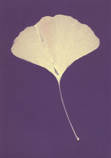
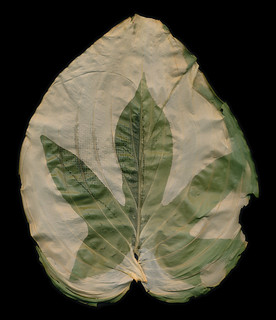
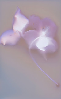 |
| Scanned Lumen Print of a Dogwood |
Step 7: Document the Image
Now take your pretty lumen print and either scan it or photograph it at high-resolution so you have a permanent image of how it looks. You may want to make several scans or photographs, and maybe use both methods. These files will be your only permanent record of the print's original appearance.
Optional! Step 8: Fix the Image
Drop the print into regular photo fixative for 5 minutes. You'll notice a dramatic shift in color and, probably, a loss of detail. Generally warm-tone papers will retain most of their color, or even become
more colorful after fixing. Other papers can lose some or all their color and some or all of their detail. It depends entirely on the brand of paper. I generally do not fix my prints, except for certain papers that I've found respond really well to fixing. I'll make some notes on that in a later Teaching Spiders post.
The End!
If you fixed your image, you now have a pre-fix product in your digital files and a post-fix physical product in the print itself. If you opted not to fix, you have your files. You can keep the original print in a dark, archival box, but even heat and time will cause the print to alter slowly. Either way, enjoy your lumens and
have fun!