Showing posts with label textiles. Show all posts

Friday, June 5, 2015

Blogging for Freya: Silk & Cyan

Cyanotype silk bag, front & back
Hey there, Spiders. This has been a very busy week for me. I've been sick, flown to Boston, hunted down apartments, met my roommate, met some other Lesley graduate students, toured the campus, flown back and still been sick. So, unfortunately, I haven't had a lot of time to do any experiments.

Instead, I'm going to tell you about the benefits of doing cyanotype on silk. I've discussed the problems with it before, but there are some distinct pro's.

The lightweight silk habotai that I buy my scarves and bags in is sturdy, but also very permeable. That means the material stains really well with minimal application of chemistry. It isn't too absorbent, so it washes clean very quickly. A two or three minute rinse is all you need to clean all the residue from silk, unlike canvas which needs a hugely extended soak of hours to diffuse all the chemistry out. For me, that's a big bonus. I like being able to work on lots of things in a day, and the canvas really slows me down since I can only soak so many objects at once.

Because the silk is so thin, chemistry will soak right through something like a bag or garment with two layers. This is great, if you want to coat both sides at once. Not so great if you are trying to leave one side blank. If that is your goal, you must put a blocking layer between the two pieces of silk. Your second side is going to be a bit lighter if you expose it indirectly (by just letting the object/negative on the top shadow both sides at once). If you want two different, fully developed images, again, put in an opaque blocking layer. Then you can just flip the silk when you're ready to do Side B.

Silk habotai also dries very quickly. It can, in fact, dry in minutes if wrung well and blow-dried. Or you can hang it in the sun, or in front of a fan. Since cyanotype is permanent, it can be treated as normal silk. Follow all standard drying, ironing and steaming instructions. Washing is a bit different, since you will bleach cyanotype if you use standard alkaline detergents. So wash only with very mild soap, if you must use any soap at all.

I quite enjoy printing on silk. I plan to order some more tiny scarves and maybe look at trying larger things again. Especially once I get to grad school.

Thursday, December 12, 2013

Blogging for Thor: Sighs and Size

First off, two hurrays. One, I turned 27 yesterday and that's pretty cool. I haven't managed to drop dead or poison myself with photo-chemistry, yet. Two, I'm actually posting this blog on Thursday instead of Friday. I'm sure Thor is very pleased with me. He must be, since the last few days have had tons of sunlight. It's just been great. Cold as balls, but great.

I had an unscheduled post earlier this week about my Cyanotype Totes project and how that was going. I also talked a lot about functional art vs non-functional art, selling art and other things. It was pretty fun. For today's post, I'm really just planning to talk about the results of the second half of that functional art experiment: my silk scarves. We'll see how much I stick to the plan.

Let's get this out of the way, shall we my spiders? I do not feel any of the cyanotype scarves are successful enough to sell. All of them are defective in one way or another. Only one of them is even partially acceptable. This was my first time dealing with cyanotype chemistry on large textiles and I learned a few things. I've mentioned them in passing in earlier posts about this project, but I'll recap briefly here.


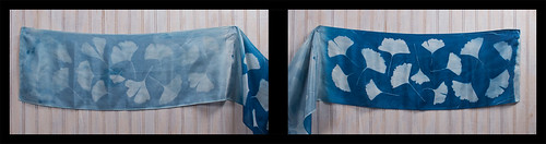
First Problem: I did not dry them correctly, resulting in moisture gathering across a crease near the center of each scarf. The moisture prevented the chemistry from setting correctly, creating a white line down the middle of all four scarves. There is no way I know to fix this after the fact, so I had to just deal with it. In the two long scarves, I was able to hide this flaw. It still bothers me.

Second Problem: I was not prepared to deal with the size of the scarves. I don't have glass big enough to cover them or backing large enough to handle them. This meant I was either forced to go glass-less, as on the two squares, or expose in sections as on the two long scarves. Without glass, my images are low-contrast and blurry. Exposing in sections results in uneven tonality and exposure, and makes it easy to accidentally reverse one section. That happened both times.

Third Problem: Silk isn't easy to document. It's extremely reflective and so bright that individual threads tend to show up clearly, making the fabric look gritty or coarse instead of smooth and, uh, silky. I got some better results with later shots, but anything close up isn't too thrilling. It's also just bloody hard to shoot scarves. They're big and hanging them up flat is hard because they want to shift and move around. They don't even look that good hung up flat, and they isn't how they're meant to be seen or used. I wish I had a mannequin or dressmaker's dummy to model them, but I don't. I may be able to get a friend to model them at some point, though.


Generally, I'm just not happy with the scarf experiment. It was a lot of work, trouble and materials for results that I'm not a fan of. I might try again later; I do have some ideas on how I could deal with the difficulties I encountered. Drying them properly isn't that hard, ironing them properly is something I can learn. I've talked to some folks that do fabric cyanotypes regularly and gotten a good bit of advice. You can use spray adhesive or silkscreener's adhesive to keep the fabric flat and in place while laying out your negatives/objects. You can buy a cheap glass door from the home improvement store to use for your frame. Cool stuff like that. It's just that the more extra items you need and the larger everything gets, the more I think cyanotype scarves may not be that great. I haven't even tried selling any yet; I have no idea if there will be any demand. Maybe if my totes go over well, I'll try scarves again.

One idea I'd like to play with is applying the cyanotype chemistry to only areas of the scarf instead of across the entire surface. I could dye the scarf before applying the chemistry, then put several images on the scarf in different locations. Each different image can be exposed and developed on its own, even sequentially. That'd take a lot more time because of having to go through the whole process of applying chemistry, let it dry, exposing it and then developing it, all for each individual image. The final result might be really cool though, since I can use different dye techniques on the scarf before the chemistry is applied and get really fun backgrounds.

If you want to view all my current photos of the scarves, check this Flickr Gallery. There are detailed comments about each scarf on Flickr.

Friday, December 6, 2013

Blogging for Thor: Really, Thor? Clouds?

I would say that I intentionally delayed today's post to spite Thor because he ruined my plans. But, no, I didn't because it's not wise to spite lightning-tossing steroid-abusers and because actually, I just fell asleep about 9 PM and woke up just now at 3 AM. Hurray...

Seriously, Thor did ruin my plans. I had hoped to finish up a project today and get it documented, but that didn't work. As part of my Christmas gifts this year, I purchased some unfinished tote bags and silk scarves from Dharma Trading. Ten totes (they sent 12 for some reason, but I'm not complaining), two 22x22 square scarves and two 8x54 standard scarves. I've coated all of them with cyanotype chemistry and been working on creating gifts by exposing photograms onto the scarves and totes. That requires sunlight, Thor! And lately, nothing but clouds. Today was a horrible, dark, grey day of drizzle and wet. I couldn't even do long exposures or document the ones I finished on Wednesday. I'll just have to hope that Freya is in a better mood and her day will be clearer.

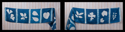
Toned cyanotype scarf.
Note the pale crease down the center.
I've already learned some valuable lessons about making cyanotype textiles. The scarves, for example, are all defective. I dyed them in the active chemistry solution, but when I hung them to dry, I hung them over plastic hangers or a line of acrylic rope I strung up in a closet. Since those substances are non-absorbent, the extra chemistry gathered on top of the hangers and left a moisture-rich line across the scarves. There's a crease on each scarf where it rested on the hanger, and when developed that line leaves a pale streak across the scarf. I'm having to pull some stunts to make it less visible in the final result. Next time I'll use safety pins to hang the scarves to dry without having anything touch them. I don't have an area large enough to let them dry flat in the dark.

There has been another issue with the scarves: size. They're big and I am not really set up to deal with exposures much larger than 8x10. Even 11x14 is difficult, since I typically document my images by scanning and my scanner doesn't handle 11x14 paper. I don't have any sheets of glass 22x22 or larger, and I really don't have much in the way of backing board that size, either. That makes it rather difficult to get good contact between the scarves and the objects used for photograms, since I can't put pressure to keep them flush. In the second scarf (I've only done one square and one traditional, so far) I tried to solve this problem by exposing it in sections. I marked off small rectangles with blue painter's tape, and used black bags to protect unexposed sections of the scarf during exposure. This way I was able to expose 1-2 rectangles of scarf at a time, using much smaller glass. The finished scarf has a film-strip appearance of individual 'frames' of small groups of leaves. I was also able to cover up the moisture-crease in the scarf under one of the tape lines. I'll be doing the same for the second rectangular scarf. The second square scarf... presents a challenge that I have not yet worked out a solution for. I'm still kicking myself about a stupid mistake on the first film-strip scarf: I accidentally put leaves in the last frame upside down. Arrgh.
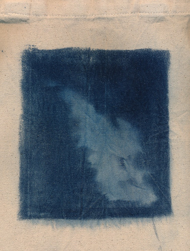
First tote. Blobby failure.

My experiments with the totes have been much more successful.
I've had two failures, both due to issues unrelated to the coating and development. The first tote I tried worked fine as far as coating, exposure, development and drying went. The problem is the plant I made a photogram of, sea oats, was blobby and the poor contact between the plant and the tote resulted in an indistinct, blurry mess of an image. Sad, but not the result of a flawed procedure. The second failure was simply because the glass I used to press the leaves down on the tote slid off and shattered, letting the leaves blow away. The result was a pure blue tote with no image left behind at all. That's what happens when your photogram object blows away during the exposure. All the rest have come out pretty much as expected.

Having fun with a failed tote
I've had some issues with staining, but I think this is due to the totes being rather difficult to wash in my regular-sized sink. If I had proper darkroom sink, or was working outside with a hose and a tray, I think these problems wouldn't be an issue. They've been fairly minor anyway. I have two totes left to expose, and I don't anticipate any issues. That should give me a final count of ten finished, good-quality totes. Since that's how many I ordered in the first place, I'm pretty pleased. The two extra totes that ended up in the order somehow have served an excellent purpose by absorbing the failure rate of the process.

Documenting textiles presents its own set of challenges, which I'll discuss once the project finishes. If you want to see the results of this project as I post them, you silly spiders you, check out my Flickr gallery: Crafts. Ignore the metalwork and felt projects, I guess. Photographing them was pretty fun, though.

Tuesday, July 16, 2013

Woolly Bully!

So, as you can see, I've finished two of my woolen anthotypes. They were exposing for a long, long time. The madder anthotype was exposed for 63 days, and the turmeric-annatto mixture for 15 days. Now some of those days were rainy and cloudy. I will say that 63 days was probably excessive. I checked the madder felt several times during its two months outside and saw little change in the last month it was out there. It was probably done after 4 weeks or so.

63-day madder root exposure
printed on nuno felt.
The madder felt is actually printed on nuno felt, meaning that there is a layer of sheer cloth inside the wool. I don't think this had any effect, it's just a way to get a thicker, sturdier felt while using less wool. As I said before, the felt did a great job of absorbing the madder. This was the first substance I tested madder on that produced a true red. The final result isn't terrible, but it's also not really worth tying up a frame for a month or more. If I ever have some kind of brilliant idea that requires a bright red anthotype, I may try again. Until then, I'm going to have to say that while madder can be used successfully as an anthotype dye, the cons are that it only really works on highly absorbent fabrics and requires a month-long (or longer) exposure. Those cons outweigh the single pro: it's the only true red natural dye I've found that can be bought at reasonable price.

Unprocessed
Contrast-Enhanced
Not to be discouraged by one impractical dye, I decided to test another dye on the same process. Well, a similar process. My second felt anthotype isn't nuno-felted, it's made on pure wool. Again, I don't see any reason that would affect the final outcome. It does affect the integrity of the wool itself. I rushed through making this felt, so it's a bit patchy. I also rushed through dyeing it. I only let it soak in the dye for a few hours instead of a full day. My hope was that the fibers would hold onto the dye less fully and the fading would be more pronounced. That part seems to have worked, but the dye itself hasn't provided a strong contrast. You can see that the unmodified antho-felt hasn't got much visibility. This is actually a problem I've had in the past with pure turmeric anthotypes on paper. They're just so yellow that it's hard to see them, then they show up great when darkened slightly in Photoshop. I added annatto powder to the turmeric, hoping to avoid this, but I don't think it was enough.

Overall, the wool felt anthoype idea is cool, but I don't know that it's really practical. It's cool that it's so very do-it-yourself, with making the dye, the fabric and the print. I really like that aspect, but the final results are extremely time-consuming and not that impressive. I may do another in a while with... I dunno, maybe blue dye from red cabbage? I liked that blue. Turmeric is my most reliable anthotype dye; I know it gives fast exposures and it practically always works. The downside is the low contrast, which I didn't compensate for enough in this experiment.

Even solving the contrast, color and time problems, anthotypes on hand-made felt may simply be something I work with rarely because of the immense time and effort involved in making them work. Making the felt itself and then dyeing it properly take quite a while. Possibly at some point I'll refine my felt-making process and speed it up. Or I might just take a few days at some point to produce a bunch of felt pieces for later anthotypes. Maybe even combine it with hand making a bunch of paper.

The two substrates: handmade felt and handmade paper, remind me a lot of each other. They both bring some very interesting conceptual and textural aspects to the table, but both require a huge investment of time and materials to get a good print. They're definitely 'advanced' anthotype techniques that may be of interest if you really enjoy getting your hands wet. 

Friday, June 14, 2013

Update: Exotic Experiments

In my last post, 34 days ago, I talked about two on-going experiments and one completed experiment. The handmade paper experiment is finished and until I find a cheap blender to make paper with again, it'll stay that way. I really should hit the Salvation Army or something, shouldn't I? I need to anyway, because I've got a bunch of frozen fruit in the freezer that might eventually just turn into colored ice.

The other two experiments, however, were just getting started. I have one-month-later results now, one encouraging and the other... well, sorta encouraging, but far less so.

Working With Wood!
This is the less encouraging result. I used a slice of cedar for my experiment, one that had been cut directly from the trunk of the now-dead tree with a chainsaw. That meant the surface was rough and bumpy, with burs and bits of bark sticking up around the edges. So solid contact with the surface was nearly impossible and as I inspected the tree a few times, I found there was some kind of image being made, but it was so blurry and indistinct I just kept letting it go longer. Finally a good hard rain hit and appears to have washed away most of the pigment I applied to the wood. I can still see the original image, but attempts to photograph or scan it didn't turn much up because the image is so faint and really only visible if you know exactly where to look.

I'm not abandoning the idea of anthotypes on wood, because I think it's a cool idea. However, I will be using a rotary saw to cut the slices of wood next time (muuuuuch smoother cuts) and maybe even sand the front surface to a satin finish before applying the pigment. I'm also going to try hickory wood instead of cedar wood, because the dye will show up better on the hickory. The tree that was cut down for this wasn't old enough or big enough to have distinctly colored heartwood, so the whole thing is a pale color from bark to core. I'll do a side-by-side comparison once I work up the energy to clean off the table saw and work out a good way to sand the faces smooth without removing my fingertips.

Woolen Wonders!
My other on-going experiment was hand-felted wool dyed in madder extract. Well, it's been sitting inside on a well-lit table for about 2 weeks and then I moved it outside into the weather for 2 more. It's still there, though I do bring it in during really nasty storms. So far the fabric isn't getting moldy, though the particle board it sits on sure is starting to turn interesting colors.

The image itself is present, though currently not very strong. Madder has a good reputation as a long-lasting, light-resistant fabric dye. Even without a mordant involved, it's probably going to take a long, long time to get a decent amount of contrast. I plan to try this experiment again with a faster-fading pigment like red cabbage, turmeric or sandalwood.

Saturday, May 11, 2013

The Sun Will Come Out Tomorrow!

I think I mentioned recently that my long hiatus was due to a bunch of stuff. First, late fall and winter are terrible times to do anthotypes or lumen prints and I haven't been working on much illustration lately. I've got some ideas there, mostly inspired by some great bands, but currently still straightening those ideas out in my brain. I hope to be deep into an illustration project sometime in the next month, though.

Anyway. I also had my largest set of students this spring semester, so I was adjusting to that. But now it's summer and while I've got some camps and workshops to keep me teaching, I have a lot more free time (and light!) to experiment with. So, I figure I'll bring y'all (no one reads this blog, I'm talking to myself) up to date on what I've been working on.

Stumps!: Over the winter, my Dad had to get rid of a tree in his front yard and after cutting it down, discovered it was a cedar tree. In case you don't know, cedar trees have a rusty red, almost purple, heartwood and pale, tan sapwood. He saved the resulting logs for me and I turned a couple slices into some nifty coasters. It only recently occurred to me that I could coat the untreated slices of cedar with anthotype dye and use them to expose on! So, right now I have some blackberry covered cedar sitting in my workshop, drying. It's supposed to rain all weekend, but I should have some results from those wood prints in a couple days. At least, I'm hoping for days, but realistically it might take two or more weeks since the wood just loves to suck up the dye and hold onto it. We'll see what happens!

Paper!: I tried making my own! It's messy and annoying, but the project was successful. I used shredded documents and some dryer lint to mix up my slurry, screened it with an old picture frame and dried it in the microwave because I have no patience. The resulting paper is blue, because I wear a lot of jeans. Next time I'll skip the lint and just add in some wool that I have laying around. I'm not the biggest fan of the blueness of the paper (which is weird, I love blue things), but the texture is great! See? Isn't it great? I think it's great. Normally I deckle the edges of the paper I use for 'finished' anthotypes (as opposed to dye-tests), but since I made this paper myself, the deckle is just a product of the imperfect production process. I like that a lot. The other nice thing is that the resulting print is mine. I mixed the dye, I made the paper, I did pretty much all of it. I might be selfish, but I enjoy making things that are mine from start to finish when I can.

Wool!: As I mentioned, I have wool laying around. A few pounds of it, actually. In college I took a textiles class and loved dyeing and manipulating the chemistry involved. That knowledge and experience has been invaluable in working with anthotypes, so I started to wonder about combining them. This whole thing was inspired by my friend Deanna Januzzi, who did some great work combining textiles and alternative photography to make cyanotype pillows and furnishings. I'm taking raw wool, felting it into cloth by hand, dyeing the felt and then going to use the dyed felt to print anthotypes on. The resulting felt is way too thick for me to fit into a picture frame like I normally use for anthotype exposures. So, I've come up with this incredibly sleek and sophisticated solution: put a glass-only frame on top of everything and hold it down with spare weights.

The really nice thing about using this wool felt? Madder root dye may not work on paper very well, and it's only so-so on muslin, linen and silk... but dayum it's awesome on wool. The felt soaked the madder up like a sponge and turned a bright, bloody red. I can't wait to see the results!

Straight Up Substrates

Anthotypes are pretty awesome. Why else would I blog about them so much? Well, boredom and an enjoyment of hearing myself.. type, I guess. But, they're pretty awesome, that's the point. One of the reasons they're awesome is that you have a huge amount of flexibility in how you make them. There are dozens or hundreds of possible dyes, each one can be diluted or applied in many different ways to create just buttloads of potential colors. But, under all that, there's even more choice! You get to choose what you put the dye on! There are many possibilities and each category breaks down even further.

Because of the sheer number of things you can put dye onto and let it fade back off, I'm only going to cover a few types of substrates, the ones that are most commonly used for anthotypes. Don't let that stop you from experimenting! Anything that takes a stain can theoretically be used to make an anthotype.

Paper: The most common substrate to use for anthotypes is paper. It's obvious, since that's what most photographs are produced on and an anthotype is a type of photograph. There are a wide variety of papers and choice does matter. I don't recommend using anything lightweight such as copy paper because it won't hold up well under the dye and it will wrinkle as it dries. You want a heavy-weight paper that's designed to take lots of liquid. Printmaking paper, watercolor paper and even sketch paper meant for use with inks will do alright.

There are many sources telling you about what kind of papers are best for this and that alternative process. Some of my favorite brands are Crane Kid Finish, Rives BFK, Stonehenge, Arches Watercolor and Canson Watercolor. I don't have as much experience with the printmaking papers, because they're rather expensive, but Rives and Stonehenge are both extremely durable, cotton-rag papers that will happily soak up your dye without deforming or tearing. They're my personal favorites for anthotypes. However, again, they're kinda expensive. So, for tests and experiments I prefer to use Canson or Arches, neither of which is very pricey. When you're just starting out, or using particularly weird dyes that you don't expect much from, Canson is the cheapest paper of the brands I've listed. It's often comprable to store-brand generic watercolor paper. Arches is much heavier, which is nice for durability.

A short note about watercolor paper: it comes in Cold Press and Hot Press. What those mean are that cold press paper has a tooth, or texture, on the surface. Hot press papers are extremely smooth. I'm a much bigger fan of smooth paper for anthotypes because it lets the most detail shine through in the print itself. You may like the texture of the paper itself, so you should probably try both.

If you're adventurous and don't mind getting dirty, you can even make your own paper. It's pretty simple, and comes out with a great finish. If done correctly and your paper mash is reinforced with some lint or fibers, you can get very, very sturdy papers. I especially like that when you make your own paper, it puts more of the process in your hands. You make the paper, you make the dye, you make the image. It's all yours. That's a nice feeling sometimes.

Fabric: After paper, the next level of advancement in substrate experimentation is normally fabric. I'll say that your best bets here are going to be natural fibers. I've used linen, muslin, wool and silk. All have given decent results. Linen has done the best for me so far. Silk doesn't like to absorb the dye as easily. Wool tends to snarl on the leaves and plants I use, though it's great at absorbing the dye. The linens I use tend to be fairly thick and heavy, with good texture. On paper, I like a smooth surface, but with fabric, I prefer texture because it helps add contrast. You won't get as much detail on fabric as you will on paper, so keeping to a smooth surface doesn't have much benefit.

I encourage experimentation with fabric, and I'm eager to hear the results of others trying fabric anthotypes. If you try them, please let me know what results you get!

Wood: Yep, you can use wood as a substrate. I wouldn't suggest plywood, but pretty much any solid wooden surface will take a dye pretty well. Wood likes to hold onto stains, so don't expect full fading. It'll be up to you if you want to surface the wood before applying your dye. Wooden panels or blocks used for painting, even gesso blocks, work just fine. A lot of your dye will slide off gesso, so be aware of that. You may need to lightly sand the gesso to get enough texture to hold your dye. Since gesso wont absorb much of your color, it's much harder to work with than untreated wood.

Parchment: Real parchment is animal hide sliced quite thin and was originally a paper-like writing surface. It's not cheap, but it has the texture and feel of the hide it was made from. Staining it with your dye will bring such textures to the foreground and can produce some truly unique anthotypes. However, vellum is a type of leather and it's not waterproof. It shrinks in water unless stretched and once wet will become stiff as it dries again unless you know how to handle it properly. I do not, so all my projects on vellum have lost their original elasticity and flexibility.

Leather: It's just as possible to use regular leather as it is to use vellum, but I have only heard of people using it for cyanotypes. I've seen leather used for anthotypes, but I don't know that the dye absorbs very well. Again, this is a place for experimentation. But, rest assured, leather is a possibility. I'd think the kind with a suedey surface would work best, since the suede will absorb the dye better than a slick surface.

Others: According to people I've spoken with working with cyanotypes, it's possible to print on just about anything. Unglazed clay and even bones will take a stain directly. It's even possible to print on plastics, glass and metal. To do so, you'll need to mix some gum-arabic or another gel agent into your dye to create a thick, sticky paste that can be applied to slicker surfaces. Just be sure whatever gel you're using has no opacity and no resistance to UV, or it'll slow the process of the dye breaking down.

Just as a note? Virtually all of this applies to cyanotypes as well as anthotypes.