Showing posts with label exposure. Show all posts

Friday, June 17, 2016

Blogging for Freya: The Importance of Lite

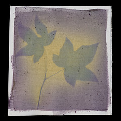
Silver Geometry #1, kosher salt
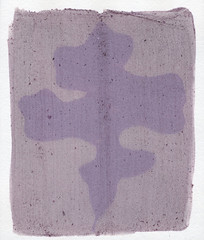
Silver Geometry #1 (reprint), 'lite' salt.
Hello, Spiders! It's been a while, and I'm sorry. I've been having a rough spot. Hopefully things are looking better! I'm certainly being more productive!

Lately, I've been back at work on the Silver Geometry Project, because there's a few shows I want to submit pieces of it to. I think they work better as 'stand alone' pieces than my thesis work does. The thesis work needs the artist statement, the titles, and some context to really be understood fully. I think that's a weakness of the thesis, and I'm working on it as I research ideas for new pieces. Silver Geometry, though, has really strong images even if the conceptual framework is looser and less rigorous. So they're what I'm working on right now, and trying to push to shows.

While I have been making new designs, I also started to re-visit some of the designs where I like the drawing, but feel that the prints didn't work out. It's been interesting, since there are a lot of little elements that are outside of my control in the process. I've also been experimenting with altering how fast I work.

Silver Geometry #13, with most of the value variation lost
This week, I tried to create more variety of value by moving the photogram material around pretty rapidly. It worked out well, but the resulting values were so delicate (created after only minutes of sunlight) that all it took was a little hesitation and distraction for a blast of bright, direct light to nearly obliterate the delicate shading. So, while I like the idea of more controlled value variation, I probably need to do that on one print at a time, instead of shuffling my attention between several prints at once. I may also need to do that on overcast days, or even inside through a window. Direct sunlight just moves the reactions too fast.

In these recent prints, I've also been manipulating the chemistry more directly. I created some lighter blue colors by diluting the cyanotype chemistry with water. I forced the silver nitrate to turn violet and red instead of brown and black by using "lite" salt instead of regular salt when preparing the paper. Since "lite" salt is a mixture of 50% potassium chloride and 50% sodium chloride, it causes a dramatically different coloration.

Up next is really small prints made from scraps of the larger sheets of Rives BFK that I'm using for the 5x5s. These are about 2.5 inches square, so the designs have to be a lot simpler. I think that'll be a fun challenge. I'm also considering some 5x5s where the chemigram component is extremely simple, and all the visual interest comes from the value added in the photogram stage. It's been a super busy week, but I'm hoping to get a good bit done this weekend and next week!

Check back in soon, Spiders!!

Wednesday, February 3, 2016

Blogging for Odin: Orderly Presentation


Well, Spiders, I'm a bit late with today's blog. Six days late, actually. Unfortunately the only excuse I have is that I simply didn't get around to editing all these images and patching them together into a cohesive scan. The beginning of the semester has been a little stressful, and I've been trying to keep it all together. But, I do hope to have an entry for tomorrow, too!

After my experiments with photograms, I decided I needed something more controlled to really do a proper test of these different halide solutions. So, I created a little digital "test sheet"that has a smooth white-to-black gradient, a 15% medium grey bar, and a six-step zone chart that has 100%, 80%, 60%, 40%, 20% and 0% black. Using this test sheet, I can tell if one compound has more contrast, less contrast, exposes faster or slower, and get a much wider range of tonality than by using photograms. I'm also controlling the process further by printing in one of the university's UV exposure boxes, instead of in sunlight.

So far, my results aren't mind-blowing or anything.

The potassium iodide (KI) is really.. ugly. I mean, there's just not anything redeeming about it, especially not once it's been fixed. Maybe it's nice in the "latent" form, just after exposure, but even just a salt water wash makes it muddy and unpleasant. Fixing it just turns it to a dull, rather hideous brown.

Ammonium chloride (NH4Cl) is extremely similar to sodium chloride (NaCl). The only difference I can see, and it's quite subtle, is that the ammonium chloride seems to be a little bit warmer. There are two tests for ammonium chloride because the first test had some pretty hideous staining. The second test, though, was slightly compromised because I waited a full day between exposing it and fixing it. This almost certainly caused some fogging in the paper before the fixing.

Bromo-Iodizer has the most interesting results, providing warm yellow highlights and soft brown shadows. I can certainly see some uses for this coloration, but I'm personally not a huge fan. I do like the long-exposure greens that it produces, but I'm not sure if I like it enough to continue working with the Bromo-Iodizer. It's quite nasty stuff, and I may be able to get similar results by simply using potassium bromide and potassium iodide together, without the presence of alcohol or cadmium.

Assuming that I've recovered from my current head-cold by tomorrow, I'll be giving a test to potassium chloride and potassium bromide, both of which arrived recently. I was able to mix up a 3% solution of both, coat and dry some test sheets, but didn't have time to apply the silver nitrate or do a test exposure. So those salted papers are waiting for me in the lab!

Toss some positive vibes my way, Spiders. I could use 'em for this little plague.

Thursday, January 21, 2016

Blogging for Thor: Saline-ent Findings

Sorry for the terrible pun, Spiders, but I'm running out of witty references to salt. This week, it was hard to wait to blog! I was so very excited about the results of my latest experiments. I think this weekend I'll be at the university, making some test prints. I have a hairdryer now! And I'm awaiting the delivery of more chemistry for further testing, too.

Here's what has me all worked up: I successfully printed photograms with non-chloride silver salts. I tested out potassium iodide and Old Workhorse Bromo-Iodizer as catalysts for salt printing, along with a sodium chloride control print and an ammonium chloride side-test. Everything produced a clear, visible image. I'm going to discuss first the basic parameters of the experiment, the controls, and then get into the preparation and results for each halide solution.

Test sheets prior to exposure.
All but one show significant fogging.
Controls: Each of the four prints was made on a sheet of Arches Platine paper, all the same size, all taken from the same full sheet of paper, and all coated at the same time. All four test sheets were first painted with a solution of the chosen halide, then allowed to dry and stored in butcher paper for 3 days while I waited for good printing weather. The night before printing, each paper was given a single coat of 12% silver nitrate, allowed to dry overnight in a dark box. Despite being in a dark box, the drying time was too long. Each test sheet showed discoloration when the box was opened. I will repeat these tests with fresh-dried sheets soon.

Bromo-Iodizer Solution: I used the Bostick & Sullivan Old Workhorse Bromo-Iodizer directly out of the bottle, with no changes to the solution. The solution is easy to coat, and has a strong yellow color that makes it easy to tell where your paper has been coated. It smells strongly of alcohol and should be used only in well-ventilated areas. The bottle should be capped immediately after the solution is extracted.

Potassium Iodide Solution: This chemical comes as a transparent/white crystal solid. I mixed 6 grams of the crystals into 200ml of water to make a 3% solution. I didn't use nearly so much, but I didn't have a small enough mixing container to measure less than 200ml water with accuracy.


Ammonium Chloride Solution: This is a shiny white powder that does not readily dissolve in water. It required a lot of stirring, and left a film of bubbles and fragments floating in the solution. Again, I mixed the same 6 grams of solid to 200ml of water, resulting in a 3% solution.

Sodium Chloride Solution: For sodium chloride, the control solution, I used Morton Kosher Salt. As with the other two dry chemicals, I mixed 6 grams of solid to 200ml of water, resulting in a 3% solution. This is a medium-strength salt solution by standard salt printing guidelines.

The prints were made in windows at my apartment, on a clear, sunny day. I exposed all four prints for 2 hours before pulling them and scanning the resulting images. None of them have been fixed, though I may do a potassium iodide fixing test just to see what happens.

Bromo-Iodizer Print: Unlike any other salt print I've seen, this one came out blueish-green, but mottled with little flecks of a more yellowish green. I was told to expect some issues due to the high alcohol content of the bromo-iodizer, but the green color was totally unexpected.
Potassium Iodide Print: This print is much paler than a normal salt print, more of a tan than a brown. It's still fully detailed, just lighter. I really want to see this printed again without the fogging, so I know what it looks like in a "proper" exposure.
Ammonium Chloride Print: Very similar to sodium chloride, though the pre-exposure fogging makes it difficult to read nuances of hue and tone. I'll have to do more specific experiments regarding the different forms of chlorides to see the exact effects of ammonium vs sodium. If there is a visible difference, it's that the ammonium chloride has a cooler, more purple tone to the browns.
Sodium Chloride Print: Exactly as expected, though unfortunately tainted by the long wait between silver coating and printing. Silver chloride, if left in contact with organic matter (like the paper), will self-expose even in darkness. That results in the violet-brown staining of the paper, and the extreme violet outlines around the image.

So, my final thoughts? I'm very excited to have proven to myself that silver chloride is not the only halide that can be used in salt printing. The potassium iodide image is considerably blander than I had hoped for, but the strange jade color of the bromo-iodizer image gives me hope for future tests. I still haven't tested potassium bromide by itself, or tested non-potassium forms of bromide and iodide. I know from previous experience that potassium chloride isn't the best form of chloride to use, so maybe potassium bromide and potassium iodide aren't the best forms of those halides, either. I'm going to look into obtaining other solutions of bromide and iodide, maybe even some alternate forms of chloride. The ammonium chloride is similar enough to sodium chloride, but I've yet to test pure potassium chloride to see the result. I've only ever used it in a "lite salt" mixture: 50% sodium chloride and 50% potassium chloride.

There's just so much more to do, Spiders!

Sunday, April 19, 2015

Blogging for Sol: Raining on the Panda Parade

Odd Bleaching, Reason Unknown
Hello, Spiders! This week has been pretty terrible as far as weather goes. Even my students have been complaining, because the weather makes it harder for them to do extra credit assignments. I give them the opportunity to do alternative process (cyanotype, lumen, anthotype or scanogram) prints for extra credit... and they all wait until the last week to do them. Of course.

So, I haven't been doing much printing lately. Nor have I made much progress on the grant project recently. I have begun to epoxy the printed parchments onto the wood, though. The first test finished curing tonight and it shows no ill-effects on either side. There's strong adhesion and everything appears to be going well. Recent grant-related developments also include 3 failures which I'll have to re-print. That's going to be challenging, since most of the last shipment of parchment was small pieces. I do have a large sheet I can cut from, but the surface isn't what I'd like... so I'm ordering another set of parchments and hoping I get some bigger bits. I'm going to include a note asking for no sheep scraps.

What I did get done was some catch-up on my documentation. I've been doing a lot of experiments with the different types of parchment and prepping for the grant work. So I had a double handful of parchment prints waiting for scans. I finally got that done! In case you were wondering, Spiders, I do not like Sheep Parchment.

In a related note, the odd fading that I've discovered lately (Mexican Heather 8, Peppervine 5) is finally scanned. I'm going to be seeing if anyone, like Christopher James or Mike Ware, can explain what's causing this reaction.

Friday, March 27, 2015

Blogging for Frigg: Eat Your Heart Out, Easter Bunny

The finished Egg
As I mentioned recently, I'm working on a project to make art out of a goose egg. Today my egg had its second round of exposure. The first exposure was too short, and although the egg looked very nice in its latent form (pictured below), it didn't end up turning out well. Half the image just washed right off. Even the remaining half of the egg was just pale and splotchy.

Fortunately, you can wipe a cyanotype. Well, sorta. I bathed the egg in a borax solution, which reduced the blue cyanotype to yellow. Then I just coated over the yellow image. The original image is still there, it just isn't visible. If this egg was placed in tannic acid, the original image would re-appear... so whoever ends up with this egg shouldn't try dunking it in tea or coffee.

I'm not sure that I really enjoy printing on eggs. The initial coating is a pain in the butt, and wastes a ton of chemistry. But, after that, it really isn't that bad. The second time around, I accelerated the coating process using a hair dryer on cool to help each layer of chemistry dry. Eggshell may not be the best surface; it seems to naturally resist chemistry in certain places. It may have some kind of residual coating, or simply have surface defects. On smaller eggs, dipping may be possible, but honestly I want to avoid that because of the sheer amount of chemistry required. If working cyanotype solution could be stored long-term, it'd be different... but it goes bad too quickly, and I don't use much on a regular basis. Possibly when I get into serious production mode on my grant, I'll make up a big batch and dip some eggs.

Once everything was coated, I used the same packing-tape-negative method that I do to print on bones, and it was quite effective. The leaves are from Carolina Geraniums, which are little weeds that grow everywhere. I like the intricate leaf shape. There were a few extra leaves left over, so I'm drying them in contact frames. Might use some of the smaller ones for jewelry, and some of the larger ones for the grant prints.

Exposure on a three dimensional object is always challenging, especially when you want even lighting on both sides. The first time, I tried rotating the egg on a stand, but I the second managed to rig a wire through the egg and hang it out to expose. The hanging method seems a lot better, especially since I can hang it just out of direct sunlight and it gets a much more even exposure. I still went out and turned the egg after an hour, then let it have the rest of evening (2.5 hours more) on the other side.

Developing the egg is actually very simple. The shell doesn't really hold onto chemistry, so it develops very quickly, no extended rinses necessary. Afterwards, I found rubbing hydrogen peroxide on with a paper towel to be effective the first time, but the second I just dunked the egg into water and added the peroxide to be sure I didn't miss any spots.

I finally gave the egg a short dunk in borax, just to clear the highlights a bit and add contrast. A few seconds only, then a thorough rinse to remove any borax clinging to the surface. I got the idea from the first time I bleached the egg clean; as soon as it went into the bath the few leaf-prints that had manifested cleaned up and gained more contrast, while the blues only faded a tiny bit. So I made use of that on the finished egg. A little more of the underlaying texture showed up after the bleaching, but I don't mind it at all.

So, overall, the results were encouraging. Despite initially poor results, I was able to clearly identify the problem and correct it. It was absolutely a result of insufficient exposure on the first run, classic issue and easy to fix. First run, it was outside for an hour total. Today it went out at 3:30 PM and is still outside, enjoying the longer evening sunlight. Even better, today was overcast and the light was extremely diffuse. That will counteracted the one-sided issue I ran into last time.

So, let's look at photos of the first exposure run? Yes, let's! Even though the result was flawed, they give a good sense of the process I went through. Unfortunately, I did not record the egg hanging from its wire on the second exposure. You'll just have to imagine it.

Uncoated Egg
First Coat, Still Wet
Coated and Dried
Exposure In-Progress
First Latent Image
Developed First Result

And that's how it was done! I much prefer the final result (image at top!) to the first run. It was fun writing this all out, Spiders. I'd almost forgotten how much I enjoy trying something new and challenging! I've also been making more of my regular parchment prints, and I'll have to scan those soon. So far, nothing crazy or innovative. Just refining my existing techniques and starting to work on the grant. It should be great!

Thursday, November 20, 2014

Blogging for Thor: A Reddy Success!

Success! First true-red Anthotype
Despite the weather, recent plagues and other negative influences, I've printed my first anthotypes in two years. Yeah, Spiders, it's been a long time since I printed any anthotypes myself. I've taught workshops on them, and given demos, written articles, but not actually done any printing.

Anthotypes take up contact frames for quite a while, and for the last two years I've been busy with lumen printing, cyanotyping and other techniques. Anthotypes just haven't really been on my mind.

I'm not sure what changed, but I think it was my visit to UNCC last semester, where one of the students decided to investigate the interaction of turmeric and soda ash. That sparked my interest, got me investigating on my own, and really put me back on track.

It's paid off. I finally have a red dye, which I've been crowing about quite a lot recently. More than that, it's a stable, easy to make, easy to apply, fast-acting dye that shows strong contrast. Everything I could ask for! Well, alright, it is a bit dusty, leaving behind a fair amount of solidified pigment when it dries, but I think altering the concentration of alcohol in the solution can fix that problem.

So, there you have it, Spiders. Two years, and my first anthotype is a stunning success. In red! It did take 12 days, but this is fall, so that's not un-expected. Low UV index and lots of clouds. No heat, either. Heat speeds things up quite a bit.

Pure Pokeberry dye
I also had three other prints exposing at the same time. A dried oak leaf on pure pokeberry juice, which turned out great (below), and two other prints made on red cabbage dye. I had whipped up a batch of the blue and green red cabbage dyes, getting an indigo instead of a blue this time, and decided to use some of them. Unfortunately, the red cabbage prints did not work out. They show almost no fading at all, despite the same 12-day exposure as the other two prints. I'm guessing there simply wasn't enough UV light to break down the red cabbage pigments. Those always were a bit slow, compared to raw berry dyes or turmeric/sandalwood which is what the red dye is mostly based on. Unfortunate, but unavoidable given the time of year.

When spring and summer roll around, I plan on getting back into anthotypes on a serious level. We'll have to see if I actually stick to that. I'm also very interested in working more with liquid lumen prints and chromo-lumens, but at the moment I'm focusing on my cyanotype bone prints and wearable art.

Thursday, August 7, 2014

Blogging for Thor: The Life and Times of Salt

Sensitized salt paper
24 hours after coating
I have discovered a flaw in my approach to salt printing. Time. I was assuming that as long as the salt print was kept in a dry, dark location, it wouldn't expose quickly. I could coat a decent sized batch of sheets one night and then wait for good weather to use them.

Wrong.

Even waiting a full day after applying the silver nitrate was too long. I opened the door of the cabinet where I was storing the paper and found this.

Print on fogged salt paper
All five coated sheets looked the same. I tried printing them anyway and both images made with negatives are so distorted that they're basically invisible. I did get a passable, in fact quite interesting, result from a contact print of a Mexican Heather sprig. The spotting and patterning becomes even more visible during the exposure. And for some reason, despite using kosher salt, these prints came out deep violet splotched with black and pink. Not at all the reds and browns I was expecting.

So, from now on, I'll have to dry the silver-coated paper fairly quickly and try to use it the same day. Or at least coat during the evening (as I do now) and use it the very next morning. I might even try using a hairdryer to accelerate the process so I can coat and print within an hour or two. It's just a bit of a bummer that I can't store the paper. Anthotype paper keeps basically forever if it's out of sunlight. Cyanotype paper keeps for a few days before it begins to fog too much. Salt prints, though, just won't keep for more than a few hours. Bummer.

Lesson learned, y'all!

Friday, November 22, 2013

Blogging for Thor: I Don't Know Days

It's Janelle Monae!
Sorry, Thor. I was totally blasted out after the amazing Janelle Monae concert I was at Wednesday night. It was super awesome because during the finale song, she got the audience to sit down and walked out into the crowd to finish her song. She stopped right next to me and ended up sitting on my shoulder for a while. So that photo over there, that isn't zoomed in. That's her from zero inches away, because she's literally on top of me. It's crazy. Then I had my friend that came to the concert with me spend the day, and it was fun. I was so tired that I actually passed out and didn't recover until after midnight.

Anyway. I also got some experimenting done before the concert. I wanted to test some of my theories regarding the use of textured acrylic. I painted the acrylic with black paint and rubbed it off, leaving only the recessed areas covered in paint. This way, the patterns in the acrylic were much more pronounced and produced a far stronger shadow on the lumen print than the un-painted acrylic did. The result was about what I had hoped for originally. You can see the first test, here to the right. The lack of pattern around the lower left corner is due to the acrylic not being held down evenly. I'm going to cut some 8x10 sheets so I can place them in frames. Cutting this kind of acrylic isn't hard, but it isn't very easy either. It likes to fracture unhelpfully, so I'm going pretty slow and trying to take a lot of care.

After checking to confirm that my modifications to the acrylic would work properly, I tested the painted acrylic on a real print. The results are here, seen to the left. Again, the same issue in the lower left corner. Incomplete contact with the acrylic. I like the results for adding texture to the background of the image, but I worry about how much detail may be lost due to pattern interference on the leaf itself. I'll have to do more exposures and check the results. Still, this has been very encouraging!

Tuesday, July 16, 2013

Woolly Bully!

So, as you can see, I've finished two of my woolen anthotypes. They were exposing for a long, long time. The madder anthotype was exposed for 63 days, and the turmeric-annatto mixture for 15 days. Now some of those days were rainy and cloudy. I will say that 63 days was probably excessive. I checked the madder felt several times during its two months outside and saw little change in the last month it was out there. It was probably done after 4 weeks or so.

63-day madder root exposure
printed on nuno felt.
The madder felt is actually printed on nuno felt, meaning that there is a layer of sheer cloth inside the wool. I don't think this had any effect, it's just a way to get a thicker, sturdier felt while using less wool. As I said before, the felt did a great job of absorbing the madder. This was the first substance I tested madder on that produced a true red. The final result isn't terrible, but it's also not really worth tying up a frame for a month or more. If I ever have some kind of brilliant idea that requires a bright red anthotype, I may try again. Until then, I'm going to have to say that while madder can be used successfully as an anthotype dye, the cons are that it only really works on highly absorbent fabrics and requires a month-long (or longer) exposure. Those cons outweigh the single pro: it's the only true red natural dye I've found that can be bought at reasonable price.

Unprocessed
Contrast-Enhanced
Not to be discouraged by one impractical dye, I decided to test another dye on the same process. Well, a similar process. My second felt anthotype isn't nuno-felted, it's made on pure wool. Again, I don't see any reason that would affect the final outcome. It does affect the integrity of the wool itself. I rushed through making this felt, so it's a bit patchy. I also rushed through dyeing it. I only let it soak in the dye for a few hours instead of a full day. My hope was that the fibers would hold onto the dye less fully and the fading would be more pronounced. That part seems to have worked, but the dye itself hasn't provided a strong contrast. You can see that the unmodified antho-felt hasn't got much visibility. This is actually a problem I've had in the past with pure turmeric anthotypes on paper. They're just so yellow that it's hard to see them, then they show up great when darkened slightly in Photoshop. I added annatto powder to the turmeric, hoping to avoid this, but I don't think it was enough.

Overall, the wool felt anthoype idea is cool, but I don't know that it's really practical. It's cool that it's so very do-it-yourself, with making the dye, the fabric and the print. I really like that aspect, but the final results are extremely time-consuming and not that impressive. I may do another in a while with... I dunno, maybe blue dye from red cabbage? I liked that blue. Turmeric is my most reliable anthotype dye; I know it gives fast exposures and it practically always works. The downside is the low contrast, which I didn't compensate for enough in this experiment.

Even solving the contrast, color and time problems, anthotypes on hand-made felt may simply be something I work with rarely because of the immense time and effort involved in making them work. Making the felt itself and then dyeing it properly take quite a while. Possibly at some point I'll refine my felt-making process and speed it up. Or I might just take a few days at some point to produce a bunch of felt pieces for later anthotypes. Maybe even combine it with hand making a bunch of paper.

The two substrates: handmade felt and handmade paper, remind me a lot of each other. They both bring some very interesting conceptual and textural aspects to the table, but both require a huge investment of time and materials to get a good print. They're definitely 'advanced' anthotype techniques that may be of interest if you really enjoy getting your hands wet. 

Wednesday, August 1, 2012

Confounding Condensation

First!
My very first anthotype ever had a really interesting result. The yellow halo is a product of the moisture in the leaves leeching out into the paper and washing away some of the pigment. However, I've not been able to replicate this. I recently tried another batch of anthotypes using fresh blackberry juice, prepared the same way as the original batch, no halos.

So, I'm fairly sure there are two culprits:
The original anthotypes were exposed outside, in the direct heat of the scorching Southern sun.
They were not in picture frames, but smooshed between two plates of acrylic, allowing air flow.
No halo.
I tried putting my picture frames outside, but no dice. I tried using two plates of acrylic inside, no dice. I think it needs both the airflow of an open frame and the blazing heat of the sun to produce the results I want. I will be trying this soon! I'm especially hopeful because another recent experiment with silk dyed in madder-root produced a moisture halo.

Oh, that's right, I never mentioned that test result. Why? It sucked. Maybe I picked a bad plant, because the leaf I used ended up virtually transparent by the end of the seven day exposure. Transparent leaf means there wasn't any light-blockage and the resulting image is almost invisible. Plus, the madder root stubbornly refuses to give me a good color. Also, it's transformed into a mess of green-brown-white fuzz.

I think I'm done with madder root for the time being, it hasn't been of any appreciable use yet. Maybe when I get around to my next project, where I buy raw wood and felt it down into my own hand-made cloth, then dye the cloth and make anthotypes on THAT... then I might use the madder root. Maybe. Probably not.