Nothing. Dammit. Three different colorants used on muslin and all of them bleached away to nothing except for the boiled blackberry dye. Boiled raspberry? Gone so far I couldn't even tell what it was without checking my notes. Turmeric disappeared even more. I'm pretty sure the only reason I could see the images at all is because the leaves had left an impression on the fabric. Now that the fabric is starting to relax from that impression, the images are almost totally gone.
Both these dyes (raspberry and turmeric) have worked on linen and raw silk, so I find myself wondering if maybe the problem isn't in the colorant, but the substrate.
Friday, April 22, 2011
Thursday, April 21, 2011
What's the Madder?
I got two new colorants (the term I've decided to use for solutions used to make anthotypes) recently from a natural dye website: sandalwood and madder root.
Sandalwood came as a thick, heavy powder with the same consistency as turmeric, which makes me hopeful. I mixed it with a bit of denatured alcohol and got the same strong, vibrant color as turmeric. Sandalwood is a pure, strong orange. I have to do more research on it to find out, but additional chemicals might be able to render yellow-orange and red-orange shades.
Madder root is, well, root. It's twigs that you have to soak overnight and grind into a pulpy mass of wood chips, which you then boil. The soup that resulted is a brilliant, bloody red and looked really, really great! Unfortunately, I already tried brushing the madder dye onto paper and got almost no results. I soaked the paper in the madder and got a pale red.. not at all the vermillion that Madder is apparently capable of according to my research.
I've got some raw silk soaking in the madder and I hope it will take better than paper did. I'll find out tomorrow when I check the dye bath. If that doesn't work, I've got some hope for evaporating off the water and collecting the powdery residue that precipitates to the bottom whenever I let the dye sit. I think THAT might have the alizarin pigment that madder carries. Once I manage to separate the dusty stuff from the liquid, I'll try an alcohol mix with the dust and see what I get.
The Madder-soaked paper will have to wait till tomorrow, but the sandalwood paper is already exposing. A three-day test exposure will be ready tomorrow!
Saturday, April 16, 2011
Dyeing for Better Results
I've tried a bunch of different emulsions for my anthotypes. I'm not sure "emulsion" is the correct word, but I can't really come up with a better one. Dyes doesn't seem to fit. Neither does pigments. They're not exactly sensitizers, and that's harder to type out. Emulsions will have to do for the moment. Anyway.
Here are the results
Here are the results
- fresh blueberry - very pale blue-brown color. poor results after fourteen days.
- fresh blackberry - pastel blue-violet color. good results after six days. reacted with moisture to provide a yellow halo.
- fresh strawberry - pale pink color. acceptable results after six days. reacted with moisture to provide a yellow halo.
- red wine - pale red-brown color. acceptable results after two days.
- turmeric - intense yellow color. acceptable results after one day. good results after three days.
- paprika - pale yellow color. acceptable results after three days.
- turmeric-paprika mixture - strong orange color, with reddish streaks. good results after three days.
- turmeric-red wine mixture - same as turmeric, with a faint orange cast.
- turmeric-red pepper mixture - same as turmeric. red pepper did not have an effect.
- oak leaf juice - extremely faint green color. did not produce any image after seven days.
- grape juice - rich violet color. produced only a faintly visible image after six days. the color does not fade enough to show a good image.
- canned beet juice - rich red-pink color. still in testing.
- boiled blackberry dye - rich maroon color. produced poor results after fourteen days. the color does not fade enough to show a good image.
- boiled raspberry dye - rich pink-red color. still in testing.
- boiled carrot dye - extremely pale orange-yellow color. still in testing, no results expected.
- boiled spinach dye - extremely faint green color. produced poor results after five days.
Notes:
- Canned beets produce a more "true" pink than raspberries, which are closer to a pale red.
- If no reaction with moisture is noted, there has been none.
- Boiled dyes are created by boiling the plants for half an hour, mashing to a pulp, boiling for another 20-30 minutes and then straining. The resulting color seems far more intense (but less moisture-reactive) than the color produced simply by straining the fruit-pulp without boiling. The boiled dyes also seem to be more light-fast, which produces poorer images.
- Tumeric, Tumeric-Red Pepper and Boiled Blackberry have been tested on fabric with results essentially the same as on paper. No mordants have been used as of yet.
- No good Greens have been produced yet. Apparently there are very few reliable green colorants from plant-based materials because they get their color from chlorophyl, which doesn't work well as a pigment. Stupid plants.
Conclusions:
Turmeric is the most reliable, predictable and intense emulsion so far. The problem with it is that the yellow is so intense that it isn't very pleasant to look at it. The intensity of the yellow also blocks out a great deal of detail. I've taken to shifting the hue of turmeric scans so the detail recorded becomes visible. I would like to find a solution that has the qualities of turmeric in a different color. Adding paprika to the turmeric results in a duller, more orange color, but has streaking and striations because the paprika doesn't fully dissolve like the turmeric does.
I'm ordering some indigo and sandalwood online, and looking for some cheap annatto seed powder. I've heard these can all be used to get good results. Indigo produces blue, obviously, while sandalwood and annatto produce oranges.
Friday, March 25, 2011
Anthotype Explosion
As of two minutes ago, I've got nine (9!) anthotypes baking at the moment. Three of them have been sitting in the back of my car since Monday afternoon, so they'll be ready to come out very soon. I'm going to re-arrange the leaves on them and try double-exposure again, but with longer exposure on the first pass. Four days should be enough.
The other six are double experiments (not exposures) since first off, they're hybrid sensitizers. I've mixed together tumeric and red wine for two of them, added paprika to two more and the other two are pure paprika which in the past I had no luck with at all. It doesn't provide a red at all, instead a sort of sickly, pale yellow-orange.
I'm going to be trying some red cayenne pepper later this weekend for a red coating. I'm also doing a lot of reading on natural dyes and once I get a set of pots that I won't be bothered by boiling up all manner of things toxic and unsafe in, I'll start producing natural dyes to use as anthotype sensitizers. I've got blackberries (violet), beets (red), carrots (orange), plus some tarragon and spinach (two greens). Found some alum in the spice section that can be used as a mordant. No idea what effect a mordant will have on the anthotype process. If applied before, will it prevent the fading which causes the process to work? If applied after, will it work at all?
Thursday, March 24, 2011
Works in Progress (Sorta)
The possibility (however faint) of a show later this year for my folklore illustrations has got me turned back on to the idea of starting a few more. Well, I started them a long time ago, I just need to finish them.
Currently, I've got three illustrations in the series:
I've started work on two more:
And I've got concepts and mind-images for a few more:
Currently, I've got three illustrations in the series:
- The Golem of Prague (Czech Republic)
- The Fate of the Mary Celeste (Atlantic Ocean by way of America)
- A Song of Sixpence (England)
I've started work on two more:
- Jenny Greenteeth (England)
- Baba Yaga (Russia)
And I've got concepts and mind-images for a few more:
- General Winter (Russia)
- The Lost Colony (America)
- The Black Dog (England)
- The Scholomance (Romania)
I really want to finish up Jenny Greenteeth (a river hag who drowns unsuspecting travelers who stray too close to the water, probably inspired by the dangers of duckweed) and Baba Yaga (a Russian/Slavic witch who appears in several stories), but the story of the Scholomance really has me going and I've got all sorts of great visuals for the Black Dog and General Winter.
Maybe I can work out some sort of collaboration with Tiffany on General Winter, since she's into military history.
Anthotypical Production
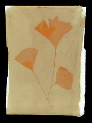
I can't decide if the prints I'm making these days are "anthotypes" at all. Certainly, they use the same process of sun-bleaching to produce a negative image via contact printing. However, an "anthotype" by definition should use flowers. Anthos means flower. Maybe a more accurate term would be Floratype or would that be Florotype? My Latin is a bit fuzzy.
I've gotten MUCH better results from spices than from flowers. Fruits and flowers I can sorta see as being under "anthotype" but it's hard for me to say a print made with a coffee sensitizer is an "anthotype." Coffee isn't a flower.
That aside, I've been having a LOT of fun this week and last working on my anthotypes (for the moment, I'll go with the established term). Some really fun results and one mind-blowing WTF moment where I still haven't figured out what happened.
Flickr, of course, has the latest results of my experimentation. See it over here?
Yeah, you see it. Ain't it cool?
Double-exposure is a pretty neat trick, I like the way it worked out. I'm going to be trying that one again, this time with a mixed tumeric-wine sensitizer.
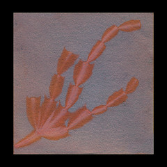
Digital manipulation of the original anthotype images just blew me away. When I scanned the first batch, all I wanted to do was boost the colors a bit, maybe clean up some stubborn spots of plant-matter adhered to the image. This second round? Adjusting the curves of the images opened up whole new levels of detail that were recorded, but not visible. Seriously, check out the Cactus image.
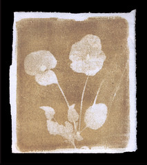
The biggest surprise came from the Red Wine print I made with fresh pansies. At first, I thought it was a failure. Hardly any bleaching had occurred after 6 days of good, strong sunlight. I could barely tell where the pansies had been, even when I was trying to pry them off the paper. On a whim, and a suggestion from Tiffany, I decided to wash the print to see if anything happened. No, it didn't. But then, for some reason, I decided to scrub the print with soapy water and a sponge. The red wine pigment started to come off very easily and underneath, there was a BLEACHED OUT IMAGE OF THE FLOWERS! The paper retained a good amount of red-brown coloration, EXCEPT where the fresh flowers had been pressed! Somehow, the flowers bleached away everything UNDER them, but it wasn't revealed until I washed away the pigment on the surface of the paper!
NO idea how it happened but... wow! It was amazing to watch. The print is pretty nice, too, but the REAL triumph of that print was just seeing it appear out of ruin and loss!
Subscribe to:
Posts (Atom)