Showing posts with label anthotype. Show all posts

Saturday, June 27, 2015

Blogging for the Baron: Slipped Discs and Salty Duds

Hi there, Spiders. I wish I didn't have a good excuse for missing this week's Thursday update, but I do. Somehow I managed to slip a disc in my lower spine while getting out of my friend's SUV. Normal, every day activity and my spine just decided that it wasn't up to it. So I spent Thursday night and Friday morning in increasing amounts of pain. Then I went to the doctor (thanks Obama!!) and found that instead of a pulled muscle, a particularly persistent cramp or anything else reasonable.. I had torn a disc in my spine and some of the jelly inside had leaked out and was messing everything up. That's not terrifying at all.

So now I have an absolute bucket full of drugs to take. Anti-inflammatories, muscle relaxants, steroids, two types of high-powered painkillers. It's pretty lame, actually. At least so far nothing actually knocks me right out... but then I haven't tried the Valium yet. Today, thankfully, was an improvement. If I'm sitting, standing, or walking... I'm mostly fine. It's just when I try to lean over, or move between positions that my back reminds me that it is most certainly not fine.

My students coating papers
Despite all that mess, I did manage to get to my workshop today. Photogenic Drawing at the Light Factory! I had six students, which was a great number. We covered chlorophyll printing, cyanotypes and lumen prints in detail. We briefly went over the theory of anthotypes, but didn't have time to make an exposure since they take several days. I had planned to include salt prints, and I sorta did... but the paper I used wasn't the right kind of cheap watercolor paper. The silver nitrate solution soaked right into the paper, leaving a blotchy, streaky mess. None of the prints came out, not even a little. It really sucked. But the other three-and-a-half processes were a big hit!

There was another, smaller issue with the cyanotypes. I've been using very old and brown ferric ammonium citrate for months now. I got a large jug of it when the Light Factory moved from their old location to their new one, and I never turn down free photo chemistry! Since getting it, I've mostly been using it for parchment prints, where color and detail get a bit muddled anyway. Originally, though, I did some tests to be sure the brown ferric ammonium citrate would work. It seemed to work fine on those tests, some months ago. I can't find them now, but I distinctly recall doing them....

Left: Green FAC.     Right: Brown FAC.
Anyway, today when we printed with the brown ferric ammonium citrate, all our cyanotypes came out with a strong sepia tinge to the highlights and with duller, more greyish-green blues. They basically look warm-tone or very "antiqued." Almost what you might expect from a tea toning. It's quite odd, but not unattractive. They still had full detail, highlights and shadows. 

Later in the class, I mixed up some green ferric ammonium citrate and the prints from that came out great. Pure whites, navy blues, all normal results. So it does appear that either the brown ferric ammonium citrate has always produced those warm tones, or something has happened to it in the last several months. I'm not sure which.

At least I know about it now, and I can take advantage of the difference. The warm-tone cyanotypes are quite pretty, so I'll be trying those out with some negatives. I might even have to start making new negatives! It even worked out really nicely with just photograms. The yarrow photograms pictured above came out great on the warm chemistry. I really love the look of yarrow sprigs, too. I'm going to have to see if I can get ahold of some myself. The yarrow my student had started wilting pretty fast in the heat, and by the time I got it home, it had curled up on itself. Big bummer. I'm going to try putting it in water and coaxing it back to life!

My students today had great success using digital transparency positives for chlorophyll printing. One of them brought in some historical photographs of faces and some scanned nature etchings from old books. They printed really well! I'm going to have to consider what kind of images I might work with, since I haven't been shooting a lot of actual photographs over the past several years. Still, it's pretty cool stuff. 

Overall, today was very productive. I had a great time, and I'm feeling really inspired to start some new experiments. I hope my students from the workshop feel the same way!

Friday, June 12, 2015

Blogging for Freyr: Reversed Results

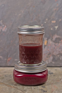
The first time I tried making an osage orange anthotype, I got very odd results. Instead of fading, the osage orange dye exposed to sunlight darkened. With all the sunlight that I've been having lately, I decided to give the osage orange dye another chance to show off its crazy properties. Once again, the exposed portion of the print has darkened dramatically.

This exposure was a bit longer (12 days vs 10) but it shows a much better result. The first experiment was during the winter months, this is during the summer, which accounts for the difference. Sunny weather really is vital for anthotypes. I think osage orange is probably a minimum of one week, even with lots of sun. I checked the exposure and it didn't seem to be moving very quickly.

I'm planning a really extended exposure soon, about a month, just to see what happens. When I quit my job at the university, I had to give back all the stuff I'd borrowed from the lab... including a contact printing frame. So I'm short one of my nicest frames. The month-long exposure will probably be fairly small.

Thursday, May 28, 2015

Blogging for Thor: Time & Turmeric

Hey there, Spiders! It turns out that last week's post was a bit hurried. When the red cabbage dye swatches dried completely, they revealed some very different colors as a result of the acidification tests. Acidified red cabbage dye turns blue. A rather nice blue, probably the best one I've gotten from an anthotype dye so far. You should crawl along to that post, Spiders. It's been updated with the new information and a new scan of the swatch!

Last week, I forgot to give a shout-out to Aspen's great students at UNCC. I wish I remembered which one specifically had raised the question of "what does altering the pH do to other dyes?" I knew even way back then that pH altered the color you get from red cabbage. I hadn't tested the idea on anything else. So thank you, mysterious student!

So, with all that in mind, let's take a look at the latest pH test I did: turmeric. Turmeric is one of my go-to dyes for anthotypes, but the problem with pure turmeric dye is that it's so yellow. It's almost painful to look at, and the yellow is so bright that it obscures detail and gives very little contrast. So, generally, I adulterate the turmeric with something like sandalwood or annatto to calm it down and shift it from yellow! to more of a soft yellow-orange.

The base turmeric dye is a fully saturated mixture of turmeric and isopropyl alcohol. I'm 100% sure that it's fully saturated because if left undisturbed, a full centimeter thick layer of turmeric powder precipitates to the bottom of the jar. By altering the pH of turmeric, I got the following results!

When baking soda (a base) is added to the dye, the liquid becomes a dark, garnet red. The solution dries down to orange. Again, just like the red cabbage, adding more baking soda will cause a darker, more intense color shift.

Adding vinegar (an acid) causes a similar shift, also turning the turmeric orange. This orange is a bit softer, but... again, I suspect that vinegar is diluting the dye far more than the baking soda is. That may also explain the doubled portion of vinegar causing a very soft, pale orange. That is very typical of a dilute dye.

All the adjusted dyes showed moderate dry down, becoming redder and lighter when dry, but none of them shifted as dramatically as acidic red cabbage did.

Friday, May 22, 2015

Blogging for Freya: Colors of Cabbage


Red Cabbage is one of the most flexible anthotype dyes I've found yet. You can see above that it has a wide range of potential colors. I've mentioned previously that the dye from red cabbage is extremely reactive to pH changes. I finally decided to do a more extensive test on the subject. So, above, you see various test swatches of red cabbage dye at regular, high and low pH.

The interesting thing is that the dried dye is not strongly reflective of the dye in liquid form. That might mean the dye would function differently on fabric. I recently dyed a silk bag with red cabbage (boiled, not puréed as the dye seen here was) and the result was a medium-deep purple, not the lilac color seen here in the dried dye swatch.

The two swatches labelled "Red Cabbage Juice" are identical: just the mixture of 1/4th head of red cabbage and 300ml of isopropyl alcohol blended until smooth, then filtered through a nylon mesh paint straining bag from Home Depot. That bag, btw, is a GREAT investment for any anthotypist or natural dyer. It washes clean, has a much finer mesh than cheesecloth, and because it's a bag, it's a lot easier to handle than folded cheesecloth. Note that the resulting dye is very watery, but will form a layer of cabbage-residue precipitate at the bottom of its container within an hour or two. It's easy to pour off the majority of the dye into a new container, leaving that mush behind. The liquid dye is bright purple, but dries to a blueish-violet lilac. It can, at higher dilution, dry to an almost periwinkle blue. I'm simply avoiding that dilution at the moment, but I will do more tests on that later!

When a small amount (aprox. 0.25 tsp) of soda ash (sodium carbonate) is added, the pH of the dye goes up, and the purple dye becomes navy blue. The navy blue liquid dries to a soft, pastel blue. If more soda ash is added (another 0.25 tsp), the blue shifts to emerald green. Even more soda ash turns the green yellower, but that yellower green dries the same shade.

Adding acid to the mixture was far less effective, even if it appeared promising to start. I added small amounts of vinegar, which turned the liquid dye bright pink. More vinegar turned the dye a redder pink. Neither vinegar test showed any significant effect on the dry color, though. There may be a slight blue-ing of the purple, but I suspect that's simply because the liquid vinegar diluted the original dye far more than the solid soda ash did. EDIT: 24 hours later, when the swatches were fully dry, I discovered that the acidified red cabbage juice dries as a blue. The original information about vinegar diluting rather that intensifying the color seems to hold true. 

This was a fun experiment, Spiders!

Thursday, February 19, 2015

Blogging for Thor: A Reversal of Fortunes!

Osage Orange print -- Golden Rain Tree leaf
"The most exciting phrase to hear in science, the one that heralds new discoveries, is not 'Eureka!' but 'That's funny...'" -- Isaac Asimov

I had a "that's funny..." moment earlier this week when I checked on an anthotype experiment that had been baking for almost two weeks. I'd checked it a few times before and been discouraged. Despite bright, sunny days (especially for winter) there seemed to be no change at all in the visible portions of the dye. No fading was visible. I presumed the exposure to be a lost cause, and pulled it on day 10.

As it happens, there had been no fading at all. Instead, there was significant darkening of the exposed dye areas. The area that had been covered by the leaf was showing the original yellow color of the dye, but the exterior areas had dulled and shifted to a dull golden hue. This is an absolutely fascinating result, because up until this point all the anthotypes that I've seen, and all my own tests, have been with natural dyes that fade upon exposure to sunlight. This dye, extracted from osage orange sawdust, is the only one that has become darker with exposure.

This raises all kinds of questions. What will happen with more sunlight during spring and summer? How will the dye respond to moisture from fresh plant samples? Does this form of anthotype have the potential to be archival, at least compared to others? If it doesn't fade under UV, will it simply stabilize, or possibly become more visible as time goes on?

I am incredibly excited by this totally unexpected result. Thanks again, Artisan Dice, you guys gave me such a great gift!

Thursday, November 20, 2014

Blogging for Thor: A Reddy Success!

Success! First true-red Anthotype
Despite the weather, recent plagues and other negative influences, I've printed my first anthotypes in two years. Yeah, Spiders, it's been a long time since I printed any anthotypes myself. I've taught workshops on them, and given demos, written articles, but not actually done any printing.

Anthotypes take up contact frames for quite a while, and for the last two years I've been busy with lumen printing, cyanotyping and other techniques. Anthotypes just haven't really been on my mind.

I'm not sure what changed, but I think it was my visit to UNCC last semester, where one of the students decided to investigate the interaction of turmeric and soda ash. That sparked my interest, got me investigating on my own, and really put me back on track.

It's paid off. I finally have a red dye, which I've been crowing about quite a lot recently. More than that, it's a stable, easy to make, easy to apply, fast-acting dye that shows strong contrast. Everything I could ask for! Well, alright, it is a bit dusty, leaving behind a fair amount of solidified pigment when it dries, but I think altering the concentration of alcohol in the solution can fix that problem.

So, there you have it, Spiders. Two years, and my first anthotype is a stunning success. In red! It did take 12 days, but this is fall, so that's not un-expected. Low UV index and lots of clouds. No heat, either. Heat speeds things up quite a bit.

Pure Pokeberry dye
I also had three other prints exposing at the same time. A dried oak leaf on pure pokeberry juice, which turned out great (below), and two other prints made on red cabbage dye. I had whipped up a batch of the blue and green red cabbage dyes, getting an indigo instead of a blue this time, and decided to use some of them. Unfortunately, the red cabbage prints did not work out. They show almost no fading at all, despite the same 12-day exposure as the other two prints. I'm guessing there simply wasn't enough UV light to break down the red cabbage pigments. Those always were a bit slow, compared to raw berry dyes or turmeric/sandalwood which is what the red dye is mostly based on. Unfortunate, but unavoidable given the time of year.

When spring and summer roll around, I plan on getting back into anthotypes on a serious level. We'll have to see if I actually stick to that. I'm also very interested in working more with liquid lumen prints and chromo-lumens, but at the moment I'm focusing on my cyanotype bone prints and wearable art.

Friday, November 7, 2014

STOP! In the Name of Red


TRIUMPH! 2:1:2 Pokeberry, Turmeric, Sandalwood
It's been 4.2 years since I started working with the anthotype process, and 3.5 years since I started to really hunt for a good red dye to use in the process. Guess what, Spiders? I found one! After some brainstorming and testing, detailed in the last few entries, I finally decided to try mixing together yellow, magenta and orange colors to produce a red.

As far as dyes go, that meant using turmeric (yellow), pokeberry (magenta) and sandalwood (orange) in combination. I've thoroughly documented turmeric and sandalwood as predictable, fast-fading anthotype dyes that are easy to use, easy to mix and work very well. I've got ample evidence from other artists that pokeberry shares these traits, even if it is harder to harvest and prepare (it's toxic, and it's a berry as opposed to a powder). The combination of all three should, I'm hoping very hard, be another quick exposure, high-quality anthotype dye.

A comparison of several different tests using Pokeberry
The best part? It's red. Really, really red. Not reddish-orange or reddish-pink. Nope, Spiders, not this time. It's RED. I am so excited. The only bummer is that I've discovered this in the fall, and the weather is just not my friend during the fall. Less sunlight, longer shadows, cooler temperatures, cloudier skies... it doesn't lend itself well at all to anthotype printing.

Still, I'm going to expose a test sheet starting tomorrow and see how it goes. Wish me luck, Spiders!

Oh, before I forget... the winning combination to produce a red dye was 2 parts pokeberry juice, 1 part turmeric, 2 parts sandalwood and enough rubbing alcohol to make the solution a thin liquid. It's still a bit grainy, but now that the color is tested, I can adjust the solution itself a bit to get better consistency. Ideally, I'd like a grain-free liquid that brushes on smoothly.

The last fun bit? Now my Master Test Sheet can truly be organized by color, since I have at least one strong, vibrant example for each color of the rainbow. Hurray!

Thursday, November 6, 2014

Blogging for Thor: Not Quite Red

Pokeberry (with alcohol) + Turmeric
Well, Spiders, my experiment to create a simple red anthotype dye hasn't yet succeeded. Pokeberry and turmeric together create a bright, vibrant orange. But, ya know what, so does Sandalwood. I'm hoping that I can do some further tests and see if maybe I can combine orange and magenta to get a red, since I have a lot of oranges. Or maybe just different proportions of yellow and magenta? I might also try using pure pokeberry juice instead of diluted pokeberry. This test was pokeberry juice diluted with alcohol.

Either way, it deserves further experimentation.

On another note, I've begun purchasing the materials to turn my Cyanotags and Cyanobones into wearable art. I've finished one pendant necklace, and I've got the materials for a bracelet. The rings and pendants... actually, tonight I talked with Aspen Hochalter and she suggested trying to find a local metalsmith to work with. That's a really cool idea, because it means I double my client base by including the metalsmith's. And it builds professional relationships, which is also nice. It does mean I have to share the profits, though, but I'm fairly ok with that.

More soon, Spiders!

Tuesday, November 4, 2014

Color Theory in Practice

Yellow + Magenta = ...Red?
In subtractive color theory (CMYK), reds are produced by mixing together magenta and yellow. While reviewing color theory with my students this semester, I began to wonder if subtractive color theory could be used to help me out with a long standing problem: the lack of true red anthotype dyes.

My best lead on a red dye, madder root, takes too long to fade (around three months!), plus it tends to produce dusky, rust colors instead of a true, garnet red. It can produce a true red, but so far I've only managed that hue on fabrics, and with extra mordants that further reduce fading. Fading is what I want, so most mordants are just bad news. Plus, the fabric-only limitation is annoying.

Further research has shown that other reds, like sumac, carmine, brazilwood and bloodroot are, for various reasons, not very useful. Mostly, they produce other colors un-altered and must be mordanted to make a red. As a fun bonus, none of them are as "true" a red as madder root is, which is why madder was the go-to red dye until the alizarin pigment in madder root was first synthesized.

Turmeric, a pure Yellow

What if I could sidestep all that mess, though, Spiders? What if I could combine a Magenta dye with a Yellow dye and create a Red? I just happen to have a fantastic, pure yellow dye: turmeric. It's easy to make, easy to get, exposes quickly and mixes very well.

Now, thanks to recent experiments, I've found a magenta dye as well: pokeberry. The pure pokeberry dye is an absolutely vibrant magenta color.

Pokeberry, a strong Magenta
It might be closing in on fall and winter, my Spiders, but I can still mix the dyes and test color swatches even if I can't do timely exposures. So, this week I plan to do some tests to see if Yellow + Magenta = Red. If so, I hope that the two combined will be a fairly easy to make dye. It'd certainly be nice!

I'm even considering ordering some calcium carbonate, a common dye additive called chalk, to see if that may help unlock a further variety of colors. Adding baking soda to some dye, like turmeric and red cabbage, produces very nice color shifts. It'll be interesting to see what the chalk does.

Monday, September 15, 2014

Blogging for Sol: Bloody Late!

Unadjusted turmeric dye, which turns red with low pH!
Hello, Spiders! I'm sorry this post is so late. On Thursday I lost track of time, on Friday I was busy and I was out of town this weekend. I think I've already paid for the lateness; it rained both days I was trying to visit friends and go to the zoo. Thor was displeased with my lack of attention.

On Friday, I was a visiting artist at UNCC again! It was great, for all the same reasons it was great last time. Engaged students who were really interested in what I had to teach them, willing to try it out and even experiment on their own!

I demonstrated anthotypes using red cabbage juice, which turns from violet to teal when the pH is lowered by adding baking soda, washing soda or borax. In this case, we used washing soda. That went over really well, and one student in particular tried experimenting with the other dyes I had brought: turmeric and sandalwood. To my surprise, the turmeric experiment showed very interesting results!

When its pH is lowered, turmeric dye changes from goldenrod yellow to bloody, garnet red! It's truly a lovely color. It fades a bit when applied to paper, but it can be applied in a thick, paste-like form and the paper stains pretty darn well! I assume, though I have not yet tested, that it could also be used to soak the paper and create a strong red in that way. I assume all the normal problems with soaking paper would be present in that case, though.

This new potential color source for a bright red is fascinating and I hope to do some experiments in the coming week, despite the rain and clouds. I'll update this post with photos as soon as I'm able to mix up a batch, coat and image!

Edit: DAGNAMBIT!!! I finished this post juuust before midnight, but the time to insert the image rolled it over and now it's logged as being posted on Monday. Bugger. All hail the Moon!

Tuesday, April 22, 2014

An Alternative Approach

Pre-washed & sun-dried suede leather test swatches
As I mentioned previously, I'm going to try a few more steps to see if I can get cyanotype chemistry to take properly on leather. I tried it on the leather right out of the shipping container and as soon as the chemistry was painted onto the skin, it turned midnight blue. Meaning it somehow developed itself instantly, without UV exposure. So, next step was pre-washing and drying one of the hides to see if that removed any residual chemistry or moisture from the material. I tested a small swatch of pre-washed/dried skin and got the same results: instant development, creating a bright blue dye. Newp, no good. So, I have another step or two in mind that might work... I'm going to try sizing the hide with a dilute mixture of glue and water to 'seal' the hide and create a surface for the chemistry to 'sit' on. I'll try the same thing with a gelatin mixture (animal products, unite!) just to see if that works better, or differently. Until I get those tests underway, I've decided to pursue some other ideas...

Since my experiments with cyanotype on leather have stalled out, I've got to find another purpose to put these hides to. I have 8 whole skins left, and one sliced into about 10 smaller sections. So, what else do I do with this stuff? Well, anything that requires washing is made vastly more difficult on leather, so lumen prints with Liquid Light are out. That leaves me with anthotypes, which require no water at all.

Annatto-dyed leather suede swatch
I've already begun preparation for testing. The leather takes anthotype dye well, which is great since anthotype dye is fairly cheap because it's largely just isopropyl alcohol with a pigment added. My first experiment was with annatto dye, but later I'll try blackberry or raspberry (whichever is in the freezer) dyes to get some other colors. These exposures will take a much longer time, and have a very different appearance... but unless I can get the cyanotype chemistry to work on leather, it's all I've got.

There is a nice kind of naturalism to making anthotypes on goatskin. Just natural ingredients, no chemistry. Only plant-sourced pigments and soft hide. We'll see what sort of detail I can get from the process... in a week or two. The skin takes a while to dry and I don't want to put it out wet, lest it molder or rot.

Friday, January 3, 2014

Blogging for Thor: Dust in the Wind

Six different anthotype dyes in their raw forms.
Man, I'm really bad at remembering what day things are. I was so happy with myself today, too. I ran errands and got things done. Like an adult. Then I came home, forgot it was Thursday and went to bed. Thankfully, I tend to wake up at 3 AM or so, stay awake a few hours and then go back to sleep. I've convinced myself that so long as my blog is up before dawn on Friday, it's still Thursday. Totally sound logic, right?

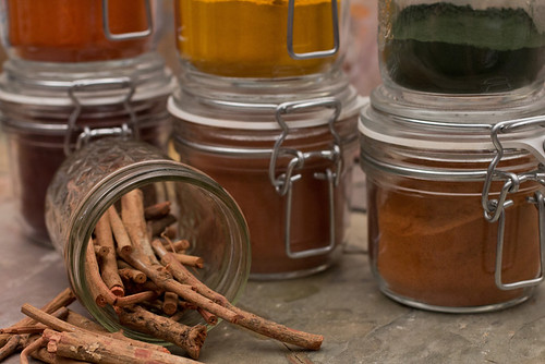
Today's blog is going to be short, though. It's mostly a plug for something else I'm doing. I decided to start photographing the different dyes that I use to make anthotypes with! Starting with the dry powders, I'm taking proper photographs of each dye. I'd really love some kind of big, interactive website where you can click on a picture of the dye and have it bring up a sample sheet showing what the dye looks like before and after exposure, with comments on how to prepare it. That'd be pretty awesome, but I have no idea how to make that work. Maybe some sort of weird eBook internet sorcery.

On other fronts: the weather has just been terrible lately. Clouds, rain, fog, clouds, rain, clouds. Even on 'bright' days the light is so filtered and low-contrast that there's hardly any UV light at all to expose prints with. It's officially the off-season for sun printing. As a result, I need to do something else and it seems like a good time to work on articles (haha, not this blog, no one reads this blog) and that vague idea for an anthotype book I keep telling myself I'm writing. Or the visual reference guide to lumen printing papers. For right now, though, I'll be focusing on the anthotype dye documentation.

The complete set of current photographs for this project is here, on my Flickr.


Thursday, September 12, 2013

Blogging for Thor: Going Green

An anthotype works by using natural pigments that break down under light. Where your pigment is protected from light, it remains dark; where it is exposed to light, it fades to a paler shade. This creates a positive image. Normally anthotypes are made by taking these pigments out of their natural source, purifying them, and applying them to a substrate. That isn't technically necessary. One of the early ancestors of the anthotype process was a technique popular in 19th century France where fruit intended for table settings was placed in sunlight behind intricately cut stencils. The stencils would shape the light, and the surface of the fruit would fade, producing patterned surfaces.

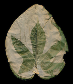
Sweet Potato Vine leaf imprinted on a Hosta Leaf
So, really, there's not a need to remove the pigment from its original source. That idea has been developed to extremely high levels by artists like Binh Danh, who his process a chlorophyll print. What he does is take a leaf (or many leaves) and places a negative on top of them. The sunlight breaks down the chlorophyll in the leaf (only works if the leaf is removed from the tree, obviously) and you end up with the green color preserved where the light was blocked; everywhere else the leaf fades and turns pale creamy yellow.

Chlorophyll printing is a cool, fun process. It actually tends to be pretty fast for an anthotype process; it prints in just a few hours if you use the right kind of leaf. If you use the wrong kind of leaf, it can take days and hardly show up at all. So far I've only tried a few kinds of leaves and my best results are from big, thin leaves like hosta and caladium. Thicker, fuzzier leaves don't tend to fade as well. It can record detail very nicely. I've been able to see some pretty decent tonal range in the leaf prints, but the results are more dramatic with strong contrast and easily identified shapes. If your negative relies heavily on subtle textures and delicate shading, it probably won't return a great result. You are, after all, not dealing with a traditional photo-sensitive metal salt process.

Chlorophyll prints are something I plan to experiment with further. I really like Danh's idea of using multiple blades of grass together as a mat to create a large area for exposure. He preserves his chlorophyll prints by casting them in clear resin. I have no idea how that would affect fading, since the resin is still transparent. Then again, I have no idea how archival the chlorophyll prints are in the first place. Dried leaves can keep their color for a fairly long time, after all.

As a final note: I am almost certain this process won't work on evergreen foliage or on autumn leaves or already-dead leaves that have lost all their green. I'm pretty sure the chlorophyll needs to be intact to make this type of print work. Who knows, this fall might prove me wrong!

Saturday, September 7, 2013

Work, Work: My Favorite Thing!

Yesterday I went to visit UNCC as a Visiting Artist. Holy. Freakin. Crap. I was a Visiting Artist. That blows my mind. Seriously. It didn't actually click until I was walking around their Fine Arts building with Aspen (the awesome photo professor who invited me, go look at her stuff) and she had to take a call. She told the phone-person she couldn't talk because she had a "Visiting Artist" there doing a workshop.

Seriously, my whole month improved at least 4 points. Not sure what that means, since I don't have a monthly scale of goodness that works on points. Still, probably a big improvement. That's one of those moments where you stop and realize, "Bejabbers, I'm doing art. Like an adult." It's great and crazy and it made me so happy. Well, actually it took a while to fully sink in and some of the happy might just be sleep deprivation. But still it was super-exciting.

Aside from me Visiting-Artist-Real-Life-Grown-Up-Professional excitement, the workshop went really well. Aspen's students were very interested, totally awesome ladies. And there was a dude there too, but he wasn't a student or something. He was just there to hang out and see what was up. Like a photography groupie, I guess? He seemed cool anyway. I had great questions, all very reasonable and proving that they were listening to what I had to say. Questions about potential sources for dye, possible objects for exposures, alternate substrates, all that good stuff. Some very cool large-scale anthotypes on sketch pads, using all kinds of items. Some big sections of lace, even one young lady with a bird skeleton. Whoever you are, bird-bone-lady, I like you. You make me feel not so weird for having a bag of assorted bones on my desk.

Aspen and I are even trying an experiment to see if we can get an anthotype print from one of her wet collodion glass negatives. That'll be interesting to see in a few days, especially since the negative had shattered and we're exposing the pieced-together fragments. That print is being made on hand-made paper (tinted blue from jean-lint) coated in a medium-dilution sandalwood dye.

Because anthotypes don't expose in a few hours, I wasn't able to see any of the results from the workshop. I'm hoping that the ladies get some awesome results and I can see them after they scan/shoot the images. They're working with turmeric, sandalwood, annatto and blackberry dyes, both pure and mixtures between the different colors. Some are even doing round anthotypes, and someone had an oblong, hurricane-shaped anthotype. I know all the pigments should give decent results in a few days, so I'm pretty sure they'll all get something.


And also amazing? The Light Factory (thanks to Laurie) is now holding open Darkroom Saturdays, and I'm heading in later today (dammit, it's today, isn't it? Why can't I sleep?) to do another demonstration of easy, at-home alternative processes for the open darkroom students. People can come in to develop film or print normal, boring silver stuff and while they're washing or drying, learn about awesome alternative processes like lumen prints and anthotypes. We're gunna see how things go for a few weeks and if they're doing well, this might become a regular thing. I really, really hope so.


There's so much great stuff going on. I might even be headed back to UNCC in a few weeks to show Aspen's students some special techniques for cyanotype toning that aren't exactly well-explained in their textbook. I do lurve me some cyanotype toning.

Anthotypes And Your Little Dog, Too!

Most alternative process books only devote a few pages to Anthotypes. Of those few pages, the majority of the space tends to be taken up with images. Part of that is the simplicity of the process: combine dye and booze, set in sun, wait. Very simple, yes? There isn't a lot of explanation required. But, the other reason is that the anthotype just isn't very popular. It never achieved the same status as a "mainstream" alternative process like the gum print, cyanotype, Van Dyke, platinum/palladium print, salt print or albumen print. At best it's a curiosity and not "real" photography.

Well, there are points there. Certainly, the anthotype is very different from 'standard' alternative processes. The anthotype isn't capable of producing the same range of detail that's seen in the processes that are based on light-sensitive metal salts. That's just fact. Another fact is that, even for contact printing processes, they take a long time. The fastest anthotypes you'll come across, chlorophyll prints, take hours in hot, bright sun. Even the densest cyanotype negative will print in an hour or so.

Permanence is another problem for many printers. A lot of alternative process printers are very attached to the physicality of their processes. They want a print that they can mat and frame. The physical object is of utmost importance for a lot of folks. Well, the anthotype doesn't, won't and can't produce a permanent print. The only way to make a truly archival anthotype is to scan or photograph the original print, then reproduce the print digitally. That's not acceptable for many alternative process printers, who want an original print as their final product.

All these things add up to making the anthotype a rather unpopular process. Generally it gets the short end of the stick, and is treated as basically a gimmick. Fun for kids, but not for 'real' art.

I don't know if you, dear fictional reader, have been following the rest of my blog. I will assume you have, since you're just a construct of my imagination. That means you already know I don't care about archival permanence. We can make stuff archival.

So, why do I like the anthotype process? Well, for one, it's slow. That's actually perfect for someone like me, with an attention span that may require special one-dimensional mathematics to measure. It seems counter-intuitive. Wouldn't people with a short attention span just forget about their anthotypes and run off to do something else, never to return? Well, yes. That's the point. You can prep a dozen or so anthotypes, put them in their frames and let them sit to expose. Since it's almost impossible to over-expose an anthotype, if you forget them for an extra few days, it's no matter. By the time your anthotypes are done exposing, your attention span has wondered away from whatever it was busy with while you had the anthotypes in the sun. You're ready to spend a few hours disassembling your frames, scanning your prints and recording your notes. Then it starts all over again.

That's why I tend to refer to my anthotypes in 'crops'. I prepare a whole sheaf of papers, sometimes a few dozen in one go. Normally this is during a busy, busy day when I'm also making a bunch of new dyes. Making dyes always gets me in a semi-manic state, so I'm more than happy to sit around in gloves and maybe goggles, coating paper like a crazy person. With my buttloads of coated paper, I'm ready to gather a few frames, prep the prints and set the crop out to bake in the sun for a few days or a few weeks.

Then if I get caught in a funk, or busy with something else, I can wander away and come back when the crop's ready to harvest. One more long day of work scanning and taking notes and that crop's processed. Generally, the manic surge of art-ness from a new anthotype harvest gets me ready to spend the next day excited and setting up a new crop. But, if not, it doesn't really matter. I sometimes take breaks of months between crops, especially if I get really into some other project. And guess what? It doesn't matter. Not one bit. I have coated paper from a year ago that's still just as good as it was the day I coated it. The paper, if you keep it in a dark place and out of extreme heat, it keeps for a nice long time.

I mean, there is the other stuff. Getting to play mad science with the different dyes, how I enjoy the process of experimentation and documenting my findings to share what I learned with other people, bringing my love of history into the present by using primitive dye techniques and materials, getting to learn so much about plants and chemistry (the fun chemistry, not the stuff with math)... well. There are a lot of reasons that I enjoy anthotypes. And I'm going to keep researching, keep experimenting and keep documenting. Because when I write about them, it's not going to be one pathetic chapter in a book about 'real' processes. And you can bet that I'm going to show just how amazing anthotypes can be.


Permanent or not, commercial or not, anthotypes are every bit as viable a form of artistic expression as encaustic painting, platinum printing or glass blowing.

Tuesday, July 16, 2013

Woolly Bully!

So, as you can see, I've finished two of my woolen anthotypes. They were exposing for a long, long time. The madder anthotype was exposed for 63 days, and the turmeric-annatto mixture for 15 days. Now some of those days were rainy and cloudy. I will say that 63 days was probably excessive. I checked the madder felt several times during its two months outside and saw little change in the last month it was out there. It was probably done after 4 weeks or so.

63-day madder root exposure
printed on nuno felt.
The madder felt is actually printed on nuno felt, meaning that there is a layer of sheer cloth inside the wool. I don't think this had any effect, it's just a way to get a thicker, sturdier felt while using less wool. As I said before, the felt did a great job of absorbing the madder. This was the first substance I tested madder on that produced a true red. The final result isn't terrible, but it's also not really worth tying up a frame for a month or more. If I ever have some kind of brilliant idea that requires a bright red anthotype, I may try again. Until then, I'm going to have to say that while madder can be used successfully as an anthotype dye, the cons are that it only really works on highly absorbent fabrics and requires a month-long (or longer) exposure. Those cons outweigh the single pro: it's the only true red natural dye I've found that can be bought at reasonable price.

Unprocessed
Contrast-Enhanced
Not to be discouraged by one impractical dye, I decided to test another dye on the same process. Well, a similar process. My second felt anthotype isn't nuno-felted, it's made on pure wool. Again, I don't see any reason that would affect the final outcome. It does affect the integrity of the wool itself. I rushed through making this felt, so it's a bit patchy. I also rushed through dyeing it. I only let it soak in the dye for a few hours instead of a full day. My hope was that the fibers would hold onto the dye less fully and the fading would be more pronounced. That part seems to have worked, but the dye itself hasn't provided a strong contrast. You can see that the unmodified antho-felt hasn't got much visibility. This is actually a problem I've had in the past with pure turmeric anthotypes on paper. They're just so yellow that it's hard to see them, then they show up great when darkened slightly in Photoshop. I added annatto powder to the turmeric, hoping to avoid this, but I don't think it was enough.

Overall, the wool felt anthoype idea is cool, but I don't know that it's really practical. It's cool that it's so very do-it-yourself, with making the dye, the fabric and the print. I really like that aspect, but the final results are extremely time-consuming and not that impressive. I may do another in a while with... I dunno, maybe blue dye from red cabbage? I liked that blue. Turmeric is my most reliable anthotype dye; I know it gives fast exposures and it practically always works. The downside is the low contrast, which I didn't compensate for enough in this experiment.

Even solving the contrast, color and time problems, anthotypes on hand-made felt may simply be something I work with rarely because of the immense time and effort involved in making them work. Making the felt itself and then dyeing it properly take quite a while. Possibly at some point I'll refine my felt-making process and speed it up. Or I might just take a few days at some point to produce a bunch of felt pieces for later anthotypes. Maybe even combine it with hand making a bunch of paper.

The two substrates: handmade felt and handmade paper, remind me a lot of each other. They both bring some very interesting conceptual and textural aspects to the table, but both require a huge investment of time and materials to get a good print. They're definitely 'advanced' anthotype techniques that may be of interest if you really enjoy getting your hands wet. 

Friday, June 28, 2013

Woolgathering pt.2

My previous attempt at an anthotype on felted wool is still outside baking away in the scoring Southern sun. It's been out there for 48 days now. I checked it a while back, but the condition remains basically the same. At 60 days I'm going to pull it and give up. Two months is more than enough time for any reasonable exposure. Anything past that falls into "unreasonable" territory and just gets written off. We'll see what it looks like by then.

Still, I went into that experiment knowing that madder root was a fairly strong textiles dye and it had good notes about its light-fastness and resistance to fading. I've confirmed in previous paper experiments that even extended exposures with madder root don't give great contrast. So whatever the failings of madder root on woolen felt, I don't think they necessarily invalidate the idea of felt. I like the concept behind it: making the substrate myself from raw fibers, dyeing them myself with my own pigments and then performing the exposure myself and doing any post-processing work necessary. So all that is pretty cool.

Today I started a new felt anthotype, this one dyed with turmeric and annatto powder (2:1 ratio, diluted in ~500 ml of alcohol) which I know to be a fast-exposing mixture. I also didn't let the felt soak in the dye as long. It still has a nice, strong yellow-gold color, but it isn't fully saturated the way the madder felt was. I left the madder felt to soak for two days, this felt only soaked for about two or three hours. So, I'm hoping some portions of the felt might bleach away totally and leave me a nice strong image. I don't expect a lot of detail in a felt exposure, but we'll see what we get! I'll be checking it once a week. I'm hoping to have results in 2-3 weeks, but I'll go for up to a month if I need to.

Friday, June 14, 2013

Update: Exotic Experiments

In my last post, 34 days ago, I talked about two on-going experiments and one completed experiment. The handmade paper experiment is finished and until I find a cheap blender to make paper with again, it'll stay that way. I really should hit the Salvation Army or something, shouldn't I? I need to anyway, because I've got a bunch of frozen fruit in the freezer that might eventually just turn into colored ice.

The other two experiments, however, were just getting started. I have one-month-later results now, one encouraging and the other... well, sorta encouraging, but far less so.

Working With Wood!
This is the less encouraging result. I used a slice of cedar for my experiment, one that had been cut directly from the trunk of the now-dead tree with a chainsaw. That meant the surface was rough and bumpy, with burs and bits of bark sticking up around the edges. So solid contact with the surface was nearly impossible and as I inspected the tree a few times, I found there was some kind of image being made, but it was so blurry and indistinct I just kept letting it go longer. Finally a good hard rain hit and appears to have washed away most of the pigment I applied to the wood. I can still see the original image, but attempts to photograph or scan it didn't turn much up because the image is so faint and really only visible if you know exactly where to look.

I'm not abandoning the idea of anthotypes on wood, because I think it's a cool idea. However, I will be using a rotary saw to cut the slices of wood next time (muuuuuch smoother cuts) and maybe even sand the front surface to a satin finish before applying the pigment. I'm also going to try hickory wood instead of cedar wood, because the dye will show up better on the hickory. The tree that was cut down for this wasn't old enough or big enough to have distinctly colored heartwood, so the whole thing is a pale color from bark to core. I'll do a side-by-side comparison once I work up the energy to clean off the table saw and work out a good way to sand the faces smooth without removing my fingertips.

Woolen Wonders!
My other on-going experiment was hand-felted wool dyed in madder extract. Well, it's been sitting inside on a well-lit table for about 2 weeks and then I moved it outside into the weather for 2 more. It's still there, though I do bring it in during really nasty storms. So far the fabric isn't getting moldy, though the particle board it sits on sure is starting to turn interesting colors.

The image itself is present, though currently not very strong. Madder has a good reputation as a long-lasting, light-resistant fabric dye. Even without a mordant involved, it's probably going to take a long, long time to get a decent amount of contrast. I plan to try this experiment again with a faster-fading pigment like red cabbage, turmeric or sandalwood.

Saturday, May 11, 2013

The Sun Will Come Out Tomorrow!

I think I mentioned recently that my long hiatus was due to a bunch of stuff. First, late fall and winter are terrible times to do anthotypes or lumen prints and I haven't been working on much illustration lately. I've got some ideas there, mostly inspired by some great bands, but currently still straightening those ideas out in my brain. I hope to be deep into an illustration project sometime in the next month, though.

Anyway. I also had my largest set of students this spring semester, so I was adjusting to that. But now it's summer and while I've got some camps and workshops to keep me teaching, I have a lot more free time (and light!) to experiment with. So, I figure I'll bring y'all (no one reads this blog, I'm talking to myself) up to date on what I've been working on.

Stumps!: Over the winter, my Dad had to get rid of a tree in his front yard and after cutting it down, discovered it was a cedar tree. In case you don't know, cedar trees have a rusty red, almost purple, heartwood and pale, tan sapwood. He saved the resulting logs for me and I turned a couple slices into some nifty coasters. It only recently occurred to me that I could coat the untreated slices of cedar with anthotype dye and use them to expose on! So, right now I have some blackberry covered cedar sitting in my workshop, drying. It's supposed to rain all weekend, but I should have some results from those wood prints in a couple days. At least, I'm hoping for days, but realistically it might take two or more weeks since the wood just loves to suck up the dye and hold onto it. We'll see what happens!

Paper!: I tried making my own! It's messy and annoying, but the project was successful. I used shredded documents and some dryer lint to mix up my slurry, screened it with an old picture frame and dried it in the microwave because I have no patience. The resulting paper is blue, because I wear a lot of jeans. Next time I'll skip the lint and just add in some wool that I have laying around. I'm not the biggest fan of the blueness of the paper (which is weird, I love blue things), but the texture is great! See? Isn't it great? I think it's great. Normally I deckle the edges of the paper I use for 'finished' anthotypes (as opposed to dye-tests), but since I made this paper myself, the deckle is just a product of the imperfect production process. I like that a lot. The other nice thing is that the resulting print is mine. I mixed the dye, I made the paper, I did pretty much all of it. I might be selfish, but I enjoy making things that are mine from start to finish when I can.

Wool!: As I mentioned, I have wool laying around. A few pounds of it, actually. In college I took a textiles class and loved dyeing and manipulating the chemistry involved. That knowledge and experience has been invaluable in working with anthotypes, so I started to wonder about combining them. This whole thing was inspired by my friend Deanna Januzzi, who did some great work combining textiles and alternative photography to make cyanotype pillows and furnishings. I'm taking raw wool, felting it into cloth by hand, dyeing the felt and then going to use the dyed felt to print anthotypes on. The resulting felt is way too thick for me to fit into a picture frame like I normally use for anthotype exposures. So, I've come up with this incredibly sleek and sophisticated solution: put a glass-only frame on top of everything and hold it down with spare weights.

The really nice thing about using this wool felt? Madder root dye may not work on paper very well, and it's only so-so on muslin, linen and silk... but dayum it's awesome on wool. The felt soaked the madder up like a sponge and turned a bright, bloody red. I can't wait to see the results!

Straight Up Substrates

Anthotypes are pretty awesome. Why else would I blog about them so much? Well, boredom and an enjoyment of hearing myself.. type, I guess. But, they're pretty awesome, that's the point. One of the reasons they're awesome is that you have a huge amount of flexibility in how you make them. There are dozens or hundreds of possible dyes, each one can be diluted or applied in many different ways to create just buttloads of potential colors. But, under all that, there's even more choice! You get to choose what you put the dye on! There are many possibilities and each category breaks down even further.

Because of the sheer number of things you can put dye onto and let it fade back off, I'm only going to cover a few types of substrates, the ones that are most commonly used for anthotypes. Don't let that stop you from experimenting! Anything that takes a stain can theoretically be used to make an anthotype.

Paper: The most common substrate to use for anthotypes is paper. It's obvious, since that's what most photographs are produced on and an anthotype is a type of photograph. There are a wide variety of papers and choice does matter. I don't recommend using anything lightweight such as copy paper because it won't hold up well under the dye and it will wrinkle as it dries. You want a heavy-weight paper that's designed to take lots of liquid. Printmaking paper, watercolor paper and even sketch paper meant for use with inks will do alright.

There are many sources telling you about what kind of papers are best for this and that alternative process. Some of my favorite brands are Crane Kid Finish, Rives BFK, Stonehenge, Arches Watercolor and Canson Watercolor. I don't have as much experience with the printmaking papers, because they're rather expensive, but Rives and Stonehenge are both extremely durable, cotton-rag papers that will happily soak up your dye without deforming or tearing. They're my personal favorites for anthotypes. However, again, they're kinda expensive. So, for tests and experiments I prefer to use Canson or Arches, neither of which is very pricey. When you're just starting out, or using particularly weird dyes that you don't expect much from, Canson is the cheapest paper of the brands I've listed. It's often comprable to store-brand generic watercolor paper. Arches is much heavier, which is nice for durability.

A short note about watercolor paper: it comes in Cold Press and Hot Press. What those mean are that cold press paper has a tooth, or texture, on the surface. Hot press papers are extremely smooth. I'm a much bigger fan of smooth paper for anthotypes because it lets the most detail shine through in the print itself. You may like the texture of the paper itself, so you should probably try both.

If you're adventurous and don't mind getting dirty, you can even make your own paper. It's pretty simple, and comes out with a great finish. If done correctly and your paper mash is reinforced with some lint or fibers, you can get very, very sturdy papers. I especially like that when you make your own paper, it puts more of the process in your hands. You make the paper, you make the dye, you make the image. It's all yours. That's a nice feeling sometimes.

Fabric: After paper, the next level of advancement in substrate experimentation is normally fabric. I'll say that your best bets here are going to be natural fibers. I've used linen, muslin, wool and silk. All have given decent results. Linen has done the best for me so far. Silk doesn't like to absorb the dye as easily. Wool tends to snarl on the leaves and plants I use, though it's great at absorbing the dye. The linens I use tend to be fairly thick and heavy, with good texture. On paper, I like a smooth surface, but with fabric, I prefer texture because it helps add contrast. You won't get as much detail on fabric as you will on paper, so keeping to a smooth surface doesn't have much benefit.

I encourage experimentation with fabric, and I'm eager to hear the results of others trying fabric anthotypes. If you try them, please let me know what results you get!

Wood: Yep, you can use wood as a substrate. I wouldn't suggest plywood, but pretty much any solid wooden surface will take a dye pretty well. Wood likes to hold onto stains, so don't expect full fading. It'll be up to you if you want to surface the wood before applying your dye. Wooden panels or blocks used for painting, even gesso blocks, work just fine. A lot of your dye will slide off gesso, so be aware of that. You may need to lightly sand the gesso to get enough texture to hold your dye. Since gesso wont absorb much of your color, it's much harder to work with than untreated wood.

Parchment: Real parchment is animal hide sliced quite thin and was originally a paper-like writing surface. It's not cheap, but it has the texture and feel of the hide it was made from. Staining it with your dye will bring such textures to the foreground and can produce some truly unique anthotypes. However, vellum is a type of leather and it's not waterproof. It shrinks in water unless stretched and once wet will become stiff as it dries again unless you know how to handle it properly. I do not, so all my projects on vellum have lost their original elasticity and flexibility.

Leather: It's just as possible to use regular leather as it is to use vellum, but I have only heard of people using it for cyanotypes. I've seen leather used for anthotypes, but I don't know that the dye absorbs very well. Again, this is a place for experimentation. But, rest assured, leather is a possibility. I'd think the kind with a suedey surface would work best, since the suede will absorb the dye better than a slick surface.

Others: According to people I've spoken with working with cyanotypes, it's possible to print on just about anything. Unglazed clay and even bones will take a stain directly. It's even possible to print on plastics, glass and metal. To do so, you'll need to mix some gum-arabic or another gel agent into your dye to create a thick, sticky paste that can be applied to slicker surfaces. Just be sure whatever gel you're using has no opacity and no resistance to UV, or it'll slow the process of the dye breaking down.

Just as a note? Virtually all of this applies to cyanotypes as well as anthotypes.