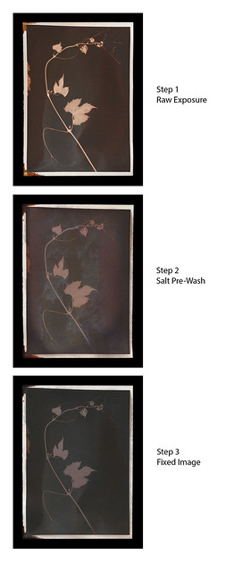
I've been wondering for a while if you can apply chromoskedasic chemistry to alternative process prints. It turns out that, yes, you can. Chromo chemistry will affect salt prints.
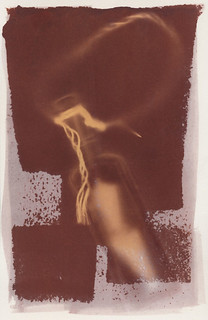
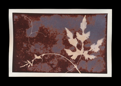
Now, before all you Spiders get excited and scurry off, the chromo chemistry tests are so far not terribly dramatic. The activator (potassium hydroxide) definitely seems to have restored some of the redder tones in the print. I applied activator to the leaves in different ways. Stabilizer, so far, has very little effect. It's buffered fixer. The stabilizer was applied roughly to the negative space of the image.
All these results should be taken with a note: the print I tested on is probably one of the worst examples I could have used. Chromo chemistry works best on un-exposed highlights, and these prints are super solarized photograms. There are no highlights left.
So this weekend I'll be doing a regular salt print to test chromo chemistry on. It'll be interesting to see what happens with that.
Also, I decided to see what happens after sunlight and time are applied to a chromo-salt print. So I have this print soaking in a dilute solution of stabilizer and activator, sitting in a metal foil tray, next to a window. I'll check it for changes tomorrow!
Just an artist talking to spiders about alternative photographic processes, cyanotypes, bones, leather, anthotypes, lumen prints and how to mix them all together. Updates weekly, for the glory of Thor.
Showing posts with label salt prints. Show all posts
Thursday, March 10, 2016
Thursday, March 3, 2016
Blogging for Thor: Developing Developments
![]() |
| Day 7 of Exposure, Unsalted Silver Nitrate Print |
What I've been doing lately is making scans of the prints as they develop. This means not only do I get to track the degredation of the print once it's made, I get to see what's happening as the exposure goes on. Since my exposures are upwards of two days, this works pretty well. I'm expecting this will go faster once there starts being brighter, hotter days again.
Overall, I'm enjoying getting a glimpse at the work from the other side. Normally I only get to see if out of the frame when it's finished exposing. I might lose some detail and registration this way (since I have to take the print out of the frame, remove the photogram object, then reassemble the thing after scanning) but I'm getting a lot more information. The process of development is really more fascinating than the process of print decay.
Tuesday, February 23, 2016
Blogging for Mani: Worth their Salt
It seems like everyone is loving on salt prints lately! In the last few days Christina Z. Anderson and J. Keith Schreiber have posted some very in-depth and interesting material about salt on the Alternative Processes Facebook group. Really, Spiders, that's a great place to be if you're working in alt processes.
Christina Z. Anderson's post (HERE) was about the fancy-schmancy new paper by Hahnemühle: Platinum Rag. It's designed for (duh) platinum printing, but also produces good results for all manner of other processes. Diana Bloomfield used it to do a multi-layer gum print without any additional sizing! That's pretty impressive. Aside from the coolness of this (expensive) new paper, I enjoyed seeing someone else doing the same kind of rigorous testing that I'm doing with chemistry. The difference between gelatinized and non-gelatinzied paper is something I'm also going to end up testing, too.
Keith Schreiber's post (HERE) is more a general thing about salt printing. He talks about how it can have an even longer tonal range than platnium printing, which I didn't actually know. Kinda makes me wonder what the point of platinum is, since everyone always gushes about it's incredible tonal range. Plus, at the end of his post, he links a Salt Printing PDF from a printer working at the Fox Talbot Museum. More fun things to study! I also like that he provides very clear examples of various toning effects. It's nice to see well-documented information. I feel that's a big downside to the book by Christopher James. He gives examples of toned photographs, or variations on a process, but he doesn't provide (often probably can't, since he sources his examples from numerous other artists) side-by-side examples so you can see the difference between Approach A and Approach B. That side-by-side is hugely important to me.
Christina Z. Anderson's post (HERE) was about the fancy-schmancy new paper by Hahnemühle: Platinum Rag. It's designed for (duh) platinum printing, but also produces good results for all manner of other processes. Diana Bloomfield used it to do a multi-layer gum print without any additional sizing! That's pretty impressive. Aside from the coolness of this (expensive) new paper, I enjoyed seeing someone else doing the same kind of rigorous testing that I'm doing with chemistry. The difference between gelatinized and non-gelatinzied paper is something I'm also going to end up testing, too.
Keith Schreiber's post (HERE) is more a general thing about salt printing. He talks about how it can have an even longer tonal range than platnium printing, which I didn't actually know. Kinda makes me wonder what the point of platinum is, since everyone always gushes about it's incredible tonal range. Plus, at the end of his post, he links a Salt Printing PDF from a printer working at the Fox Talbot Museum. More fun things to study! I also like that he provides very clear examples of various toning effects. It's nice to see well-documented information. I feel that's a big downside to the book by Christopher James. He gives examples of toned photographs, or variations on a process, but he doesn't provide (often probably can't, since he sources his examples from numerous other artists) side-by-side examples so you can see the difference between Approach A and Approach B. That side-by-side is hugely important to me.
Labels:
experiments,
salt prints,
shout-out,
Thor
Thursday, February 11, 2016
Blogging for Thor: Deadly, Deadly Chromium!
![]() |
| 6 hour exposure of dichromate test print |
So, I made a small salt print (the normal way, with 3% kosher salt), then added a drop of 5% ammonium dichromate to the top left and a drop of 5% potassium dichromate to the bottom right. In the middle of the print, I sprinkled the cream of tartar. Cream of tartar is chemically potassium bitartrate (KC4H5O6), which is a form of tartaric acid.
Again, my discussions with Johannes suggested that adding tartaric acid to a salt print should produce some variations of color. In the future, I'll test this further by mixing up a tartaric acid solution, probably just cream of tartar in water. Then I'll coat that solution onto a salted paper, in addition to regular sodium chloride.
Just to add some variety, I put a Red Nightshade leaf onto the salted, dichromated and tartarated paper. Then I exposed the paper for about 6 hours in sunlight, from dawn till around noon. Once I'd scanned the image after the first exposure, I let it sit out in sunlight (without the leaf) for another 2 days before I scanned it again. I've continued to leave it unprotected, so I'll be scanning again in a few weeks.After 2 hours, the red color in the dichromate was lovely. Unfortunately, after the two days of sunlight, the dichromate had turned mostly violet, while the silver was the expected green. The cream of tartar had left slightly darker spots, but I'm not sure if that's just because it affected the original 6-hour exposure, or if it chemically created a reaction. Further testing is required!
I also did some tests on Potassium Iodide and Potassium Chloride salt prints. I'll have those results up on Flickr in the near future. They haven't been washed and fixed, yet. That's on the agenda for today, though!
Labels:
experiments,
salt prints,
science,
shout-out,
Thor
Thursday, February 4, 2016
Blogging for Thor: Chemical Crossovers
![]() |
| Potassium Dichromate (K2Cr2O7): a rather nasty but potentially beautiful little chemical |
Serdar informed me that he had previously made images using silver citrate, silver tartarate and silver carbonate instead of a silver halide. Unfortunately, he did not have any scans of these images, but he did say that he found them either too low in d-max, or too high in contrast for negative printing. Here's a list of what he said he used to create the different silver compounds
Silver Citrate = Silver Nitrate + Sodium Citrate
Silver Tartarate = Silver Nitrate + Tartaric Acid (maybe from cream of tartar?)
Silver Carbonate = Silver Nitrate + Sodium Carbonate (soda ash)
Basically, all that means that silver compounds aside from halides can likely be used to print visible images. I'm going to give these a try most definitely, especially since soda ash and cream of tartar are so easy to get. Sodium citrate is available from the university lab, so I'll be giving that a shot as well.
Mark Osterman discussed with me the fixing ability of potassium iodide. Previously, I had fixed several prints in 5.6% potassium iodide, but not noticed any significant difference in the result from the more traditional sodium thiosulfate fixer. If anything, the potassium iodide leaves a warmer tone in the fixed image, but both fixing processes remove a lot of the color from a salt printed image. Mark says that, in theory, a salt print fixed in potassium iodide should turn yellow as the silver is converted to silver iodide. He also recommended that I find a copy of Records of the Dawn of Photography, which is a published version of Talbot's early notebooks. Unfortunately, that book sells for over four hundred dollars and there aren't any circulating copies in my local libraries. I may be able to visit a nearby university (I'm in friggin Boston) and make scans or notes. I'll have to look into that.
The most interesting conversation, though, was with Johannes Schmidt. He told me that he'd run across some literature a bit over a year ago that suggested adding salts of organic acids to the standard sodium chloride and silver nitrate mixture used in salt printing could alter the color of the print. He mixed up solutions of potassium or sodium compounds of acetate, ascorbate, formate, succinate and tartrate. These solutions were applied along with sodium chloride to paper, which was then sensitized with silver nitrate. He also tested the effects of dichromate, iodine and photographic developer on the silvered paper. There are some truly lovely results, especially from the dichromate. In fact, I'm going to borrow some ammonium dichromate from the university and do some tests of my own with applying it to salt prints.
Who knows, maybe I'll give up on this whole "photogram" thing and just create my images through pure chemistry. Chemigrams are popular, right?
Labels:
chemigrams,
chemistry,
experiments,
salt prints,
shout-out,
Thor
Wednesday, February 3, 2016
Blogging for Odin: Orderly Presentation
Well, Spiders, I'm a bit late with today's blog. Six days late, actually. Unfortunately the only excuse I have is that I simply didn't get around to editing all these images and patching them together into a cohesive scan. The beginning of the semester has been a little stressful, and I've been trying to keep it all together. But, I do hope to have an entry for tomorrow, too!
After my experiments with photograms, I decided I needed something more controlled to really do a proper test of these different halide solutions. So, I created a little digital "test sheet"that has a smooth white-to-black gradient, a 15% medium grey bar, and a six-step zone chart that has 100%, 80%, 60%, 40%, 20% and 0% black. Using this test sheet, I can tell if one compound has more contrast, less contrast, exposes faster or slower, and get a much wider range of tonality than by using photograms. I'm also controlling the process further by printing in one of the university's UV exposure boxes, instead of in sunlight.
So far, my results aren't mind-blowing or anything.
The potassium iodide (KI) is really.. ugly. I mean, there's just not anything redeeming about it, especially not once it's been fixed. Maybe it's nice in the "latent" form, just after exposure, but even just a salt water wash makes it muddy and unpleasant. Fixing it just turns it to a dull, rather hideous brown.
Ammonium chloride (NH4Cl) is extremely similar to sodium chloride (NaCl). The only difference I can see, and it's quite subtle, is that the ammonium chloride seems to be a little bit warmer. There are two tests for ammonium chloride because the first test had some pretty hideous staining. The second test, though, was slightly compromised because I waited a full day between exposing it and fixing it. This almost certainly caused some fogging in the paper before the fixing.
Bromo-Iodizer has the most interesting results, providing warm yellow highlights and soft brown shadows. I can certainly see some uses for this coloration, but I'm personally not a huge fan. I do like the long-exposure greens that it produces, but I'm not sure if I like it enough to continue working with the Bromo-Iodizer. It's quite nasty stuff, and I may be able to get similar results by simply using potassium bromide and potassium iodide together, without the presence of alcohol or cadmium.
Assuming that I've recovered from my current head-cold by tomorrow, I'll be giving a test to potassium chloride and potassium bromide, both of which arrived recently. I was able to mix up a 3% solution of both, coat and dry some test sheets, but didn't have time to apply the silver nitrate or do a test exposure. So those salted papers are waiting for me in the lab!
Toss some positive vibes my way, Spiders. I could use 'em for this little plague.
Labels:
chemistry,
experiments,
exposure,
salt prints,
science,
Thor,
updates
Thursday, January 21, 2016
Blogging for Thor: Saline-ent Findings
Sorry for the terrible pun, Spiders, but I'm running out of witty references to salt. This week, it was hard to wait to blog! I was so very excited about the results of my latest experiments. I think this weekend I'll be at the university, making some test prints. I have a hairdryer now! And I'm awaiting the delivery of more chemistry for further testing, too.
Here's what has me all worked up: I successfully printed photograms with non-chloride silver salts. I tested out potassium iodide and Old Workhorse Bromo-Iodizer as catalysts for salt printing, along with a sodium chloride control print and an ammonium chloride side-test. Everything produced a clear, visible image. I'm going to discuss first the basic parameters of the experiment, the controls, and then get into the preparation and results for each halide solution.
Controls: Each of the four prints was made on a sheet of Arches Platine paper, all the same size, all taken from the same full sheet of paper, and all coated at the same time. All four test sheets were first painted with a solution of the chosen halide, then allowed to dry and stored in butcher paper for 3 days while I waited for good printing weather. The night before printing, each paper was given a single coat of 12% silver nitrate, allowed to dry overnight in a dark box. Despite being in a dark box, the drying time was too long. Each test sheet showed discoloration when the box was opened. I will repeat these tests with fresh-dried sheets soon.
Bromo-Iodizer Solution: I used the Bostick & Sullivan Old Workhorse Bromo-Iodizer directly out of the bottle, with no changes to the solution. The solution is easy to coat, and has a strong yellow color that makes it easy to tell where your paper has been coated. It smells strongly of alcohol and should be used only in well-ventilated areas. The bottle should be capped immediately after the solution is extracted.
Potassium Iodide Solution: This chemical comes as a transparent/white crystal solid. I mixed 6 grams of the crystals into 200ml of water to make a 3% solution. I didn't use nearly so much, but I didn't have a small enough mixing container to measure less than 200ml water with accuracy.
Ammonium Chloride Solution: This is a shiny white powder that does not readily dissolve in water. It required a lot of stirring, and left a film of bubbles and fragments floating in the solution. Again, I mixed the same 6 grams of solid to 200ml of water, resulting in a 3% solution.
Sodium Chloride Solution: For sodium chloride, the control solution, I used Morton Kosher Salt. As with the other two dry chemicals, I mixed 6 grams of solid to 200ml of water, resulting in a 3% solution. This is a medium-strength salt solution by standard salt printing guidelines.
The prints were made in windows at my apartment, on a clear, sunny day. I exposed all four prints for 2 hours before pulling them and scanning the resulting images. None of them have been fixed, though I may do a potassium iodide fixing test just to see what happens.
So, my final thoughts? I'm very excited to have proven to myself that silver chloride is not the only halide that can be used in salt printing. The potassium iodide image is considerably blander than I had hoped for, but the strange jade color of the bromo-iodizer image gives me hope for future tests. I still haven't tested potassium bromide by itself, or tested non-potassium forms of bromide and iodide. I know from previous experience that potassium chloride isn't the best form of chloride to use, so maybe potassium bromide and potassium iodide aren't the best forms of those halides, either. I'm going to look into obtaining other solutions of bromide and iodide, maybe even some alternate forms of chloride. The ammonium chloride is similar enough to sodium chloride, but I've yet to test pure potassium chloride to see the result. I've only ever used it in a "lite salt" mixture: 50% sodium chloride and 50% potassium chloride.
There's just so much more to do, Spiders!
Here's what has me all worked up: I successfully printed photograms with non-chloride silver salts. I tested out potassium iodide and Old Workhorse Bromo-Iodizer as catalysts for salt printing, along with a sodium chloride control print and an ammonium chloride side-test. Everything produced a clear, visible image. I'm going to discuss first the basic parameters of the experiment, the controls, and then get into the preparation and results for each halide solution.
![]() |
| Test sheets prior to exposure. All but one show significant fogging. |
Bromo-Iodizer Solution: I used the Bostick & Sullivan Old Workhorse Bromo-Iodizer directly out of the bottle, with no changes to the solution. The solution is easy to coat, and has a strong yellow color that makes it easy to tell where your paper has been coated. It smells strongly of alcohol and should be used only in well-ventilated areas. The bottle should be capped immediately after the solution is extracted.
Potassium Iodide Solution: This chemical comes as a transparent/white crystal solid. I mixed 6 grams of the crystals into 200ml of water to make a 3% solution. I didn't use nearly so much, but I didn't have a small enough mixing container to measure less than 200ml water with accuracy.
Ammonium Chloride Solution: This is a shiny white powder that does not readily dissolve in water. It required a lot of stirring, and left a film of bubbles and fragments floating in the solution. Again, I mixed the same 6 grams of solid to 200ml of water, resulting in a 3% solution.
The prints were made in windows at my apartment, on a clear, sunny day. I exposed all four prints for 2 hours before pulling them and scanning the resulting images. None of them have been fixed, though I may do a potassium iodide fixing test just to see what happens.
So, my final thoughts? I'm very excited to have proven to myself that silver chloride is not the only halide that can be used in salt printing. The potassium iodide image is considerably blander than I had hoped for, but the strange jade color of the bromo-iodizer image gives me hope for future tests. I still haven't tested potassium bromide by itself, or tested non-potassium forms of bromide and iodide. I know from previous experience that potassium chloride isn't the best form of chloride to use, so maybe potassium bromide and potassium iodide aren't the best forms of those halides, either. I'm going to look into obtaining other solutions of bromide and iodide, maybe even some alternate forms of chloride. The ammonium chloride is similar enough to sodium chloride, but I've yet to test pure potassium chloride to see the result. I've only ever used it in a "lite salt" mixture: 50% sodium chloride and 50% potassium chloride.
There's just so much more to do, Spiders!
Labels:
chemistry,
experiments,
exposure,
ideas,
salt prints,
Thor,
triumph
Saturday, June 27, 2015
Blogging for the Baron: Slipped Discs and Salty Duds
Hi there, Spiders. I wish I didn't have a good excuse for missing this week's Thursday update, but I do. Somehow I managed to slip a disc in my lower spine while getting out of my friend's SUV. Normal, every day activity and my spine just decided that it wasn't up to it. So I spent Thursday night and Friday morning in increasing amounts of pain. Then I went to the doctor (thanks Obama!!) and found that instead of a pulled muscle, a particularly persistent cramp or anything else reasonable.. I had torn a disc in my spine and some of the jelly inside had leaked out and was messing everything up. That's not terrifying at all.
Despite all that mess, I did manage to get to my workshop today. Photogenic Drawing at the Light Factory! I had six students, which was a great number. We covered chlorophyll printing, cyanotypes and lumen prints in detail. We briefly went over the theory of anthotypes, but didn't have time to make an exposure since they take several days. I had planned to include salt prints, and I sorta did... but the paper I used wasn't the right kind of cheap watercolor paper. The silver nitrate solution soaked right into the paper, leaving a blotchy, streaky mess. None of the prints came out, not even a little. It really sucked. But the other three-and-a-half processes were a big hit!
Anyway, today when we printed with the brown ferric ammonium citrate, all our cyanotypes came out with a strong sepia tinge to the highlights and with duller, more greyish-green blues. They basically look warm-tone or very "antiqued." Almost what you might expect from a tea toning. It's quite odd, but not unattractive. They still had full detail, highlights and shadows.
So now I have an absolute bucket full of drugs to take. Anti-inflammatories, muscle relaxants, steroids, two types of high-powered painkillers. It's pretty lame, actually. At least so far nothing actually knocks me right out... but then I haven't tried the Valium yet. Today, thankfully, was an improvement. If I'm sitting, standing, or walking... I'm mostly fine. It's just when I try to lean over, or move between positions that my back reminds me that it is most certainly not fine.
![]() |
| My students coating papers |
There was another, smaller issue with the cyanotypes. I've been using very old and brown ferric ammonium citrate for months now. I got a large jug of it when the Light Factory moved from their old location to their new one, and I never turn down free photo chemistry! Since getting it, I've mostly been using it for parchment prints, where color and detail get a bit muddled anyway. Originally, though, I did some tests to be sure the brown ferric ammonium citrate would work. It seemed to work fine on those tests, some months ago. I can't find them now, but I distinctly recall doing them....
![]() |
| Left: Green FAC. Right: Brown FAC. |
Later in the class, I mixed up some green ferric ammonium citrate and the prints from that came out great. Pure whites, navy blues, all normal results. So it does appear that either the brown ferric ammonium citrate has always produced those warm tones, or something has happened to it in the last several months. I'm not sure which.
At least I know about it now, and I can take advantage of the difference. The warm-tone cyanotypes are quite pretty, so I'll be trying those out with some negatives. I might even have to start making new negatives! It even worked out really nicely with just photograms. The yarrow photograms pictured above came out great on the warm chemistry. I really love the look of yarrow sprigs, too. I'm going to have to see if I can get ahold of some myself. The yarrow my student had started wilting pretty fast in the heat, and by the time I got it home, it had curled up on itself. Big bummer. I'm going to try putting it in water and coaxing it back to life!
My students today had great success using digital transparency positives for chlorophyll printing. One of them brought in some historical photographs of faces and some scanned nature etchings from old books. They printed really well! I'm going to have to consider what kind of images I might work with, since I haven't been shooting a lot of actual photographs over the past several years. Still, it's pretty cool stuff.
Overall, today was very productive. I had a great time, and I'm feeling really inspired to start some new experiments. I hope my students from the workshop feel the same way!
Labels:
anthotype,
chemistry,
chlorophyll print,
cyanotype,
failures,
lumen prints,
salt prints,
teaching,
Thor,
triumph
Thursday, August 7, 2014
Blogging for Thor: The Life and Times of Salt
![]() |
| Sensitized salt paper 24 hours after coating |
Wrong.
Even waiting a full day after applying the silver nitrate was too long. I opened the door of the cabinet where I was storing the paper and found this.
![]() |
| Print on fogged salt paper |
So, from now on, I'll have to dry the silver-coated paper fairly quickly and try to use it the same day. Or at least coat during the evening (as I do now) and use it the very next morning. I might even try using a hairdryer to accelerate the process so I can coat and print within an hour or two. It's just a bit of a bummer that I can't store the paper. Anthotype paper keeps basically forever if it's out of sunlight. Cyanotype paper keeps for a few days before it begins to fog too much. Salt prints, though, just won't keep for more than a few hours. Bummer.
Lesson learned, y'all!
Labels:
experiments,
exposure,
failures,
salt prints,
Thor
Friday, July 25, 2014
Blogging for Freya: Salting Spiders, Part 2
![]() |
| Print made with lite salt |
Set-up
You can do this process almost anywhere, but you're going to need a flat area to work. If it's an area you care about, first cover it in a plastic tablecloth or protective sheeting. The plastic prevents the nitrate from soaking through a towel and getting on anything important. However, the nirate can slide around on plastic, so to be extra super careful you could put towels or a cloth down on your plastic.
Make sure you have your gloves (to avoid black spots on your nails and hands) and your protective glasses (to avoid eye damage) in place. You don't need to actually put them on until you take out the silver nitrate. I don't 'suit up' until I'm ready for the silver nitrate coating, because the gloves make my fingers clumsy. I always wear my glasses, because without them, I can't see. I have little plastic additions to my glasses that clip on to provide extra eye protection. Goggles just fog up on me and hurt my face. Whatever method you use to protect your eyes is up to you, but it is kinda important.
And that's it, you're ready to go. Protect the area, protect yourself, and get ready for some printing!
![]() |
| Print on Lokta Fiber Paper |
Select your paper. As with most alternative processes, you want a high-quality printmaking or watercolor paper. I've had great luck with Arches Aquarelle and Rives BFK. Others have recommended Crane Kid Finish, Bienfang or pretty much any cotton rag paper. If it works for cyanotypes, anthotypes, van dykes or other alternative processes, it's probably great for salt prints.
Personally, I prefer smooth surfaces with just a bit of tooth. Too much texture in the paper and it starts removing detail from your print. Too smooth a surface just looks bland to me. I like a nice medium. Hot press papers are generally great for this.
You generally don't need to size your paper, but a simple gelatin sizing may be helpful if you are experiencing significantly less contrast than you expect or desire. To do a gelatin sizing, simply mix up unflavored gelatin (Knox seems the most common brand around here) in hot water and soak the paper in it. Allow to dry completely, then proceed to the next step.
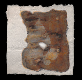
Small note: handmade papers or exotic papers may be too absorbent to use for this process without sizing. I attempted to use some Nepalese lokta fiber paper and it's basically just a rag made of cellulose. I wasn't able to spread the silver nitrate at all and ended up using way too much of the chemical because it had to absolutely saturate the paper. If I experiment again with this paper, I'll be using sizing. I had similar issues with cyanotypes and anthotypes on hand-made paper using dryer lint and shredded recyclables.
![]() |
| Print made with sea water |
You'll need to make some salt water. The amount of salt in the water is entirely up to your discretion. It's perfectly viable to use seawater. Normally I add about 2 teaspoons of salt to a liter of water. Less than a 2% salt solution doesn't give very much of an image at all. That's basically the minimum required. I have been told that the more salt you add, the more contrast you'll see in the final image. I have not seen a significant difference myself.
You can use chemical grade sodium chloride (additive-free salt) and distilled water. There's no need to use pure chemistry, though. I don't use distilled water. I generally use tap water that I know is absolutely not pure. The pH is on the basic side, it's hard water with a lot of calcium and iron. It works fine. Sea water works fine too and who knows what's wrong with that stuff. Rainwater is fine. The type of water you use, as long as it's not actually contaminated with heavy metals or something, won't produce a big difference in your prints. Minor differences, sure, but not huge ones.
The type of salt you use will dramatically affect your prints. I like using "lite" salt. That's a mixture of 50% sodium chloride and 50% potassium chloride. The important part of the salt is chloride, since you're using it to convert the silver nitrate to silver chloride. Silver chloride is far more reactive to light and produces a much stronger image than silver nitrate. How you get the chloride in your paper isn't important to the light-sensitivity, but it is important to the color. I haven't experimented with ammonium chloride, but I know it can also be used for salt prints.
Lite salt produces violet images that, when fixed, turn pale yellow. I have not bothered tracking down any pure potassium chloride to test what it does, but I imagine it has a slightly different effect. My kosher salt images are red to brown before fixing and turn brown or black after being fixed. Prints made with sea water from the Florida coast have produces a nice middle ground
![]() |
| Print made with both lite and kosher salt |
The basic step here is to mix up your salt water and then soak your paper in it. As a faster alternative, you can simply paint the salt water onto the paper with a brush. Either way is fine!
Silver Nitrate
It's time to put on that protective gear! Get your gloves and glasses firmly in place. Once your salted paper is bone dry, paint on your silver nitrate. Do this in low light to avoid fogging the paper or the jar of silver nitrate. I know it's in amber glass, but better safe than sorry. When not in use, the glass of nitrate should be stored in a dry, dark place. I work at night, with a dim lamp or computer monitor as my light source.
Use an eyedropper, pipette or other method to drag a thin line of the 15% silver nitrate liquid across the top of your sheet of paper. Then you can spread it out into an even coating using a foam brush, hake brush, glass puddle pusher or even just a regular flat paint brush.
Getting an even coating can be tricky, because until it exposes, the silver nitrate solution is clear. It can be very difficult to see if you've left any streaks, brushmarks or spots behind. I recommend simply doing two or three light, even coats across the entire surface going in different directions. If you want an especially dark image, you can apply two heavy coats of silver.
Exposure
As with most of my guides, I simply suggest using a picture frame to expose your prints. It's cheap and easy to obtain. Head to your local art supply store, or even the local Target, and grab some inexpensive picture frames that have a hard back. Don't get the really cheap ones with the hinged cardboard back, they're just not sturdy enough to provide good contact between your negative (or object) and the coated paper. I'm going to go into extreme detail on different methods of exposure in a future post.
Since the salt printing process is a "printing out process", it develops while it exposes. You can test exposure simply by looking at a portion of the exposed silver that isn't covered by your negative or objects. When it reaches a density you're happy with (generally dark rusty red or brown), you're done!
Fixing
Now, it is possible to simply treat a salt print like a lumen print and avoid fixing it. However, that isn't traditional and the salt print is a very traditional process. It's also a lot more tactile than the lumen print, so I do generally fix my salt prints. An unfixed salt print, like most unfixed prints, will continue to darken and expose in even standard interior lighting.
To fix a salt print, you can mix your own fixer (difficult and annoying) or use standard photo fixer. Guess which approach I favor? That's right, the standard photo fixer. I use Sprint Rapid Fixer, because that's what I can borrow from the university. It's also what I've used for my entire photographic career. I dilute it heavily, about 20ml of concentrate to a liter of water, meaning it's at 20% of the regular working strength. You do not want stronger fix; it will bleach your prints. Even using the weakened fixer, only fix for 1-2 minutes at most. That's more than enough to fix the image. Again, over-fixing will bleach your prints.
Spiders, you should be aware that fixing a salt print does cause a potentially dramatic color shift. I mentioned earlier that the violet images produced by "lite" salt will fix to a pale yellow. The ruddy reds of kosher or regular salt will fix to a duller, darker red or (with high levels of silver) to an almost black brown. I generally prefer the pre-fix image, but not always. So I scan both before and after fixing.
That's all I've got, Spiders. Between this post and the last one, you should be ready to sally forth and print as long as you've got sun, salt and silver!
Labels:
papers,
salt prints,
teaching,
Teaching Spiders,
Thor,
tutorial
Thursday, July 17, 2014
Blogging for Thor: Teaching Spiders about Salt
![]() |
| Salt print made during a demo with tap water and fast-food salt packets. It doesn't get any less exacting than this. |
Salt prints aren't complicated. They're also not very dangerous. You can purchase the silver nitrate required in a pre-mixed low-concentration solution. I bought my 15% silver nitrate from Bostick & Sullivan. Here's the link to the specific product I used. 100ml should last a fairly long time, since you only need a single eyedropper full to coat a 5x7 sheet of paper. Each eyedropper is maybe 1ml.
By avoiding powdered silver nitrate, you significant reduce the risks of the chemical. In its dilute, liquid form, it won't burn your skin or get into your respiratory system. It can still cause some nasty harm if it gets in your eyes, but wearing glasses or goggles will protect you. At worst, it will cause stains on counters, skin and anything else organic (including plastics... like plexiglass and acrylic). So what safety gear do you need? Gloves and glasses. The most basic of chemical safety practices will be entirely sufficient.
I am assuming that you use 15% liquid silver nitrate solution. I won't give any details about how to mix the solution yourself, because I never do that. I don't like caustic chemical dust in my house.
Now, onto the actual process! Here's the short, simple version first.
Basic Materials
- Salt (approx. 10-100 grams)
- Water (approx. 1 liter)
- Brushes (foam, hake or flats) or a Puddle Pusher
- Soaking basin or tray
- Jug or glass to mix salt water in
- 15% silver nitrate solution
- Eyedropper
- Rubber gloves
- Protective eye goggles or glasses
- High-quality watercolor or printmaking/drawing paper
- Picture frame or alternate exposure method
- Negatives or photogram objects
- OPTIONAL: Hair dryer
- OPTIONAL: Photographic Paper Fixer (diluted to 25% regular working strength)
Simplified Step-by-Step Instructions
- Gather your materials and set up!
- Mix up a 1-5% solution of salt water.
- Soak your paper in the salt water for at least 10 minutes.
- Dry completely!
- Use the eyedropper to apply a line of silver nitrate across the top of the salted paper.
- Spread the silver nitrate into a thin, even coat with a foam brush.
- Dry Completely!
- Place a negative or photogram object on the coated paper.
- Cover the paper and your negative/object with glass. Real glass, not plexiglass.
- Place in the sun for ~10-20 minutes.
- VERY OPTIONAL: Rinse the print in a salt water bath for 5 minutes to remove extra silver.
- OPTIONAL: Fix the print in regular photo fixer (diluted to 25% strength) for 1 minute.
That's it. That's the entire process! Well... basically. I can, and will, go into a bit more detail. Actually, a lot more detail, my arachnodroid friends. The rest of the write-up is already over 1000 words long and it's still not done. So that's going to be broken off into a second entry. Stay tuned, spiders!
Labels:
alternative processes,
salt prints,
teaching,
Teaching Spiders,
Thor,
tutorial
Monday, June 30, 2014
Blogging for the Moon: Lunar Caustic
![]() |
| Unfixed Salt Print on Fotokemika Varycon |
Well, as I've been forced to hear repeatedly in recent days, all you can do once you've made a mistake is learn from it and move on, trying your best not to repeat the mistake. I know that I'll be late to blog again, but I'm really trying to get better. I might even try to write my blogs early and schedule them to automatically post on Thursdays. That'd be pretty novel!
Let's skip that stuff and get to what you actually care about, right? Spiders care nothing for human trials, but love some photography. Or something. Today's topic is one of my recent experiments: salted lumen prints. I was lead to this idea by John Fobes, who coated one of his lumen prints in albumen mixed with ammonium chloride. Mr. Fobes got some very interesting color shifts as a result of printing on the still-wet albumen-coated paper, but it got me wondering if it would be possible to use silver gelatin paper as a base for salt prints to combine the salt print with a lumen print.
I soaked two sheets of Fotokemika Varycon fiber-base paper in a simple solution of filtered tap water and kosher salt, the same kind of solution I'd use to soak normal paper before making a salt print. I used quite a lot of salt, getting the water up to the saturation point. Then, I allowed both sheets to dry completely overnight before coating one sheet in the same 15% silver nitrate solution used for salt prints. I allowed that sheet to dry for several hours as well, then exposed them both as I would normal lumens, for 1 hour each.
Overall, I did not see a big difference between a salt-soaked lumen print and a regular lumen print, at least not on the Fotokemika Varycon paper. They look about the same, the only significant difference being that the salted print had less color and was overall less vibrant. I'll be testing other brands of paper to see if I can achieve different results. I think Mr. Fobes' use of albumen also contributed to the color shifts he saw, not just the application of chloride.
Using the silver gelatin paper as a base for a salt print proved effective. The paper doesn't take coating as evenly as something more porous would, but I think that can be solved with multiple coats of silver nitrate, or just more careful application. The image looks very similar to a traditional salt print, but carries strong undertones of the paper color. The unfixed image carries much more of these tones, but that's because fixing destroys most of the color in Varycon paper. I plan to experiment with a more vibrantly colored paper, maybe Collodio POP or Harman Direct Positive, but the concept proved itself. You can make a salt print on silver gelatin paper, and doing so does affect the final image.
Labels:
experiments,
exposition,
failures,
lumen prints,
papers,
salt prints,
Thor
Subscribe to:
Posts (Atom)