Saturday, December 28, 2013

Blogging for the Baron: Slated For Next Week!

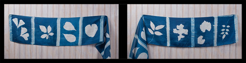
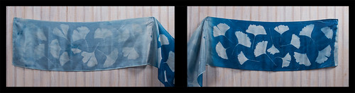
Yeah, I took a bit of a break this week on account of Christmas. I've done virtually nothing photographic for several days, aside from teach my sister how to use her new Nikon D3000. That meant when Thursday rolled around, I had nothing to blog about. Honestly, even if I had, I was wiped out from Christmas anyway and wouldn't have gotten anything up. Friday, I cleaned up my studio and organized my collection of lumen papers and anthotype dyes. My parents gave me an awesome new collection of the cutest little tiny Mason Jars to keep dyes in. I'll have to take a day or so soon to label everything and transfer the really low-volume dyes (indigo, woad, spirulina, etc) to the tiny jars.

Anyway, all that. I still haven't made any new lumens or anthotypes. So, today, I'm dedicating my blog to Baron Samedi and hoping he doesn't decide it'd be funny for me to get run over by a car or something. We cool, Baron? Hope so. I don't have any tobacco or rum (I have bourbon?) to offer him, but I've got some nasty pennies laying around.

What's the blog going to be about today? Actually, it's going to be about ideas. Cheap ones. Now, see, when I do actual photography-with-a-camera it's generally small object photography. Taking pictures of things I've made or found, mostly. Having a small studio space means I don't get too complex. I don't own a seamless. I make my backgrounds out of alternative resources. Today seems like a good day to talk about those.

Tiny felt turtle on a silk shirt
Old shirts and pants make great backgrounds. I have about six pairs of jeans and dozens of shirts, especially shirts from my mother and sister that they don't wear anymore. If you don't have any handy fabric-loving family members, there's always thrift stores. Silk shirts are especially nice, since the back of the shirt provides a large, solid area to work with. They come in lots of colors and after being worn and cleaned several times, they tend to lose that ludicrously-shiny appearance that new silk can have.

Black velvet makes a great background because of the way velvet absorbs light. It throws back very little shine, even under intense light. This is great for jewelry or anything else bright and shiny, where you want the background to absolutely disappear. I imagine white velvet would work great, too, but I've never tried it. Velvet is kinda expensive, though. My solution? A thrift store in Atlanta back when I was visiting for SPESE. I grabbed a velvet slip, sliced it in half and now have about a square yard (it was a really small slip) of black velvet that cost me $2. Velvet at the fabric store can run upwards of $10/yard. Since I do mostly small objects, a square yard is more than enough for me, most of the time.

Tiny felt Totoro on Polyfill
When I want a white background, I generally use a sheet of high-quality drawing paper like Stonehenge or Rives BFK. These papers are extremely matte and, like the velvet, throw back almost no shine or glare. They fold and bend easily, but won't ever ripple or drape like fabric. For a no-horizon seamless sweep, these nice papers are great. Plus you can roll them or store them in a sleeve. They're great! Very durable, too, and if they get dirty you can generally clean them with a decent-quality eraser.

I've also found that white polyfill (fluffy stuff used to fill stuffed animals or fluffy blankets) is a great background and spacer material. You can light it from behind or underneath to get a real 'glowing cloud' effect. Plus it's very posable and supportive for light objects like jewelry and small textile crafts.

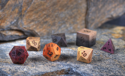
ArtisanDice polyhedrals on natural slate
The title of this post, though, comes from one of my favorite backgrounds: slate. It's a great rock and it's very cheap. There's a little food mart / home store around here (Hillbilly Produce) that sells landscaping slate and I buy natural stones there for a few cents a pound. Generally I buy rocks maybe 1-2 feet in any direction, 1-2 inches thick. They have great texture and colors. Very subdued, but nice variations of blues, greys, browns, reds and oranges. If I want something flatter and maybe brighter colored, home improvement stores like Home Depot sell slate flagstone tiles for about $7 per pack of five square foot tiles. Or you can buy them individually if you just need one or two. Not only are the tiles great by themselves, they're great for using to 'extend' the natural rocks. You can put the tiles in the background and they blend in perfectly with the more textured stones, especially if you use a low depth of field. I like using slate when I want a more visually interesting background that will be complementary to my subject, but not detract. It's also great for wood, since it provides a nice contrast. It can be used to give things a vintage, rustic feel as well.

That's all for today folks! I might be back soon with an unscheduled entry, to make up for today's rambling craziness and the lack of holiday on-time-ness. But maybe not! With Grad School Applications looming, who knows?!

Friday, December 20, 2013

Blogging for Freya: Life's Hard

Hello, my lovely little spiders. This is the latest I've ever been with a weekly blog and it's because I'm a big fat sack of sad. I tried to be a Real Adult and got my hopes and dreams promptly smashed by artist statements, online portfolios, pay stubs, W-2 forms, calculators and words like "references", "application fee", "copay" and "deductible." It was all very harrowing, and I retaliated against the world's cruelty by reading internet comics for 48 hours and trying not to try. Then I made cookies, did art and kicked myself in the balls until I felt better. Or at least until I was able to convince myself I felt better. I think Allie Brosch summed it up really well.

Anyway, that's over. I've been finding it harder and harder to get myself to experiment and actually do art, which makes it harder and harder to write this blog since I have nothing exciting and amazing to report. Part of that is the weather and the season. I work with plants and there aren't a lot of plants around in the winter. A few, yes, but not many. The sunlight is also duller, the days colder and typically cloudier. Exposures take a lot longer, and since it gets dark earlier, I have less time to do them anyway. It's just a bad season for my chosen type of work.

Now, all that said, I have been doing some experiments. Slowly, painfully, but they're happening. For my Birthday (woo?) I was given two packs of very cool lumen paper. Harman Direct Positive paper and some Ilford Warmtone RC.  I'd been wanting to try another warm-tone paper for a while. They tend to have really cool effects when fixed, as opposed to neutral-tone papers that generally have very disappointing effects when fixed.

I may also save some of the Ilford Warmtone and try chromoskedasic sabatier once I get back into the university darkroom in January. This is a really fun process that makes for some awesome chemigrams, or can be combined wit regular contact printing! I discovered that process in a workshop with Angela Wells, from ECU, back at SPESE '13. It was very fun, but it DOES need a darkroom and certainly isn't as home-friendly as my favored processes are. Still, pretty cool stuff!

Tonight, I wanted to talk about the Harman Direct Positive paper. It's pink, y'all. Totally pink. Bright, Barbie-and-Bubblegum pink. Straight out of the box, it's instantly pink. I have no idea if, like color photo paper, it turns instantly upon exposure to light, or if it's actually supposed to be pink and that goes away when you develop it? No idea! It's pink. It's also really sloooow. We are talking 2-3 day exposures for a lumen print. That's insane. Seriously insane. I left a sheet out for two cloudy days and saw no change at all. It took a third full day of bright sun to change the paper. Today I left another sheet out and after five hours of bright, sunny weather, no change. It's the slowest lumen paper I've ever heard of at all. I contacted another experienced lumen printer about it and he agreed. He went so far as to say he didn't consider the paper useful for lumens at all. I'm not sure I agree yet. I hope I don't, since that was expensive paper and now that it's exposed to light, lumens are all it's good for....unless I try chromoskedasic sabatier on it? HUH. Might do.

When the Direct Positive paper finally does start changing, it isn't that dramatic. The bubblegum-pink shades into Barney-purple and finally into a dull blue. Moisture seems to cause it to bleach back to white, which may be interesting when spring rolls around and there are fresh plants to use again. I'll probably put further Direct Positive experiments on hold until spring, honestly. See what it does with better light, heat and subject matters.

That's all for now folks! Hopefully I can get moving on all the many things I have to do before January 15th and make some of my dreams come true. Oh, crippling fear of change, you're so crippling.

Thursday, December 12, 2013

Blogging for Thor: Sighs and Size

First off, two hurrays. One, I turned 27 yesterday and that's pretty cool. I haven't managed to drop dead or poison myself with photo-chemistry, yet. Two, I'm actually posting this blog on Thursday instead of Friday. I'm sure Thor is very pleased with me. He must be, since the last few days have had tons of sunlight. It's just been great. Cold as balls, but great.

I had an unscheduled post earlier this week about my Cyanotype Totes project and how that was going. I also talked a lot about functional art vs non-functional art, selling art and other things. It was pretty fun. For today's post, I'm really just planning to talk about the results of the second half of that functional art experiment: my silk scarves. We'll see how much I stick to the plan.

Let's get this out of the way, shall we my spiders? I do not feel any of the cyanotype scarves are successful enough to sell. All of them are defective in one way or another. Only one of them is even partially acceptable. This was my first time dealing with cyanotype chemistry on large textiles and I learned a few things. I've mentioned them in passing in earlier posts about this project, but I'll recap briefly here.


First Problem: I did not dry them correctly, resulting in moisture gathering across a crease near the center of each scarf. The moisture prevented the chemistry from setting correctly, creating a white line down the middle of all four scarves. There is no way I know to fix this after the fact, so I had to just deal with it. In the two long scarves, I was able to hide this flaw. It still bothers me.

Second Problem: I was not prepared to deal with the size of the scarves. I don't have glass big enough to cover them or backing large enough to handle them. This meant I was either forced to go glass-less, as on the two squares, or expose in sections as on the two long scarves. Without glass, my images are low-contrast and blurry. Exposing in sections results in uneven tonality and exposure, and makes it easy to accidentally reverse one section. That happened both times.

Third Problem: Silk isn't easy to document. It's extremely reflective and so bright that individual threads tend to show up clearly, making the fabric look gritty or coarse instead of smooth and, uh, silky. I got some better results with later shots, but anything close up isn't too thrilling. It's also just bloody hard to shoot scarves. They're big and hanging them up flat is hard because they want to shift and move around. They don't even look that good hung up flat, and they isn't how they're meant to be seen or used. I wish I had a mannequin or dressmaker's dummy to model them, but I don't. I may be able to get a friend to model them at some point, though.


Generally, I'm just not happy with the scarf experiment. It was a lot of work, trouble and materials for results that I'm not a fan of. I might try again later; I do have some ideas on how I could deal with the difficulties I encountered. Drying them properly isn't that hard, ironing them properly is something I can learn. I've talked to some folks that do fabric cyanotypes regularly and gotten a good bit of advice. You can use spray adhesive or silkscreener's adhesive to keep the fabric flat and in place while laying out your negatives/objects. You can buy a cheap glass door from the home improvement store to use for your frame. Cool stuff like that. It's just that the more extra items you need and the larger everything gets, the more I think cyanotype scarves may not be that great. I haven't even tried selling any yet; I have no idea if there will be any demand. Maybe if my totes go over well, I'll try scarves again.

One idea I'd like to play with is applying the cyanotype chemistry to only areas of the scarf instead of across the entire surface. I could dye the scarf before applying the chemistry, then put several images on the scarf in different locations. Each different image can be exposed and developed on its own, even sequentially. That'd take a lot more time because of having to go through the whole process of applying chemistry, let it dry, exposing it and then developing it, all for each individual image. The final result might be really cool though, since I can use different dye techniques on the scarf before the chemistry is applied and get really fun backgrounds.

If you want to view all my current photos of the scarves, check this Flickr Gallery. There are detailed comments about each scarf on Flickr.

Friday, December 6, 2013

Blogging for Thor: Really, Thor? Clouds?

I would say that I intentionally delayed today's post to spite Thor because he ruined my plans. But, no, I didn't because it's not wise to spite lightning-tossing steroid-abusers and because actually, I just fell asleep about 9 PM and woke up just now at 3 AM. Hurray...

Seriously, Thor did ruin my plans. I had hoped to finish up a project today and get it documented, but that didn't work. As part of my Christmas gifts this year, I purchased some unfinished tote bags and silk scarves from Dharma Trading. Ten totes (they sent 12 for some reason, but I'm not complaining), two 22x22 square scarves and two 8x54 standard scarves. I've coated all of them with cyanotype chemistry and been working on creating gifts by exposing photograms onto the scarves and totes. That requires sunlight, Thor! And lately, nothing but clouds. Today was a horrible, dark, grey day of drizzle and wet. I couldn't even do long exposures or document the ones I finished on Wednesday. I'll just have to hope that Freya is in a better mood and her day will be clearer.

Toned cyanotype scarf.
Note the pale crease down the center.
I've already learned some valuable lessons about making cyanotype textiles. The scarves, for example, are all defective. I dyed them in the active chemistry solution, but when I hung them to dry, I hung them over plastic hangers or a line of acrylic rope I strung up in a closet. Since those substances are non-absorbent, the extra chemistry gathered on top of the hangers and left a moisture-rich line across the scarves. There's a crease on each scarf where it rested on the hanger, and when developed that line leaves a pale streak across the scarf. I'm having to pull some stunts to make it less visible in the final result. Next time I'll use safety pins to hang the scarves to dry without having anything touch them. I don't have an area large enough to let them dry flat in the dark.

There has been another issue with the scarves: size. They're big and I am not really set up to deal with exposures much larger than 8x10. Even 11x14 is difficult, since I typically document my images by scanning and my scanner doesn't handle 11x14 paper. I don't have any sheets of glass 22x22 or larger, and I really don't have much in the way of backing board that size, either. That makes it rather difficult to get good contact between the scarves and the objects used for photograms, since I can't put pressure to keep them flush. In the second scarf (I've only done one square and one traditional, so far) I tried to solve this problem by exposing it in sections. I marked off small rectangles with blue painter's tape, and used black bags to protect unexposed sections of the scarf during exposure. This way I was able to expose 1-2 rectangles of scarf at a time, using much smaller glass. The finished scarf has a film-strip appearance of individual 'frames' of small groups of leaves. I was also able to cover up the moisture-crease in the scarf under one of the tape lines. I'll be doing the same for the second rectangular scarf. The second square scarf... presents a challenge that I have not yet worked out a solution for. I'm still kicking myself about a stupid mistake on the first film-strip scarf: I accidentally put leaves in the last frame upside down. Arrgh.
First tote. Blobby failure.

My experiments with the totes have been much more successful.
I've had two failures, both due to issues unrelated to the coating and development. The first tote I tried worked fine as far as coating, exposure, development and drying went. The problem is the plant I made a photogram of, sea oats, was blobby and the poor contact between the plant and the tote resulted in an indistinct, blurry mess of an image. Sad, but not the result of a flawed procedure. The second failure was simply because the glass I used to press the leaves down on the tote slid off and shattered, letting the leaves blow away. The result was a pure blue tote with no image left behind at all. That's what happens when your photogram object blows away during the exposure. All the rest have come out pretty much as expected.

Having fun with a failed tote
I've had some issues with staining, but I think this is due to the totes being rather difficult to wash in my regular-sized sink. If I had proper darkroom sink, or was working outside with a hose and a tray, I think these problems wouldn't be an issue. They've been fairly minor anyway. I have two totes left to expose, and I don't anticipate any issues. That should give me a final count of ten finished, good-quality totes. Since that's how many I ordered in the first place, I'm pretty pleased. The two extra totes that ended up in the order somehow have served an excellent purpose by absorbing the failure rate of the process.

Documenting textiles presents its own set of challenges, which I'll discuss once the project finishes. If you want to see the results of this project as I post them, you silly spiders you, check out my Flickr gallery: Crafts. Ignore the metalwork and felt projects, I guess. Photographing them was pretty fun, though.