Saturday, May 11, 2013

The Sun Will Come Out Tomorrow!

I think I mentioned recently that my long hiatus was due to a bunch of stuff. First, late fall and winter are terrible times to do anthotypes or lumen prints and I haven't been working on much illustration lately. I've got some ideas there, mostly inspired by some great bands, but currently still straightening those ideas out in my brain. I hope to be deep into an illustration project sometime in the next month, though.

Anyway. I also had my largest set of students this spring semester, so I was adjusting to that. But now it's summer and while I've got some camps and workshops to keep me teaching, I have a lot more free time (and light!) to experiment with. So, I figure I'll bring y'all (no one reads this blog, I'm talking to myself) up to date on what I've been working on.

Stumps!: Over the winter, my Dad had to get rid of a tree in his front yard and after cutting it down, discovered it was a cedar tree. In case you don't know, cedar trees have a rusty red, almost purple, heartwood and pale, tan sapwood. He saved the resulting logs for me and I turned a couple slices into some nifty coasters. It only recently occurred to me that I could coat the untreated slices of cedar with anthotype dye and use them to expose on! So, right now I have some blackberry covered cedar sitting in my workshop, drying. It's supposed to rain all weekend, but I should have some results from those wood prints in a couple days. At least, I'm hoping for days, but realistically it might take two or more weeks since the wood just loves to suck up the dye and hold onto it. We'll see what happens!

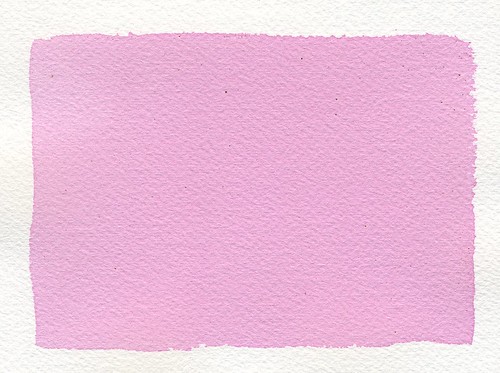
Paper!: I tried making my own! It's messy and annoying, but the project was successful. I used shredded documents and some dryer lint to mix up my slurry, screened it with an old picture frame and dried it in the microwave because I have no patience. The resulting paper is blue, because I wear a lot of jeans. Next time I'll skip the lint and just add in some wool that I have laying around. I'm not the biggest fan of the blueness of the paper (which is weird, I love blue things), but the texture is great! See? Isn't it great? I think it's great. Normally I deckle the edges of the paper I use for 'finished' anthotypes (as opposed to dye-tests), but since I made this paper myself, the deckle is just a product of the imperfect production process. I like that a lot. The other nice thing is that the resulting print is mine. I mixed the dye, I made the paper, I did pretty much all of it. I might be selfish, but I enjoy making things that are mine from start to finish when I can.

Wool!: As I mentioned, I have wool laying around. A few pounds of it, actually. In college I took a textiles class and loved dyeing and manipulating the chemistry involved. That knowledge and experience has been invaluable in working with anthotypes, so I started to wonder about combining them. This whole thing was inspired by my friend Deanna Januzzi, who did some great work combining textiles and alternative photography to make cyanotype pillows and furnishings. I'm taking raw wool, felting it into cloth by hand, dyeing the felt and then going to use the dyed felt to print anthotypes on. The resulting felt is way too thick for me to fit into a picture frame like I normally use for anthotype exposures. So, I've come up with this incredibly sleek and sophisticated solution: put a glass-only frame on top of everything and hold it down with spare weights.

The really nice thing about using this wool felt? Madder root dye may not work on paper very well, and it's only so-so on muslin, linen and silk... but dayum it's awesome on wool. The felt soaked the madder up like a sponge and turned a bright, bloody red. I can't wait to see the results!

Straight Up Substrates

Anthotypes are pretty awesome. Why else would I blog about them so much? Well, boredom and an enjoyment of hearing myself.. type, I guess. But, they're pretty awesome, that's the point. One of the reasons they're awesome is that you have a huge amount of flexibility in how you make them. There are dozens or hundreds of possible dyes, each one can be diluted or applied in many different ways to create just buttloads of potential colors. But, under all that, there's even more choice! You get to choose what you put the dye on! There are many possibilities and each category breaks down even further.

Because of the sheer number of things you can put dye onto and let it fade back off, I'm only going to cover a few types of substrates, the ones that are most commonly used for anthotypes. Don't let that stop you from experimenting! Anything that takes a stain can theoretically be used to make an anthotype.

Paper: The most common substrate to use for anthotypes is paper. It's obvious, since that's what most photographs are produced on and an anthotype is a type of photograph. There are a wide variety of papers and choice does matter. I don't recommend using anything lightweight such as copy paper because it won't hold up well under the dye and it will wrinkle as it dries. You want a heavy-weight paper that's designed to take lots of liquid. Printmaking paper, watercolor paper and even sketch paper meant for use with inks will do alright.

There are many sources telling you about what kind of papers are best for this and that alternative process. Some of my favorite brands are Crane Kid Finish, Rives BFK, Stonehenge, Arches Watercolor and Canson Watercolor. I don't have as much experience with the printmaking papers, because they're rather expensive, but Rives and Stonehenge are both extremely durable, cotton-rag papers that will happily soak up your dye without deforming or tearing. They're my personal favorites for anthotypes. However, again, they're kinda expensive. So, for tests and experiments I prefer to use Canson or Arches, neither of which is very pricey. When you're just starting out, or using particularly weird dyes that you don't expect much from, Canson is the cheapest paper of the brands I've listed. It's often comprable to store-brand generic watercolor paper. Arches is much heavier, which is nice for durability.

A short note about watercolor paper: it comes in Cold Press and Hot Press. What those mean are that cold press paper has a tooth, or texture, on the surface. Hot press papers are extremely smooth. I'm a much bigger fan of smooth paper for anthotypes because it lets the most detail shine through in the print itself. You may like the texture of the paper itself, so you should probably try both.

If you're adventurous and don't mind getting dirty, you can even make your own paper. It's pretty simple, and comes out with a great finish. If done correctly and your paper mash is reinforced with some lint or fibers, you can get very, very sturdy papers. I especially like that when you make your own paper, it puts more of the process in your hands. You make the paper, you make the dye, you make the image. It's all yours. That's a nice feeling sometimes.

Fabric: After paper, the next level of advancement in substrate experimentation is normally fabric. I'll say that your best bets here are going to be natural fibers. I've used linen, muslin, wool and silk. All have given decent results. Linen has done the best for me so far. Silk doesn't like to absorb the dye as easily. Wool tends to snarl on the leaves and plants I use, though it's great at absorbing the dye. The linens I use tend to be fairly thick and heavy, with good texture. On paper, I like a smooth surface, but with fabric, I prefer texture because it helps add contrast. You won't get as much detail on fabric as you will on paper, so keeping to a smooth surface doesn't have much benefit.

I encourage experimentation with fabric, and I'm eager to hear the results of others trying fabric anthotypes. If you try them, please let me know what results you get!

Wood: Yep, you can use wood as a substrate. I wouldn't suggest plywood, but pretty much any solid wooden surface will take a dye pretty well. Wood likes to hold onto stains, so don't expect full fading. It'll be up to you if you want to surface the wood before applying your dye. Wooden panels or blocks used for painting, even gesso blocks, work just fine. A lot of your dye will slide off gesso, so be aware of that. You may need to lightly sand the gesso to get enough texture to hold your dye. Since gesso wont absorb much of your color, it's much harder to work with than untreated wood.

Parchment: Real parchment is animal hide sliced quite thin and was originally a paper-like writing surface. It's not cheap, but it has the texture and feel of the hide it was made from. Staining it with your dye will bring such textures to the foreground and can produce some truly unique anthotypes. However, vellum is a type of leather and it's not waterproof. It shrinks in water unless stretched and once wet will become stiff as it dries again unless you know how to handle it properly. I do not, so all my projects on vellum have lost their original elasticity and flexibility.

Leather: It's just as possible to use regular leather as it is to use vellum, but I have only heard of people using it for cyanotypes. I've seen leather used for anthotypes, but I don't know that the dye absorbs very well. Again, this is a place for experimentation. But, rest assured, leather is a possibility. I'd think the kind with a suedey surface would work best, since the suede will absorb the dye better than a slick surface.

Others: According to people I've spoken with working with cyanotypes, it's possible to print on just about anything. Unglazed clay and even bones will take a stain directly. It's even possible to print on plastics, glass and metal. To do so, you'll need to mix some gum-arabic or another gel agent into your dye to create a thick, sticky paste that can be applied to slicker surfaces. Just be sure whatever gel you're using has no opacity and no resistance to UV, or it'll slow the process of the dye breaking down.

Just as a note? Virtually all of this applies to cyanotypes as well as anthotypes.

Friday, May 10, 2013

Covering Coatings

This is going to be a short post, but I'm just getting back in the groove after my winter downtime. I live in the South and during the winter the sun is weak enough that an anthotype exposure that should take a week takes a month. It's rather distressing, so I tend to take a break from the whole mess. I was also fairy busy this Spring semester with my students.

But! I've got free time during the summer, lots of light and excess brain-juice so I might as well art, am I right? I am. So for today, we're going to talk about...

How To Coat Your Anthotype Paper!
There are basically two ways to coat substrates for an anthotype: brush the dye on, or soak the substrate in the dye. There are pro's and con's of both!

Brushing: This is probably going to be your default method of coating. It's easier to control, it's gets the dye on faster, it dries faster and it's cleaner. It also allows you to decide if you want to leave a border on your paper instead of having the color cover the whole sheet. I suggest using a foam brush, but some people enjoy using hake brushes. It's really up to you, but hake brushes are a lot more expensive and tend to shed all over. Also, you can get foam brushes in a wide variety of sizes! The benefit of a hake brush is that they can give very nice effects on the border and tend to give extremely even coats. Eh, I go for the foam; I'm cheap. I use a hake brush for cyanotypes, though.
Poorly Applied Single-Coat

When brushing on your dye, the evenness of the coat is important. You don't want to leave streaks and you don't want to coat too lightly; it will leave blotches where there's visible overlap of your first and second coats. This isn't going to affect the quality of your print, but it will leave very visible lines. Ideally, you'll get a perfectly smooth, even coat and no one will be able to see any brush lines or double-coat edges. If your first coat goes streaky, try adding a second coat after the first one dries.

Smooth, Even Coat
Don't overload your brush, whatever type you're using. Too much fluid in your brush will make puddles and drips inevitable. Puddles will give you the same mottled appearance that poorly-blended brush strokes will. Be gentle, brush slowly and lightly. Don't press the brush into the paper, just move it gently across the surface. There's no need to squeeze the dye out of the brush, it should be sufficiently saturated so that the dye glides out on its own, but doesn't drip off and ooze around. It takes some practice, but give it time and you'll have gorgeous, smooth coats.

Soaking: This is my preferred method of preparing fabric for anthotype use, but I don't like it for paper. In my experience, when you soak paper in your dye, the dye absorbs so fully into the paper that it takes much, much longer for you to get a good exposure. The pigment works its way into the fibers of the paper and that makes it harder for the sun to break down the pigment. At least, that's my theory. I'm not a scientist, so I can't explain it scientifically. I just know that when I test soaked paper samples vs brushed paper samples, the soaked papers take longer to expose and come out with less contrast because the exposed regions retain far, far more color if they've been soaked in the dye.

Now, for fabric, soaking is generally a better way. When soaking a fabric sample in dye, I like to fill a mason jar with the dye and drop the fabric into the jar, which I can then seal up and shake heartily for a good while to agitate it. I can leave it to soak for hours or days, shaking every so often. Sometimes, to ensure even coverage, I remove the fabric, wring it out in the sink and stuff it back in the jar in a different arrangement so I don't end up with a tie-dye effect. For paper, I use a flat tray full of dye that I cover with something opaque so light doesn't get in there and start exposing the paper prematurely. Again, agitation is important. I turn over my paper a few times during the soak using tongs.

Side Note: Dayum, this post is WAAAAY longer and more complex than I thought it would be!

There may be other ways to get your dye onto the substrate, but they'd be pretty specific to an odd substrate. For paper, fabric, vellum and leather, it just comes down to either soaking the material in your dye or brushing the dye onto the surface. If you have other ways, please comment and let me know how they work and when you use them!

I think next post will be about substrates and the different pros and cons of the ones I've explored, plus some theory on ones I haven't tried yet but have data on.