 |
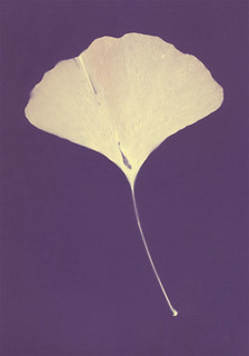
| Bergger NB - 10 minutes |
Both of these types of paper have demonstrated some fairly significant range in their possible colors. Mostly the other paper brands I've worked with are at least vaguely consistent. There are variables if you get moisture involved, yes. Some of the papers give a radically different color if you work with extremely short exposures. Bergger is fairly unique in that the difference between a short exposure and a long exposure isn't just a deepening of color, it's a complete tonal shift. Whole new palettes of color will show up.
Bergger Variable NB has at least two distinct phases. A short exposure, under 20 minutes, will give you a pale butter-yellow in the highlights and a rich amethyst purple in the shadows. It's a very nice, very strong contrast. Medium exposures, from 40 minutes to 2 hours will turn the yellows to red-oranges and the purples to maroon and brown. True long exposures on Bergger Neutral Base haven't been tested yet, but the difference between a 40 minute exposure and 90 minute exposure suggests that the orange starts to darken to red and the background goes from maroon to greenish-brown. No moisture tests so far, but that's on my to-do list.
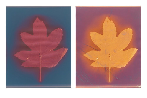 |
| Bergger CB pre- and post-Fixer comparison |
When I start formatting things properly, I'm going to organize this information more fully. Think of this as a preview of the sort of information that will be in my catalogue once I get it assembled. It's slow going, articulating what I've learned in a formal, simple way. That's never easy for me. I'm so much better at stream of consciousness with interwoven smart-assery. After all, I write my blog as if talking to imaginary readers and sentient web-spiders. Yeah, being serious and straight forward isn't my strength, but I feel like the catalogue should be simple to read and access. It's a challenge. But it's one I can beat. I'll probably post a sample spread in the next few weeks.
No comments:
Post a Comment