Monday, November 5, 2012

Rainbow Reverie: Red

Now that I've got at least a few dyes that produce each color of the spectrum, I'm going back in detail to review the properties and preparations for the most effective of the dyes and mention the ones I tried and found lacking. Color by color, I'll go through my anthotype library.

Today, we start with Red. When I say 'red' what I actually mean is pink. I've found a single deep red-orange and many shades of red-violet and pink, but none of the dyes I've tried have actually produced red. I still think that there may be one out there. I have a suspicion (listed below), but no confirmation as of yet.

Strawberry: Initially, I had high hopes for strawberries. They're so colorful, after all. The problem seems to be that when rendered down either with crushing or chopping or boiling, the resulting liquid is primarily composed of the inner, pale flesh instead of the outer skin of the berries. It gives you pale, pale pinks that show some images after 5-7 days, but at low contrast. The really annoying problem with strawberry dye is that it doesn't keep. It rapidly transforms itself into a gooey mass of green-white mold. I don't think my usual solution to mold (mixing with iso-alcohol) would work, because strawberry dye is already so pale that diluting it would just ruin the whole thing.

Raspberry Dye Test
Raspberry: This dye comes very close to being purple, but it's also pretty pink, so I'm listing it under Red. It can be used either undiluted for stronger color, or with alcohol for pastel shades. As normal with undiluted dyes, the exposures are fairly long: 5+ days to get a good contrast in your prints. Your field will fade down into a brown-violet, leaving the red-violet object behind. Raspberry dye tends to have a big issue with seeds and bits of berry-skin being left behind in the dye, bigger than other dyes. Don't worry too much, it can be rubbed off while the paper is drying.
You can boil raspberry dye to reduce it down, or you can boil the berries themselves before blending them. You can also boil the berries and smash them in the boiling bot to extract the dye that way instead of using a blender to puree them and then straining the puree. In general, I do not recommend boiling your dyes. There will be a post going into more detail on how to prep different dyes, more detail on this there.

Beet: I've only tried canned beets, and have a suspicion that they may have been tainted with artificial colors or additives. I will be trying regular beets eventually, but the results from canned beets weren't particularly encouraging and I've seen other people work with beet juice for anthotypes and not enjoyed the results. Beet juice gives you strong, bright pinks, a few shades brighter than what I'd call "bubblegum"... maybe more like cotton candy, or strawberry frosting. It exposes fairly quickly, 3-5 days giving good results. The only reason I don't like beet juice is just that I'm averse to the color. I prefer darker, stronger colors. The pink that beet juice gives is just too... pink. Totally a personal call; the dye itself has no big problems.

Madder Root Dye Comparison 
Madder Root: There are two forms of madder root: a powder and actual roots. I've experimented many times with both methods, and only the powder has produced any results. I tried mixing up the dye from the roots by following various online tutorials, but the liquid produced (while a gorgeous crimson) didn't stain paper at all and was incredibly light-fast on fabric. So, I ordered some powder which arrived quite recently. No exposure results so far, but several dye swatches were produced. Consulting various online resources about madder root, I tested various additions to the dye to produce different colors. Alum, chalk (turns out I used the wrong kind of chalk), cream of tartar and baking soda (for an alkali). I ran across some suggestions to use citric acid to create oranges, but I have lots of oranges and not many good Reds. The chart above lists some of the various combinations and methods used to adjust the color of the madder powder.
Edit: Further testing has shown that it is possible to get a bright red color from madder root by soaking the paper for 1-2 full days in the dye. More details here.
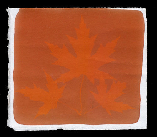
Sandalwood Anthotype
Sandalwood: Primarily, sandalwood produces oranges. If used at the strongest concentrations, where the dye is almost a paste instead of a liquid, sandalwood is so orange that it turns into a dark rust. The drawback here is that the exposure times are fairly long, minimum of one week. Even at long exposures, the contrast is pretty low. Post-processing can easily adjust that, but purists may be disappointed in the results.

Red Wine: The easiest anthotype dye, bar none, because it can be used straight out of the bottle. There's no mixing or measuring or filtering required. All you need to do to create a red wine anthotype is buy some cheap cooking wine, paint it onto the paper and expose. Red wine can produce images within 3 days, but it does better with more time. Ideally, give red wine at least a week of strong sunlight. You'll get a dull, faded orange background with a very soft pink-red subject. I do not recommend red wine as an anthotype dye because of the incredibly pale colors produced. The visibility and contrast is quite poor. However, it is fairly consistent and easy, so people just starting out may want to try it for themselves before moving on to more complex dyes.

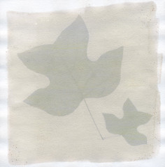
Friday, November 2, 2012

Crazy Cool Colors

When I first started researching anthotypes and the possible dyes used to make them, I immediately found that there are very few ways to create natural, plant-based dyes that fall into the cooler part of the color spectrum. Many plants create yellows, oranges, red-pinks, purples and browns. There are very few natural plant-based dyes that create blues or greens.

At first I thought, well that's stupid, most plants are green, why can't I just grind up their leaves? Well, most plants that I tired simply didn't produce much of a color, even ground up and reduced to a paste. While searching around Flickr, and then again reading Malin Fabbri's new book on Anthotypes, I learned that chard seems to give a good, strong green. Researching other natural dyes, I came across some ideas for using red cabbage to produce a blue and learned that an algae called spirulina is used to tint soaps and candles green.

So, I went to the local health store to buy the spirulina (it's also a herbal diet supplement) and hit the local grocery store to get the chard and the red cabbage.

Chard was a bit tricky to work with. The instructions I had run across suggested boiling it to produce a stronger color. This was in direct contrast to my earlier observations that boiling dyes seems to break down the pigment and give a weaker color. My experiments with chard basically confirmed my earlier theory: the boiled chard solution was pale and brownish. I do not anticipate strong results.

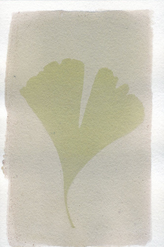
I tried putting shredded chard leaves into the blender mixed with water and got a reasonably strong solution, strained through cheesecloth to remove the plant matter. My results were far stronger, again as noted in earlier experiments, when iso-alcohol was used instead of water. Chard seems to produce a very nice, soft green that fades to brown when exposed to light. That gives a good contrast between the image and the field.

Spirulina hasn't been exposure-tested yet, but I've mixed up a solution of the algae (it's a dark green powder) and iso-alcohol that gave a good, true green. It's a bit bluer than the chard solution and a tiny bit darker. Expecting good things from the mixture.

The red cabbage was a very surprising idea. I actually found it on a blog about all-nature food coloring alternatives. The original recipe, once again, called for boiling. Already suspicious, I tried both boiling the leaves and blending them into paste. By itself, the red cabbage renders an intensely violet dye, but when applied to paper it dries from violet to a pure sky blue, a truly gorgeous color. The boiled dye produced virtually no results, but the blended (diluted with alcohol) mixture is great.

The food blog entry was about creating blue dye from red cabbage, and in a liquid form the red cabbage is violet. So the food blogger noted that adding alkalinity to the cabbage dye (baking soda) would convert the violet liquid into a deep blue solution. It does! It's amazing! Hold up, though. Just as the violet liquid dries into a sky blue, the navy liquid from the baking soda-cabbage mixture dries a different color: teal. It's an absolutely amazing blue-green and I can't wait to see what it looks like after exposure!

I am SO excited to get these mixtures into frames, but it will have to wait until after the weekend. I will be scanning the test sheets before exposure to document the colors. I'm working on a more orderly approach, with double the records, since I'm in the process of compiling together what might become a book on anthotypes.


Tuesday, August 7, 2012

Time to Dye

One day exposure!
I've been having really, really good results from the more dilute dyes, the ones with much higher levels of alcohol than normal. They're exposing in 1-2 days instead of 3-7 and still retaining good detail. Turmeric exhibits the same issues of color visibility, but the rest are working really well.

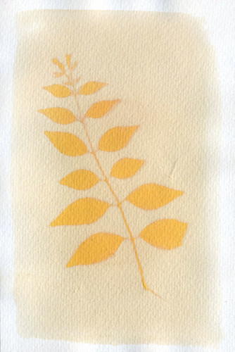
The problem with turmeric used by itself is that the resulting image is so yellow that it's hard to see. A slight hue shift in post-processing can make the image dramatically better simply by reducing the amount of yellow by about 10%, moving it to a more orangey hue. The same result can be achieved in the anthotype itself simply by including about 30% sandalwood in the mixture, or a light coat of blackberry juice on top of the turmeric.
10% more orange

Blackberry juice with lots of alcohol (about a 2:1 alcohol to juice mix) is, as I've mentioned before, green. This green dye produces a very fast exposure; I got a perfect exposure with visible detail like leaf veins in just one day of bright light. One day. That's mind-blowing for anthotypes.

Wednesday, August 1, 2012

Confounding Condensation

First!
My very first anthotype ever had a really interesting result. The yellow halo is a product of the moisture in the leaves leeching out into the paper and washing away some of the pigment. However, I've not been able to replicate this. I recently tried another batch of anthotypes using fresh blackberry juice, prepared the same way as the original batch, no halos.

So, I'm fairly sure there are two culprits:
The original anthotypes were exposed outside, in the direct heat of the scorching Southern sun.
They were not in picture frames, but smooshed between two plates of acrylic, allowing air flow.
No halo.
I tried putting my picture frames outside, but no dice. I tried using two plates of acrylic inside, no dice. I think it needs both the airflow of an open frame and the blazing heat of the sun to produce the results I want. I will be trying this soon! I'm especially hopeful because another recent experiment with silk dyed in madder-root produced a moisture halo.

Oh, that's right, I never mentioned that test result. Why? It sucked. Maybe I picked a bad plant, because the leaf I used ended up virtually transparent by the end of the seven day exposure. Transparent leaf means there wasn't any light-blockage and the resulting image is almost invisible. Plus, the madder root stubbornly refuses to give me a good color. Also, it's transformed into a mess of green-brown-white fuzz.

I think I'm done with madder root for the time being, it hasn't been of any appreciable use yet. Maybe when I get around to my next project, where I buy raw wood and felt it down into my own hand-made cloth, then dye the cloth and make anthotypes on THAT... then I might use the madder root. Maybe. Probably not.

Tuesday, July 24, 2012

Blackberry Booze Surprise

I got around to grinding up some blackberries for a new batch of dye. This time, I didn't boil the blackberries, I just blender'd them straight out of the freezer. The boiling seemed to alter the dye's color and properties last time I tried it, so this time I skipped it in an attempt to replicate early successes with blackberry dye.

There was enough of the blackberry puree to split in half: one batch is about 2 parts blackberry to one part rubbing alcohol, the other is the inverse. The blackberry-heavy solution produced expected colors: deep blue-violets that are standing up pretty well to light. I expect long exposure times on those tests.

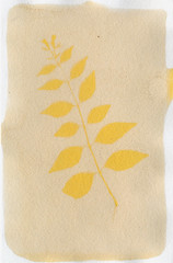
An alcohol-heavy solution, however, proved surprising. The dye is green, as you can see in the test to the left. Much like the alcohol-heavy batches of sandalwood and turmeric dyes, it reacted much faster to light. A three day exposure produced the example seen here. I'll be trying another for five days fairly soon, just to see if I can get some better contrast.

The blackberry-heavy solutions are still exposing.

Monday, July 9, 2012

Alcohol Makes Things Better! Sometimes.

Test #2, Sandalwood.
As I mentioned a few days ago, I set up a new crop of anthotypes recently. I've now pulled all but two of them after some very bright, very sunny days. Mixed results!

These anthotypes were all printed using a much, much greater amount of alcohol than normal. Up till now, I've simply poured a small amount of the powder or what-have-you into a bowl and added just enough alcohol to make the mixture liquid and paintable. This time, I added a buttload of alcohol to the powder in a mason jar, attempting to reach the saturation point instead of heavily over-saturating the mixture. Why? Because I was tired of wasting pigment when the alcohol evaporated off and left me with a dust-covered sheet of paper.

The results so far:

Test #1: Mixture of turmeric and sandalwood. This is the most disappointing of the tests. It may be due to being pulled early, but when I checked it after two days, the field had bleached almost totally away. Problem being, the image itself isn't very visible either. May be the result of the turmeric's characteristic eye-burning-yellow color, when hue-shifted in Photoshop, the image is much more visible, but still not the best.

Test #2: Pure sandalwood, an extremely successful result. Three day exposure gave me a faintly visible pale orange field and a moderately bright image. A 10% bump in the darkness levels with Photoshop got me a nice, dramatic image with a pleasant color. Much better than the burnt-orange-red of high-concentration sandalwood which is almost as hard to see and enjoy as pure turmeric. The high levels of alcohol really shine with sandalwood, it seems.

Test #3: Another pure sandalwood. Virtually identical results as with Test #2, but this one has a darker spot in the center of it. I sat the paper on top of a water bottle to dry, and apparently the cap of the water bottle left a darker area for some reason. Somewhat annoyed. Image integrity very nice, though.

Test #4: Pure turmeric with high alcohol. Not a bad image result, though as with most turmeric images, it benefits from a hue-shift towards orange. The hue-shift makes the image stand out more and reduces the burn on your retinas from staring at the collected essence of the color Yellow. Boring composition makes me hate it, though.

Still waiting on Tests #5 and 6. Planning to give them two more days of exposure.

Test #5 is a boiled blackberry dye, with increased alcohol content to prevent spoilage of the berry juice. The juice at this point is nearly a year old and should probably be thrown out, but the aged juice has a very different color profile than fresh, so I'm hanging onto it. Smells funny.

Test #6 is a double-coated mixture, one layer of boiled blackberry, another of sandalwood. The resulting field color is a reddish-orange instead of the pure orange of sandalwood or the dull violet of boiled blackberry. The leaves used in this anthotype (virginia creeper) have begun to desiccate and shrink. Not happy about that, because it'll give me fuzzy edges on the image. Waiting to see final results before declaring total hatred, though.

EDIT: Ah-hah! I forgot one! There's another test currently in the works. I had a square of heavy linen soaking in boiled madder-root dye. Instead of following all the proper madder-root procedures, I just ground up the roots and tossed them into a pot of boiling water for a few hours, and collected my pretty red water. The linen soaked in it for ~24 hours and is now exposing. Should be ready in another week. I like to give fabric anthotypes a long, long exposure time.

Thursday, July 5, 2012

New I-lumen-ation!

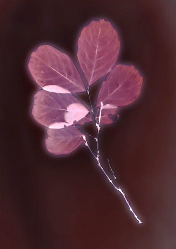
Test #1, Crepe Myrtle
I got my hands on some Kodak Polycontrast IV RC paper a while ago and decided to test out a few sheets of it as lumen printing material. I've used Kodak Polymax in the past and its one of my favorite types of lumen paper, so I was hopeful.

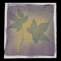
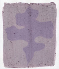
So far, in both my tests, the Polycontrast has produced a brown-red background with violet-maroon images, VERY pretty. One print, left out in light after exposure, has darkened to a blue-violet in the image, with an almost black field.

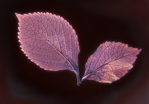
Test #2, Hydrangea
Compared to the Polymax, which tends to produce brown fields with red-pink images, I think this paper is a little less dramatic, but still very nice.

My scanner isn't doing a very good job of capturing these lumens acurately. I may need to buy a new one; there's some kind of horrible, streaky residue that seems to be between the two sheets of glass that make up the scan-plate. I've cleaned both sides of the scan-plate, but the residue remains the same. The scanner hasn't got any problems capturing my cyanovellums or anthotypes, the residue only shows up when scanning the large, blank backgrounds of the lumen prints. It's very distressing. I may need to start imaging them with a camera.