 |
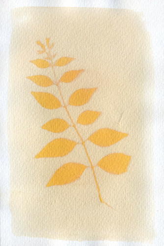
| Test #2, Sandalwood. |
These anthotypes were all printed using a much, much greater amount of alcohol than normal. Up till now, I've simply poured a small amount of the powder or what-have-you into a bowl and added just enough alcohol to make the mixture liquid and paintable. This time, I added a buttload of alcohol to the powder in a mason jar, attempting to reach the saturation point instead of heavily over-saturating the mixture. Why? Because I was tired of wasting pigment when the alcohol evaporated off and left me with a dust-covered sheet of paper.
The results so far:
Test #1: Mixture of turmeric and sandalwood. This is the most disappointing of the tests. It may be due to being pulled early, but when I checked it after two days, the field had bleached almost totally away. Problem being, the image itself isn't very visible either. May be the result of the turmeric's characteristic eye-burning-yellow color, when hue-shifted in Photoshop, the image is much more visible, but still not the best.
Test #2: Pure sandalwood, an extremely successful result. Three day exposure gave me a faintly visible pale orange field and a moderately bright image. A 10% bump in the darkness levels with Photoshop got me a nice, dramatic image with a pleasant color. Much better than the burnt-orange-red of high-concentration sandalwood which is almost as hard to see and enjoy as pure turmeric. The high levels of alcohol really shine with sandalwood, it seems.
Test #3: Another pure sandalwood. Virtually identical results as with Test #2, but this one has a darker spot in the center of it. I sat the paper on top of a water bottle to dry, and apparently the cap of the water bottle left a darker area for some reason. Somewhat annoyed. Image integrity very nice, though.
Test #4: Pure turmeric with high alcohol. Not a bad image result, though as with most turmeric images, it benefits from a hue-shift towards orange. The hue-shift makes the image stand out more and reduces the burn on your retinas from staring at the collected essence of the color Yellow. Boring composition makes me hate it, though.
Still waiting on Tests #5 and 6. Planning to give them two more days of exposure.
Test #5 is a boiled blackberry dye, with increased alcohol content to prevent spoilage of the berry juice. The juice at this point is nearly a year old and should probably be thrown out, but the aged juice has a very different color profile than fresh, so I'm hanging onto it. Smells funny.
Test #6 is a double-coated mixture, one layer of boiled blackberry, another of sandalwood. The resulting field color is a reddish-orange instead of the pure orange of sandalwood or the dull violet of boiled blackberry. The leaves used in this anthotype (virginia creeper) have begun to desiccate and shrink. Not happy about that, because it'll give me fuzzy edges on the image. Waiting to see final results before declaring total hatred, though.
EDIT: Ah-hah! I forgot one! There's another test currently in the works. I had a square of heavy linen soaking in boiled madder-root dye. Instead of following all the proper madder-root procedures, I just ground up the roots and tossed them into a pot of boiling water for a few hours, and collected my pretty red water. The linen soaked in it for ~24 hours and is now exposing. Should be ready in another week. I like to give fabric anthotypes a long, long exposure time.
No comments:
Post a Comment