Showing posts with label ideas. Show all posts

Thursday, May 26, 2016

Blogging for Thor: Writing in the Dark

Skotograph by Madge Donohoe, 1920s-30s.
What should I blog about, Spiders? I ask myself this every week that I haven't got an on-going experiment or process that I'm fiddling with. Earlier today, I was considering a post about lumen prints made primarily with opaque objects, like fruits and vegetables. The primary exposing agent in such a case would be the chemical interaction between the photo paper and the bio-matter, not light. Light might expose the uncovered areas of the paper, but anything that happened on the covered areas would be explicitly chemical. That's interesting to me, since it's photography without light. That should be impossible, right? Photography without light is... what? Chemistry? Chemography? Or... Skotography?

I looked up what the Greek root-word for "darkness" would be. Skotos, it turns out. Then, I had to wonder if 'skotography' is a word? Yes. Yes, it is. It's two words!

Scotography (another way to spell the same word, because going from one alphabet to another is a bit flexible) is the medical practice of using non-visible wavelengths of radiation to create images. X-Ray photography is, therefor, scotography.

There's also Skotography, which was a spiritualist practice in the late 1800s and early 1900s. The idea was that, in darkness, spirits could project energy onto photographic material and produce images. Skotography was the high-tech version of a seance, or table-rapping. Treating photography as magic has a long history, about as long as the history of photography itself. Today we have 'aura photography' or Kirlian photography. And ghost-hunters that use their cameras to image the supernatural. And, there are, of course, still people who believe in skotography.

People are weird, but the few supposed skotographs I've found are actually fairly interesting in appearance. There's even a French artist who is doing a modern project inspired by the work of Madge Donohoe, a popular skotographer during the 20's and 30's.

Friday, April 29, 2016

Blogging for Freya: Fun with Food

Transference #2 – Orange juice, rice, milk, flour
Ugh, I'm getting so bad at this, Spiders! I'm supposed to blog for Thor! But I forgot entirely last week, and this week I was at game night. Sorry, Thor. At least Freya alliterates well with this week's topic! And, as a fertility goddess, she's more suited to a post about food!

My thesis project is going well. I've hammered out an artist statement that's concise and meaningful, I've produced a good start on a body of work, I've got lots of new places to go with that body of work, and I'm enjoying my work!

In short, I'm making 'chemigrams' with food, or the ingredients of food. Playing around with different bits of food science, baking, and cooking to produce chemical reactions that cause photo-paper to change color under sunlight. So, they're 'lumen prints' in that they're made on darkroom photo-paper exposed to sunlight, but they're chemigrams in that the only thing used to make them are chemically active, not negatives or inert objects. The paper does really react to the chemistry. Acids, bases, oils and salts all have distinct effects on the paper, aside from simply altering how much light reaches the surface.

The biggest problem has been that I have classes and work during the day, so I tend to leave home soon after getting up, and get home shortly before the sun goes down. That's made it extremely difficult to get much printing done. But the weather is finally turning sunny, and classes are almost over. I hope to get a TON of work done this spring and summer! I'm finally really excited about my projects, too. That's so important, because now I'm actually motivated to do work.

The failed baking soda / vinegar volcano print
My latest experiment was building a baking soda and vinegar volcano on a sheet of photo paper... it didn't come out super well. The baking soda worked fine, even created some nice patterns, but the vinegar turned the paper an unpleasant poo-like brown. I have some ideas on minimizing that, so I'll try the experiment again. Probably later today!

The next idea I have to work on is creating a webwork made out of the stringy bits on bananas (I'll have so many bananas left that I'll probably make banana bread) and the smaller stringy bits found on orange slices. The challenge will be to use the right paper. Since the banana strings and orange strings are so thin and small, it needs to be a paper that reacts to light quickly. Otherwise, I'm afraid that the light will burn through these small objects and leave a very low-contrast, poorly-defined image.

I may also give a shot at printing an image that's immersed in boiling water. I've done underwater prints before, so I know they work. Making the water boiling could be fun! I'll probably do that with something that I suspect will react strongly with boiling water. Maybe milk or yogurt, which may begin to curdle and burn? Or cheese, which may melt? It'll be fun! I could even freeze the paper ahead of time, and then pour boiling water on it while it's still frozen. I know if you do that with film it can shatter the gelatin base, causing a crackle effect. I don't know if that would be visible on photo paper, but it's worth a shot!

Thursday, April 7, 2016

Blogging for Thor: Physics, and Chemistry, and Geometry, Oh My!

Photogram by Lazlo Maholy-Nagy, for inspiration.
Last time I did a long-term project, it was about paper. I decided that I wanted to form a new habit. So for 251 days, I made a photograph of paper every night. It was a great experience, and I even got some nice images out of it. Some crappy ones, maybe even mostly crappy ones, but overall it was a good project. The core of the project was a set of four rules.

Since I enjoyed the project so much, I'm going to start again. Not the Folded Paper Project, but something similar. Another project with a strict set of rules, a time-table, and enough scope that I won't have to worry if each one comes out perfectly. I want that kind of structure and freedom. I'm trying, and so far succeeding, at enjoying art again. Hopefully this will add another dimension.

My thesis is all about food, so the exotic chemicals I've been experimenting with aren't appropriate. That's where this project comes in. I'll be using alternative photographic processes, whatever chemicals I find appropriate to use. So I can experiment with salt, cyanotype, maybe even platinum or gold! I'm giving myself a lot of room here to experiment with chemicals.

This project is going to be a lot more complex than the Folded Paper Project. I won't just be taking pictures. Instead, I'm going to be making mixed alternative process prints that combine elements of chemigrams and photograms. 

So, instead of a set of "rules" there will be a set of "steps."
  • Step 1: Draw a geometric design on a 5x5 square of smooth-finish cotton rag paper, using light pencil lines. Only two different types of geometric shapes can be used (circles, squares, hexagons, triangles, etc).
  • Step 2: Paint alt process chemistry onto the geometric design, filling in each shape with chemistry to create a sort of alt process coloring book. Chemicals from up to two processes may be used for this.
  • Step 3: Layer photogram materials of varying opacity on top of the paper once the chemicals have dried. These photogram objects must also be geometric, and only use two shapes. At most one of the two shapes can be shared with the drawing.
  • Step 4: Expose the print for 2 days. During that time, the print can be moved, and the photogram objects re-arranged.
  • Step 5: Scan the final image.
I'll be setting up the first one of these experiments tonight, and exposing it tomorrow. I'm very excited to see how this works!

Thursday, March 31, 2016

Blogging for Thor: A Recipe for Success

Hello Spiders. As you know, because you read everything I post online, I have been struggling with graduate school. I've always struggled to fit into the Fine Arts community, and it's been particularly bad this year, after not having to worry about it for six years or so. I've been more focused on education, community engagement, experimentation, learning and process. But to succeed in graduate school, I need to be thinking about conversation, experience, presentation and conceptuality. Super fun, right, Spiders?

It was speaking with David Hilliard, the visiting artist for my graduate class, that I was finally able to articulate these difficulties and start coming to a resolution. I've been looking at work by people like Alison Rossiter, Chris McCaw, Brittany Nelson, Marco Breuer, and Christina Z. Anderson. What I needed to do was focus less on the process as the work, and more on the finished image. I'm turning things around and using the techniques I love to make images that are beautiful and engaging on their own.

After talking with David, I went back through my archives and started looking for the really unique, engaging images. I settled in on the food-based lumen-chemigrams that I began experimenting with two years ago. There's a small gallery of them on my Flickr (LINK), but I never really pursued the idea. It was fun, though, and it actually meshes very well with what I've been doing recently at grad school.

My nod to process, and to experience, is to frame my prints as the product of a recipe. The prints exist as themselves, pieces of art to be visually engaging and aesthetically stimulating. But, with each print, there is a recipe. The materials and process used to create that print, listed plainly. In fact, there is literally a recipe, on a recipe card. I work in the kitchen, that's been the center of my process since I left undergrad. Everything I've been doing has been safe for the kitchen, and generally the kitchen has been my darkroom. I carry the same experimental desires I have with photography into cooking, so why not bring things full circle?

The recipe cards I've been making for each print frame the print as a product of my own past, my interests, events in my life and hopes for my future. The same way a cake recipe might be "Kathy's Birthday Cake" and carry with it all the significance of the event it was created for, my photographic recipes are things like "Orange Rice Mitochondria" and carry with them my memories of a favorite book (A Wind in the Door by Madeleine L'Engle) as well as representing my interest in biology, science and evolution. Each recipe carries a personal snippet that ties the image back to my life.

So, seriously Spiders, this shit better be Fine Art. Because, I'm actually enjoying it, and I am tired of starting over.

My main task is going to be creating new prints despite terrible weather (apparently New England does not believe in sunlight until July or something..) and tying the appearance of the print to the actual driving force behind the print. My next piece, pH Balance Of Milk And Citrus, needs to actually incorporate the ideas of balance, chemical forces, and somehow reference the destructively complementary nature of acids and bases. Fun, right? Actually... yes!

Thursday, January 21, 2016

Blogging for Thor: Saline-ent Findings

Sorry for the terrible pun, Spiders, but I'm running out of witty references to salt. This week, it was hard to wait to blog! I was so very excited about the results of my latest experiments. I think this weekend I'll be at the university, making some test prints. I have a hairdryer now! And I'm awaiting the delivery of more chemistry for further testing, too.

Here's what has me all worked up: I successfully printed photograms with non-chloride silver salts. I tested out potassium iodide and Old Workhorse Bromo-Iodizer as catalysts for salt printing, along with a sodium chloride control print and an ammonium chloride side-test. Everything produced a clear, visible image. I'm going to discuss first the basic parameters of the experiment, the controls, and then get into the preparation and results for each halide solution.

Test sheets prior to exposure.
All but one show significant fogging.
Controls: Each of the four prints was made on a sheet of Arches Platine paper, all the same size, all taken from the same full sheet of paper, and all coated at the same time. All four test sheets were first painted with a solution of the chosen halide, then allowed to dry and stored in butcher paper for 3 days while I waited for good printing weather. The night before printing, each paper was given a single coat of 12% silver nitrate, allowed to dry overnight in a dark box. Despite being in a dark box, the drying time was too long. Each test sheet showed discoloration when the box was opened. I will repeat these tests with fresh-dried sheets soon.

Bromo-Iodizer Solution: I used the Bostick & Sullivan Old Workhorse Bromo-Iodizer directly out of the bottle, with no changes to the solution. The solution is easy to coat, and has a strong yellow color that makes it easy to tell where your paper has been coated. It smells strongly of alcohol and should be used only in well-ventilated areas. The bottle should be capped immediately after the solution is extracted.

Potassium Iodide Solution: This chemical comes as a transparent/white crystal solid. I mixed 6 grams of the crystals into 200ml of water to make a 3% solution. I didn't use nearly so much, but I didn't have a small enough mixing container to measure less than 200ml water with accuracy.


Ammonium Chloride SolutionThis is a shiny white powder that does not readily dissolve in water. It required a lot of stirring, and left a film of bubbles and fragments floating in the solution. Again, I mixed the same 6 grams of solid to 200ml of water, resulting in a 3% solution.

Sodium Chloride SolutionFor sodium chloride, the control solution, I used Morton Kosher Salt. As with the other two dry chemicals, I mixed 6 grams of solid to 200ml of water, resulting in a 3% solution. This is a medium-strength salt solution by standard salt printing guidelines.

The prints were made in windows at my apartment, on a clear, sunny day. I exposed all four prints for 2 hours before pulling them and scanning the resulting images. None of them have been fixed, though I may do a potassium iodide fixing test just to see what happens.

Bromo-Iodizer Print: Unlike any other salt print I've seen, this one came out blueish-green, but mottled with little flecks of a more yellowish green. I was told to expect some issues due to the high alcohol content of the bromo-iodizer, but the green color was totally unexpected.
Potassium Iodide Print: This print is much paler than a normal salt print, more of a tan than a brown. It's still fully detailed, just lighter. I really want to see this printed again without the fogging, so I know what it looks like in a "proper" exposure.
Ammonium Chloride Print: Very similar to sodium chloride, though the pre-exposure fogging makes it difficult to read nuances of hue and tone. I'll have to do more specific experiments regarding the different forms of chlorides to see the exact effects of ammonium vs sodium. If there is a visible difference, it's that the ammonium chloride has a cooler, more purple tone to the browns.
Sodium Chloride Print: Exactly as expected, though unfortunately tainted by the long wait between silver coating and printing. Silver chloride, if left in contact with organic matter (like the paper), will self-expose even in darkness. That results in the violet-brown staining of the paper, and the extreme violet outlines around the image.

So, my final thoughts? I'm very excited to have proven to myself that silver chloride is not the only halide that can be used in salt printing. The potassium iodide image is considerably blander than I had hoped for, but the strange jade color of the bromo-iodizer image gives me hope for future tests. I still haven't tested potassium bromide by itself, or tested non-potassium forms of bromide and iodide. I know from previous experience that potassium chloride isn't the best form of chloride to use, so maybe potassium bromide and potassium iodide aren't the best forms of those halides, either. I'm going to look into obtaining other solutions of bromide and iodide, maybe even some alternate forms of chloride. The ammonium chloride is similar enough to sodium chloride, but I've yet to test pure potassium chloride to see the result. I've only ever used it in a "lite salt" mixture: 50% sodium chloride and 50% potassium chloride.

There's just so much more to do, Spiders!

Thursday, January 14, 2016

Blogging for Thor: What's in a Halide?

The three common silver halide precipitates:
AgI, AgBr & AgCl (left to right)
Hey there spiders! I'm gunna hit you with some SCIENCE!

Modern silver gelatin photography uses the term "silver halide" a lot. In film and in paper, the term gets tossed around in reference to the light sensitive salt used to make photographic images. "Halide" is not a specific chemical, though. There's no such element as "Haline" on the periodic table. Instead, "halide" refers to a group of chemicals: chlorine, bromine, iodine, fluorine, and astatine. So a silver halide is a silver compound with any of those five elements. Two of the silver halides are weird, so I want to go into detail on them!

First off, silver astatide isn't used in photography because astatine is extremely radioactive and compounds using it decay in a very short time. So, while silver astatide does exist, it isn't physically feasible to use for any practical purpose. The short half-life of astatine means that it's difficult to study even in laboratory situations, so the light sensitivity of silver astatide isn't even well documented.

The other weird silver halide is silver fluoride. It exists, it isn't radioactive, but it still isn't used in photography... for the most part. Silver fluoride exists in three forms: disilver monofluoride, silver monofluoride, and silver difluoride. None of these forms of silver fluoride are useful in traditional photography, primarily because they react with water. Depending on the specific fluoride compound, they will either oxidize violently or break down via hydrolysis. Because of the inability to use silver fluorides in combination with water-based chemistry, silver fluoride was long ignored in photography. However, in 1966 a US patent was filed for a process where silver fluoride could be vacuum deposited onto a surface along with gold, and treated with boron trifluoride vapors to create a high-resolution, extremely low-speed photographic surface. It appears, though I'm not an expert at deciphering patents, that this research was carried out in connection with the Polaroid Corporation, by a scientist named Joel M. Peisach. I've had no luck tracking down any further literature or contact information regarding this process, and certainly no examples. It's extremely disappointing, even if the complex process and materials required put this technique far outside the reach of anyone working outside a laboratory environment. Still, it was really, really cool to find out that silver fluoride photography does exist.

Silver chloride, silver iodide and silver bromide are all widely used in different forms of photography. Each compound produces different tonal ranges, color palettes and contrast ranges and functions in different photographic processes. Generally, silver chloride is the form used in salt printing.

Why the big science dump, Spiders? Because I'm all about breaking the rules and getting into the how and why of things. So, who's to tell me that a salt print uses silver chloride? Why can't it use silver bromide? Or silver iodide? Or a combination of two halides? Or all three halides? Why can't it be as halide happy as it can get, Spiders? It's about to get like that, Spiders. I'm searching for ways to make "salted paper" images using silver bromide and silver iodide in addition to, or in place of, silver chloride.

Fortunately, I found this weird stuff called "Old Workhorse Bromo-Iodizer" in my university's alt process lab, and I found Potassium Bromide for sale from Bostick & Sullivan. I need an iodide solution, but I'm sure I can find it. After all, iodine isn't exactly hard to get a hold of. This is going to get crazy, Spiders.

Friday, March 6, 2015

Blogging for Freya: Wood I? Should I?

Mock-up of presentation
As part of my on-going experiments with how to present the parchment cyanotypes, I ordered three slices of "live" Osage Orange wood. They arrived a while ago, but I've been lazy as far as printing goes. The weather hasn't helped, but I really should have been more productive lately. Anyway, I finally cut a sheet of parchment down into an appropriately shaped ovoid and made a print. Using some double-sided tape, I mocked up a presentation of the parchment print on the hardwood slice.

I really, really like the result. Right now, for my grant, this is not cost-effective. Each slice of wood costs about $6 and shipping can get expensive because of the weight. I'm trying to keep material costs for these things fairly low. For the future, though, I am loving this idea. The color of Osage Orange wood really complements the cyanotype blue, the live wood surface brings the natural connection back to the foreground and fits with the organic surface of the parchment. It just fits so nicely.  Plus, with a thick (half inch or better) piece of wood, I can just use a power drill to add a small hole in the back instead of hanging hardware. So simple! How about you, Spiders? Does anyone have thoughts about this presentation? Is it great, terrible, average?

One of the three slices of "live" osage orange
I'm still trying to see if there's a way to track
down local supplies of Osage Orange here in the Charlotte area. The trees grow in North Carolina, but they're mostly cultivated as ornamentals. I don't have a lot of wood-craft contacts that can help me find people dealing with raw Osage Orange logs, which is what I want. I can get finished boards, but that loses everything I want from the bark-edged cross-sections.

Eh, who knows? $6 isn't that bad for these discs, especially because they're sanded to a glassy finish and oiled for me. Doing that labor myself would be a big investment, since I'm not practiced at it. If you need something done... find someone who does it really well, because they do it faster. I do photography really well, someone else can do the woodwork. For now.

Thursday, January 29, 2015

Blogging for Thor: The Cloud is Our Friend

Hello Spiders. Today's update is small, but at least it'll be on time. I received a comment from one of you, an actual human Spider. At least, he sounded human. He brought up something that I've been noticing myself: some of the pictures on older posts have been disappearing. These are photos that I've linked to via Instagram, Flickr, or Facebook, so I assume it's those services (or maybe me) fiddling around with back-end stuff and messing up the links.

Well, that's kinda lame. If a new Spider wants to crawl around in the blog, they should be able to see the lovely photos and examples. So I've gone through and repaired all the broken links, uploading the troubled photos directly to the blog. I'll be doing this from now on, and checking regularly to see if there are any further broken links. If you see one, just leave a comment! I do love comments!

I actually have a real update for this week, but I want to give it another day or two. It's regarding some of the anthotypes I started exposure on waaaay back at the beginning of December. Winter isn't a good time to do anthotypes, but I figured I'd give it a whirl. Applying to grad schools and going over all my application packets always makes me incredibly twitchy, but it reminds me of the other two experiments that I'm working on. I generally only work on one at a time, so sometimes I forget. Cyanotypes have been eating my attention for months, but I figure come spring, I'll get back to lumens and anthotypes. Won't that be nice?

Seeya soon, Spiders!

Thursday, January 22, 2015

Blogging for Thor: Sickness and Ideas.

Hi there, Spiders. I'm very tired. I've been coughing pretty much non-stop for a month, and it's rather annoying. The doctor hasn't been a lot of help. I don't appear to have tuberculosis, bronchitis or anything else particularly nasty. So, just coughing. Maybe I'll cough my way to a fitter belly? Who knows. My diaphragm muscles sure are getting sore. Hopefully today's blog, posting on Thursday, will maybe make up for skipping last week entirely?

Artistically? I'm actually struggling with budgets and brainstorming. My grant came in, so I've got a decent amount of money to make fifty (50!) pieces of art. Well, it's a decent amount when you take it as a lump, but it becomes far smaller split 50 ways. The real issue for me is how best to present these items for shipping and handling while keeping them aesthetically pleasing, environmentally friendly and cost-effective.

The cost-effective issue is a big deal, mostly because I value my own time. It took me a lot of work to assemble the pieces for my show in Asheville. I don't want to go through that mess again. So I need to find a fairly simple way to present these prints. 

I'm splitting the 50 pieces into 20 wearable objects (necklaces, rings, scarves, earrings) and 30 traditional prints. Oddly enough, the prints are actually going to be the ones that require the most work. Assembling the ready-made jewelry with parchment prints is pretty easy. It's even easier using wood prints. Scarves, at least the small kind that I discovered for Christmas, are fast, too. For the prints? Those I have to make (easy, fairly cheap, takes time, though) and frame. The framing is the sticking point. I don't want to do traditional frames, glass and all, I want something simpler.

At the moment, I'm considering mounting the parchment prints on wooden blocks or artist panels. We'll see how that goes. While tooootally not cost-effective for this grant, I might use some of the left over money (ya know, the amount that goes to me for my time) to buy some interesting products. I discovered a company that makes exotic hardwood artist panels, and realized that you can use Etsy to purchase all kinds of stuff. I'm thinking some live-wood (bark and all) slices of osage orange wood would make a great background for some round prints. Wouldn't that be cool?

Any of you spiders know where to get logs of exotic hardwood... and a belt sander? I need those. 

Saturday, January 10, 2015

Blogging for Saturn: Baby's First Budget!

Parchment Cyanotype, Framed
Heya, Spiders! I know, I'm still late. I'm just really bad at writing during the days and now that I have a social life, I keep doing things on Thursday and Friday nights. It's a real issue... except for the part where I'm out, having fun with friends. So. Not a huge issue, really. Thor might be getting a bit miffed, though.

Today I'm blogging for Saturn, because he's the Roman God of (among other things) wealth and fortune. Why? Well, Spiders, I'm happy to tell you that I've gotten my first grant. The Art & Science Council of Mecklenburg County offered a grant for artists to participate in a Community Supported Arts program. I was selected as one of nine artists to be featured this year. I'll be making 50 small pieces of handmade art, to be distributed to the people who buy shares of the program.

For me, that means making 50 of my cyanotypes on parchment, wood and bone. In all honesty, I'm extremely unlikely to include any bones in the grant program. I'm only getting a budget of about $40 per piece; the bones are just worth too much to me. They're hard to make and the materials are a bit scarce. I'd rather use them myself. So, instead, I'll be making prints on wood and parchment for the grant program. My offerings will be a combination of the wearable art that I've been experimenting with, and the normal parchment prints that I've been doing for some time.

My biggest challenge is going to be the framing and packaging. I've got to keep my costs low, and my time fairly limited on each object individually. The type of display I used for my show in Asheville, seen above, is too labor intensive and costly as far as materials go. I'll need a simpler way to present the parchment prints. The wearable art will probably stick fairly close to the early test models, like the ones featured in the last two weeks. The material and time cost on that is pretty low.

Obviously there's going to be some research into how best to package everything, where to get the best value frames, how to assemble everything, what adhesives to use... but that's actually kinda fun for me. I'm excited, because if I can get this all down, then future work will be that much easier to make!

All of this is pretty amazing. It means I'm getting paid to continue with my experiments. I have a budget! I'm actually being paid to make art. Honestly, that doesn't happen very often for me. I'm very, very excited. You can rest assured that as I move forward with the grant, I'll be posting updates on the work made for it and what I learn during the process.

Thursday, November 20, 2014

Blogging for Thor: A Reddy Success!

Success! First true-red Anthotype
Despite the weather, recent plagues and other negative influences, I've printed my first anthotypes in two years. Yeah, Spiders, it's been a long time since I printed any anthotypes myself. I've taught workshops on them, and given demos, written articles, but not actually done any printing.

Anthotypes take up contact frames for quite a while, and for the last two years I've been busy with lumen printing, cyanotyping and other techniques. Anthotypes just haven't really been on my mind.

I'm not sure what changed, but I think it was my visit to UNCC last semester, where one of the students decided to investigate the interaction of turmeric and soda ash. That sparked my interest, got me investigating on my own, and really put me back on track.

It's paid off. I finally have a red dye, which I've been crowing about quite a lot recently. More than that, it's a stable, easy to make, easy to apply, fast-acting dye that shows strong contrast. Everything I could ask for! Well, alright, it is a bit dusty, leaving behind a fair amount of solidified pigment when it dries, but I think altering the concentration of alcohol in the solution can fix that problem.

So, there you have it, Spiders. Two years, and my first anthotype is a stunning success. In red! It did take 12 days, but this is fall, so that's not un-expected. Low UV index and lots of clouds. No heat, either. Heat speeds things up quite a bit.

Pure Pokeberry dye
I also had three other prints exposing at the same time. A dried oak leaf on pure pokeberry juice, which turned out great (below), and two other prints made on red cabbage dye. I had whipped up a batch of the blue and green red cabbage dyes, getting an indigo instead of a blue this time, and decided to use some of them. Unfortunately, the red cabbage prints did not work out. They show almost no fading at all, despite the same 12-day exposure as the other two prints. I'm guessing there simply wasn't enough UV light to break down the red cabbage pigments. Those always were a bit slow, compared to raw berry dyes or turmeric/sandalwood which is what the red dye is mostly based on. Unfortunate, but unavoidable given the time of year.

When spring and summer roll around, I plan on getting back into anthotypes on a serious level. We'll have to see if I actually stick to that. I'm also very interested in working more with liquid lumen prints and chromo-lumens, but at the moment I'm focusing on my cyanotype bone prints and wearable art.

Thursday, November 6, 2014

Blogging for Thor: Not Quite Red

Pokeberry (with alcohol) + Turmeric
Well, Spiders, my experiment to create a simple red anthotype dye hasn't yet succeeded. Pokeberry and turmeric together create a bright, vibrant orange. But, ya know what, so does Sandalwood. I'm hoping that I can do some further tests and see if maybe I can combine orange and magenta to get a red, since I have a lot of oranges. Or maybe just different proportions of yellow and magenta? I might also try using pure pokeberry juice instead of diluted pokeberry. This test was pokeberry juice diluted with alcohol.

Either way, it deserves further experimentation.

On another note, I've begun purchasing the materials to turn my Cyanotags and Cyanobones into wearable art. I've finished one pendant necklace, and I've got the materials for a bracelet. The rings and pendants... actually, tonight I talked with Aspen Hochalter and she suggested trying to find a local metalsmith to work with. That's a really cool idea, because it means I double my client base by including the metalsmith's. And it builds professional relationships, which is also nice. It does mean I have to share the profits, though, but I'm fairly ok with that.

More soon, Spiders!

Tuesday, November 4, 2014

Color Theory in Practice

Yellow + Magenta = ...Red?
In subtractive color theory (CMYK), reds are produced by mixing together magenta and yellow. While reviewing color theory with my students this semester, I began to wonder if subtractive color theory could be used to help me out with a long standing problem: the lack of true red anthotype dyes.

My best lead on a red dye, madder root, takes too long to fade (around three months!), plus it tends to produce dusky, rust colors instead of a true, garnet red. It can produce a true red, but so far I've only managed that hue on fabrics, and with extra mordants that further reduce fading. Fading is what I want, so most mordants are just bad news. Plus, the fabric-only limitation is annoying.

Further research has shown that other reds, like sumac, carmine, brazilwood and bloodroot are, for various reasons, not very useful. Mostly, they produce other colors un-altered and must be mordanted to make a red. As a fun bonus, none of them are as "true" a red as madder root is, which is why madder was the go-to red dye until the alizarin pigment in madder root was first synthesized.

Turmeric, a pure Yellow

What if I could sidestep all that mess, though, Spiders? What if I could combine a Magenta dye with a Yellow dye and create a Red? I just happen to have a fantastic, pure yellow dye: turmeric. It's easy to make, easy to get, exposes quickly and mixes very well.

Now, thanks to recent experiments, I've found a magenta dye as well: pokeberry. The pure pokeberry dye is an absolutely vibrant magenta color.

Pokeberry, a strong Magenta
It might be closing in on fall and winter, my Spiders, but I can still mix the dyes and test color swatches even if I can't do timely exposures. So, this week I plan to do some tests to see if Yellow + Magenta = Red. If so, I hope that the two combined will be a fairly easy to make dye. It'd certainly be nice!

I'm even considering ordering some calcium carbonate, a common dye additive called chalk, to see if that may help unlock a further variety of colors. Adding baking soda to some dye, like turmeric and red cabbage, produces very nice color shifts. It'll be interesting to see what the chalk does.

Friday, October 24, 2014

Blogging for Freya: Folding Paper

Folded Paper Project, Day 4
I've been working on a side project recently, Spiders. While attending SPESE-2014 I attended a lecture by Aline Smithson, the founder of the Lenscratch photo blog. She was talking about, among other things, about how she started her blog and how it's become one of the most popular and well-trafficked photography blogs online. She decided early on that she was going to write about a different photographer every day.

As you know, Spiders, I struggle to post a blog entry about any topic at all on a weekly basis. The idea of researching and featuring a different photographer every single day blows me away.

No, of course that doesn't mean I'm going to start posting more often. That's silly.

Still, the idea got lodged in my brain along with other things from the conference and from recent events. Finally getting an Instagram account, as I mentioned on Monday, was one such thing. It was largely motivated by the idea of getting my work "out there" via another outlet and potentially reaching other people interested in what I do. Another thing that was rolling around in my brain was the sheer amount of work being produced by some artists I keep in touch with, like Joshua White and John Fobes. I was also struggling with constantly trying to convince my students that, yes, they can make amazing photos and no, they do not have to go anywhere to do it. They can make interesting compositions right at their desks!
Folded Paper Project, Day 3

Those many things came together and I decided to start a new series: the Folded Paper Project. I started off with some rules for myself.

1) Take a new photo every day, using Instagram
2) Shoot only torn, cut or folded printer paper
3) Use only household light sources
4) Apply identical in-app adjustments to each photo

The most "advanced" tool I've used in the project so far is sticky poster tac to hold bits of paper in place for me, and a plastic ice cream bucket to act as a diffusion surface.

So far, the project has been quite fun. I haven't missed a single day yet, though for the Folded Paper Project, I'm measuring "day" by my sleep cycle rather than the 24-hour calendar. So if I don't get to the image until 2 AM, that's fine, because I haven't gone to bed and woken up the next morning yet! Honestly, Spiders, I think that is pretty much how I treat this blog, except I really do try to get it done on Thursdays so I can stop angering Thor. I just keep missing that deadline.

If you want to follow the Folded Paper Project, I'm keeping it tracked via Flickr as well as on Instagram!

Thursday, October 2, 2014

Blogging for Thor: Morbid Midnight Musings

I've been thinking lately, how to combine alternative processes with physical products to create something of artistic interest that is both beautiful and functional? I experimented previously with cyanotype scarves and bags, but that's kind of limited and rather done.

Recently having proven that it's perfectly possible to create lovely images on bone using cyanotype, I just today thought to myself: why not create jewelry out of cyanotype'd bones?

Why not, indeed, spiders. I'll be back next week, hopefully with some progress on this idea! I need a bunch of fairly small, fairly polished bone bits. Off to Etsy!

If any of you lovely spiders have ideas on where to acquire bones at a reasonable price, without getting on some kind of watchlist, please let me know!

Friday, May 30, 2014

Both is Better

Original Print
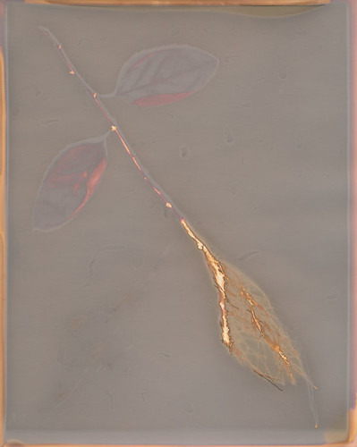
I took a small supply of fixer home with me this summer, to avoid the 45-minute drive to a darkroom. I mixed some up for my salt prints and decided, hey, why not use this for what I actually planned on? So I've been doing some tests of how different lumen papers respond to fixing. Most of them don't respond well, as I've noted multiple times before.

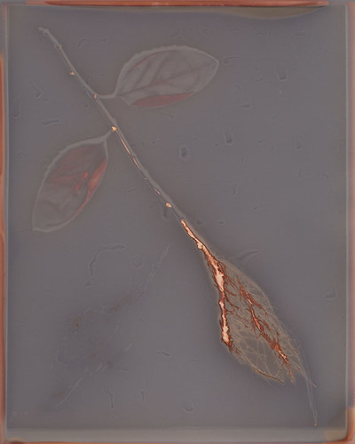
However, I got a bit of a surprise when I did a fix test on a sheet of Adox MCC 110 Premium FB paper. The image was nice enough before fixing, with a grey field and rusty orange highlights. The fixed image was much softer, with a grey-brown field and more golden highlights. The weirdness was that in the fixed image, shades of maroon appeared in areas that had formerly been just bland grey. The leaves, the stem and the border all became much more visually interesting in the fixed print than they had been in the original.
Post-Fix Print

That was pretty cool. It wasn't perfect, because the fixer had reduced the contrast with the background and taken some of the drama away from the roots by softening the colors. It also lightened everything, even the dark shadows. Looking at the two images side-by-side on my screen, I realized something: I could just put them together.

In a traditional photograph, I could bracket to get the sky properly exposed in one shot, and the foreground properly exposed in the next. There was no reason that I couldn't do the same thing here, with this lumen print. I've digitally modified lumens before to enhance contrast, clean up the scan, repair damage or make a pale print more vibrant. I've never really taken it that far, because I tend to treat my lumens as a process rather than a final product. There's really no reason to do that,
Final Composite Print
though.

So I dropped the Post-Fix file into the Original Print file as a layer, slapped a black mask onto it and cut holes so the leaves, stem and parts of the border would show the extra colors created in the Post-Fix file. A little bit of blending finished the merge, and I got a single image with the best aspects of both the Original Print and the Post-Fix print. A digital hybrid that shows a single image in its best light.

I think there's a lot more room to explore here.

Thursday, January 9, 2014

Blogging for Thor: Tis the Season (for Gloom)

Hello, my little internet spiders. I'm doing well, I suppose. Graduate school applications on schedule, getting things done, taking care of business. Just not art business. I can lay some of that down at the feet of the season. It's cold, so going outside sucks. The light is mostly indirect and dull, so exposures take longer even when there are sunny days to do them. It's winter, so all the plants I use for my images are dead anyway.

I can't blame everything on the season, though. I have projects I could be working on. Just out of my photo-related projects, I have a whole friggin book I'm supposedly working on and have made very little headway with. I was supposed to be putting together a guide to different papers for lumen printing, and another guide to different dyes for anthotypes, and yet another guide to different methods for cyanotype toning. All of those consist mostly of organizing existing material, formatting and writing. I can do those in the dark, so I can't blame the weather. That's not even touching the non-photographic projects I have on the back burners, like pure writing projects and a calendar I've been meaning to design and send off to a Kickstarter company that I'm a big fan of, just to see if they like the idea and would be interested in working with me.

My motivation for creativity is pretty shot. This happens every so often, and it's always a bummer. I think it's a build-up of anxiety, and it doesn't do any good since losing my creativity just makes me more anxious and unhappy with myself since there's all these things I want to do that I'm not doing. Right now I'm worried about grad school, about being able to teach this new class I've got for the upcoming semester, about being able to get students for my museum classes so I can make extra money. Not to mention worries about my elderly dog's health, making sure my Obamacare goes through properly (it isn't Obama's fault anymore, now I'm dealing with a purely private company that is underwhelmingly prepared to handle the influx of new policy holders), paying off recent car repairs, wondering how to do taxes... oh, and of course the general looming dread that even once I get past grad school, I still have to somehow surmount all the obstacles between adjunct-hood and tenured professorship.

So, yeah. Anxiety might be the opposite of creativity. Creativity is work, guys. It's really hard work, and it takes a lot of effort. For me at least, it isn't like on TV where I just "get inspired" and the creativity flows out of my eyeballs and just makes art happen. Even if I'm feeling creative as balls, it's still a massive amount of time and energy invested in the work part of creativity. Coating paper, making exposures, rigging new exposure frames, making new dyes, research, writing, planning, prepping, doing layout, formatting, researching, editing (photos and writing)... not to mention all the shooting involved in any project needing illustrative photographs to demonstrate processes. That's a lot of work. It's not easy, even when I'm overflowing with creative brainwaves.

When anxiety attacks, it drains all my energy. It's like living inside a lead suit, where even the normal activities of daily life seem like labors, and accomplishing basic human tasks like showering and going to buy food seem like such incredible accomplishments that I should earn a reward just for keeping myself going at a basic level of civilized competence. It's being exhausted, constantly. It's spending whole days in bed because just trying to plan out your day becomes an hours-long task that sends you spiraling into worry and dread.

This ended up pretty gloomy. Allie Brosch puts Depression in perspective, but I don't know if I have depression. I've never checked; Obamacare doesn't cover depression anyway. If I do have it, I can't tell and I can't afford to have medical conditions. That's extra gloomy.

Fuckit, in three days, I'll be back to teaching at the university. I'll have a whole batch of new students, a new class to teach and for at least a month, I'll be teaching seven classes a week. I always feel better when I'm teaching. Here's hoping!

Friday, January 3, 2014

Blogging for Thor: Dust in the Wind

Six different anthotype dyes in their raw forms.
Man, I'm really bad at remembering what day things are. I was so happy with myself today, too. I ran errands and got things done. Like an adult. Then I came home, forgot it was Thursday and went to bed. Thankfully, I tend to wake up at 3 AM or so, stay awake a few hours and then go back to sleep. I've convinced myself that so long as my blog is up before dawn on Friday, it's still Thursday. Totally sound logic, right?

Today's blog is going to be short, though. It's mostly a plug for something else I'm doing. I decided to start photographing the different dyes that I use to make anthotypes with! Starting with the dry powders, I'm taking proper photographs of each dye. I'd really love some kind of big, interactive website where you can click on a picture of the dye and have it bring up a sample sheet showing what the dye looks like before and after exposure, with comments on how to prepare it. That'd be pretty awesome, but I have no idea how to make that work. Maybe some sort of weird eBook internet sorcery.

On other fronts: the weather has just been terrible lately. Clouds, rain, fog, clouds, rain, clouds. Even on 'bright' days the light is so filtered and low-contrast that there's hardly any UV light at all to expose prints with. It's officially the off-season for sun printing. As a result, I need to do something else and it seems like a good time to work on articles (haha, not this blog, no one reads this blog) and that vague idea for an anthotype book I keep telling myself I'm writing. Or the visual reference guide to lumen printing papers. For right now, though, I'll be focusing on the anthotype dye documentation.

The complete set of current photographs for this project is here, on my Flickr.


Saturday, December 28, 2013

Blogging for the Baron: Slated For Next Week!

Yeah, I took a bit of a break this week on account of Christmas. I've done virtually nothing photographic for several days, aside from teach my sister how to use her new Nikon D3000. That meant when Thursday rolled around, I had nothing to blog about. Honestly, even if I had, I was wiped out from Christmas anyway and wouldn't have gotten anything up. Friday, I cleaned up my studio and organized my collection of lumen papers and anthotype dyes. My parents gave me an awesome new collection of the cutest little tiny Mason Jars to keep dyes in. I'll have to take a day or so soon to label everything and transfer the really low-volume dyes (indigo, woad, spirulina, etc) to the tiny jars.

Anyway, all that. I still haven't made any new lumens or anthotypes. So, today, I'm dedicating my blog to Baron Samedi and hoping he doesn't decide it'd be funny for me to get run over by a car or something. We cool, Baron? Hope so. I don't have any tobacco or rum (I have bourbon?) to offer him, but I've got some nasty pennies laying around.

What's the blog going to be about today? Actually, it's going to be about ideas. Cheap ones. Now, see, when I do actual photography-with-a-camera it's generally small object photography. Taking pictures of things I've made or found, mostly. Having a small studio space means I don't get too complex. I don't own a seamless. I make my backgrounds out of alternative resources. Today seems like a good day to talk about those.

Tiny felt turtle on a silk shirt
Old shirts and pants make great backgrounds. I have about six pairs of jeans and dozens of shirts, especially shirts from my mother and sister that they don't wear anymore. If you don't have any handy fabric-loving family members, there's always thrift stores. Silk shirts are especially nice, since the back of the shirt provides a large, solid area to work with. They come in lots of colors and after being worn and cleaned several times, they tend to lose that ludicrously-shiny appearance that new silk can have.

Black velvet makes a great background because of the way velvet absorbs light. It throws back very little shine, even under intense light. This is great for jewelry or anything else bright and shiny, where you want the background to absolutely disappear. I imagine white velvet would work great, too, but I've never tried it. Velvet is kinda expensive, though. My solution? A thrift store in Atlanta back when I was visiting for SPESE. I grabbed a velvet slip, sliced it in half and now have about a square yard (it was a really small slip) of black velvet that cost me $2. Velvet at the fabric store can run upwards of $10/yard. Since I do mostly small objects, a square yard is more than enough for me, most of the time.

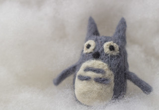
Tiny felt Totoro on Polyfill
When I want a white background, I generally use a sheet of high-quality drawing paper like Stonehenge or Rives BFK. These papers are extremely matte and, like the velvet, throw back almost no shine or glare. They fold and bend easily, but won't ever ripple or drape like fabric. For a no-horizon seamless sweep, these nice papers are great. Plus you can roll them or store them in a sleeve. They're great! Very durable, too, and if they get dirty you can generally clean them with a decent-quality eraser.

I've also found that white polyfill (fluffy stuff used to fill stuffed animals or fluffy blankets) is a great background and spacer material. You can light it from behind or underneath to get a real 'glowing cloud' effect. Plus it's very posable and supportive for light objects like jewelry and small textile crafts.

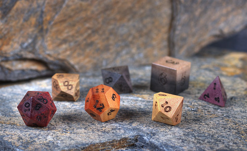
ArtisanDice polyhedrals on natural slate
The title of this post, though, comes from one of my favorite backgrounds: slate. It's a great rock and it's very cheap. There's a little food mart / home store around here (Hillbilly Produce) that sells landscaping slate and I buy natural stones there for a few cents a pound. Generally I buy rocks maybe 1-2 feet in any direction, 1-2 inches thick. They have great texture and colors. Very subdued, but nice variations of blues, greys, browns, reds and oranges. If I want something flatter and maybe brighter colored, home improvement stores like Home Depot sell slate flagstone tiles for about $7 per pack of five square foot tiles. Or you can buy them individually if you just need one or two. Not only are the tiles great by themselves, they're great for using to 'extend' the natural rocks. You can put the tiles in the background and they blend in perfectly with the more textured stones, especially if you use a low depth of field. I like using slate when I want a more visually interesting background that will be complementary to my subject, but not detract. It's also great for wood, since it provides a nice contrast. It can be used to give things a vintage, rustic feel as well.

That's all for today folks! I might be back soon with an unscheduled entry, to make up for today's rambling craziness and the lack of holiday on-time-ness. But maybe not! With Grad School Applications looming, who knows?!

Thursday, November 14, 2013

Blogging for Thor: Snarly Snaggle of Progress

Last week, I talked about some ideas I was working on for more advanced lumen printing. Not advanced technically, in the sense of how the printing itself works or the colors produced or the image making itself, but conceptually more advanced than photograms of leaves on solid backgrounds. I don't want to stop working with leaves or stop doing photograms. I don't have any desire to get negatives involved with this process. That's not how I want to go.

I'm wanting to create a multi-layer effect by introducing texture and value in the image beyond the leaf itself. Instead of just documenting how a leaf looks, I'd like to use the leaves to create my own work that takes more than just the placement of the leaf into account. I've been pondering ways to do that. I have some textured acrylic sheeting, the kind that goes over florescent light bays, and I tried using that instead of glass during a lumen exposure. Only the very, very faintest traces of texture were visible in the background of the print. I think that was partly due to me just putting the acrylic on top of the exposure frame instead of having it in direct contact with the paper; the light was allowed to diffuse instead of being directed clearly against the paper. Also, even with the texture, the entire acrylic sheet is transparent.

Next to-do experiment is to rub black paint onto the textured acrylic, then rub it back off. Hopefully that will bring the texture into stark relief and create veining or other patterns across the surface of the print next time I try. I might also just try cliche verre backgrounds, creating my own texture with the paint or ink applied to smooth glass or acrylic sheets. I've considered fabric with stains or dye as well, especially heavily textured fabric like rough muslin, handmade felt, burlap or raw silk.

I also want to try combining scanograms with lumen prints. I've done that before, by making a lumen print of a plant, then making a scanogram of the plant with the lumen print as the background to the scanogram. I think I can take it further, though, and incorporate them into each other. Using the mosaic style of lumen printing, cutting small sheets of paper and exposing them individually under different sections of the plant, I can highlight certain interesting areas of the plant with lumen printing, and use a scanogram of the entire plant to connect these lumen tiles.

Even while writing tonight's post, I considered what might happen if I soaked some of my handmade felt in a puddle of Liquid Light? Or what if I mix Liquid Light and acrylic gel medium together to get a soft, flexible plastic that has light sensitive material inside it?

It's a pity that fixing lumen prints tends to work so poorly. I think it'd be fun to do some work along these lines that incorporates the physical prints as objects, especially with vellum, felt or other interesting surfaces.