Showing posts with label lumen prints. Show all posts

Friday, April 29, 2016

Blogging for Freya: Fun with Food

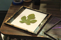
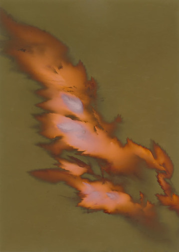
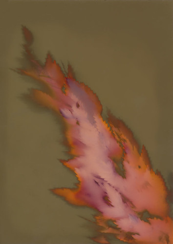
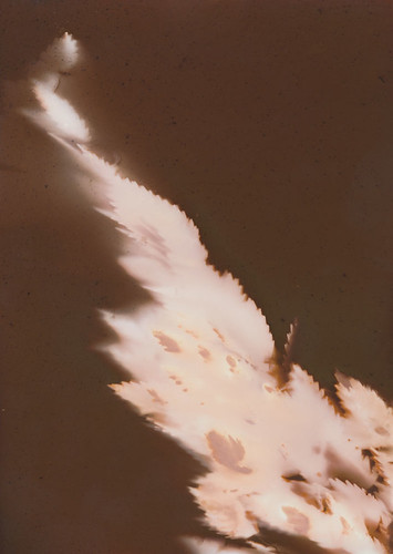
Transference #2 – Orange juice, rice, milk, flour
Ugh, I'm getting so bad at this, Spiders! I'm supposed to blog for Thor! But I forgot entirely last week, and this week I was at game night. Sorry, Thor. At least Freya alliterates well with this week's topic! And, as a fertility goddess, she's more suited to a post about food!

My thesis project is going well. I've hammered out an artist statement that's concise and meaningful, I've produced a good start on a body of work, I've got lots of new places to go with that body of work, and I'm enjoying my work!

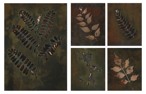
In short, I'm making 'chemigrams' with food, or the ingredients of food. Playing around with different bits of food science, baking, and cooking to produce chemical reactions that cause photo-paper to change color under sunlight. So, they're 'lumen prints' in that they're made on darkroom photo-paper exposed to sunlight, but they're chemigrams in that the only thing used to make them are chemically active, not negatives or inert objects. The paper does really react to the chemistry. Acids, bases, oils and salts all have distinct effects on the paper, aside from simply altering how much light reaches the surface.

The biggest problem has been that I have classes and work during the day, so I tend to leave home soon after getting up, and get home shortly before the sun goes down. That's made it extremely difficult to get much printing done. But the weather is finally turning sunny, and classes are almost over. I hope to get a TON of work done this spring and summer! I'm finally really excited about my projects, too. That's so important, because now I'm actually motivated to do work.

The failed baking soda / vinegar volcano print
My latest experiment was building a baking soda and vinegar volcano on a sheet of photo paper... it didn't come out super well. The baking soda worked fine, even created some nice patterns, but the vinegar turned the paper an unpleasant poo-like brown. I have some ideas on minimizing that, so I'll try the experiment again. Probably later today!

The next idea I have to work on is creating a webwork made out of the stringy bits on bananas (I'll have so many bananas left that I'll probably make banana bread) and the smaller stringy bits found on orange slices. The challenge will be to use the right paper. Since the banana strings and orange strings are so thin and small, it needs to be a paper that reacts to light quickly. Otherwise, I'm afraid that the light will burn through these small objects and leave a very low-contrast, poorly-defined image.

I may also give a shot at printing an image that's immersed in boiling water. I've done underwater prints before, so I know they work. Making the water boiling could be fun! I'll probably do that with something that I suspect will react strongly with boiling water. Maybe milk or yogurt, which may begin to curdle and burn? Or cheese, which may melt? It'll be fun! I could even freeze the paper ahead of time, and then pour boiling water on it while it's still frozen. I know if you do that with film it can shatter the gelatin base, causing a crackle effect. I don't know if that would be visible on photo paper, but it's worth a shot!

Saturday, June 27, 2015

Blogging for the Baron: Slipped Discs and Salty Duds

Hi there, Spiders. I wish I didn't have a good excuse for missing this week's Thursday update, but I do. Somehow I managed to slip a disc in my lower spine while getting out of my friend's SUV. Normal, every day activity and my spine just decided that it wasn't up to it. So I spent Thursday night and Friday morning in increasing amounts of pain. Then I went to the doctor (thanks Obama!!) and found that instead of a pulled muscle, a particularly persistent cramp or anything else reasonable.. I had torn a disc in my spine and some of the jelly inside had leaked out and was messing everything up. That's not terrifying at all.

So now I have an absolute bucket full of drugs to take. Anti-inflammatories, muscle relaxants, steroids, two types of high-powered painkillers. It's pretty lame, actually. At least so far nothing actually knocks me right out... but then I haven't tried the Valium yet. Today, thankfully, was an improvement. If I'm sitting, standing, or walking... I'm mostly fine. It's just when I try to lean over, or move between positions that my back reminds me that it is most certainly not fine.

My students coating papers
Despite all that mess, I did manage to get to my workshop today. Photogenic Drawing at the Light Factory! I had six students, which was a great number. We covered chlorophyll printing, cyanotypes and lumen prints in detail. We briefly went over the theory of anthotypes, but didn't have time to make an exposure since they take several days. I had planned to include salt prints, and I sorta did... but the paper I used wasn't the right kind of cheap watercolor paper. The silver nitrate solution soaked right into the paper, leaving a blotchy, streaky mess. None of the prints came out, not even a little. It really sucked. But the other three-and-a-half processes were a big hit!

There was another, smaller issue with the cyanotypes. I've been using very old and brown ferric ammonium citrate for months now. I got a large jug of it when the Light Factory moved from their old location to their new one, and I never turn down free photo chemistry! Since getting it, I've mostly been using it for parchment prints, where color and detail get a bit muddled anyway. Originally, though, I did some tests to be sure the brown ferric ammonium citrate would work. It seemed to work fine on those tests, some months ago. I can't find them now, but I distinctly recall doing them....

Left: Green FAC.     Right: Brown FAC.
Anyway, today when we printed with the brown ferric ammonium citrate, all our cyanotypes came out with a strong sepia tinge to the highlights and with duller, more greyish-green blues. They basically look warm-tone or very "antiqued." Almost what you might expect from a tea toning. It's quite odd, but not unattractive. They still had full detail, highlights and shadows. 

Later in the class, I mixed up some green ferric ammonium citrate and the prints from that came out great. Pure whites, navy blues, all normal results. So it does appear that either the brown ferric ammonium citrate has always produced those warm tones, or something has happened to it in the last several months. I'm not sure which.

At least I know about it now, and I can take advantage of the difference. The warm-tone cyanotypes are quite pretty, so I'll be trying those out with some negatives. I might even have to start making new negatives! It even worked out really nicely with just photograms. The yarrow photograms pictured above came out great on the warm chemistry. I really love the look of yarrow sprigs, too. I'm going to have to see if I can get ahold of some myself. The yarrow my student had started wilting pretty fast in the heat, and by the time I got it home, it had curled up on itself. Big bummer. I'm going to try putting it in water and coaxing it back to life!

My students today had great success using digital transparency positives for chlorophyll printing. One of them brought in some historical photographs of faces and some scanned nature etchings from old books. They printed really well! I'm going to have to consider what kind of images I might work with, since I haven't been shooting a lot of actual photographs over the past several years. Still, it's pretty cool stuff. 

Overall, today was very productive. I had a great time, and I'm feeling really inspired to start some new experiments. I hope my students from the workshop feel the same way!

Friday, August 1, 2014

Blogging for Freya: Fiber and Plastic

While it's entirely possible to create a lumen print on non-traditional surfaces by using liquid photo emulsion or an alternative process like cyanotype or salt printing, most lumen prints are made on photographic darkroom paper.

Darkroom photo paper comes in two forms: Resin-Coated (RC) and Fiber-Based (Fiber or FB). There are pro's and con's of both for normal darkroom printing that have been covered in-depth by dozens or hundreds of different photographers. Lumen printing, however, is not traditional darkroom usage. There are some different reasons you may want to work with either RC or FB papers for your lumens.

First off, remember that lumen color profiles vary by the type of paper and, yes, that includes a difference like RC vs FB. Not always significantly different, but different. Some brands might vary to a considerable degree, but all of them will vary at least a bit. So one thing you have to consider when making your choice is simply if you care. Maybe the specific colors you want don't come from RC, or can't be produced on Fiber. In that case, this guide will just help you deal with the downsides of that particular material.

Monday, June 30, 2014

Blogging for the Moon: Lunar Caustic

Unfixed Salt Print on Fotokemika Varycon
I'm sorry spiders, I've just been feeling down for a while. A few things happened that kept the sad rolling and I just wasn't able to muster the mental fortitude to resist. So I spent a while trapped in the fog, with no work to break me out. I did manage to do some experiments while I was in there, but I just couldn't get to the record keeping and documentation steps, or actually bring myself to write them up. I've let you down, spiders, and I've let down Thor, Freya, Baron Samedi and the Sun itself. Darn.

Well, as I've been forced to hear repeatedly in recent days, all you can do once you've made a mistake is learn from it and move on, trying your best not to repeat the mistake. I know that I'll be late to blog again, but I'm really trying to get better. I might even try to write my blogs early and schedule them to automatically post on Thursdays. That'd be pretty novel!


Let's skip that stuff and get to what you actually care about, right? Spiders care nothing for human trials, but love some photography. Or something. Today's topic is one of my recent experiments: salted lumen prints. I was lead to this idea by John Fobes, who coated one of his lumen prints in albumen mixed with ammonium chloride. Mr. Fobes got some very interesting color shifts as a result of printing on the still-wet albumen-coated paper, but it got me wondering if it would be possible to use silver gelatin paper as a base for salt prints to combine the salt print with a lumen print.

I soaked two sheets of Fotokemika Varycon fiber-base paper in a simple solution of filtered tap water and kosher salt, the same kind of solution I'd use to soak normal paper before making a salt print. I used quite a lot of salt, getting the water up to the saturation point. Then, I allowed both sheets to dry completely overnight before coating one sheet in the same 15% silver nitrate solution used for salt prints. I allowed that sheet to dry for several hours as well, then exposed them both as I would normal lumens, for 1 hour each.

Overall, I did not see a big difference between a salt-soaked lumen print and a regular lumen print, at least not on the Fotokemika Varycon paper. They look about the same, the only significant difference being that the salted print had less color and was overall less vibrant. I'll be testing other brands of paper to see if I can achieve different results. I think Mr. Fobes' use of albumen also contributed to the color shifts he saw, not just the application of chloride.

Using the silver gelatin paper as a base for a salt print proved effective. The paper doesn't take coating as evenly as something more porous would, but I think that can be solved with multiple coats of silver nitrate, or just more careful application. The image looks very similar to a traditional salt print, but carries strong undertones of the paper color. The unfixed image carries much more of these tones, but that's because fixing destroys most of the color in Varycon paper. I plan to experiment with a more vibrantly colored paper, maybe Collodio POP or Harman Direct Positive, but the concept proved itself. You can make a salt print on silver gelatin paper, and doing so does affect the final image.

Friday, June 6, 2014

Blogging for Freya: Basic Chemistry

4 hours, regular water
2 hours, basic water
2 hours, acidic water
Ugh, sorry Thor! I'll make it up by posting twice this week. I just lost track of blogging today.


I have previously experimented with exposing lumens in water. Often a paper has totally different characteristics when exposed to moisture, so lumens made in water will tend to display a radically different color scheme than normal. Since both the paper and the printing object are floating in water, contact is limited and the images are blurry, sometimes very blurry if the paper or object are disturbed in the water. Debris can get into the water, moving around and creating interesting background results. The water adds another dimension to the printing process.

Over the last few days, I decided to try something else. I already knew from
other experiments (and just basic darkroom chemistry) that photographic paper reacts not only to moisture, but also to acids and bases. Developer, for example, is basic. Stop bath is acidic. I once tried painting liquid detergent (a strong base) onto photopaper, only have to it turn black within seconds. I knew ahead of time that by adding acids or bases to the paper, I could influence how it developed. So, I mixed up some solutions and exposed lumen prints in either a slightly acidic solution, or a slightly basic solution.

My base solution was just a simple addition of baking soda to hot water. I dissolved the soda completely, though I do plan to do some later tests with larger amounts to see what it does when large amounts are in direct contact with the paper. From these preliminary tests, I found that (as expected) the baking soda solution seems to accelerate the exposure. Normally the paper tested, Fomalux RC Contact Paper, shifts from violet to green over the course of 4-5 hours if exposed underwater. When immersed in the baking soda solution, that time was cut in half. I got a full conversion to the desired orange-green scheme in just under 2 hours. Normally a 2 hour exposure in water is just brown. I'm going to experiment with this to speed up other long-exposure papers like Collodio POP and Harman Direct Positive.

For the acid solution, I used anhydrous citric acid crystals, which I did not fully dissolve. In one test, I sprinkled the crystals directly onto the paper. No significant results, but the areas of contact did show some minor resistance to exposure. In general, the acidic environment did as expected and slowed exposure considerably. The Fomalux paper, after 2 hours, was a dull brown with very little contrast. It seems to affect the background more strongly than the object (possibly not as much acid reaching the paper where it was covered by the object?) because the object was turning orange already while the rest of the paper was still brown.

I'll be trying with some other solutions and concentrations, but I think this technique (especially the basic solution) has some interesting potential. Speeding or slowing chemical exposure of lumens could allow for some fun play with papers that normally expose too fast or too slow. I need to see if I can produce the results without submerging the prints, possibly by pre-soaking the paper. That would allow more traditional, full-contact lumens. That'd be nice; I like detail.

Friday, May 30, 2014

Both is Better

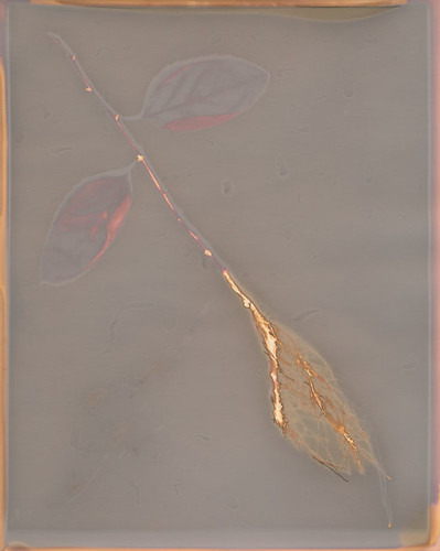
Original Print
I took a small supply of fixer home with me this summer, to avoid the 45-minute drive to a darkroom. I mixed some up for my salt prints and decided, hey, why not use this for what I actually planned on? So I've been doing some tests of how different lumen papers respond to fixing. Most of them don't respond well, as I've noted multiple times before.

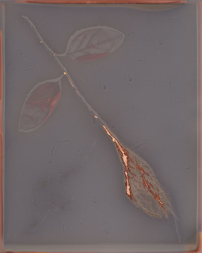
However, I got a bit of a surprise when I did a fix test on a sheet of Adox MCC 110 Premium FB paper. The image was nice enough before fixing, with a grey field and rusty orange highlights. The fixed image was much softer, with a grey-brown field and more golden highlights. The weirdness was that in the fixed image, shades of maroon appeared in areas that had formerly been just bland grey. The leaves, the stem and the border all became much more visually interesting in the fixed print than they had been in the original.
Post-Fix Print

That was pretty cool. It wasn't perfect, because the fixer had reduced the contrast with the background and taken some of the drama away from the roots by softening the colors. It also lightened everything, even the dark shadows. Looking at the two images side-by-side on my screen, I realized something: I could just put them together.

In a traditional photograph, I could bracket to get the sky properly exposed in one shot, and the foreground properly exposed in the next. There was no reason that I couldn't do the same thing here, with this lumen print. I've digitally modified lumens before to enhance contrast, clean up the scan, repair damage or make a pale print more vibrant. I've never really taken it that far, because I tend to treat my lumens as a process rather than a final product. There's really no reason to do that,
Final Composite Print
though.

So I dropped the Post-Fix file into the Original Print file as a layer, slapped a black mask onto it and cut holes so the leaves, stem and parts of the border would show the extra colors created in the Post-Fix file. A little bit of blending finished the merge, and I got a single image with the best aspects of both the Original Print and the Post-Fix print. A digital hybrid that shows a single image in its best light.

I think there's a lot more room to explore here.

Thursday, May 29, 2014

Blogging for Thor: In Soviet Russia...

So many stamps! There's just so many!
Thanks to the wonders of eBay, I was recently able to purchase some Soviet-era photographic paper from a seller in Lithuania. I'm not sure why they needed 44 stamps to send it to me, but apparently they did. I'm keeping this envelope forever. I asked a Lithuanian friend if such an abundance of stamps was ordinary or reasonable, but he assures me it is neither. He was at a loss to explain the stamp-splosion that arrived in my mailbox. Whatever, it's awesome.

The paper itself is decidedly... less awesome. First off, all three types of paper I got are designed for color processing. Generally, I do not find color photo paper to be as well-suited to lumen printing as black and white paper. It tends to take longer to expose and often has less dramatic colors. I've found that certain Kodak types of color paper have an odd reversal effect when exposed to moisture, producing a positive image instead of a negative image. That can be cool, but the colors are still generally just not as bright and fun as black & white paper can produce.

One frustrating thing about this Soviet paper is that it doesn't have any kind of brand or identification. It's just labelled "Photo Paper" with the sub-label "PhotoColor-2". Soviet Communism appears to have been boring as shit in addition to all its other faults. I approached the Alternative Photographic Processes group on Facebook to see if anyone could help translate the Russian information on the envelopes. Special thanks to Galja Karpova and Anton Orlov especially for translating some of the information. It appears at least some of this of paper dates from the 1970s and was produced in Leningrad. I believe it also has a glossy surface.

I purchased two sizes of the USSR FotoTsvet-2 (8x12 and 18x24), along with one bag of Fortecolor Type 3 paper (13x18) from Hungary. The Forte paper may be newer than the USSR paper, but not by much.

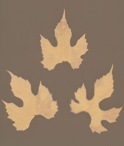
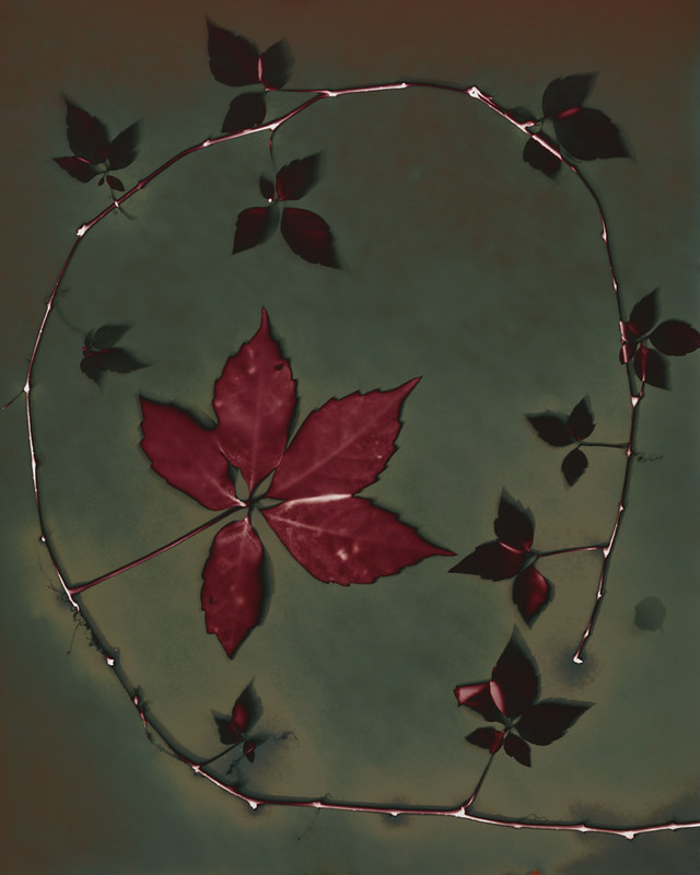
3 wet wild grape leaves
FotoTsvet-2 (18x24)
The 18x24 size of FotoTsvet-2 appears to have distinctly different characteristics from the smaller size. I got two 20-sheet packets of it. Overall, I'm not impressed with the paper. It's boring and dull, but I am continuing experiments to see if there might be something that can be done with it to produce more interesting results.

Color Palette: Brown field and light brown images. There seems to be very little range in this paper. I've done only two exposures, both for fairly long times (6+ hours) but I don't anticipate anything interesting happening at shorter exposures. The paper is very slow to expose at all. It starts off as a cream color, either naturally or as a result of its extreme age and fog.

Moisture Response: Almost none. There is a tiny visible halo of lighter brown, but it is extremely difficult to see even on the physical print.

Reaction to Fixing: Unknown as yet. I am not enthusiastic, given the rather dull colors that this paper presents prior to fixing. My previous experience with fixing color paper is that it virtually destroys the image.

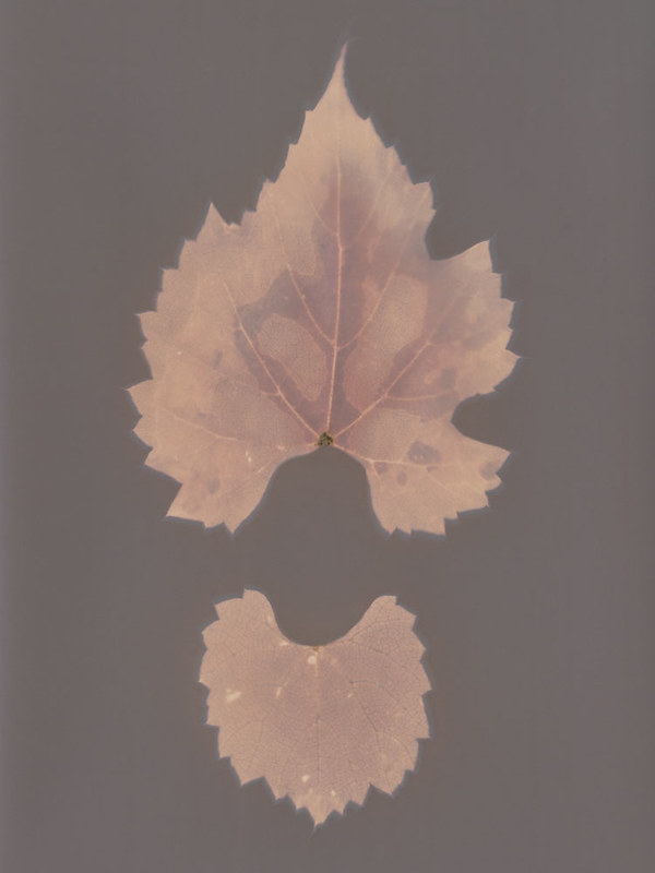
FotoTsvet-2 (8x12)
I only have one 20-sheet pack of this size of paper, so I'm trying to be a bit cautious with it. I'm enjoying it more than the 18x24 size. It's still limited to earth tones, but there's some variation.

Color Palette: Violet-brown seems to be the color of the field, no matter what else changes. Objects can take on different tones depending on moisture and length of exposure, but generally all within a yellow-orange to red-orange range. The paper is very slow to expose at all. It starts off as a cream color, either naturally or as a result of its extreme age and fog.

Moisture Response: Unlike the larger size of FotoTsvet-2, this version does have a notable reaction to moisture. The example image shows two leaves exposed on the same sheet. The upper leaf was dry, the lower leaf had been soaking in water for a few days, so it was full of moisture and damp on the surface. Further experiments have revealed that fresh leaves and water produce deeper, redder colors and better contrast on this paper. Very little in the way of a halo effect, but there is a minor darkening around the edge of wet subjects.

Reaction to Fixing: Unknown as yet. I am not enthusiastic, given the rather dull colors that this paper presents prior to fixing. My previous experience with fixing color paper is that it virtually destroys the image.

Fortecolor Type 3
I enjoy modern, black and white papers produced by Forte quite a bit. Fortecolor Type 3, though, is not one of my favorites. So far, results have been very bland.

Color Palette: Browns, mostly. The paper has an overall tint of violet, but generally the colors produced can be described best as shades of brown. The field is dark brown, the objects are light brown. It isn't quite as starkly boring as FotoTsvet-2 (18x24), but it's close.

Moisture Response: Again, very little. There is some response to direct liquid application, which produces a darkening with more purple than brown in the affected areas, but simple moisture from fresh or even wet leaves is not enough to cause a dramatic effect. I may experiment with immersion during exposure, just to see what happens.

Reaction to Fixing: Unknown as yet. I am not enthusiastic, given the rather dull colors that this paper presents prior to fixing. My previous experience with fixing color paper is that it virtually destroys the image.


As always, you can check out my Flickr for further experiments. "FotoColor-2" and "Fortecolor" are the keywords for these new papers!

Thursday, May 22, 2014

Blogging for Thor: Halo There!

I had a lot of fun today playing salted paper prints, but that isn't what this blog is about. That's because I had this thing to talk about first, and also because the salt print blog is going to take a while to write and it's 10:45 right now, as I start this. I wouldn't make the midnight deadline if I did the salted print post. Plus, in all fairness to this post, I did have the idea for it first. Mostly.

You know what, spiders, just read the blog. This post is actually informative and useful, while the salt print one is just kinda cool and fun. So there's that, too. Not sure what else there was.


Pre-exposed print with emphasized halo
One of the really cool things about lumen prints is that if you use fresh plants to make your contact prints, there will often be a "halo" around your subject. The moisture in the fresh plant material sweats out under the sunlight and heat, soaking into the paper. The wet paper reacts differently to light than the dry paper does, creating a different hue or value depending on what kind of paper you're dealing with.

This week's fun fact is that you can dramatically enhance the appearance of such halos by leaving your lumen print out to "pre-expose" under indirect light or interior lights. The low amount of light is enough to begin the exposure of your paper, and start the moisture reaction, but not enough for a big dramatic tonal shift that will produce a vibrant lumen. So the halo has time to creep outward with the moisture while the exposure is still happening fairly slowly and subtly.

Once your halo has been established in a few minutes to a few hours, take your print outside and let it expose in direct sunlight. Now, all at once, the halo and the background will darken dramatically, creating a very stark, very visible halo in your image. That's because the low light allowed it to form first, then expose. When you just expose a lumen normally the halo is struggling to form while exposure is already happening all around it. The moisture doesn't have time to sink in and affect the paper as much, because more of the paper is being exposed before the moisture can spread out.

Regular print with faint halo
A pretty cool trick, and one I can't take credit for. I learned it from John Fobes, who is another enthusiastic lumen printer with far more experience than I have. He discusses the idea a little bit here, in this particular image. Here's the relevant quote:
Polycontrast is capable of producing a nice halo if you prepare the specimen [and] first let the prepared print sit for a few hours under weak room light before you expose it to sunlight.
Mr. Fobes is referring specifically to one type of paper (Kodak Polycontrast II), but it holds true for many types of papers since the underlying mechanic of the halos is the same. Note that this technique works best in hot places, because the heat will wither the plant material faster, releasing more of that lovely moisture onto and into your paper. That's another reason why spring and summer are the best times to work with lumen printing.


Whelp, that's all Spiders!

Tuesday, May 20, 2014

The Importance of Numerals

I was extremely excited to find a 100 sheet pack of Kodak Polymax II RC paper (glossy) for sale on eBay. As I mentioned last week, Kodak Polymax RC is one of my favorite types of paper for lumen printing. It did not occur to me that Kodak Polymax II and Kodak Polymax would be entirely different papers. They are totally different papers.

Kodak Polymax (no numerals) is a much older formulation of that type of paper. Like I mentioned, it tends to produce cream to brown fields with orange to red (sometimes violet) objects. I've found nothing that gets close to the same delicacy and lightness of Polymax, though some other Kodak papers will produce the same brown/red scheme, they can't match the lighter shades that Polymax can render.

Unfortunately, Polymax II doesn't seem to be even remotely connected to Polymax. I did a test print as soon as the paper arrived and, much to my dismay, the paper began turning indigo once struck by sunlight. Not brown, cream, tan or beige. Indigo. There are several papers that produce similar colors, so the indigo isn't anything I haven't seen before. It's nothing particularly arresting. Which sucks. I was hoping for a replacement for a very hard to find paper that gives amazing results... and I didn't get it. Not even a moderately nearby substitute.

Lame. At least it isn't a big loss, since the Polymax II isn't ugly. It wasn't even that expensive, which is part of why I was so excited. It was cheaper than even buying newly made photo paper, which is actually refreshing. Most expired and outdated photo papers are extremely expensive. I'm not exactly sure why, because such old papers aren't really that useful for printing. They tend to be fogged or unpredictable in their printing because of their age. I guess some folks are willing to pay for their old favorite papers, even at an unbelievable markup, and even when the papers may not actually work any longer. There can't be that big a market for old papers to use in lumen printing.

Kodak Polymax II RC
I've mentioned before that Kodak has not produced any new photographic papers since 2005, which is nearly a decade now. So even Polymax II isn't easy to obtain. It's much easier to get than the original Polymax, but as described above (at length), it isn't as nice.

Color Palette: Field starts out as indigo blue, then shifts with sufficient (2+ hour) exposure into a dark violet-brown. Objects will start out a very soft baby blue, developing into a very nice mixture of red, violet and blue. Interestingly, these remain separate instead of simply blurring into a continuum.

Moisture Response: There is a reaction, but not a huge one. The moisture creates a darker halo around objects, with a bit of a shift towards red.

Reaction to Fixing: Untested, but Kodak products in general do not react well to being fixed. I will be testing this soon, though.

Friday, May 16, 2014

Blogging for Thor: Playing Favorites

I've used many different papers (and non-papers) for lumen printing. I generally try anything I can get my hands on, really. Admittedly, I don't have the deep pockets to chase down much in the way of discontinued or expired paper types. Occasionally I'm able to get samples of old papers from friends, co-workers or stockpiles at work (I always try to use old paper for demos, since the old paper is worthless for printing). I prefer buying smaller quantities, because quite honestly most papers I've tested for lumen prints are kinda boring.

There are some exceptions, and those exceptions are my favorite types of lumen papers. The ones that stand head-and-shoulders above the rest, laughing at their dull, boring colors while they strut around flashing their giant tails at everyone. My top three at the moment are APP Collodio-Chloride POP, Kodak Polymax II RC and Adox Fine Print Variotone Warmtone. Shall we talk about why?

APP Collodio-Chloride POP 
Multiple fixed images, all with fresh leaves.
This one's still being made, just not being made commercially. It's individually coated by one guy up in New York and it's expensive: $6 a sheet for 8x10s. Sometimes he has "test quality" sheets that he sells for $3, but as he improves his techniques for production, that's becoming less commonly available. Its lumen characteristics are amazing. It has two distinct tonal phases and even fixes in a gorgeous way. I love working with it, but am forced to do so only for the most interesting subjects and compositions due to scarce supply. I tend to make fairly small prints (4x5, 3x3 or 2.5x3) because of the expense.

Color Palette (Short Exposure): For very short exposures (15 minutes or less) the paper turns scarlet red, with objects remaining white or shifting towards golds and creams.

Color Palette (Long Exposure): Eventually (generally 2-3 hours) the paper works its way through and ugly brown color and clears to reveal a deep green that ranges from olive to emerald. At this stage, objects have shifted to the earlier pinks and reds. I often use extended exposures (5+ hours) to create deep emerald fields with scarlet subjects.

Moisture Response: The paper reacts very well to moisture, creating blue-silver metallic highlights that shine brilliantly in the light. Collodio-Chloride POP even fixes well. Once fixed, the paper will generally move from a smooth texture to a varigated surface that highlights even the tiniest flaws, scratches, fingerprints and smudges. The visual effect works out a lot better than the description, I promise.

Reaction to Fixing: When fixed, Collodio-Chloride prints tend to become even more metallic, taking on weathered copper and tarnished bronze shades. This is my very favorite lumen surface to work with, but my least used because of how costly the paper is.

Further Flickr Examples: One, Two, Three

Kodak Polymax RC 
Dry wild carrot blossom
Since Kodak no longer makes any darkroom papers at all, this paper is hard to find. It wasn't discontinued very long ago, I'm still able to find papers from 2005. It can be found on eBay, though, and occasionally it's even fairly cheap. At one point it was an extremely common paper. That's where I get my supply of it. With a gorgeous color palette and an often reasonable price, this is my "old reliable" favorite paper.

Color Palette: As with most Kodak papers, the general range is warm, with a very distinct split between objects and the field. The field will start off light, a kind of creamy almond that can eventually darken down to a chocolate brown. Objects start from an initial flaming orange, then develop into scarlet reds with hints of red-violet or more pure maroon. It's a very striking paper.

Moisture Response: Very little, actually. Halos do form, but they tend to have little color effect. If the paper is saturated with moisture during the exposure, though, there is a complete palette shift from tan field and red object to green fields with yellow-orange objects. A similar response to Fomalux RC Contact paper, with slightly more muted colors.

Reaction to Fixing: Again, this paper is typical of Kodak products. It does not react well to fixing. It fades away, losing almost all color and shifting to a dull, greyish orange-tan. It's extremely unpleasant and I have ceased any fixing of prints made on this paper.

Further Flickr Examples: One, Two, Three

Adox Fine Print Variotone Warmtone FB
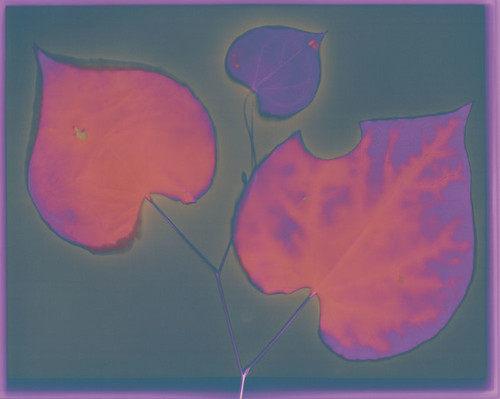
Fresh-cut Judas Tree leaves
While Ilford's Warmtone FB paper has similar characteristics, this Adox paper has much brighter colors and more subtle tones. I only recently discovered it, but I have fallen in love with it. It produces fairly boring results with dry subjects, so I strongly recommend using it only with fresh-cut plants. It is still being produced commercially, and is easily available from Freestyle. The only downside is that it's not cheap, and comes only in small packages. No where near as bad as the APP Collodio-Chloride, but still not cheap. I'm currently in love with the 25-pack I purchased as part of a new paper exploration splurge, but I still try to control myself and use it only for interesting leaves and well-composed images.

Color Palette: Without moisture, this paper tends to produce simple images. Predominately grey-blue-violet fields with brighter red-violet objects. It isn't ugly, but it is nothing compared to the moisture response.

Moisture Reaction: Once you involve moisture, Adox FB Variotone Warmtone really comes alive. The moisture creates highlights of orange and yellow in the red-violet objects, making them stand out dramatically against the field, which can occasionally take on slight shades of green among the grey-blue-violets.

Reaction to Fixing: Untested. Warmtone paper normally fixes pretty well, but tends to change its appearance completely, shifting to a whole new palette of colors. I'll experiment with this soon, since I got some fixer to play with over the summer instead of having to drive down to work.

Further Flickr Examples: One, Two, Three

Friday, May 9, 2014

Blogging for Freya: Light in the Suck

One of my Featured Entries
I'm actually pretty steamed right now, spiders. As you know from gathering my private information and selling it to advertising companies, I am a professor. I've got mad drama going on right now and it's gone from feeling bad to just feeling mad. I won't go into it further, but it's been a rough week.

However, there has been a pretty damn bright spot. Several weeks ago, Joshua White shared with me a call for entries from Plates to Pixels, asking for artists working with lumen prints. Obviously I was all over that! It was free to enter, so why not, says I? Then I forgot about it for a while, until I got an email from the gallery that the exhibition was up. I skimmed the list of accepted photographers and didn't see myself. That's because I was looking in the "Group Show" section. I wasn't there. I was selected as a Featured Artist!!

I'm truly honored, especially since the other Featured Artists are some amazing folks. I've talked with John Fobes on Flickr, sharing comments and experiences with different types of paper and different exposure techniques. He's very knowledgeable, and he has thousands of lumen prints. While I'm not familiar with any of the other artists selected, I am going to reach out to some of them, because they have obtained some absolutely gorgeous colors and techniques, which I'd like to learn more about. Erin McGuire, for example, has some great blue and deep scarlet tones I want to ask about.

Being a featured artist means the all 13 of my submitted photos were shown in a private gallery, I got top billing and a link to my website. I wish I'd gotten my revised, updated website online before that went live, but I'm working through how to remap my domain name and now I have even more reason to get it up and live.

To sum things up, this week hasn't been great, but this news sure was!

Here's the link to the show: Lumen Eyes.

Thursday, May 1, 2014

Blogging for Thor: Luminous Chroma

My best chromo-lumen!
Hello spiders! It's 4 AM and I'm really tired. You're not, I know, because you're just bundles of code scattered through a series of tubes. Whatever. You don't understand me, spiders. But you get me, you know? I love you, spiders.

So anyway. As you know, I love lumen prints and recently I've been experimenting with the chromoskedasic sabatier technique. Oh, actually I just reviewed the blog to provide a link to me talking about chromo (so much shorter to call it that), but didn't find anything. So you don't know that I've been experimenting with that process! I'll have to devote a blog to talking about it! Cool. Anyway, I totally have been doing that. And lumens. Back at SPESE 2013, when I was taking Angela Wells' great workshop on chromo, I asked her if she'd even combined the technique with lumen printing. She had not, since she had not heard of lumen printing. Another guy there, Joshua White who teaches up at App State, is very much into lumens but was just learning about chromo and had never combined them. I did some research online and I can't find any results of anyone that does combine the techniques.

I like the contrast!
Anyone except me! WOO. Turns out you totally can combine them. All you need to do is take a lumen print, dip it in very dilute developer (or it'll just vanish because lumens are massively overexposed by their nature) for a few seconds, wash it off in water and then proceed to chromo all over it as normal. It turns out pretty awesome, actually. I find that it's a great way to add visual interest to empty areas of a lumen print, creating a much more dynamic figure-ground relationship than most lumens tend to have. It also brings more of a personal, organic touch to the lumen process. There is a lot of potential to explore, especially for artists that have fine manual dexterity and some skill at painting. Chromo is basically painting with chemistry, so this combination of techniques can effectively be used as a very alchemical form of hand-coloring. Hand-coloring with metallic deposit precipitation. The best kind of hand-painting, obviously.

The puke-green is actually
oil-on-water shiny metal.
I'll be updating my Chromo-Lumen Flickr Gallery with future images for you lovely spiders (and any humans, lovely or not) to check out. So far I just have four, but I have a lot of boring lumens to attack with this technique!

My only regret is that chromo prints still need to be fixed. Just like lumens, they lose a great deal of saturation and vibrance when fixed, but it's pretty much necessary. As I lament in my last post, the intensely reflective, metallic nature of chromo prints just can't be scanned or photographed. It needs to be seen physically. That means the print needs to be the final product, not a digital reproduction, and that... means fixing the prints. Le suck, but what can you do?

Friday, April 4, 2014

Blogging for Thor: 200 Lumen Slog

I made my 200th Lumen Print recently. I wanted to do something special for 200, so I tried combining a few ideas. I'd previously considered working with multi-part images, and very recently I started making lumen prints with gels, syrups and liquids instead of leaves. I made a nine-part collage, with each panel using a different type of paper and different combination of materials. I like the results, at least in some individual images, but I think in the future I'm going to work with fewer types of paper for a single set. Maybe even just one set of paper, and maybe reduce the number of substances too. Go for a more consistent appearance, you know? I haven't decided quite yet, but it'll be a fun thing to explore!

Liquigrams as I've been calling them, are a great amount of fun. The only downside is that in order to prevent the stuff on the paper from dripping, sliding and melting all kind of different directions, they have to be exposed to sunlight while kept flat. Since my house is on a hill and halfway surrounded by trees, that's quite a challenge. There's really only three places I can put them, and I only have a few of the plastic trays I make them in (keeps things cleaner). So my production of liquigrams is much slower than my production of regular lumen prints.

On that note, I've got to make a minor note: I'm really slow at lumen prints. I know a few others that work with the process and they tend to have exposures only a few minutes long. They can churn out a dozen or more prints in a day, whereas I'm happy with doing maybe 4 in a day, if I'm lucky with sunlight and at home the whole time. I generally have exposure times that run upwards of 2 hours.

Mid-Post Note: Dammit! I got distracted watching TV and didn't finish this post in time. Oh well, I started it on Thursday!

I'm going to compile a list of which papers I've done Lumens with at some point this weekend, which will be another post. It's my first step towards creating a lumen paper compendium. I also plan on discussing in more detail the results of lumen printing on ortho-litho film, and get into some lumens on regular film, like 4x5 and 35mm.

Thursday, March 27, 2014

Blogging for Thor: Viscous Fluids

I tried new things today! I've been researching the chemigram process since I attended a lecture at SPE by S. Gayle Stevens. The basic idea is that instead of using photo chemistry to develop an image made by light and shadow, you're using that chemistry to directly create an image through the tone and color shifts created by applying the chemistry to activated paper. Using different resists to alter the rate and strength of the reaction between chemistry and paper introduces different shades, and the paper itself can add colors based on further chemical reactions.

So I started thinking, "Well, isn't that just how a lumen print works, except without the photo chemistry?" And yeah, basically it is. So I decided to set out to do some lumen prints inspired by chemigrams. Since they don't use darkroom chemistry, I'm calling them 'liquigrams' but there might actually already be a word for them. I dunno. I Googled for five minutes and didn't find one.

So far, I've made three of these prints. I only have so many basins that I can make them in, and they require a good washing after exposure so they take a bit longer than normal lumens. Still, the weather's been nice and I'm hoping to do some this coming week as well. Today my prints were made using corn syrup, chocolate syrup, orange juice, milk, ice cream salt, maple syrup and strawberry jam. The best results (above) came from carefully planning out what I wanted the final result to look like. Pre-visualization is key, just as with all forms of art.

I strongly suggest anyone wanting to experiment does some tests to figure out which resist will cause which colors. In mine, the chocolate syrup tended to produce pinks and reds, where clear syrups or uncovered paper left the greyish blue. The yellow at the bottom of the above print comes from milk and ice cream salt combined. I got orange-browns where I applied maple syrup. Orange juice did not seem to impart a particular color. Once you know, generally, what kind of colors you can create, you can basically treat this medium like painting. I'm gunna have some fun, let me tell you!

Later this semester I may try involving the chemistry used to create chromoskedasic sabatier effects. I did a workshop (also at SPE) with Angela Wells about that technique and it is really awesome. I'd love to see how it combines with my lumen printing.

There will be two posts this week, because I've also been experimenting with lumen prints on ortho-litho film. I was introduced to the idea by John Fobes, and it shows some promise. That's for later, though. I want to test the technique with fresh leaves... or maybe fluids! Who knows! Anyway, so far my results with that technique haven't been particularly awesome. They require a good bit of post-processing to create strong images, and I'd rather accomplish that in-process.

Thursday, March 6, 2014

Blogging for Thor: My Discontent with Winter

Much to my discontent, it remains firmly winter here in the South. Near-freezing temperatures, grey skies and cold liquids falling from space. It all sucks, my spiders. Get working on the NASA satellite weather-control thing, will you?

Tonight's blog will be brief. I haven't been entirely unproductive recently. Teaching a darkroom class has actually had me in the darkroom. I'm not a big fan, especially since I was basically just watching my students do their thing until I was able to change the policy to get them an open-door lab. One of the advantages of just sitting around while my students worked was that I had time to mix myself up a batch of fixer and test some more lumen papers.

Before and after: Ilford Warmtone
As normal, warm-tone paper (I got a pack of Ilford Warmtone for my birthday back in December) continues to be really awesome when fixed. The relatively boring purple of pre-fixer changes to a nice gradient of red-golds. So far, since everything is dead and dry, I have not been able to test the effects of moisture on the Ilford Warmtone, but I look forward to doing that during spring.

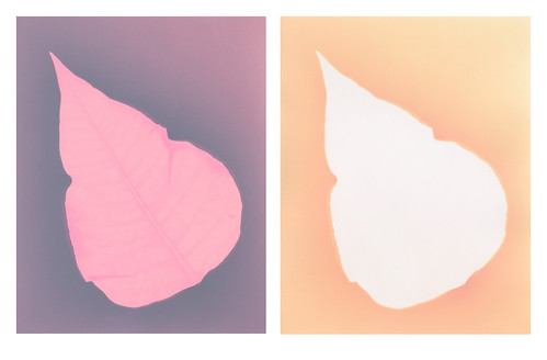
The second paper I tested was the Harman Direct Positive, which is bubblegum pink when taken out of the pack and exposes down to a dull slate-grey. It takes forever to expose, several days which is unheard of for a lumen print. When fixed, anything that stayed pink just washes right off and goes to pure white, but the grey areas turn a very soft, pastel peach. I think it might be worth pushing this paper further to see what can be achieved there.
Before and after: Harman Direct Positive

I also experimented with fixing some of my Liquid Light lumens that were made on metal, glass or animal skin. The results weren't as cool as I hoped. When fixed, Liquid Light goes from a dull purple-grey to a dull tan. It's not very exciting. I'm having trouble scanning them, because the fixer bath and rinse left them very delicate and extremely warped. I may have to photograph them.

Friday, February 14, 2014

Blogging for Freya: Snow Daze

It's been snowing a lot lately, which is distressing because I live in the South. It's all Obama's fault. If NASA had funding, we'd be controlling the weather with magical satellite lasers or something. THANKS OBAMA.

Anyway, I actually did try to get out and do some art things in the snow. Taking pictures of it? BWAHAHA. No. It's cold outside, are you crazy? No. I put out two lumen prints to see if the snow would affect them at all. It didn't, and the bland, grey light (plus diffusion from the snow that quickly layered on top of them) resulted in pale, low contrast images that barely showed up. So, overall, it wasn't productive. I haven't even scanned the lumens because they're incredibly underwhelming.

However! I did scan something else! I scanned the dead poinsettia I used to make the lumens and I really enjoy the results. I think I'll be spending some time with the dead poinsettia to make some scanograms. I like the curled, veiny leaves and the long, withered stems. They're just appealing.

Also, as a result of the snow, I have two make-up days for my latest DSLR class from the Light Factory. The first of these make-up days is scheduled for tomorrow and, hopefully, we will be heading out to the local botanical garden to photograph in their greenhouse conservatory. It should be a ton of fun... if they're open. I tried calling for hours today and they were closed. Hopefully they open tomorrow. The roads are fine!

Friday, December 20, 2013

Blogging for Freya: Life's Hard

Hello, my lovely little spiders. This is the latest I've ever been with a weekly blog and it's because I'm a big fat sack of sad. I tried to be a Real Adult and got my hopes and dreams promptly smashed by artist statements, online portfolios, pay stubs, W-2 forms, calculators and words like "references", "application fee", "copay" and "deductible." It was all very harrowing, and I retaliated against the world's cruelty by reading internet comics for 48 hours and trying not to try. Then I made cookies, did art and kicked myself in the balls until I felt better. Or at least until I was able to convince myself I felt better. I think Allie Brosch summed it up really well.

Anyway, that's over. I've been finding it harder and harder to get myself to experiment and actually do art, which makes it harder and harder to write this blog since I have nothing exciting and amazing to report. Part of that is the weather and the season. I work with plants and there aren't a lot of plants around in the winter. A few, yes, but not many. The sunlight is also duller, the days colder and typically cloudier. Exposures take a lot longer, and since it gets dark earlier, I have less time to do them anyway. It's just a bad season for my chosen type of work.

Now, all that said, I have been doing some experiments. Slowly, painfully, but they're happening. For my Birthday (woo?) I was given two packs of very cool lumen paper. Harman Direct Positive paper and some Ilford Warmtone RC.  I'd been wanting to try another warm-tone paper for a while. They tend to have really cool effects when fixed, as opposed to neutral-tone papers that generally have very disappointing effects when fixed.

I may also save some of the Ilford Warmtone and try chromoskedasic sabatier once I get back into the university darkroom in January. This is a really fun process that makes for some awesome chemigrams, or can be combined wit regular contact printing! I discovered that process in a workshop with Angela Wells, from ECU, back at SPESE '13. It was very fun, but it DOES need a darkroom and certainly isn't as home-friendly as my favored processes are. Still, pretty cool stuff!

Tonight, I wanted to talk about the Harman Direct Positive paper. It's pink, y'all. Totally pink. Bright, Barbie-and-Bubblegum pink. Straight out of the box, it's instantly pink. I have no idea if, like color photo paper, it turns instantly upon exposure to light, or if it's actually supposed to be pink and that goes away when you develop it? No idea! It's pink. It's also really sloooow. We are talking 2-3 day exposures for a lumen print. That's insane. Seriously insane. I left a sheet out for two cloudy days and saw no change at all. It took a third full day of bright sun to change the paper. Today I left another sheet out and after five hours of bright, sunny weather, no change. It's the slowest lumen paper I've ever heard of at all. I contacted another experienced lumen printer about it and he agreed. He went so far as to say he didn't consider the paper useful for lumens at all. I'm not sure I agree yet. I hope I don't, since that was expensive paper and now that it's exposed to light, lumens are all it's good for....unless I try chromoskedasic sabatier on it? HUH. Might do.

When the Direct Positive paper finally does start changing, it isn't that dramatic. The bubblegum-pink shades into Barney-purple and finally into a dull blue. Moisture seems to cause it to bleach back to white, which may be interesting when spring rolls around and there are fresh plants to use again. I'll probably put further Direct Positive experiments on hold until spring, honestly. See what it does with better light, heat and subject matters.

That's all for now folks! Hopefully I can get moving on all the many things I have to do before January 15th and make some of my dreams come true. Oh, crippling fear of change, you're so crippling.

Friday, November 29, 2013

Blogging for Thor: Teaching Spiders 1

EDIT: Faaaarts! This blog post took way longer to write than I expected. I swear, I started writing at 11:15! Don't smite me, Thor!

Today, for those web-spiders crawling my blog from servers based in the USA, is Thanksgiving. It's vaguely traditional that today Americans remember things we are thankful for, then tell the internet how thankful we are for them. It's kind of a way to show off the things we have, so other people can admire how much we have and how thankful we are for them.

I personally am thankful that I get to be a teacher. I'm an adjunct professor most of the time, and the rest of the time I teach at local art centers and do my own private classes. I love teaching eager students about photography, design, art and how they all come together to make the world a better place. Every time I go to work, I'm thankful that I was able to be in the right place at the right time and know the right people to get my job. In all honestly, I am not qualified for my job. I don't have a Master's degree so I'm literally not qualified. I lack the appropriate scholarly qualification. I still do a great job, don't get me wrong, but it's a minor miracle of the sentient universe that I have my position, and I am incredibly grateful to whatever agent of destiny was responsible for arranging things thus.

Instead of just saying all that, I'm going to show it. Today kicks off a new segment of the blog: Teaching Spiders. And today, my digital arachnids, I'm going to teach you how to make lumen prints. I'll be doing more of these Teaching Spiders posts, sometimes as part of my Blogging for Thor series and sometimes by themselves. Use the tag system to find them all, hopefully there will be a bunch at some point! I'm going to do general how-to's like this one, and also more specific question-and-answer. I've already done some of these (way before Teaching Spiders was a thing) for Anthotypes. I'll adjust tags so you can find them!

Now, I some time today shooting pictures to illustrate this process. Way more time than you'll think, once you see them. Partly, that's because I did it at night when it's dark and my workroom is (intentionally) poorly lit. Partly, it's because I don't have much practice at illustrative photography. Mostly, it's because I realized these steps are so simple that a monkey could follow them. Since you're all hyper-intelligent code-spiders from the interwebs, you'll be fine.

Before we start, let me make a very important note: You Can Do All Of This In Regular Light. Lumen Printing Does Not Require A Darkroom Or Light Closet Of Any Kind. Though, if you plan on using a specific pack of paper for darkroom and lumen printing, you will want to open it and remove some paper while in the dark, obviously. However, lumen printing works just fine on exposed, expired and otherwise ruined paper. I keep all my lumen paper in a box in the kitchen. I never use a darkroom for it at all. It's all been totally exposed and is worthless for darkroom printing. I care not even the tiniest bit.

Step 0: Gather the Materials
You need three things to make a lumen print: a picture frame, an object to make a print from and a sheet of photographic enlarging paper. You can have more things, some very helpful, but those are the basics. In fact, the whole 'picture frame' bit is optional. You just need something to hold your object in place on top of your photo paper. That can take a lot of forms, but we're doing a very basic lesson here. So, use a picture frame.

Step 1: Choose Your Paper
The brand of paper you choose will determine the colors of your print. Each brand has a slightly different cocktail of chemistry in the emulsion and in the paper base. These react to light differently and produce the colors of your image. Some papers are blue, others are pink, red, brown, violet, green, indigo, or orange. Pretty much any color you want, there's some brand of paper out there that will produce that shade. The best way to find out what papers you enjoy is experimentation!

Step 2: Choose Your Object
This is pretty simple. We're doing a basic lesson here, remember that Spiders, so go with something flat that will fit in your picture frame. Feathers, coins, keys, jewelry, lace, cut paper, negatives, plants, flowers, leaves, bits of string, etc. Plants tend to produce particularly interesting lumens because the moisture inside them leeches out and onto the paper. When moisture interacts with the chemistry in the paper, it makes new colors. Remember that, it can be super fun!

Step 3: Load your Frame
Front-Glass Regular Frame
Double-Glass Frame
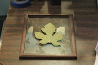
Ok, this gets a tiny bit tricky. How you load the frame depends on what kind of picture frame you have. Some picture frames have two sheets of glass and no real "back" at all. These are actually my favorite kind, because then I can put the paper down first, face up, and arrange my objects on the paper easily before laying the covering sheet of glass down. I've included a photo of that, for reference. For contrast, there's also a photo of a traditional frame being loaded. Those are a bit harder, since you have to arrange your objects on the glass and then put the paper down behind them, and close the whole thing up while hoping you don't accidentally nudge anything out of place. On my regular frames, unless they have a very tight fit already, I fill the back in with paper towels or some sheets of cheap craft store felt. This ensures full contact between my object and my paper.

Full contact is very important for detail. Anywhere there is light or no contact between your object and your paper, light creeps in. This results in blurry, fuzzy areas around the edges. You may like this, since it can give the appearance of 3D form to your prints, but you should probably start off with keeping everything nice and flat. Get crazy and experimental with partial contact later.

Step 4: Place In Sunlight
I'll actually update this later with a photo, because I like using the back of my car for this and it's kinda fun. Honestly, it doesn't matter where you put your lumen print to expose, it just needs sunlight. Exposures can range from a few seconds to several hours. This is a bit frustrating for rule-oriented people who want a hard time limit so they know the print is "done", but there isn't one. A lumen print is "done" when you like the color it has turned. The longer you leave a print out, the more it will change. Some papers turn totally different colors as they expose more and more. I have a favorite paper that starts off gold, then turns ruby red, muddy brown, neon green and finally a deep emerald. It's pretty awesome, and I decide on a case-by-case basis which color I want.

So, basically, stick your lumen print in sunlight and then wait until it looks pretty. Remove from sunlight and...

Step 5: Remove from Frame
Uh, open the frame back up and take everything out. This is super-simple. Remember that your print is still sensitive to light at this point, so best do this inside and out of sunlight.

Step 6: Really, this is optional, but not for me. Document everything. Document how long the exposure was, what day it was on, what the weather was like, what kind of paper you used, what object you used and if it was a plant was it dry or fresh? Document everything. This way if you want to repeat your process you have some incredibly faint hope of doing so. Lumens are very unpredictable because they respond so closely to so many different factors like time of day, humidity, weather conditions, brightness of the sun, angle of light, moisture in the object, etc. It's very, very hard to reproduce a lumen and downright impossible without good notes.
Scanned Lumen Print of a Dogwood
Step 7: Document the Image
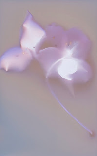
Now take your pretty lumen print and either scan it or photograph it at high-resolution so you have a permanent image of how it looks. You may want to make several scans or photographs, and maybe use both methods. These files will be your only permanent record of the print's original appearance.

Optional! Step 8: Fix the Image
Drop the print into regular photo fixative for 5 minutes. You'll notice a dramatic shift in color and, probably, a loss of detail. Generally warm-tone papers will retain most of their color, or even become more colorful after fixing. Other papers can lose some or all their color and some or all of their detail. It depends entirely on the brand of paper. I generally do not fix my prints, except for certain papers that I've found respond really well to fixing. I'll make some notes on that in a later Teaching Spiders post.

The End!
If you fixed your image, you now have a pre-fix product in your digital files and a post-fix physical product in the print itself. If you opted not to fix, you have your files. You can keep the original print in a dark, archival box, but even heat and time will cause the print to alter slowly. Either way, enjoy your lumens and have fun!

Friday, November 22, 2013

Blogging for Thor: I Don't Know Days

It's Janelle Monae!
Sorry, Thor. I was totally blasted out after the amazing Janelle Monae concert I was at Wednesday night. It was super awesome because during the finale song, she got the audience to sit down and walked out into the crowd to finish her song. She stopped right next to me and ended up sitting on my shoulder for a while. So that photo over there, that isn't zoomed in. That's her from zero inches away, because she's literally on top of me. It's crazy. Then I had my friend that came to the concert with me spend the day, and it was fun. I was so tired that I actually passed out and didn't recover until after midnight.

Anyway. I also got some experimenting done before the concert. I wanted to test some of my theories regarding the use of textured acrylic. I painted the acrylic with black paint and rubbed it off, leaving only the recessed areas covered in paint. This way, the patterns in the acrylic were much more pronounced and produced a far stronger shadow on the lumen print than the un-painted acrylic did. The result was about what I had hoped for originally. You can see the first test, here to the right. The lack of pattern around the lower left corner is due to the acrylic not being held down evenly. I'm going to cut some 8x10 sheets so I can place them in frames. Cutting this kind of acrylic isn't hard, but it isn't very easy either. It likes to fracture unhelpfully, so I'm going pretty slow and trying to take a lot of care.

After checking to confirm that my modifications to the acrylic would work properly, I tested the painted acrylic on a real print. The results are here, seen to the left. Again, the same issue in the lower left corner. Incomplete contact with the acrylic. I like the results for adding texture to the background of the image, but I worry about how much detail may be lost due to pattern interference on the leaf itself. I'll have to do more exposures and check the results. Still, this has been very encouraging!

Thursday, November 14, 2013

Blogging for Thor: Snarly Snaggle of Progress

Last week, I talked about some ideas I was working on for more advanced lumen printing. Not advanced technically, in the sense of how the printing itself works or the colors produced or the image making itself, but conceptually more advanced than photograms of leaves on solid backgrounds. I don't want to stop working with leaves or stop doing photograms. I don't have any desire to get negatives involved with this process. That's not how I want to go.

I'm wanting to create a multi-layer effect by introducing texture and value in the image beyond the leaf itself. Instead of just documenting how a leaf looks, I'd like to use the leaves to create my own work that takes more than just the placement of the leaf into account. I've been pondering ways to do that. I have some textured acrylic sheeting, the kind that goes over florescent light bays, and I tried using that instead of glass during a lumen exposure. Only the very, very faintest traces of texture were visible in the background of the print. I think that was partly due to me just putting the acrylic on top of the exposure frame instead of having it in direct contact with the paper; the light was allowed to diffuse instead of being directed clearly against the paper. Also, even with the texture, the entire acrylic sheet is transparent.

Next to-do experiment is to rub black paint onto the textured acrylic, then rub it back off. Hopefully that will bring the texture into stark relief and create veining or other patterns across the surface of the print next time I try. I might also just try cliche verre backgrounds, creating my own texture with the paint or ink applied to smooth glass or acrylic sheets. I've considered fabric with stains or dye as well, especially heavily textured fabric like rough muslin, handmade felt, burlap or raw silk.

I also want to try combining scanograms with lumen prints. I've done that before, by making a lumen print of a plant, then making a scanogram of the plant with the lumen print as the background to the scanogram. I think I can take it further, though, and incorporate them into each other. Using the mosaic style of lumen printing, cutting small sheets of paper and exposing them individually under different sections of the plant, I can highlight certain interesting areas of the plant with lumen printing, and use a scanogram of the entire plant to connect these lumen tiles.

Even while writing tonight's post, I considered what might happen if I soaked some of my handmade felt in a puddle of Liquid Light? Or what if I mix Liquid Light and acrylic gel medium together to get a soft, flexible plastic that has light sensitive material inside it?

It's a pity that fixing lumen prints tends to work so poorly. I think it'd be fun to do some work along these lines that incorporates the physical prints as objects, especially with vellum, felt or other interesting surfaces.