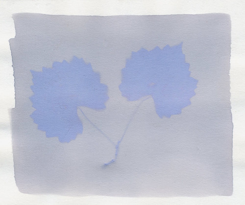
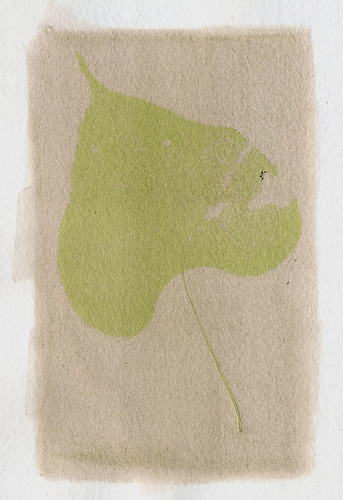
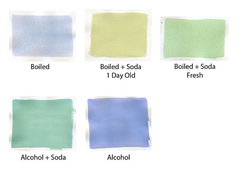
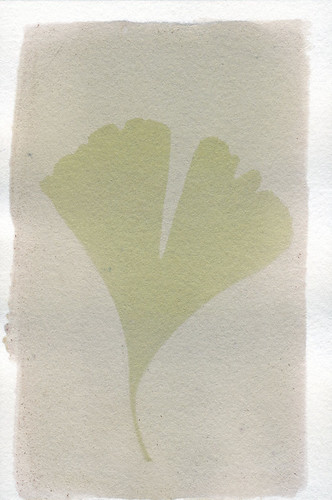
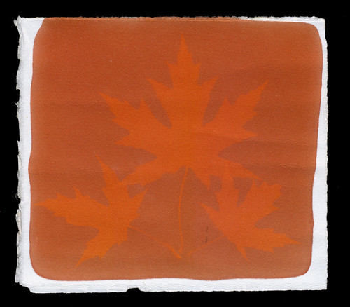
Showing posts with label dyes. Show all posts

Thursday, May 28, 2015

Blogging for Thor: Time & Turmeric

Hey there, Spiders! It turns out that last week's post was a bit hurried. When the red cabbage dye swatches dried completely, they revealed some very different colors as a result of the acidification tests. Acidified red cabbage dye turns blue. A rather nice blue, probably the best one I've gotten from an anthotype dye so far. You should crawl along to that post, Spiders. It's been updated with the new information and a new scan of the swatch!

Last week, I forgot to give a shout-out to Aspen's great students at UNCC. I wish I remembered which one specifically had raised the question of "what does altering the pH do to other dyes?" I knew even way back then that pH altered the color you get from red cabbage. I hadn't tested the idea on anything else. So thank you, mysterious student!

So, with all that in mind, let's take a look at the latest pH test I did: turmeric. Turmeric is one of my go-to dyes for anthotypes, but the problem with pure turmeric dye is that it's so yellow. It's almost painful to look at, and the yellow is so bright that it obscures detail and gives very little contrast. So, generally, I adulterate the turmeric with something like sandalwood or annatto to calm it down and shift it from yellow! to more of a soft yellow-orange.

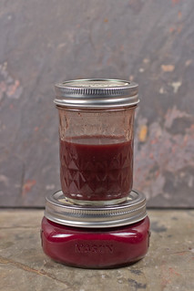
The base turmeric dye is a fully saturated mixture of turmeric and isopropyl alcohol. I'm 100% sure that it's fully saturated because if left undisturbed, a full centimeter thick layer of turmeric powder precipitates to the bottom of the jar. By altering the pH of turmeric, I got the following results!

When baking soda (a base) is added to the dye, the liquid becomes a dark, garnet red. The solution dries down to orange. Again, just like the red cabbage, adding more baking soda will cause a darker, more intense color shift.

Adding vinegar (an acid) causes a similar shift, also turning the turmeric orange. This orange is a bit softer, but... again, I suspect that vinegar is diluting the dye far more than the baking soda is. That may also explain the doubled portion of vinegar causing a very soft, pale orange. That is very typical of a dilute dye.

All the adjusted dyes showed moderate dry down, becoming redder and lighter when dry, but none of them shifted as dramatically as acidic red cabbage did.

Friday, May 22, 2015

Blogging for Freya: Colors of Cabbage


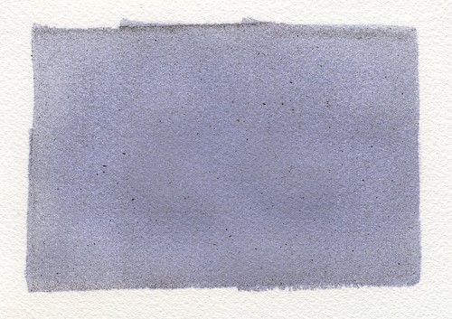
Red Cabbage is one of the most flexible anthotype dyes I've found yet. You can see above that it has a wide range of potential colors. I've mentioned previously that the dye from red cabbage is extremely reactive to pH changes. I finally decided to do a more extensive test on the subject. So, above, you see various test swatches of red cabbage dye at regular, high and low pH.

The interesting thing is that the dried dye is not strongly reflective of the dye in liquid form. That might mean the dye would function differently on fabric. I recently dyed a silk bag with red cabbage (boiled, not puréed as the dye seen here was) and the result was a medium-deep purple, not the lilac color seen here in the dried dye swatch.

The two swatches labelled "Red Cabbage Juice" are identical: just the mixture of 1/4th head of red cabbage and 300ml of isopropyl alcohol blended until smooth, then filtered through a nylon mesh paint straining bag from Home Depot. That bag, btw, is a GREAT investment for any anthotypist or natural dyer. It washes clean, has a much finer mesh than cheesecloth, and because it's a bag, it's a lot easier to handle than folded cheesecloth. Note that the resulting dye is very watery, but will form a layer of cabbage-residue precipitate at the bottom of its container within an hour or two. It's easy to pour off the majority of the dye into a new container, leaving that mush behind. The liquid dye is bright purple, but dries to a blueish-violet lilac. It can, at higher dilution, dry to an almost periwinkle blue. I'm simply avoiding that dilution at the moment, but I will do more tests on that later!

When a small amount (aprox. 0.25 tsp) of soda ash (sodium carbonate) is added, the pH of the dye goes up, and the purple dye becomes navy blue. The navy blue liquid dries to a soft, pastel blue. If more soda ash is added (another 0.25 tsp), the blue shifts to emerald green. Even more soda ash turns the green yellower, but that yellower green dries the same shade.

Adding acid to the mixture was far less effective, even if it appeared promising to start. I added small amounts of vinegar, which turned the liquid dye bright pink. More vinegar turned the dye a redder pink. Neither vinegar test showed any significant effect on the dry color, though. There may be a slight blue-ing of the purple, but I suspect that's simply because the liquid vinegar diluted the original dye far more than the solid soda ash did. EDIT: 24 hours later, when the swatches were fully dry, I discovered that the acidified red cabbage juice dries as a blue. The original information about vinegar diluting rather that intensifying the color seems to hold true. 

This was a fun experiment, Spiders!

Thursday, February 19, 2015

Blogging for Thor: A Reversal of Fortunes!

Osage Orange print -- Golden Rain Tree leaf
"The most exciting phrase to hear in science, the one that heralds new discoveries, is not 'Eureka!' but 'That's funny...'" -- Isaac Asimov

I had a "that's funny..." moment earlier this week when I checked on an anthotype experiment that had been baking for almost two weeks. I'd checked it a few times before and been discouraged. Despite bright, sunny days (especially for winter) there seemed to be no change at all in the visible portions of the dye. No fading was visible. I presumed the exposure to be a lost cause, and pulled it on day 10.

As it happens, there had been no fading at all. Instead, there was significant darkening of the exposed dye areas. The area that had been covered by the leaf was showing the original yellow color of the dye, but the exterior areas had dulled and shifted to a dull golden hue. This is an absolutely fascinating result, because up until this point all the anthotypes that I've seen, and all my own tests, have been with natural dyes that fade upon exposure to sunlight. This dye, extracted from osage orange sawdust, is the only one that has become darker with exposure.

This raises all kinds of questions. What will happen with more sunlight during spring and summer? How will the dye respond to moisture from fresh plant samples? Does this form of anthotype have the potential to be archival, at least compared to others? If it doesn't fade under UV, will it simply stabilize, or possibly become more visible as time goes on?

I am incredibly excited by this totally unexpected result. Thanks again, Artisan Dice, you guys gave me such a great gift!

Thursday, November 20, 2014

Blogging for Thor: A Reddy Success!

Success! First true-red Anthotype
Despite the weather, recent plagues and other negative influences, I've printed my first anthotypes in two years. Yeah, Spiders, it's been a long time since I printed any anthotypes myself. I've taught workshops on them, and given demos, written articles, but not actually done any printing.

Anthotypes take up contact frames for quite a while, and for the last two years I've been busy with lumen printing, cyanotyping and other techniques. Anthotypes just haven't really been on my mind.

I'm not sure what changed, but I think it was my visit to UNCC last semester, where one of the students decided to investigate the interaction of turmeric and soda ash. That sparked my interest, got me investigating on my own, and really put me back on track.

It's paid off. I finally have a red dye, which I've been crowing about quite a lot recently. More than that, it's a stable, easy to make, easy to apply, fast-acting dye that shows strong contrast. Everything I could ask for! Well, alright, it is a bit dusty, leaving behind a fair amount of solidified pigment when it dries, but I think altering the concentration of alcohol in the solution can fix that problem.

So, there you have it, Spiders. Two years, and my first anthotype is a stunning success. In red! It did take 12 days, but this is fall, so that's not un-expected. Low UV index and lots of clouds. No heat, either. Heat speeds things up quite a bit.

Pure Pokeberry dye
I also had three other prints exposing at the same time. A dried oak leaf on pure pokeberry juice, which turned out great (below), and two other prints made on red cabbage dye. I had whipped up a batch of the blue and green red cabbage dyes, getting an indigo instead of a blue this time, and decided to use some of them. Unfortunately, the red cabbage prints did not work out. They show almost no fading at all, despite the same 12-day exposure as the other two prints. I'm guessing there simply wasn't enough UV light to break down the red cabbage pigments. Those always were a bit slow, compared to raw berry dyes or turmeric/sandalwood which is what the red dye is mostly based on. Unfortunate, but unavoidable given the time of year.

When spring and summer roll around, I plan on getting back into anthotypes on a serious level. We'll have to see if I actually stick to that. I'm also very interested in working more with liquid lumen prints and chromo-lumens, but at the moment I'm focusing on my cyanotype bone prints and wearable art.

Friday, November 7, 2014

STOP! In the Name of Red


TRIUMPH! 2:1:2 Pokeberry, Turmeric, Sandalwood
It's been 4.2 years since I started working with the anthotype process, and 3.5 years since I started to really hunt for a good red dye to use in the process. Guess what, Spiders? I found one! After some brainstorming and testing, detailed in the last few entries, I finally decided to try mixing together yellow, magenta and orange colors to produce a red.

As far as dyes go, that meant using turmeric (yellow), pokeberry (magenta) and sandalwood (orange) in combination. I've thoroughly documented turmeric and sandalwood as predictable, fast-fading anthotype dyes that are easy to use, easy to mix and work very well. I've got ample evidence from other artists that pokeberry shares these traits, even if it is harder to harvest and prepare (it's toxic, and it's a berry as opposed to a powder). The combination of all three should, I'm hoping very hard, be another quick exposure, high-quality anthotype dye.

A comparison of several different tests using Pokeberry
The best part? It's red. Really, really red. Not reddish-orange or reddish-pink. Nope, Spiders, not this time. It's RED. I am so excited. The only bummer is that I've discovered this in the fall, and the weather is just not my friend during the fall. Less sunlight, longer shadows, cooler temperatures, cloudier skies... it doesn't lend itself well at all to anthotype printing.

Still, I'm going to expose a test sheet starting tomorrow and see how it goes. Wish me luck, Spiders!

Oh, before I forget... the winning combination to produce a red dye was 2 parts pokeberry juice, 1 part turmeric, 2 parts sandalwood and enough rubbing alcohol to make the solution a thin liquid. It's still a bit grainy, but now that the color is tested, I can adjust the solution itself a bit to get better consistency. Ideally, I'd like a grain-free liquid that brushes on smoothly.

The last fun bit? Now my Master Test Sheet can truly be organized by color, since I have at least one strong, vibrant example for each color of the rainbow. Hurray!

Thursday, November 6, 2014

Blogging for Thor: Not Quite Red

Pokeberry (with alcohol) + Turmeric
Well, Spiders, my experiment to create a simple red anthotype dye hasn't yet succeeded. Pokeberry and turmeric together create a bright, vibrant orange. But, ya know what, so does Sandalwood. I'm hoping that I can do some further tests and see if maybe I can combine orange and magenta to get a red, since I have a lot of oranges. Or maybe just different proportions of yellow and magenta? I might also try using pure pokeberry juice instead of diluted pokeberry. This test was pokeberry juice diluted with alcohol.

Either way, it deserves further experimentation.

On another note, I've begun purchasing the materials to turn my Cyanotags and Cyanobones into wearable art. I've finished one pendant necklace, and I've got the materials for a bracelet. The rings and pendants... actually, tonight I talked with Aspen Hochalter and she suggested trying to find a local metalsmith to work with. That's a really cool idea, because it means I double my client base by including the metalsmith's. And it builds professional relationships, which is also nice. It does mean I have to share the profits, though, but I'm fairly ok with that.

More soon, Spiders!

Tuesday, November 4, 2014

Color Theory in Practice

Yellow + Magenta = ...Red?
In subtractive color theory (CMYK), reds are produced by mixing together magenta and yellow. While reviewing color theory with my students this semester, I began to wonder if subtractive color theory could be used to help me out with a long standing problem: the lack of true red anthotype dyes.

My best lead on a red dye, madder root, takes too long to fade (around three months!), plus it tends to produce dusky, rust colors instead of a true, garnet red. It can produce a true red, but so far I've only managed that hue on fabrics, and with extra mordants that further reduce fading. Fading is what I want, so most mordants are just bad news. Plus, the fabric-only limitation is annoying.

Further research has shown that other reds, like sumac, carmine, brazilwood and bloodroot are, for various reasons, not very useful. Mostly, they produce other colors un-altered and must be mordanted to make a red. As a fun bonus, none of them are as "true" a red as madder root is, which is why madder was the go-to red dye until the alizarin pigment in madder root was first synthesized.

Turmeric, a pure Yellow

What if I could sidestep all that mess, though, Spiders? What if I could combine a Magenta dye with a Yellow dye and create a Red? I just happen to have a fantastic, pure yellow dye: turmeric. It's easy to make, easy to get, exposes quickly and mixes very well.

Now, thanks to recent experiments, I've found a magenta dye as well: pokeberry. The pure pokeberry dye is an absolutely vibrant magenta color.

Pokeberry, a strong Magenta
It might be closing in on fall and winter, my Spiders, but I can still mix the dyes and test color swatches even if I can't do timely exposures. So, this week I plan to do some tests to see if Yellow + Magenta = Red. If so, I hope that the two combined will be a fairly easy to make dye. It'd certainly be nice!

I'm even considering ordering some calcium carbonate, a common dye additive called chalk, to see if that may help unlock a further variety of colors. Adding baking soda to some dye, like turmeric and red cabbage, produces very nice color shifts. It'll be interesting to see what the chalk does.

Monday, September 15, 2014

Blogging for Sol: Bloody Late!

Unadjusted turmeric dye, which turns red with low pH!
Hello, Spiders! I'm sorry this post is so late. On Thursday I lost track of time, on Friday I was busy and I was out of town this weekend. I think I've already paid for the lateness; it rained both days I was trying to visit friends and go to the zoo. Thor was displeased with my lack of attention.

On Friday, I was a visiting artist at UNCC again! It was great, for all the same reasons it was great last time. Engaged students who were really interested in what I had to teach them, willing to try it out and even experiment on their own!

I demonstrated anthotypes using red cabbage juice, which turns from violet to teal when the pH is lowered by adding baking soda, washing soda or borax. In this case, we used washing soda. That went over really well, and one student in particular tried experimenting with the other dyes I had brought: turmeric and sandalwood. To my surprise, the turmeric experiment showed very interesting results!

When its pH is lowered, turmeric dye changes from goldenrod yellow to bloody, garnet red! It's truly a lovely color. It fades a bit when applied to paper, but it can be applied in a thick, paste-like form and the paper stains pretty darn well! I assume, though I have not yet tested, that it could also be used to soak the paper and create a strong red in that way. I assume all the normal problems with soaking paper would be present in that case, though.

This new potential color source for a bright red is fascinating and I hope to do some experiments in the coming week, despite the rain and clouds. I'll update this post with photos as soon as I'm able to mix up a batch, coat and image!

Edit: DAGNAMBIT!!! I finished this post juuust before midnight, but the time to insert the image rolled it over and now it's logged as being posted on Monday. Bugger. All hail the Moon!

Friday, January 3, 2014

Blogging for Thor: Dust in the Wind

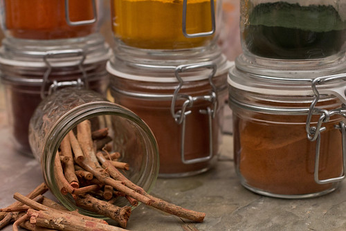
Six different anthotype dyes in their raw forms.
Man, I'm really bad at remembering what day things are. I was so happy with myself today, too. I ran errands and got things done. Like an adult. Then I came home, forgot it was Thursday and went to bed. Thankfully, I tend to wake up at 3 AM or so, stay awake a few hours and then go back to sleep. I've convinced myself that so long as my blog is up before dawn on Friday, it's still Thursday. Totally sound logic, right?

Today's blog is going to be short, though. It's mostly a plug for something else I'm doing. I decided to start photographing the different dyes that I use to make anthotypes with! Starting with the dry powders, I'm taking proper photographs of each dye. I'd really love some kind of big, interactive website where you can click on a picture of the dye and have it bring up a sample sheet showing what the dye looks like before and after exposure, with comments on how to prepare it. That'd be pretty awesome, but I have no idea how to make that work. Maybe some sort of weird eBook internet sorcery.

On other fronts: the weather has just been terrible lately. Clouds, rain, fog, clouds, rain, clouds. Even on 'bright' days the light is so filtered and low-contrast that there's hardly any UV light at all to expose prints with. It's officially the off-season for sun printing. As a result, I need to do something else and it seems like a good time to work on articles (haha, not this blog, no one reads this blog) and that vague idea for an anthotype book I keep telling myself I'm writing. Or the visual reference guide to lumen printing papers. For right now, though, I'll be focusing on the anthotype dye documentation.

The complete set of current photographs for this project is here, on my Flickr.


Friday, December 6, 2013

Blogging for Thor: Really, Thor? Clouds?

I would say that I intentionally delayed today's post to spite Thor because he ruined my plans. But, no, I didn't because it's not wise to spite lightning-tossing steroid-abusers and because actually, I just fell asleep about 9 PM and woke up just now at 3 AM. Hurray...

Seriously, Thor did ruin my plans. I had hoped to finish up a project today and get it documented, but that didn't work. As part of my Christmas gifts this year, I purchased some unfinished tote bags and silk scarves from Dharma Trading. Ten totes (they sent 12 for some reason, but I'm not complaining), two 22x22 square scarves and two 8x54 standard scarves. I've coated all of them with cyanotype chemistry and been working on creating gifts by exposing photograms onto the scarves and totes. That requires sunlight, Thor! And lately, nothing but clouds. Today was a horrible, dark, grey day of drizzle and wet. I couldn't even do long exposures or document the ones I finished on Wednesday. I'll just have to hope that Freya is in a better mood and her day will be clearer.

Toned cyanotype scarf.
Note the pale crease down the center.
I've already learned some valuable lessons about making cyanotype textiles. The scarves, for example, are all defective. I dyed them in the active chemistry solution, but when I hung them to dry, I hung them over plastic hangers or a line of acrylic rope I strung up in a closet. Since those substances are non-absorbent, the extra chemistry gathered on top of the hangers and left a moisture-rich line across the scarves. There's a crease on each scarf where it rested on the hanger, and when developed that line leaves a pale streak across the scarf. I'm having to pull some stunts to make it less visible in the final result. Next time I'll use safety pins to hang the scarves to dry without having anything touch them. I don't have an area large enough to let them dry flat in the dark.

There has been another issue with the scarves: size. They're big and I am not really set up to deal with exposures much larger than 8x10. Even 11x14 is difficult, since I typically document my images by scanning and my scanner doesn't handle 11x14 paper. I don't have any sheets of glass 22x22 or larger, and I really don't have much in the way of backing board that size, either. That makes it rather difficult to get good contact between the scarves and the objects used for photograms, since I can't put pressure to keep them flush. In the second scarf (I've only done one square and one traditional, so far) I tried to solve this problem by exposing it in sections. I marked off small rectangles with blue painter's tape, and used black bags to protect unexposed sections of the scarf during exposure. This way I was able to expose 1-2 rectangles of scarf at a time, using much smaller glass. The finished scarf has a film-strip appearance of individual 'frames' of small groups of leaves. I was also able to cover up the moisture-crease in the scarf under one of the tape lines. I'll be doing the same for the second rectangular scarf. The second square scarf... presents a challenge that I have not yet worked out a solution for. I'm still kicking myself about a stupid mistake on the first film-strip scarf: I accidentally put leaves in the last frame upside down. Arrgh.
First tote. Blobby failure.

My experiments with the totes have been much more successful.
I've had two failures, both due to issues unrelated to the coating and development. The first tote I tried worked fine as far as coating, exposure, development and drying went. The problem is the plant I made a photogram of, sea oats, was blobby and the poor contact between the plant and the tote resulted in an indistinct, blurry mess of an image. Sad, but not the result of a flawed procedure. The second failure was simply because the glass I used to press the leaves down on the tote slid off and shattered, letting the leaves blow away. The result was a pure blue tote with no image left behind at all. That's what happens when your photogram object blows away during the exposure. All the rest have come out pretty much as expected.

Having fun with a failed tote
I've had some issues with staining, but I think this is due to the totes being rather difficult to wash in my regular-sized sink. If I had proper darkroom sink, or was working outside with a hose and a tray, I think these problems wouldn't be an issue. They've been fairly minor anyway. I have two totes left to expose, and I don't anticipate any issues. That should give me a final count of ten finished, good-quality totes. Since that's how many I ordered in the first place, I'm pretty pleased. The two extra totes that ended up in the order somehow have served an excellent purpose by absorbing the failure rate of the process.

Documenting textiles presents its own set of challenges, which I'll discuss once the project finishes. If you want to see the results of this project as I post them, you silly spiders you, check out my Flickr gallery: Crafts. Ignore the metalwork and felt projects, I guess. Photographing them was pretty fun, though.

Friday, December 21, 2012

The Essentials of Extracts

In the last big series of posts, Rainbow Reverie, I collected notes and examples about most of the the various forms of anthotype dye I've experimented with. I've figured out at least one good dye for every color except red and I feel pretty good about that. Almost as important as what substance you use to create your dyes is the method you use to extract the pigment from the original material.

There are a lot of different ways to do this and each one has its ups and downs, so I'm going to cover the most common methods. Hopefully this won't be a very long post, but it should be helpful.

Blending
Use a regular blender (not one you use for food) to puree the substance and render it down into ooze. I suggest adding either water or alcohol to dry substances (leaves, twigs, dried berries, etc) so you don't burn out your blender. Don't add too much or you'll dilute the dye, but just enough to make sure the matter in the blender is reduced to a soup. This is my default method for extracting dye because it retains all of the object, including fruit skins which often have a lot of pigment in them. It also doesn't induce any chemical changes as boiling might.
Once you've blended the base matter down to a soup, you can choose to either use that soup directly as a dye or further reduce it. Reduction will be covered as its own method of extraction below because it tends to change the final dye a good bit. Keep that in mind. For comparison purposes, blending is simply that: tossing the dye-matter into a blender, adding fluids if required and using the resulting paste/soup as a dye.

Mixing
This method is only suitable for powders such as turmeric, woad, indigo, alkanet and madder extract. The idea here is that you take your powder and add alcohol or water to it in order to produce a fluid of whatever viscosity you want. The thicker the paste, the stronger your color will be. When working with powders, I find this simple method to be the best. It doesn't provoke any chemical changes, it's fast and it's simple. Why mess with a good thing?
Pay attention to your level of dilution and what you use to dilute the powder. Water will take longer to dry and give weaker colors. Alcohol dries faster and gives brighter colors, but leaves behind a lot more pigment that can collect on the surface of your paper and end up as loose dust. Trying to remove this loose dust can end up staining the whites of your paper.

Boiling
I have read many guides to anthotypes that suggest boiling your dye-matter before trying to extract the color. This seems to be a hold-over from textiles procedures where heat is actually required to cause many dyes to work. This is not true for anthotypes!! The heat helps the dyes work if they need to absorb into fibers. We don't want the dye to absorb into the fibers of the paper, that makes it harder for light to break it down. Boiling seems to break down the pigment in a few organic dyes, making them duller. I have also noticed that boiled dyes take much longer to expose. This could be due to the pigment already having been degraded by the heat or some other chemical reason. I'm not sure, I'm just reporting my findings.
I Do Not Recommend Boiling. It's rarely worth the time and effort involved, but there are a few dyes that just don't work without boiling. Mostly these are going to be dyes borrowed from textiles, like madder root. In order to extract the alizarin pigment from madder roots, you have to boil the roots. I find it much easier to simply buy extracts instead of the raw plant, but if you enjoy going through the extra steps, you're welcome to.
Your method of boiling will vary based on each dye you use. The basic idea is to use as little water as possible and watch very carefully to avoid your dye boiling dry. You'll end up with a brightly-colored soup, but the liquid is much more impressive than its stain results. Please, don't judge a dye by its color.

Filtering
This can be considered a Step 2, because it can be used on a dye obtained through blending, mixing or boiling. The idea here is to remove as much extra matter from the dye as possible to reduce the amount of debris or residue left from the dye-matter and get a pure liquid dye. You can use cheesecloth to filter thick pastes like blended berry or leaf mixtures but for the powder-based dyes you'll need to use something like a coffee filter to get the extra powder out of your dye. You can double-filter thicker mixtures, first using cheesecloth and then running the resulting liquid through a coffee filter for extra clarity. I've found this can be quite helpful because the cheesecloth (maybe mine is old?) lets a lot of material through.
Be aware! Filtering your dyes will make them less vibrant. They'll be very pure colors, but not very saturated. You'll get rid of all the residue and debris, but sometimes those impurities can result in some very interesting textures in the paper. I suggest filtering half of any batch of dye so you can do a side-by-side comparison and figure out if you prefer the filtered result with the unfiltered result. In a few cases (please consult Flickr for more details), filtering your dyes can change the color entirely, which is another good reason to only filter half your batch and do a side-by-side.


I think the next post will probably be about the different ways to apply your dye to a substrate and maybe touch on substrates themselves? That might be two posts. Who knows?!

Tuesday, November 27, 2012

Rainbow Reverie: Violet

Violet is a very easy color to produce for anthotypes since many of the things that make violet are cheap and easy to buy. There are only a few actual dyes, but there are several ways to prepare each one.

Alkanet with Soda test
Alkanet: This root is typically used as a textile dye. It interacts with pH values to produce a varying range of blues and purples. I wasn't interested in exploring it for use as a blue dye, so I used high concentrations of the powder and used baking soda to alter the pH of the alkanet-alcohol mixture. Without any soda, alkanet provided a red-violet color. With the soda added, the color shifts to a dull violet, adding a lot of blue. So far, I haven't gotten any results from exposure. I'm expecting the alkanet will take a long time to exposure because the dye is noted as being quite light-fast.

Blackberry: Probably the most flexible source of purple dye for anthotypes, blackberries can be used many different ways. If you just crush the berries and strain the juice without any dilution at all, it provides an intense, Barney-like violet. Diluted, the color is softer but the exposures are shorter. If you boil the blackberries before squeezing them, the color will be darker. If you filter the boiled blackberry, it reduces the darkness and shifts the color closer to a red-violet. As usual, boiling the dye will slow your exposure times and in general produce less useful results.
There are lots of possibilities and all of them give good results. Generally under a week for your exposures. Also note that blackberries respond well to moisture in the exposure, sometimes creating interesting halos if fresh plants are used and the exposure frame isn't sealed up tight.
There are so many permutations of blackberry, I'll just link my Flickr dye tests.

Blueberry, filtered fine
Blueberry: Now blueberries are right and pretty, but not the best dye. Don't try to boil the blueberries, you'll destroy all the pigment. Boiled blueberry dye produces almost nothing at all. Just straight puree is best; don't dilute the mixture with alcohol. If you rough-filter the puree with cheesecloth or a strainer, you'll get a dark blue-violet. Using a finer filter like a coffee filter will give you a truer purple and a lighter color, with faster exposure times. Overall, blueberry is pretty fast. Expect under a week in strong light to give good exposures. The field will fade to a bluish-brown.

Monday, November 19, 2012

Rainbow Reverie: Indigo

Indigo isn't a real color. Check back for Violet soon. Isaac Newton just wanted there to be 7 colors to fit with numerology. 7 days of the week, 7 notes in a musical scale, etc. Indigo isn't real.

'It is customary to list indigo as a color lying between blue and violet, but it has never seemed to me that indigo is worth the dignity of being considered a separate color. To my eyes it seems merely deep blue.' -- Isaac Asimov

Rainbow Reverie: Blue

Blue was not a color I expected to be able to get from anthotypes. I've found one really good dye and two that are alright, but definitely not as good as I had originally hoped.

Indigo Dye Test
Indigo: An extremely ancient and well-known natural blue dye, indigo has a complex chemistry and needs a whole lot of additives to function properly. Still, the indigo powder itself is a bright blue and I had hoped that it would stain the paper pretty well. It did produce a strong color, but it's just barely blue at all. The actual color is a dirty blue-grey with a strong yellow undertone. No data on exposure times yet.

Red Cabbage Anthotype
Red Cabbage: A very simple and easy dye, if a little deceptive. Red Cabbage produces a bright violet liquid after you run the leaves through a blender with some alcohol. If you boil the leaves in water, then you'll get a much paler purple. Despite the liquid being purple, the stain is a bright blue. As usual, the stain created from alcohol is much brighter and stronger. Possibly because of the poor autumn sunlight, my exposures are averaging around 1 week, but the contrast is very nice.

Woad Dye Test

Woad: Like indigo, Woad is a long-standing textile (and skin) dye. Also like indigo, Woad requires some work to function properly. It does best in an anerobic environment, which was not something I had any intention of trying to create. Fermentation vats are fine for fibers, but not for anthotypes. Still, the powder was a nice color and I tried it just mixed with alcohol. The resulting color is a gunmetal blue-grey kind of like old jeans. There's a lot of grainularity in the color. I tried filtering the mixture, but that didn't work. The resulting liquid was thin and violet, leaving little color behind. Still waiting on exposure data for woad, but the base color is interesting.

Monday, November 12, 2012

Rainbow Reverie: Green

Anthotypes are a pretty green process; they don't use any caustic chemicals and no heavy metals. In most cases (and all cases for me, personally) they don't even use any artificial dyes. Natural plant products and alcohol are all that go into making the 'chemistry' used for the process. The exposure is sunlight and there's no development process or fixing at all.

That's all well and good, but today we're talking about a different kind of green. At I thought that green pigments for anthotypes would be really easy to come by; plants are green, right? Well, I tried just throwing green leaves, cut grass and shrubbery into the blender and making prints with the resulting muck. Nothing. There just wasn't enough pigment in most leafy bits to generate a lasting dye. Considering how hard it is to remove grass stains from clothing, I think there might still be potential there and the grass I was using was just too dry and dead. Very real possibility considering the lawns around here.

So, there was despair. Later, I was able to track down some potential subjects and tried them out. I've actually had a lot more success than expected! So, here are the green dyes that I've tested and the results.

Swiss Chard Anthotype
Swiss Chard: I found some folks working with this dye on Flickr and they'd gotten pretty good results, so I gave it a try myself. Boiling the chard leaves and using the water left over will give you a stain, but it's weak and pale, almost brown instead of green. Once again, I don't recommend boiling your anthotype dyes. When I stripped the leaves off the chard and simply tossed them in the blender with water (first) or alcohol (second test), the results were much stronger. Chard gives you fairly yellow greens, but they're bright and exposure times are nice and short. After 3 days you can expect the field of your anthotype to have faded to a tan and the image to remain a bright green.

Spinach: Before I came across chard, I tried spinach. I will be trying it again in the future, but the plant is closely related to chard and I don't expect the results to differ very much. My original results from spinach produced a stain so faint it was almost invisible before exposure and after it was exposed the result needed extensive post-processing to even be seen.

Spirulina: Fairly cheap to purchase, you can get spirulina at your local health store because it's some trendy new part of a healthy diet. Lots of plant-protein or something. For our purposes it's a dark green powder that readily dissolves in alcohol and will give you a smooth, bright green that hasn't got much yellow or blue to taint it. It's also pretty fast; exposures will vary but should be less than 4 days.

Red Cabbage: The color of the liquids here is pretty deceptive, and red cabbage is a dye that needs some fiddling to produce the colors you want. Baking soda (alkali) will alter the color of the liquid and the stain. I haven't tried acid, but that's on my to-do list. The raw liquid obtained from pureeing the cabbage leaves is bright violet, but dries down to a nice summer-sky blue. To get a green, you'll add the baking soda to your filtered liquid, which will turn bright blue. The blue liquid will produce a nice sea-green stain. If you use alcohol to dilute your cabbage, the color that results will be bluer. Using water gives you a more green cast. This gets a little complicated, so there's a chart!
Exposure times for red cabbage, no matter the color, are on the heavy end of the scale, at least a full week. This may be due to working in the autumn instead of the summer. The brighter greens may require a bit of tweaking in Photoshop to give the best detail; there are similar issues to turmeric and sandalwood with the intensity and brightness of the color hiding some detail. The boiled dyes also did not perform nearly as well as the alcohol-based dyes.

Blackberry Anthotype
Blackberry: Under normal circumstances, blackberry dye is purple. However, if you dilute the dye at a 2:1 ratio with alcohol, the stain is pale green and provides fantastic detail in as little as a single day of exposure.

Oak Leaves: Terrible idea. Ran them through the blender with alcohol, didn't stain at all.

Grass: Also a terrible idea. Considering how common grass stains are on clothing, though, I think the problem might have been that the grass I was using was just dry and sickly. I might have to talk to some landscaping people at a park or golf course and see if I can get some clippings.

Code Red!

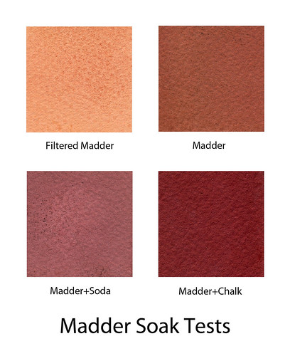
As I mentioned in Getting Madder and Madder, I attempted to get true reds from the dye by soaking small samples of paper in each of the most promising dye pots. After two days, I retrieved the paper and dried it.

Success! The madder and chalk mixture had produced what I am comfortable labeling as a 'true red' stain. The other colors produced aren't bad, but I can mimic them through other dyes or application methods.
Now, while I am extremely happy to have found a technique that produces a true red, I still have strong reservations about madder root proving to be an effective anthotype material. In all the research I've done, I found that madder root was prized among natural dyes for its light-fastness. That's not a good thing for an anthotype. Light-fastness refers to how well a dye resists breakdown and fading when exposed to sunlight; a very light-fast dye will last a long time without visible fading or discoloration. Since the entire anthotype process is based on using dyes that do break down and fade away when exposed to sunlight, I am afraid that madder root won't give good results.

I still have some hope, because paper holds dyes differently than fabric does and part of the preparation of madder root for a fabric dye involved specific chemicals called 'mordants' which help the dye adhere to the fabric and retain color. Since the best result came from a mixture of madder and chalk, not one of the mixtures that contained alum (a mordant), I still may able to get decent results. The madder might also be affected by both temperature and moisture. When spring rolls around again and I get bright sun and high temperatures again, the results may improve.

There will be a test (already have sheets of paper soaking) to see what can be done during the autumn months, but as I said: expectations are currently low. If a nice result is obtained, that's awesome, but I don't want to build myself up hoping for poppingly red anthotypes only to get a month-long exposure time for a low-contrast, blurry image.

Saturday, November 10, 2012

Getting Madder and Madder

Nuts to you, madder root. According to numerous sources, this was the dye used by the British and it was the reason the "redcoats" were red. With various mordants, specifically alum and chalk, it is supposed to deliver a rich, crimson red. I think history is lying. Of course, some of that could be a result of me trying to use the dye on paper instead of fabric, but my tests on fabric didn't come out that good either.

I've tried many different methods of mixing madder root. I gave a brief over-view of the struggle in my Rainbow Reverie: Red post, but I feel the need to go more in-depth. This is an extremely troublesome dye and given all the effort I've put into it, I want to document clearly why I think it's just not worth my time to continue investigating.

My first attempt at madder root was to purchase actual roots. Following instructions from the supplier, I chopped the roots up, soaked them overnight, ran the through a blender to chop them even more and then slowly raised them to a simmer and kept the there for over an hour. The water that resulted was nice and bloody, but left virtually no stain at all on paper. It did soak into fabric pretty well and I even added some alum to that mix. However after exposing the dyed fabric for a week, I had no decent image. What is there may actually be the result of water from fresh leaves soaking in and washing off the dye. So, overall, my attempt with using the roots themselves was a bust. Still, I've decided to try again and have some roots soaking right now.

I later learned that madder root can be purchased as a concentrated powder, so I ordered some of that. It arrived and was distressingly brown. Right off, I mixed some of the powder with alcohol and tested it. Not terrible, but not red.

Further testing ensued, with the madder powder being combined with chalk (crushed sticks, not actual chalk which is on a list of things to test with later now that I know that chalk isn't chalk), baking soda (to raise the pH), citric acid (to lower the pH), cream of tartar (a suggested mordant) and alum (another mordant suggested for true reds). I tried microwaving the liquid, simmering it for extended periods of time, dripping the liquid through a coffee filter to remove the particles and applying the dye as a thick paste. I got a lot if different results (see below), but none of them are red. They're certainly reddish, but not red. At this point, I'm pretty sure that madder just isn't where I need to go for a true red in anthotypes. The problem is, I don't know where else to look.

Beet juice is supposed to be a great red food dye, but when I make the liquid, it brushes on as a bubblegum pink. I tried adding vinegar as suggested in some recipes and it gets a bit darker, but not too much. Previous experience with boiling dyes tells me that if I try reducing the liquid down, it'll ruin the pigment.. but I might have to try anyway and see what happens. I can always get more beets.

The last really well-known red dye from a natural source is cochineal, also called carmine. It's gathered from crushed insects native to south-central America. I don't want to deal with the process required to extract the dye from the bugs, and the little things are expensive. Really, really expensive. Maybe sometime in the future, or if I can figure out a way to order it through the university... but until something like that happens, cochineal is just out of my range. Plus, it seems to require some work as well and I'm not certain if it could be used for dyeing paper.

There's something called 'lac', which is from India and is related to cochineal, but it's either just as expensive as cochineal or even more expensive. I have the same concerns about if it would work on paper because as far as I can tell, lac requires chemical shenanigans to release the colors. It also seems to favor red-violets instead of true reds.

So, for the moment, I'm lacking a real red. I may just have to deal with that, but I have two last hopes before I give up on the color.

1) I am attempting to make that second batch of madder dye from the roots. I will be SURE to follow the dyer's directions as carefully as possible, not skipping any steps or shortening anything. Once I obtain the dyebath, I will then try soaking the paper in it, using it on fabric and also reducing some of it down via simmering (not boiling) to paint onto paper.

2) I'm going to try soaking some small paper samples in my current batches of madder and see if extended exposure to the dyes gives better results. I may also test this with fabric.

If you were wondering what all this experimentation yielded, well, I've got a lovely table of the results so far right here.


Rainbow Reverie: Yellow

Yellow is not a difficult color to get from nature, but I've only experimented with a few yellow dyes because the nature of the color is the same, no matter the source. Yellow is freaking bright. It makes it difficult to see the resulting images and produces low-contrast results. For any yellow anthotype, I will typically adjust the color in Photoshop by about 10%, making it more orange. Whatever my subject is, the visibility and detail jumps dramatically with this simple change.

Despite that, yellow colors are easy to get and the two main dyes I use to obtain them are very simple and straightforward. There are numerous ways to adjust them so that you won't need the Photoshop adjustment. It can, in fact, be worked right into your dye.

Filtered Paprika Dye Test
Paprika: While the spice itself is orange and it can be used to create an orange effect if applied to the paper as a thick paste, paprika creates yellows when diluted into a liquid. I've created two different yellows through different means of preparing the dye.
The first is a goldenrod color, gentle and creamy, which is created by using a coffee filter to drip alcohol through about 2 tablespoons of paprika. The collected liquid is pale orange and exposes in 2-4 days.
Second, you can simply add the paprika directly to the alcohol until the saturation point is reached. This liquid will still appear orange, but when painted on the paper it will only leave a few streaks and bits of residue that can be brushed off when the paper dries. The yellow created this way will be very pale, but still give decent results in 2-3 days. In order to increase your visibility, simply add a little sandalwood or madder root to your paprika. You can experiment with other

Turmeric Dye Test
Turmeric: This is one of the easiest and most reliable dyes I've used for anthotypes. You can buy it at almost any grocery store or supermarket. If you have a local farmer's market, sometimes you can purchase it there very cheaply, too. Turmeric is a spice and perfectly safe so no worries about getting it in your mouth or on your hands or all over your kitchen. It's sold as a thick, golden powder. Diluting with alcohol forms a liquid that is your dye. Just a little alcohol will produce a yellow so bright it hurts the eyes, while high dilutions give muted, pastel shades.
Your exposures with turmeric can be as quick as 2 days (high dilution) and as long as 2 weeks (low dilution with poor light), but will average around 4 days for a good image. As mentioned above, the yellows of turmeric don't provide much contrast and I regularly sift in a bit of sandalwood to my turmeric to give more golden hues that provide better visibility. You can also do a double coat on your paper with a thin layer of blackberry first, and this will also give you more ruddy images that show up quite well.


Our next color is Green, which can be tricky, but is a lot of fun!

Thursday, November 8, 2012

Rainbow Reverie: Orange

Installment 2 is here and today we're covering the color Orange! This is going to be a short entry, with some notes for the future.

I've tested two successful orange dyestuffs: Paprika and Sandalwood, both of which can be used to produce other colors. However, since this is the entry on Orange, we'll focus on preparing those dyes to create... well, orange.

Paprika Dye Test
Paprika: In order to produce a strong orange, you will need a lot of paprika diluted with just enough alcohol to make it a spreadable paste. You want it clumpy and full of paprika. Unlike the powdery sandalwood and turmeric, paprika is gritty and granular. It won't dissolve into the alcohol. That's alright, it will produce an absolutely brilliant orange if you use it in the grainy, paste-like form. Exposure times are pretty good, 3-5 days or so. Be sure to let the paper dry fully, then just take a paper towel or your finger and wipe off the excess paprika so you have a smooth surface to print on.


Sandalwood Dye Test
Sandalwood: This is a really easy dye to work with, and very flexible. As already noted in the Red section, if you use only a small amount of alcohol to dilute sandalwood powder it will create deep rusty, red-orange shade. Using more alcohol lowers the intensity, giving you a range from salmon pink-orange down to a pale gold-orange. Sandalwood can also be softened with a bit of turmeric to create more golden, yellow-orange shades. No matter how you prepare it, the exposure times are very fast. Expect 3 days to give a good result, with times decreasing down to 1 or 2 days if diluted with strong enough alcohol dilution.
I do suggest diluting sandalwood a good bit, or breaking its color up with another dye such as turmeric or red wine. By itself, at high concentrations, the color produced is so strong and vibrant that the resulting prints are actually hard to see. You get better contrast if the color starts out weaker.

Carrots: I tried shredding carrots and using the result to create a dye. It certainly produced a thick, bright orange liquid, but it was useless. When applied to paper, the carrot juice didn't leave more than the faintest stain. Even soaking paper in the juice didn't provide a noticeable color. Tried it with fabric, too, and still no results. Conclusion: carrots are good to eat, not to use for dye.

Annatto: Some folks that I've corresponded with on Flickr and AlternativePhotography.com have used annatto, which is a south american spice, and gotten good oranges. I just recently ordered some (it hasn't arrived yet), and will be testing it out myself. According to other artists, the spice is diluted in alcohol or water just like sandalwood or turmeric, and takes 3-5 days to expose. It produces soft, vibrant oranges that are a bit easier on the eyes than pure Sandalwood.
UPDATE: My annatto arrived very quickly, and I set to work testing it out. I purchased a powdered extract version of the plant, not the whole anise seeds. Diluted with alcohol, the annatto powder does as expected and produces a variety of oranges from a bright tangerine to a soft pastel. The powder leaves a bit more debris than sandalwood, but can be coffee-filtered so long as you don't mind losing a lot of the vibrancy. Otherwise, just wipe off the dust when your paper is dry.


Tune in again soon for YELLOW: the Happy Color!

Monday, November 5, 2012

Rainbow Reverie: Red

Now that I've got at least a few dyes that produce each color of the spectrum, I'm going back in detail to review the properties and preparations for the most effective of the dyes and mention the ones I tried and found lacking. Color by color, I'll go through my anthotype library.

Today, we start with Red. When I say 'red' what I actually mean is pink. I've found a single deep red-orange and many shades of red-violet and pink, but none of the dyes I've tried have actually produced red. I still think that there may be one out there. I have a suspicion (listed below), but no confirmation as of yet.

Strawberry: Initially, I had high hopes for strawberries. They're so colorful, after all. The problem seems to be that when rendered down either with crushing or chopping or boiling, the resulting liquid is primarily composed of the inner, pale flesh instead of the outer skin of the berries. It gives you pale, pale pinks that show some images after 5-7 days, but at low contrast. The really annoying problem with strawberry dye is that it doesn't keep. It rapidly transforms itself into a gooey mass of green-white mold. I don't think my usual solution to mold (mixing with iso-alcohol) would work, because strawberry dye is already so pale that diluting it would just ruin the whole thing.

Raspberry Dye Test
Raspberry: This dye comes very close to being purple, but it's also pretty pink, so I'm listing it under Red. It can be used either undiluted for stronger color, or with alcohol for pastel shades. As normal with undiluted dyes, the exposures are fairly long: 5+ days to get a good contrast in your prints. Your field will fade down into a brown-violet, leaving the red-violet object behind. Raspberry dye tends to have a big issue with seeds and bits of berry-skin being left behind in the dye, bigger than other dyes. Don't worry too much, it can be rubbed off while the paper is drying.
You can boil raspberry dye to reduce it down, or you can boil the berries themselves before blending them. You can also boil the berries and smash them in the boiling bot to extract the dye that way instead of using a blender to puree them and then straining the puree. In general, I do not recommend boiling your dyes. There will be a post going into more detail on how to prep different dyes, more detail on this there.

Beet: I've only tried canned beets, and have a suspicion that they may have been tainted with artificial colors or additives. I will be trying regular beets eventually, but the results from canned beets weren't particularly encouraging and I've seen other people work with beet juice for anthotypes and not enjoyed the results. Beet juice gives you strong, bright pinks, a few shades brighter than what I'd call "bubblegum"... maybe more like cotton candy, or strawberry frosting. It exposes fairly quickly, 3-5 days giving good results. The only reason I don't like beet juice is just that I'm averse to the color. I prefer darker, stronger colors. The pink that beet juice gives is just too... pink. Totally a personal call; the dye itself has no big problems.

Madder Root Dye Comparison 
Madder Root: There are two forms of madder root: a powder and actual roots. I've experimented many times with both methods, and only the powder has produced any results. I tried mixing up the dye from the roots by following various online tutorials, but the liquid produced (while a gorgeous crimson) didn't stain paper at all and was incredibly light-fast on fabric. So, I ordered some powder which arrived quite recently. No exposure results so far, but several dye swatches were produced. Consulting various online resources about madder root, I tested various additions to the dye to produce different colors. Alum, chalk (turns out I used the wrong kind of chalk), cream of tartar and baking soda (for an alkali). I ran across some suggestions to use citric acid to create oranges, but I have lots of oranges and not many good Reds. The chart above lists some of the various combinations and methods used to adjust the color of the madder powder.
Edit: Further testing has shown that it is possible to get a bright red color from madder root by soaking the paper for 1-2 full days in the dye. More details here.

Sandalwood Anthotype
Sandalwood: Primarily, sandalwood produces oranges. If used at the strongest concentrations, where the dye is almost a paste instead of a liquid, sandalwood is so orange that it turns into a dark rust. The drawback here is that the exposure times are fairly long, minimum of one week. Even at long exposures, the contrast is pretty low. Post-processing can easily adjust that, but purists may be disappointed in the results.

Red Wine: The easiest anthotype dye, bar none, because it can be used straight out of the bottle. There's no mixing or measuring or filtering required. All you need to do to create a red wine anthotype is buy some cheap cooking wine, paint it onto the paper and expose. Red wine can produce images within 3 days, but it does better with more time. Ideally, give red wine at least a week of strong sunlight. You'll get a dull, faded orange background with a very soft pink-red subject. I do not recommend red wine as an anthotype dye because of the incredibly pale colors produced. The visibility and contrast is quite poor. However, it is fairly consistent and easy, so people just starting out may want to try it for themselves before moving on to more complex dyes.