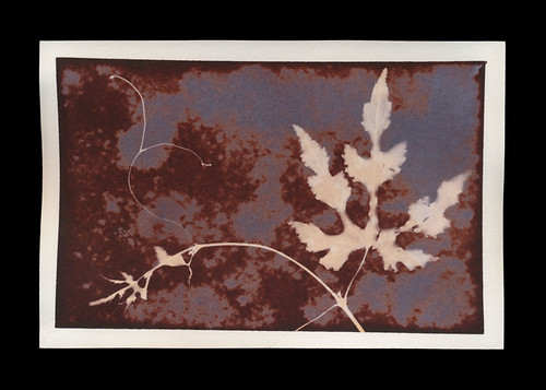
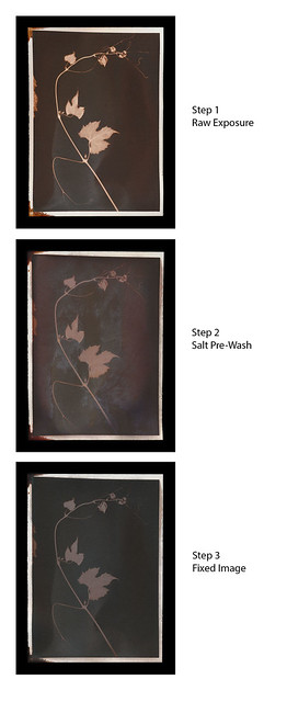
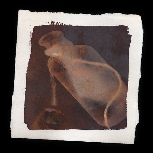
Showing posts with label Teaching Spiders. Show all posts

Monday, October 20, 2014

Inspiration and Illumination via Instagram

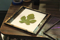
All the elements assembled for shooting
Instagram is great! Since I started using it, I've been doing tons better at documenting my processes and experiments. It's so much easier just to use my phone to Instagram small set-ups and examples rather than to have to get lights set up, pull out the DSLR, deal with Camera RAW files and all the other mess that comes from a "proper" shoot.

The difference in results isn't that dramatic, either. Not to say there isn't one, but for my primary purposes (this blog), I don't need huge, high-res images of my process. Now, if I ever get around to assembling that Anthotype book I keep talking about (you know the one, Spiders...) then I will have to do process documentation shooting with a real camera. Ditto for the Lumen Folio. For now, though, Instagram is where it's at. Spiders, did you know you can even get people interested in your work via Instagram?

Shoot in progress!
My Instagram hero is Joshua White, a professor up at App State in Boone. His entire current body of work, A Photographic Survey of the American Yard, was created on Instagram and is displayed on his account. With simple rules, minimal equipment and a straight-forward procedure, he creates gorgeous pieces of work. On Instagram. With an iPhone. So that's awesome. So far he's been featured by Instagram itself, in articles on Wired.com, Mother Nature Network, Fstoppers, Gizmodo, FeatureShoot, and probably other places! He's Instagram-famous, and it's really cool.

I actually took inspiration from Joshua when figuring out how to document my Plastron Prints and my Cyanotags (another project that I'll blog about soon!) for viewing. The photos here today are showing how that documentation works. It's really simple, Spiders.

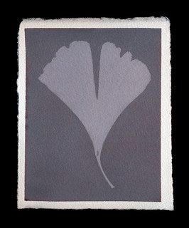
The finished result, via Flickr!
There isn't much you need to do shadowless, floating documentation of small objects.  A shaded, outdoor space to shoot in is the most basic. Then get a piece of cardboard, or foamboard, or a corkboard.. anything pins will go into but not back out of easily. If the board you're using isn't the right color and/or texture, then add a sheet of paper or other covering to make it the right color and/or texture. Then just get yourself 1-3 pins, and some sticky poster-tack or soft wax. Then you can adhere the object onto the pin(s), holding it off the surface of the paper-covered board. That distances the object from the background, reducing any shadows not already removed by using the diffuse light of an outdoor, shaded shooting area.

Your end result should be a very clean image, as shown in Joshua's series and my latest images on Flickr. The images I posted earlier, on Instagram, used the same ideas, but I shot them inside, using desk lamps. That created shadows. So when I wanted larger, clearer images (using a DSLR and a macro lens), I took my set-up outside! The results from outside were much better.

Friday, July 25, 2014

Blogging for Freya: Salting Spiders, Part 2

Print made with lite salt
Hello, Spiders! Welcome to part 2 of my Salt Print learnable. You're in for a treat, because this is the full-length version and it took forever to write.

Set-up
You can do this process almost anywhere, but you're going to need a flat area to work. If it's an area you care about, first cover it in a plastic tablecloth or protective sheeting. The plastic prevents the nitrate from soaking through a towel and getting on anything important. However, the nirate can slide around on plastic, so to be extra super careful you could put towels or a cloth down on your plastic.

Make sure you have your gloves (to avoid black spots on your nails and hands) and your protective glasses (to avoid eye damage) in place. You don't need to actually put them on until you take out the silver nitrate. I don't 'suit up' until I'm ready for the silver nitrate coating, because the gloves make my fingers clumsy. I always wear my glasses, because without them, I can't see. I have little plastic additions to my glasses that clip on to provide extra eye protection. Goggles just fog up on me and hurt my face. Whatever method you use to protect your eyes is up to you, but it is kinda important.

And that's it, you're ready to go. Protect the area, protect yourself, and get ready for some printing!

Print on Lokta Fiber Paper
Paper
Select your paper. As with most alternative processes, you want a high-quality printmaking or watercolor paper. I've had great luck with Arches Aquarelle and Rives BFK. Others have recommended Crane Kid Finish, Bienfang or pretty much any cotton rag paper. If it works for cyanotypes, anthotypes, van dykes or other alternative processes, it's probably great for salt prints.

Personally, I prefer smooth surfaces with just a bit of tooth. Too much texture in the paper and it starts removing detail from your print. Too smooth a surface just looks bland to me. I like a nice medium. Hot press papers are generally great for this.

You generally don't need to size your paper, but a simple gelatin sizing may be helpful if you are experiencing significantly less contrast than you expect or desire. To do a gelatin sizing, simply mix up unflavored gelatin (Knox seems the most common brand around here) in hot water and soak the paper in it. Allow to dry completely, then proceed to the next step.

Small note: handmade papers or exotic papers may be too absorbent to use for this process without sizing. I attempted to use some Nepalese lokta fiber paper and it's basically just a rag made of cellulose. I wasn't able to spread the silver nitrate at all and ended up using way too much of the chemical because it had to absolutely saturate the paper. If I experiment again with this paper, I'll be using sizing. I had similar issues with cyanotypes and anthotypes on hand-made paper using dryer lint and shredded recyclables. 

Print made with sea water
Salt
You'll need to make some salt water. The amount of salt in the water is entirely up to your discretion. It's perfectly viable to use seawater. Normally I add about 2 teaspoons of salt to a liter of water. Less than a 2% salt solution doesn't give very much of an image at all. That's basically the minimum required. I have been told that the more salt you add, the more contrast you'll see in the final image. I have not seen a significant difference myself.

You can use chemical grade sodium chloride (additive-free salt) and distilled water. There's no need to use pure chemistry, though. I don't use distilled water. I generally use tap water that I know is absolutely not pure. The pH is on the basic side, it's hard water with a lot of calcium and iron. It works fine. Sea water works fine too and who knows what's wrong with that stuff. Rainwater is fine. The type of water you use, as long as it's not actually contaminated with heavy metals or something, won't produce a big difference in your prints. Minor differences, sure, but not huge ones.

The type of salt you use will dramatically affect your prints. I like using "lite" salt. That's a mixture of 50% sodium chloride and 50% potassium chloride. The important part of the salt is chloride, since you're using it to convert the silver nitrate to silver chloride. Silver chloride is far more reactive to light and produces a much stronger image than silver nitrate. How you get the chloride in your paper isn't important to the light-sensitivity, but it is important to the color. I haven't experimented with ammonium chloride, but I know it can also be used for salt prints.

Lite salt produces violet images that, when fixed, turn pale yellow. I have not bothered tracking down any pure potassium chloride to test what it does, but I imagine it has a slightly different effect. My kosher salt images are red to brown before fixing and turn brown or black after being fixed. Prints made with sea water from the Florida coast have produces a nice middle ground

Print made with both lite and kosher salt
Here's a cool tidbit: if you put different types of salt in your water, they don't always mix. The result can be a splotched print that has some areas of the paper coated in one type of salt and the rest in the other. It can be a very fun calico effect. I've gotten especially stunning results prior to fix, using half lite salt and half kosher salt, to get a violet-red combination. Don't underestimate the appearance of the post-fix combination of red and gold from the same combination, though. It's pretty awesome, too.

The basic step here is to mix up your salt water and then soak your paper in it. As a faster alternative, you can simply paint the salt water onto the paper with a brush. Either way is fine!

Silver Nitrate
It's time to put on that protective gear! Get your gloves and glasses firmly in place. Once your salted paper is bone dry, paint on your silver nitrate. Do this in low light to avoid fogging the paper or the jar of silver nitrate. I know it's in amber glass, but better safe than sorry. When not in use, the glass of nitrate should be stored in a dry, dark place. I work at night, with a dim lamp or computer monitor as my light source.

Use an eyedropper, pipette or other method to drag a thin line of the 15% silver nitrate liquid across the top of your sheet of paper. Then you can spread it out into an even coating using a foam brush, hake brush, glass puddle pusher or even just a regular flat paint brush.

Getting an even coating can be tricky, because until it exposes, the silver nitrate solution is clear. It can be very difficult to see if you've left any streaks, brushmarks or spots behind. I recommend simply doing two or three light, even coats across the entire surface going in different directions. If you want an especially dark image, you can apply two heavy coats of silver.

Exposure
As with most of my guides, I simply suggest using a picture frame to expose your prints. It's cheap and easy to obtain. Head to your local art supply store, or even the local Target, and grab some inexpensive picture frames that have a hard back. Don't get the really cheap ones with the hinged cardboard back, they're just not sturdy enough to provide good contact between your negative (or object) and the coated paper. I'm going to go into extreme detail on different methods of exposure in a future post.

Since the salt printing process is a "printing out process", it develops while it exposes. You can test exposure simply by looking at a portion of the exposed silver that isn't covered by your negative or objects. When it reaches a density you're happy with (generally dark rusty red or brown), you're done!

Fixing
Now, it is possible to simply treat a salt print like a lumen print and avoid fixing it. However, that isn't traditional and the salt print is a very traditional process. It's also a lot more tactile than the lumen print, so I do generally fix my salt prints. An unfixed salt print, like most unfixed prints, will continue to darken and expose in even standard interior lighting.

To fix a salt print, you can mix your own fixer (difficult and annoying) or use standard photo fixer. Guess which approach I favor? That's right, the standard photo fixer. I use Sprint Rapid Fixer, because that's what I can borrow from the university. It's also what I've used for my entire photographic career. I dilute it heavily, about 20ml of concentrate to a liter of water, meaning it's at 20% of the regular working strength. You do not want stronger fix; it will bleach your prints. Even using the weakened fixer, only fix for 1-2 minutes at most. That's more than enough to fix the image. Again, over-fixing will bleach your prints.

Spiders, you should be aware that fixing a salt print does cause a potentially dramatic color shift. I mentioned earlier that the violet images produced by "lite" salt will fix to a pale yellow. The ruddy reds of kosher or regular salt will fix to a duller, darker red or (with high levels of silver) to an almost black brown. I generally prefer the pre-fix image, but not always. So I scan both before and after fixing.


That's all I've got, Spiders. Between this post and the last one, you should be ready to sally forth and print as long as you've got sun, salt and silver!

Thursday, July 17, 2014

Blogging for Thor: Teaching Spiders about Salt

Salt print made during a demo with
tap water and fast-food salt packets.
It doesn't get any less exacting than this.
Well, Spiders, I've been talking about salt prints for a while now. I've finally set aside some time to document the process and write a short guide to making them in your kitchen. Maybe not literally in your kitchen, because everything I've tried to remove the silver stains from my counter has failed. I've got a nice splatter of brown dots there and they show no signs of going anywhere. If you take care to avoid and spills, drips or splatters, you should be fine. Then again, you're spiders and you don't have kitchens. Just work anywhere, really.

Salt prints aren't complicated. They're also not very dangerous. You can purchase the silver nitrate required in a pre-mixed low-concentration solution. I bought my 15% silver nitrate from Bostick & Sullivan. Here's the link to the specific product I used. 100ml should last a fairly long time, since you only need a single eyedropper full to coat a 5x7 sheet of paper. Each eyedropper is maybe 1ml.

By avoiding powdered silver nitrate, you significant reduce the risks of the chemical. In its dilute, liquid form, it won't burn your skin or get into your respiratory system. It can still cause some nasty harm if it gets in your eyes, but wearing glasses or goggles will protect you. At worst, it will cause stains on counters, skin and anything else organic (including plastics... like plexiglass and acrylic). So what safety gear do you need? Gloves and glasses. The most basic of chemical safety practices will be entirely sufficient.

I am assuming that you use 15% liquid silver nitrate solution. I won't give any details about how to mix the solution yourself, because I never do that. I don't like caustic chemical dust in my house.

Now, onto the actual process! Here's the short, simple version first.

Basic Materials


  • Salt (approx. 10-100 grams)
  • Water (approx. 1 liter)
  • Brushes (foam, hake or flats) or a Puddle Pusher
  • Soaking basin or tray
  • Jug or glass to mix salt water in
  • 15% silver nitrate solution
  • Eyedropper
  • Rubber gloves
  • Protective eye goggles or glasses
  • High-quality watercolor or printmaking/drawing paper
  • Picture frame or alternate exposure method
  • Negatives or photogram objects
  • OPTIONAL: Hair dryer
  • OPTIONAL: Photographic Paper Fixer (diluted to 25% regular working strength)

Simplified Step-by-Step Instructions


  1. Gather your materials and set up!
  2. Mix up a 1-5% solution of salt water.
  3. Soak your paper in the salt water for at least 10 minutes.
  4. Dry completely!
  5. Use the eyedropper to apply a line of silver nitrate across the top of the salted paper.
  6. Spread the silver nitrate into a thin, even coat with a foam brush.
  7. Dry Completely!
  8. Place a negative or photogram object on the coated paper.
  9. Cover the paper and your negative/object with glass. Real glass, not plexiglass.
  10. Place in the sun for ~10-20 minutes.
  11. VERY OPTIONAL: Rinse the print in a salt water bath for 5 minutes to remove extra silver. 
  12. OPTIONAL: Fix the print in regular photo fixer (diluted to 25% strength) for 1 minute.
That's it. That's the entire process! Well... basically. I can, and will, go into a bit more detail. Actually, a lot more detail, my arachnodroid friends. The rest of the write-up is already over 1000 words long and it's still not done. So that's going to be broken off into a second entry. Stay tuned, spiders!

Sunday, February 2, 2014

Blogging for Spiders: Back in Blue

I haven't been feeling particularly artistic lately, my dear spiders. You've no doubt noticed that by the recent trend of blogs falling further and further behind on the weekly schedule and generally being a bit gloomy and lacking in new projects or progress on old projects. Winter isn't my most productive time, but that's hardly an excuse. I've just been in a rut and battling the fog-monster. Today I launched a massive attack on his nebulous ass. I got out into my lab and did some work.

Previously, I've talked about printing cyanotypes on parchment. It's pretty awesome, because the parchment imparts a remarkable amount of texture that rarely manages to detract from the subject matter. The organic nature of the material, and the fact that I print on scraps instead of properly processed, sized and cut sheets, means that each piece has a different texture, surface, thickness and quality. The scraps I get come from any of four types of parchment (deer, goat, sheep, calf), but I have no way to tell which I'm actually using.

Just to clarify, when I say 'parchment', I do not mean the stuff you buy at the grocery store to bake on. I do not mean the vellum you buy at office stores to put in wedding invitations. It's thin-cut and treated animal skin, the kind of material used in medieval documents and illuminated manuscripts. If you'd like to buy some of your own to play with, I get my supplies from a tannery in New York state: Pergamena.

Eventually I would love to order a full-size skin and do large format cyanotype contact prints, but at the moment that isn't feasible since I don't have a place to work large enough for that, or a way to handle washing, drying and pressing a skin that big. Cyanotypes printed on parchment must deal with the qualities of the material. Parchment, despite being used as paper, behaves very little like paper. It reacts differently to moisture, heat and tension.

So, how do you print cyanotypes on parchment successfully? Let me 'splain to you.

Coating the Parchment

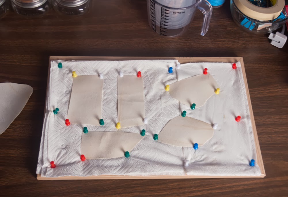
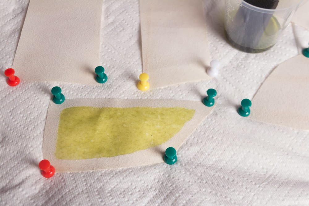
Stretched and pinned parchment sheets

First off, your parchment needs to be stretched before it can be coated. That's because the parchment will curl and warp in response to moisture. It will then dry in that shape while you allow the chemistry to dry. You'll want to pin, tape or otherwise secure your parchment to a solid surface before coating. This will allow the parchment to keep its shape much better than just trying to coat and dry it loose. Personally, I use a small cork-board covered in paper towels (extra absorbent padding, plus easy to clean by replacing the towels) to handle smaller pieces of parchment. Larger sheets are taped down to pieces of particle board. You may be able to get away with pushing broad-based pushpins and instead of spearing through the parchment, just using the plastic to hold it in place. I try doing that, because I don't particularly like holes in my parchment, but it doesn't always work out. Especially later.

One sheet of parchment coated.
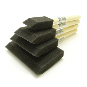
When coating your parchment, I recommend a small foam brush. You don't want to over-saturate the parchment. Depending on the type of parchment you're using, it can be anywhere from slick and hard (the chemistry will try to run right off and you really have to work it into the material) or it can be soft and suedey (the chemistry is sucked right in and absorbs very smoothly). The small foam brush lets you get into small corners, which is great if you're using small sheets of parchment. You'll have to decide for yourself if you want to cover the entire surface, or leave an un-coated border. I like leaving the border, but I've tried it both ways and been satisfied with the results. The border just lends your piece a nice, defined edge.

Drying the Parchment

Once you've coated your parchment, you have to let it dry. As with all cyanotype materials, do this out of light. A warm, dry, dark environment is best if you can manage it. I keep mine in a cabinet. Allow parchment to dry fully, until it retains absolutely no moisture. This may take between 1-2 days depending on your local humidity and temperature. The dry parchment will be stiffer and far less flexible than it was when you started. After being exposed to moisture, the parchment never really gets that soft, flexible feeling back. I've contacted different tanners and they all say they's just how it works. They recommend not wetting your parchment, but obviously that isn't an option for anyone wanting to do photography on it. There's some additional chemicals and steps the tanners themselves use when dyeing and tanning the hide that keeps it supple, but it's not exactly stuff you can do at home (or want to, as it stinks). Just deal with the stiffness of the final product.

Exposing the Parchment

Exposure is fairly standard. Close contact between your negative or object and the chemistry is key. Be forewarned that because of the texture, surface quality and stiffness of your parchment, no cyanotype will ever come out as detailed and clear as it will on paper. Ever. It's just a factor of how the parchment is. I don't even try negatives anymore, they were too indistinct and fuzzy for me. I only use parchment to do contact prints with plants and objects.

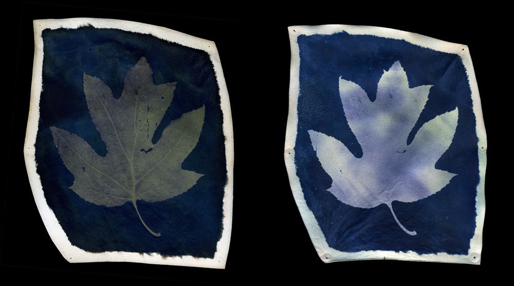
There is one note here to be made: your exposures will be longer than normal. There's something about the parchment that makes it resistant to exposure. Chemistry on parchment doesn't hold detail very well, so you need to really burn it in. It's extremely common to find that your latent image is much more detailed and vibrant than your developed print. Check the example below.

Left: Latent Image. Right: Developed Image.
As a result of this detail loss, even during extended exposure (this was 2 hours), I scan my latent images. We've already discussed how I feel about archival permanence. I see no reason to discard such a powerful image just because it isn't chemically stable.

Washing the Parchment

Washing (developing) parchment cyanotypes (I call them cyanovellums) is also perfectly simple; just dump them into water and stir them around. They take longer to wash than regular paper, especially if the parchment itself is thick or soft. The thin, hard, slick parchment washes pretty fast and doesn't respond nearly as much to moisture as other types. The problem with washing cyanovellums is that whole issue parchment has with moisture.

Drying the Parchment

You can't dry them quickly, and you have to stretch them or they'll curl up like mad. If you try to dry them with an iron, they'll shrivel up like a slug under salt.

What you end up doing is drying them in a book, or under weight. Pad both sides of the parchment with towels or something else absorbent, then press the whole thing under heavy weight. Large books do great for this, but they can occasionally transfer ink from their pages onto the parchment. Might be interesting, but more likely to be a distraction from your image. Experiment with that, but go into it expecting to experiment. If you don't want any ink transfer, just put something absorbent between your parchment and the paper.

If you'd rather stretch and dry the parchment, you can do that. You will have to pin through the parchment. There's no way to use the weight of the pushpin's plastic to hold the parchment in place as it dries, like you can try doing while coating. There's too much water in the parchment that has to get out and the curling is going to have some force behind it. Stretch the parchment tight and pin it in place securely. You may choose just to pin the corners, or pin regularly around the sides. Because I don't like having holes in my parchments, I tend to prefer the weighted press method of drying. Stretch-n-pin does offer a bit of a chance to 'cheat' and dry the parchment faster. You can use a hairdryer on low, held several inches from the surface of the parchment, to speed up the drying. Don't hurry too much, even a small parchment will take a good 20 minutes or so, but you can manage it.

Either way, pinning or pressing, if you don't cheat with heat then you can expect it to take 2-3 days to fully dry your parchments. If working during a hot, sunny day then you can leave your press or stretching board outside and let the sun help you dry. That speeds up the process considerably!

Finishing Up

Now, if you've done something wrong, or your parchment just isn't cooperating, you can always re-soak and re-dry the parchment. Just remember, it's never, not ever, going to be as supple and flexible after being washed as it was when you first started.

Each cyanovellum is unique. A combination of the hide's texture, size, coloration and surface along with the variations in the cyanotype process itself will create an absolutely individual piece. You can go further and tone your cyanovellums, but the toning processes may not work exactly the same on parchment as they do on paper. For example, most bleaching processes turn cyanovellums golden orange.

Since the tactile appearance of cyanovellums is so striking, I prefer to present mine in shadowboxes. I generally choose a box with a natural wood finish, then cover the back of the box with either a black or natural, unbleached cloth. I use small sheets of cardboard or foamboard to raise the cyanovellums off the background, 'floating' them against the background. Hot glue makes for a good seal and can be easily removed from the back of the parchment without causing damage.

Friday, November 29, 2013

Blogging for Thor: Teaching Spiders 1

EDIT: Faaaarts! This blog post took way longer to write than I expected. I swear, I started writing at 11:15! Don't smite me, Thor!

Today, for those web-spiders crawling my blog from servers based in the USA, is Thanksgiving. It's vaguely traditional that today Americans remember things we are thankful for, then tell the internet how thankful we are for them. It's kind of a way to show off the things we have, so other people can admire how much we have and how thankful we are for them.

I personally am thankful that I get to be a teacher. I'm an adjunct professor most of the time, and the rest of the time I teach at local art centers and do my own private classes. I love teaching eager students about photography, design, art and how they all come together to make the world a better place. Every time I go to work, I'm thankful that I was able to be in the right place at the right time and know the right people to get my job. In all honestly, I am not qualified for my job. I don't have a Master's degree so I'm literally not qualified. I lack the appropriate scholarly qualification. I still do a great job, don't get me wrong, but it's a minor miracle of the sentient universe that I have my position, and I am incredibly grateful to whatever agent of destiny was responsible for arranging things thus.

Instead of just saying all that, I'm going to show it. Today kicks off a new segment of the blog: Teaching Spiders. And today, my digital arachnids, I'm going to teach you how to make lumen prints. I'll be doing more of these Teaching Spiders posts, sometimes as part of my Blogging for Thor series and sometimes by themselves. Use the tag system to find them all, hopefully there will be a bunch at some point! I'm going to do general how-to's like this one, and also more specific question-and-answer. I've already done some of these (way before Teaching Spiders was a thing) for Anthotypes. I'll adjust tags so you can find them!

Now, I some time today shooting pictures to illustrate this process. Way more time than you'll think, once you see them. Partly, that's because I did it at night when it's dark and my workroom is (intentionally) poorly lit. Partly, it's because I don't have much practice at illustrative photography. Mostly, it's because I realized these steps are so simple that a monkey could follow them. Since you're all hyper-intelligent code-spiders from the interwebs, you'll be fine.

Before we start, let me make a very important note: You Can Do All Of This In Regular Light. Lumen Printing Does Not Require A Darkroom Or Light Closet Of Any Kind. Though, if you plan on using a specific pack of paper for darkroom and lumen printing, you will want to open it and remove some paper while in the dark, obviously. However, lumen printing works just fine on exposed, expired and otherwise ruined paper. I keep all my lumen paper in a box in the kitchen. I never use a darkroom for it at all. It's all been totally exposed and is worthless for darkroom printing. I care not even the tiniest bit.

Step 0: Gather the Materials
You need three things to make a lumen print: a picture frame, an object to make a print from and a sheet of photographic enlarging paper. You can have more things, some very helpful, but those are the basics. In fact, the whole 'picture frame' bit is optional. You just need something to hold your object in place on top of your photo paper. That can take a lot of forms, but we're doing a very basic lesson here. So, use a picture frame.

Step 1: Choose Your Paper
The brand of paper you choose will determine the colors of your print. Each brand has a slightly different cocktail of chemistry in the emulsion and in the paper base. These react to light differently and produce the colors of your image. Some papers are blue, others are pink, red, brown, violet, green, indigo, or orange. Pretty much any color you want, there's some brand of paper out there that will produce that shade. The best way to find out what papers you enjoy is experimentation!

Step 2: Choose Your Object
This is pretty simple. We're doing a basic lesson here, remember that Spiders, so go with something flat that will fit in your picture frame. Feathers, coins, keys, jewelry, lace, cut paper, negatives, plants, flowers, leaves, bits of string, etc. Plants tend to produce particularly interesting lumens because the moisture inside them leeches out and onto the paper. When moisture interacts with the chemistry in the paper, it makes new colors. Remember that, it can be super fun!

Step 3: Load your Frame
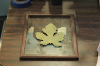
Front-Glass Regular Frame
Double-Glass Frame
Ok, this gets a tiny bit tricky. How you load the frame depends on what kind of picture frame you have. Some picture frames have two sheets of glass and no real "back" at all. These are actually my favorite kind, because then I can put the paper down first, face up, and arrange my objects on the paper easily before laying the covering sheet of glass down. I've included a photo of that, for reference. For contrast, there's also a photo of a traditional frame being loaded. Those are a bit harder, since you have to arrange your objects on the glass and then put the paper down behind them, and close the whole thing up while hoping you don't accidentally nudge anything out of place. On my regular frames, unless they have a very tight fit already, I fill the back in with paper towels or some sheets of cheap craft store felt. This ensures full contact between my object and my paper.

Full contact is very important for detail. Anywhere there is light or no contact between your object and your paper, light creeps in. This results in blurry, fuzzy areas around the edges. You may like this, since it can give the appearance of 3D form to your prints, but you should probably start off with keeping everything nice and flat. Get crazy and experimental with partial contact later.

Step 4: Place In Sunlight
I'll actually update this later with a photo, because I like using the back of my car for this and it's kinda fun. Honestly, it doesn't matter where you put your lumen print to expose, it just needs sunlight. Exposures can range from a few seconds to several hours. This is a bit frustrating for rule-oriented people who want a hard time limit so they know the print is "done", but there isn't one. A lumen print is "done" when you like the color it has turned. The longer you leave a print out, the more it will change. Some papers turn totally different colors as they expose more and more. I have a favorite paper that starts off gold, then turns ruby red, muddy brown, neon green and finally a deep emerald. It's pretty awesome, and I decide on a case-by-case basis which color I want.

So, basically, stick your lumen print in sunlight and then wait until it looks pretty. Remove from sunlight and...

Step 5: Remove from Frame
Uh, open the frame back up and take everything out. This is super-simple. Remember that your print is still sensitive to light at this point, so best do this inside and out of sunlight.

Step 6: Really, this is optional, but not for me. Document everything. Document how long the exposure was, what day it was on, what the weather was like, what kind of paper you used, what object you used and if it was a plant was it dry or fresh? Document everything. This way if you want to repeat your process you have some incredibly faint hope of doing so. Lumens are very unpredictable because they respond so closely to so many different factors like time of day, humidity, weather conditions, brightness of the sun, angle of light, moisture in the object, etc. It's very, very hard to reproduce a lumen and downright impossible without good notes.
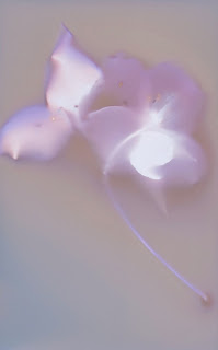
Scanned Lumen Print of a Dogwood
Step 7: Document the Image
Now take your pretty lumen print and either scan it or photograph it at high-resolution so you have a permanent image of how it looks. You may want to make several scans or photographs, and maybe use both methods. These files will be your only permanent record of the print's original appearance.

Optional! Step 8: Fix the Image
Drop the print into regular photo fixative for 5 minutes. You'll notice a dramatic shift in color and, probably, a loss of detail. Generally warm-tone papers will retain most of their color, or even become more colorful after fixing. Other papers can lose some or all their color and some or all of their detail. It depends entirely on the brand of paper. I generally do not fix my prints, except for certain papers that I've found respond really well to fixing. I'll make some notes on that in a later Teaching Spiders post.

The End!
If you fixed your image, you now have a pre-fix product in your digital files and a post-fix physical product in the print itself. If you opted not to fix, you have your files. You can keep the original print in a dark, archival box, but even heat and time will cause the print to alter slowly. Either way, enjoy your lumens and have fun!

Saturday, May 11, 2013

Straight Up Substrates

Anthotypes are pretty awesome. Why else would I blog about them so much? Well, boredom and an enjoyment of hearing myself.. type, I guess. But, they're pretty awesome, that's the point. One of the reasons they're awesome is that you have a huge amount of flexibility in how you make them. There are dozens or hundreds of possible dyes, each one can be diluted or applied in many different ways to create just buttloads of potential colors. But, under all that, there's even more choice! You get to choose what you put the dye on! There are many possibilities and each category breaks down even further.

Because of the sheer number of things you can put dye onto and let it fade back off, I'm only going to cover a few types of substrates, the ones that are most commonly used for anthotypes. Don't let that stop you from experimenting! Anything that takes a stain can theoretically be used to make an anthotype.

Paper: The most common substrate to use for anthotypes is paper. It's obvious, since that's what most photographs are produced on and an anthotype is a type of photograph. There are a wide variety of papers and choice does matter. I don't recommend using anything lightweight such as copy paper because it won't hold up well under the dye and it will wrinkle as it dries. You want a heavy-weight paper that's designed to take lots of liquid. Printmaking paper, watercolor paper and even sketch paper meant for use with inks will do alright.

There are many sources telling you about what kind of papers are best for this and that alternative process. Some of my favorite brands are Crane Kid Finish, Rives BFK, Stonehenge, Arches Watercolor and Canson Watercolor. I don't have as much experience with the printmaking papers, because they're rather expensive, but Rives and Stonehenge are both extremely durable, cotton-rag papers that will happily soak up your dye without deforming or tearing. They're my personal favorites for anthotypes. However, again, they're kinda expensive. So, for tests and experiments I prefer to use Canson or Arches, neither of which is very pricey. When you're just starting out, or using particularly weird dyes that you don't expect much from, Canson is the cheapest paper of the brands I've listed. It's often comprable to store-brand generic watercolor paper. Arches is much heavier, which is nice for durability.

A short note about watercolor paper: it comes in Cold Press and Hot Press. What those mean are that cold press paper has a tooth, or texture, on the surface. Hot press papers are extremely smooth. I'm a much bigger fan of smooth paper for anthotypes because it lets the most detail shine through in the print itself. You may like the texture of the paper itself, so you should probably try both.

If you're adventurous and don't mind getting dirty, you can even make your own paper. It's pretty simple, and comes out with a great finish. If done correctly and your paper mash is reinforced with some lint or fibers, you can get very, very sturdy papers. I especially like that when you make your own paper, it puts more of the process in your hands. You make the paper, you make the dye, you make the image. It's all yours. That's a nice feeling sometimes.

Fabric: After paper, the next level of advancement in substrate experimentation is normally fabric. I'll say that your best bets here are going to be natural fibers. I've used linen, muslin, wool and silk. All have given decent results. Linen has done the best for me so far. Silk doesn't like to absorb the dye as easily. Wool tends to snarl on the leaves and plants I use, though it's great at absorbing the dye. The linens I use tend to be fairly thick and heavy, with good texture. On paper, I like a smooth surface, but with fabric, I prefer texture because it helps add contrast. You won't get as much detail on fabric as you will on paper, so keeping to a smooth surface doesn't have much benefit.

I encourage experimentation with fabric, and I'm eager to hear the results of others trying fabric anthotypes. If you try them, please let me know what results you get!

Wood: Yep, you can use wood as a substrate. I wouldn't suggest plywood, but pretty much any solid wooden surface will take a dye pretty well. Wood likes to hold onto stains, so don't expect full fading. It'll be up to you if you want to surface the wood before applying your dye. Wooden panels or blocks used for painting, even gesso blocks, work just fine. A lot of your dye will slide off gesso, so be aware of that. You may need to lightly sand the gesso to get enough texture to hold your dye. Since gesso wont absorb much of your color, it's much harder to work with than untreated wood.

Parchment: Real parchment is animal hide sliced quite thin and was originally a paper-like writing surface. It's not cheap, but it has the texture and feel of the hide it was made from. Staining it with your dye will bring such textures to the foreground and can produce some truly unique anthotypes. However, vellum is a type of leather and it's not waterproof. It shrinks in water unless stretched and once wet will become stiff as it dries again unless you know how to handle it properly. I do not, so all my projects on vellum have lost their original elasticity and flexibility.

Leather: It's just as possible to use regular leather as it is to use vellum, but I have only heard of people using it for cyanotypes. I've seen leather used for anthotypes, but I don't know that the dye absorbs very well. Again, this is a place for experimentation. But, rest assured, leather is a possibility. I'd think the kind with a suedey surface would work best, since the suede will absorb the dye better than a slick surface.

Others: According to people I've spoken with working with cyanotypes, it's possible to print on just about anything. Unglazed clay and even bones will take a stain directly. It's even possible to print on plastics, glass and metal. To do so, you'll need to mix some gum-arabic or another gel agent into your dye to create a thick, sticky paste that can be applied to slicker surfaces. Just be sure whatever gel you're using has no opacity and no resistance to UV, or it'll slow the process of the dye breaking down.

Just as a note? Virtually all of this applies to cyanotypes as well as anthotypes.

Friday, May 10, 2013

Covering Coatings

This is going to be a short post, but I'm just getting back in the groove after my winter downtime. I live in the South and during the winter the sun is weak enough that an anthotype exposure that should take a week takes a month. It's rather distressing, so I tend to take a break from the whole mess. I was also fairy busy this Spring semester with my students.

But! I've got free time during the summer, lots of light and excess brain-juice so I might as well art, am I right? I am. So for today, we're going to talk about...

How To Coat Your Anthotype Paper!
There are basically two ways to coat substrates for an anthotype: brush the dye on, or soak the substrate in the dye. There are pro's and con's of both!

Brushing: This is probably going to be your default method of coating. It's easier to control, it's gets the dye on faster, it dries faster and it's cleaner. It also allows you to decide if you want to leave a border on your paper instead of having the color cover the whole sheet. I suggest using a foam brush, but some people enjoy using hake brushes. It's really up to you, but hake brushes are a lot more expensive and tend to shed all over. Also, you can get foam brushes in a wide variety of sizes! The benefit of a hake brush is that they can give very nice effects on the border and tend to give extremely even coats. Eh, I go for the foam; I'm cheap. I use a hake brush for cyanotypes, though.
Poorly Applied Single-Coat

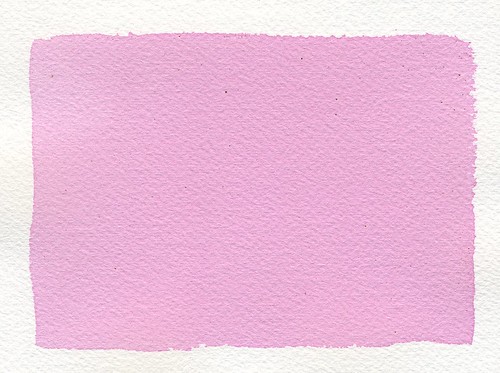
When brushing on your dye, the evenness of the coat is important. You don't want to leave streaks and you don't want to coat too lightly; it will leave blotches where there's visible overlap of your first and second coats. This isn't going to affect the quality of your print, but it will leave very visible lines. Ideally, you'll get a perfectly smooth, even coat and no one will be able to see any brush lines or double-coat edges. If your first coat goes streaky, try adding a second coat after the first one dries.

Smooth, Even Coat
Don't overload your brush, whatever type you're using. Too much fluid in your brush will make puddles and drips inevitable. Puddles will give you the same mottled appearance that poorly-blended brush strokes will. Be gentle, brush slowly and lightly. Don't press the brush into the paper, just move it gently across the surface. There's no need to squeeze the dye out of the brush, it should be sufficiently saturated so that the dye glides out on its own, but doesn't drip off and ooze around. It takes some practice, but give it time and you'll have gorgeous, smooth coats.

Soaking: This is my preferred method of preparing fabric for anthotype use, but I don't like it for paper. In my experience, when you soak paper in your dye, the dye absorbs so fully into the paper that it takes much, much longer for you to get a good exposure. The pigment works its way into the fibers of the paper and that makes it harder for the sun to break down the pigment. At least, that's my theory. I'm not a scientist, so I can't explain it scientifically. I just know that when I test soaked paper samples vs brushed paper samples, the soaked papers take longer to expose and come out with less contrast because the exposed regions retain far, far more color if they've been soaked in the dye.

Now, for fabric, soaking is generally a better way. When soaking a fabric sample in dye, I like to fill a mason jar with the dye and drop the fabric into the jar, which I can then seal up and shake heartily for a good while to agitate it. I can leave it to soak for hours or days, shaking every so often. Sometimes, to ensure even coverage, I remove the fabric, wring it out in the sink and stuff it back in the jar in a different arrangement so I don't end up with a tie-dye effect. For paper, I use a flat tray full of dye that I cover with something opaque so light doesn't get in there and start exposing the paper prematurely. Again, agitation is important. I turn over my paper a few times during the soak using tongs.

Side Note: Dayum, this post is WAAAAY longer and more complex than I thought it would be!

There may be other ways to get your dye onto the substrate, but they'd be pretty specific to an odd substrate. For paper, fabric, vellum and leather, it just comes down to either soaking the material in your dye or brushing the dye onto the surface. If you have other ways, please comment and let me know how they work and when you use them!

I think next post will be about substrates and the different pros and cons of the ones I've explored, plus some theory on ones I haven't tried yet but have data on.

Friday, December 21, 2012

The Essentials of Extracts

In the last big series of posts, Rainbow Reverie, I collected notes and examples about most of the the various forms of anthotype dye I've experimented with. I've figured out at least one good dye for every color except red and I feel pretty good about that. Almost as important as what substance you use to create your dyes is the method you use to extract the pigment from the original material.

There are a lot of different ways to do this and each one has its ups and downs, so I'm going to cover the most common methods. Hopefully this won't be a very long post, but it should be helpful.

Blending
Use a regular blender (not one you use for food) to puree the substance and render it down into ooze. I suggest adding either water or alcohol to dry substances (leaves, twigs, dried berries, etc) so you don't burn out your blender. Don't add too much or you'll dilute the dye, but just enough to make sure the matter in the blender is reduced to a soup. This is my default method for extracting dye because it retains all of the object, including fruit skins which often have a lot of pigment in them. It also doesn't induce any chemical changes as boiling might.
Once you've blended the base matter down to a soup, you can choose to either use that soup directly as a dye or further reduce it. Reduction will be covered as its own method of extraction below because it tends to change the final dye a good bit. Keep that in mind. For comparison purposes, blending is simply that: tossing the dye-matter into a blender, adding fluids if required and using the resulting paste/soup as a dye.

Mixing
This method is only suitable for powders such as turmeric, woad, indigo, alkanet and madder extract. The idea here is that you take your powder and add alcohol or water to it in order to produce a fluid of whatever viscosity you want. The thicker the paste, the stronger your color will be. When working with powders, I find this simple method to be the best. It doesn't provoke any chemical changes, it's fast and it's simple. Why mess with a good thing?
Pay attention to your level of dilution and what you use to dilute the powder. Water will take longer to dry and give weaker colors. Alcohol dries faster and gives brighter colors, but leaves behind a lot more pigment that can collect on the surface of your paper and end up as loose dust. Trying to remove this loose dust can end up staining the whites of your paper.

Boiling
I have read many guides to anthotypes that suggest boiling your dye-matter before trying to extract the color. This seems to be a hold-over from textiles procedures where heat is actually required to cause many dyes to work. This is not true for anthotypes!! The heat helps the dyes work if they need to absorb into fibers. We don't want the dye to absorb into the fibers of the paper, that makes it harder for light to break it down. Boiling seems to break down the pigment in a few organic dyes, making them duller. I have also noticed that boiled dyes take much longer to expose. This could be due to the pigment already having been degraded by the heat or some other chemical reason. I'm not sure, I'm just reporting my findings.
I Do Not Recommend Boiling. It's rarely worth the time and effort involved, but there are a few dyes that just don't work without boiling. Mostly these are going to be dyes borrowed from textiles, like madder root. In order to extract the alizarin pigment from madder roots, you have to boil the roots. I find it much easier to simply buy extracts instead of the raw plant, but if you enjoy going through the extra steps, you're welcome to.
Your method of boiling will vary based on each dye you use. The basic idea is to use as little water as possible and watch very carefully to avoid your dye boiling dry. You'll end up with a brightly-colored soup, but the liquid is much more impressive than its stain results. Please, don't judge a dye by its color.

Filtering
This can be considered a Step 2, because it can be used on a dye obtained through blending, mixing or boiling. The idea here is to remove as much extra matter from the dye as possible to reduce the amount of debris or residue left from the dye-matter and get a pure liquid dye. You can use cheesecloth to filter thick pastes like blended berry or leaf mixtures but for the powder-based dyes you'll need to use something like a coffee filter to get the extra powder out of your dye. You can double-filter thicker mixtures, first using cheesecloth and then running the resulting liquid through a coffee filter for extra clarity. I've found this can be quite helpful because the cheesecloth (maybe mine is old?) lets a lot of material through.
Be aware! Filtering your dyes will make them less vibrant. They'll be very pure colors, but not very saturated. You'll get rid of all the residue and debris, but sometimes those impurities can result in some very interesting textures in the paper. I suggest filtering half of any batch of dye so you can do a side-by-side comparison and figure out if you prefer the filtered result with the unfiltered result. In a few cases (please consult Flickr for more details), filtering your dyes can change the color entirely, which is another good reason to only filter half your batch and do a side-by-side.


I think the next post will probably be about the different ways to apply your dye to a substrate and maybe touch on substrates themselves? That might be two posts. Who knows?!