Showing posts with label tips. Show all posts

Friday, July 17, 2015

Blogging for Thor: Salted Sadness

Sweaty and squinting was the whole day.
Hello, Spiders. I've been feeling unwell and generally pre-occupied either with grad school, moving, loans or medical issues. Thus, two missed weeks of blogs.

Despite that, I have been making (or trying to make) art! After the salt prints at my workshop failed, I decided to figure out why. Well, I determined easily enough that it was the paper. So I switched to a different brand (Arches Aquarelle Cold-Press Blocks) and the coating went well. The exposures went well. I got great images with full detail and tonal range... until I fixed them. As soon as I fix any of these salt prints I've been making, they darken dramatically. All the whites turn beige at best and dull brown at worst. Some of the images disappear entirely. They're fine before the fix, and ruined afterwards. I really can't pin down what's going on. So, figuring out the salt printing issues is one artistic challenge on my plate.

In other news, I attended my first local artist market as a vendor. It was hot, sticky and not very profitable. I only sold $31 worth of prints (three total pieces) and all to people I knew. So I wasn't that excited. But, one of those people was a friend I'd known years ago while taking typography classes at the local community college. Now she's working at a handmade boutique in the Charlotte arts district. That's great, and she seems to really love her work. She also loves my work, and bought two of my pieces. She'd reached out to contact me via the Facebook advertising for the art show even before she realized who I was. So this coming week I'll be meeting with her and the owner of the boutique to see if they'd like to sell my work. Cyanotype totes, parchment prints and the cyanotype jewelry, mostly. Maybe some of my textiles.

Even if the show didn't work out, I'm hoping this new opportunity will! I'll keep you posted on the shop and the salt, Spiders!

Monday, October 20, 2014

Inspiration and Illumination via Instagram

All the elements assembled for shooting
Instagram is great! Since I started using it, I've been doing tons better at documenting my processes and experiments. It's so much easier just to use my phone to Instagram small set-ups and examples rather than to have to get lights set up, pull out the DSLR, deal with Camera RAW files and all the other mess that comes from a "proper" shoot.

The difference in results isn't that dramatic, either. Not to say there isn't one, but for my primary purposes (this blog), I don't need huge, high-res images of my process. Now, if I ever get around to assembling that Anthotype book I keep talking about (you know the one, Spiders...) then I will have to do process documentation shooting with a real camera. Ditto for the Lumen Folio. For now, though, Instagram is where it's at. Spiders, did you know you can even get people interested in your work via Instagram?

Shoot in progress!
My Instagram hero is Joshua White, a professor up at App State in Boone. His entire current body of work, A Photographic Survey of the American Yard, was created on Instagram and is displayed on his account. With simple rules, minimal equipment and a straight-forward procedure, he creates gorgeous pieces of work. On Instagram. With an iPhone. So that's awesome. So far he's been featured by Instagram itself, in articles on Wired.com, Mother Nature Network, Fstoppers, Gizmodo, FeatureShoot, and probably other places! He's Instagram-famous, and it's really cool.

I actually took inspiration from Joshua when figuring out how to document my Plastron Prints and my Cyanotags (another project that I'll blog about soon!) for viewing. The photos here today are showing how that documentation works. It's really simple, Spiders.

The finished result, via Flickr!
There isn't much you need to do shadowless, floating documentation of small objects.  A shaded, outdoor space to shoot in is the most basic. Then get a piece of cardboard, or foamboard, or a corkboard.. anything pins will go into but not back out of easily. If the board you're using isn't the right color and/or texture, then add a sheet of paper or other covering to make it the right color and/or texture. Then just get yourself 1-3 pins, and some sticky poster-tack or soft wax. Then you can adhere the object onto the pin(s), holding it off the surface of the paper-covered board. That distances the object from the background, reducing any shadows not already removed by using the diffuse light of an outdoor, shaded shooting area.

Your end result should be a very clean image, as shown in Joshua's series and my latest images on Flickr. The images I posted earlier, on Instagram, used the same ideas, but I shot them inside, using desk lamps. That created shadows. So when I wanted larger, clearer images (using a DSLR and a macro lens), I took my set-up outside! The results from outside were much better.

Thursday, May 22, 2014

Blogging for Thor: Halo There!

I had a lot of fun today playing salted paper prints, but that isn't what this blog is about. That's because I had this thing to talk about first, and also because the salt print blog is going to take a while to write and it's 10:45 right now, as I start this. I wouldn't make the midnight deadline if I did the salted print post. Plus, in all fairness to this post, I did have the idea for it first. Mostly.

You know what, spiders, just read the blog. This post is actually informative and useful, while the salt print one is just kinda cool and fun. So there's that, too. Not sure what else there was.


Pre-exposed print with emphasized halo
One of the really cool things about lumen prints is that if you use fresh plants to make your contact prints, there will often be a "halo" around your subject. The moisture in the fresh plant material sweats out under the sunlight and heat, soaking into the paper. The wet paper reacts differently to light than the dry paper does, creating a different hue or value depending on what kind of paper you're dealing with.

This week's fun fact is that you can dramatically enhance the appearance of such halos by leaving your lumen print out to "pre-expose" under indirect light or interior lights. The low amount of light is enough to begin the exposure of your paper, and start the moisture reaction, but not enough for a big dramatic tonal shift that will produce a vibrant lumen. So the halo has time to creep outward with the moisture while the exposure is still happening fairly slowly and subtly.

Once your halo has been established in a few minutes to a few hours, take your print outside and let it expose in direct sunlight. Now, all at once, the halo and the background will darken dramatically, creating a very stark, very visible halo in your image. That's because the low light allowed it to form first, then expose. When you just expose a lumen normally the halo is struggling to form while exposure is already happening all around it. The moisture doesn't have time to sink in and affect the paper as much, because more of the paper is being exposed before the moisture can spread out.

Regular print with faint halo
A pretty cool trick, and one I can't take credit for. I learned it from John Fobes, who is another enthusiastic lumen printer with far more experience than I have. He discusses the idea a little bit here, in this particular image. Here's the relevant quote:
Polycontrast is capable of producing a nice halo if you prepare the specimen [and] first let the prepared print sit for a few hours under weak room light before you expose it to sunlight.
Mr. Fobes is referring specifically to one type of paper (Kodak Polycontrast II), but it holds true for many types of papers since the underlying mechanic of the halos is the same. Note that this technique works best in hot places, because the heat will wither the plant material faster, releasing more of that lovely moisture onto and into your paper. That's another reason why spring and summer are the best times to work with lumen printing.


Whelp, that's all Spiders!

Tuesday, April 1, 2014

Dustbusting 101

I found a cool trick today in Photoshop. My cyanotypes, anthotypes and lumens all need to be scanned, so I spend a lot of time in Photoshop cleaning up dust and debris. No matter how clean you get your scanner, and how much you wipe and baby the prints, there's always dust and stuff sitting on there. Somewhere. It's always there. And you have to get rid of it in Photoshop. It takes forever, and it's tedious... but there's a faster way!

The Spot-Healing brush is awesome at spotting. That's what it's for, after all. However, if you have a lot of really tiny dust, it's a pain. There's the Dust &Scratches filter, which is great, but it has the downside of also removing detail. So for a long time, I combined both of them. I ran a fairly low-powered Dust & Scratches filter across the entire print, then cleaned up the big stuff with Spot-Healing. Pretty simple, if extremely time-consuming. The biggest issue was that, even at low power, the Dust & Scratches filter still removes detail. It's especially nasty if you're printing on a textured surface and want to retain details of that surface tooth, because that's one of the easiest things to loose.

What I realized today is that most dust is lighter than the rest of the image. That's what makes it stand out. So a really, really simple way to get rid of tons of dust all at once is to apply a medium-strength Dust & Scratches filter...then set it to the "Darker Only" blending mode. Holy crap!! It works so well! It takes out virtually all the light dust and specks, leaving behind just a faintly blurred pixel here or there. It's amazing. Then all you have to do is Spot Heal the darker specks, which tend to be far less numerous and troublesome.

This technique saved me at least an hour tonight, and the results are hands down better than the way I did things before. No lost detail! No having to make tricky masks to restore the detail lost to Dust & Scratches. It's Dust & Scratches that only effects dust!!!


I'm pretty excited, can you tell? CAN YOU, SPIDERS?! Eeee!


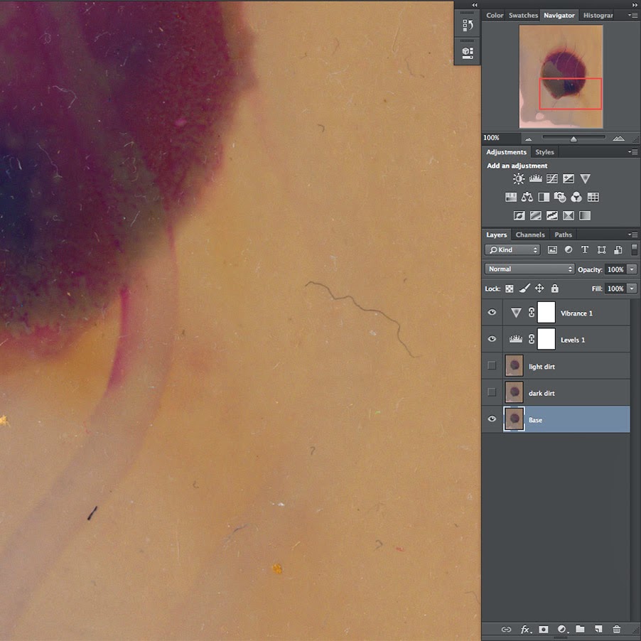
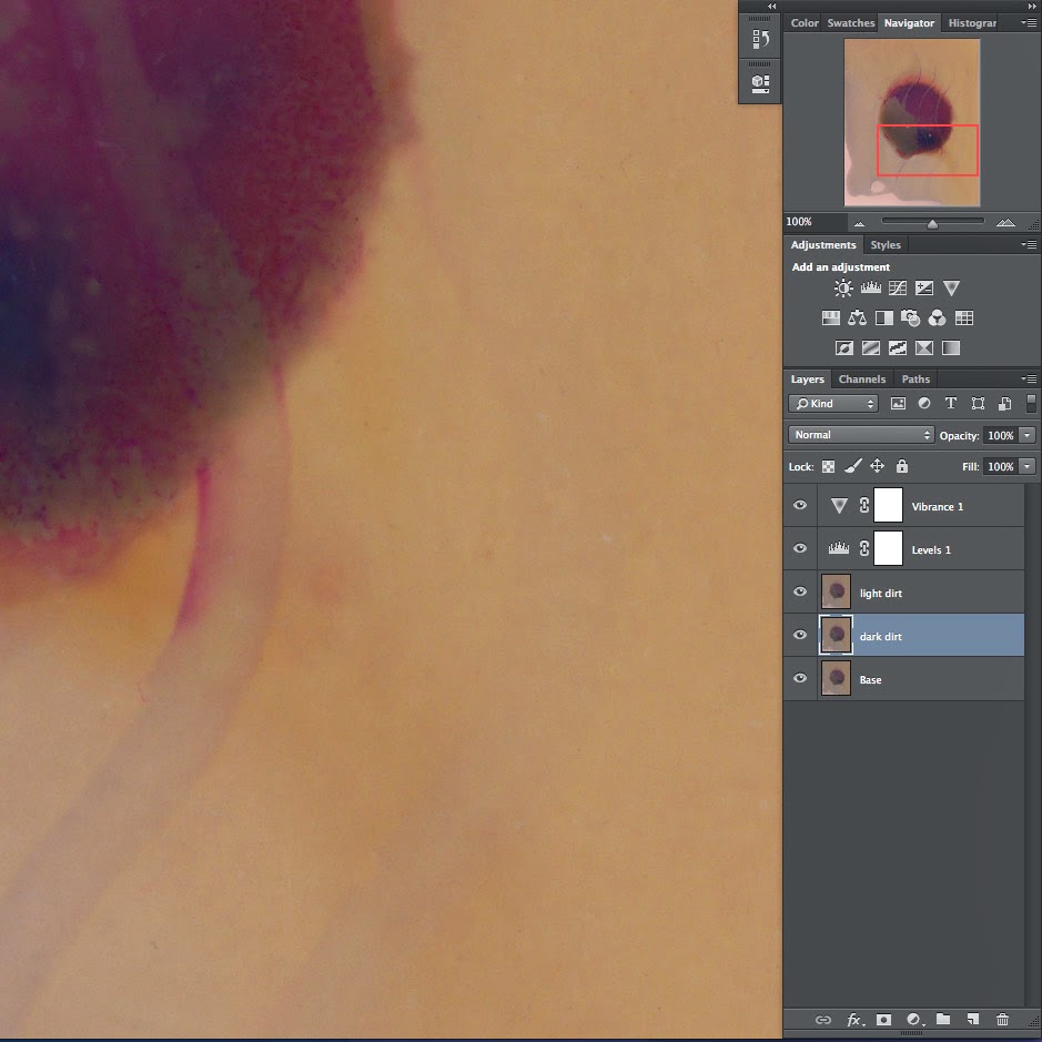
UPDATE: I added pictures! You'll see that I have two dust-removal layers in this example: one is the Darker-Only Dust & Scratches copy and the second is a regular Dust & Scratches copy. That's because I hate doing repair work on my original layer, just in case I make a mistake. I also came across a pretty simple extra step.

You see, if you just do a Darker-Only layer, then a dark dust layer, you have a few nagging spots left over where the Darker-Only Dust & Scratches (DODS!) is still showing that dark dust. This happens because your DODS layer is on top of your DDL (dark dust layer) and if you Spot-Heal away the dust on DDL, you can still see whatever was there on the earlier-created DODS layer. Here are the steps I follow in this dust-removal scheme.
Step 1: Open file.
Step 2: Duplicate Background layer to create your first DODS layer.
Step 3: Run the Dust & Scratches filter at low power (generally Radius 2-3, Threshold 1) on your first DODS layer.
Step 4: Duplicate the Background layer again, creating your DDL (dark dust layer).
Step 5: Spot Heal away all the dark dust on the DDL.
Step 6: Duplicate the DDL to create your second DODS layer.
Step 7: Run the Dust & Scratches filter at low power (generally Radius 2-3, Threshold 1) on your second DODS layer.
Step 8: Delete your first DODS layer.
You should now be left with three layers: your second DODS on top, DDL in the middle and Background on the bottom. Theoretically you could save a few steps by creating the DDL and doing all the dark dust Spot Healing first, but I found it much easier to create the initial DODS layer just so that while cleaning up my dark dust on the DDL, I had less distraction. The photo was already so much cleaner from creating the initial DODS layer that it was much easier to identify and remove the dark dust. It only adds an extra few clicks and a few seconds to your time. Still, there's no reason you can't eliminate steps 2 and 3 from my list.

I hope this helps someone else out! All that time spotting is time you could be printing! Or playing games. Or whittling. Or whatever.

Saturday, December 28, 2013

Blogging for the Baron: Slated For Next Week!

Yeah, I took a bit of a break this week on account of Christmas. I've done virtually nothing photographic for several days, aside from teach my sister how to use her new Nikon D3000. That meant when Thursday rolled around, I had nothing to blog about. Honestly, even if I had, I was wiped out from Christmas anyway and wouldn't have gotten anything up. Friday, I cleaned up my studio and organized my collection of lumen papers and anthotype dyes. My parents gave me an awesome new collection of the cutest little tiny Mason Jars to keep dyes in. I'll have to take a day or so soon to label everything and transfer the really low-volume dyes (indigo, woad, spirulina, etc) to the tiny jars.

Anyway, all that. I still haven't made any new lumens or anthotypes. So, today, I'm dedicating my blog to Baron Samedi and hoping he doesn't decide it'd be funny for me to get run over by a car or something. We cool, Baron? Hope so. I don't have any tobacco or rum (I have bourbon?) to offer him, but I've got some nasty pennies laying around.

What's the blog going to be about today? Actually, it's going to be about ideas. Cheap ones. Now, see, when I do actual photography-with-a-camera it's generally small object photography. Taking pictures of things I've made or found, mostly. Having a small studio space means I don't get too complex. I don't own a seamless. I make my backgrounds out of alternative resources. Today seems like a good day to talk about those.

Tiny felt turtle on a silk shirt
Old shirts and pants make great backgrounds. I have about six pairs of jeans and dozens of shirts, especially shirts from my mother and sister that they don't wear anymore. If you don't have any handy fabric-loving family members, there's always thrift stores. Silk shirts are especially nice, since the back of the shirt provides a large, solid area to work with. They come in lots of colors and after being worn and cleaned several times, they tend to lose that ludicrously-shiny appearance that new silk can have.

Black velvet makes a great background because of the way velvet absorbs light. It throws back very little shine, even under intense light. This is great for jewelry or anything else bright and shiny, where you want the background to absolutely disappear. I imagine white velvet would work great, too, but I've never tried it. Velvet is kinda expensive, though. My solution? A thrift store in Atlanta back when I was visiting for SPESE. I grabbed a velvet slip, sliced it in half and now have about a square yard (it was a really small slip) of black velvet that cost me $2. Velvet at the fabric store can run upwards of $10/yard. Since I do mostly small objects, a square yard is more than enough for me, most of the time.

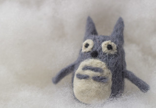
Tiny felt Totoro on Polyfill
When I want a white background, I generally use a sheet of high-quality drawing paper like Stonehenge or Rives BFK. These papers are extremely matte and, like the velvet, throw back almost no shine or glare. They fold and bend easily, but won't ever ripple or drape like fabric. For a no-horizon seamless sweep, these nice papers are great. Plus you can roll them or store them in a sleeve. They're great! Very durable, too, and if they get dirty you can generally clean them with a decent-quality eraser.

I've also found that white polyfill (fluffy stuff used to fill stuffed animals or fluffy blankets) is a great background and spacer material. You can light it from behind or underneath to get a real 'glowing cloud' effect. Plus it's very posable and supportive for light objects like jewelry and small textile crafts.

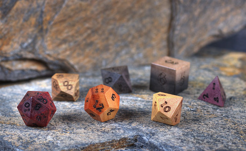
ArtisanDice polyhedrals on natural slate
The title of this post, though, comes from one of my favorite backgrounds: slate. It's a great rock and it's very cheap. There's a little food mart / home store around here (Hillbilly Produce) that sells landscaping slate and I buy natural stones there for a few cents a pound. Generally I buy rocks maybe 1-2 feet in any direction, 1-2 inches thick. They have great texture and colors. Very subdued, but nice variations of blues, greys, browns, reds and oranges. If I want something flatter and maybe brighter colored, home improvement stores like Home Depot sell slate flagstone tiles for about $7 per pack of five square foot tiles. Or you can buy them individually if you just need one or two. Not only are the tiles great by themselves, they're great for using to 'extend' the natural rocks. You can put the tiles in the background and they blend in perfectly with the more textured stones, especially if you use a low depth of field. I like using slate when I want a more visually interesting background that will be complementary to my subject, but not detract. It's also great for wood, since it provides a nice contrast. It can be used to give things a vintage, rustic feel as well.

That's all for today folks! I might be back soon with an unscheduled entry, to make up for today's rambling craziness and the lack of holiday on-time-ness. But maybe not! With Grad School Applications looming, who knows?!