Showing posts with label photography. Show all posts

Monday, May 16, 2016

Cameras and Caramel

Caramelized sugar, the product of thermal decomposition. SCIENCE!
Today I came across an absolutely awesome blog: Serious Eats. They are serious about cooking, as they should be. It's serious stuff. Even though my MFA thesis project is created with food, it does seem odd to feature a cooking blog on a photography blog, doesn't it? No. It doesn't. Shut up, Spiders.

One of my oldest friends shared an article from Serious Eats: How to Make Rich, Flavorful Caramel Without Melting Sugar. And it's everything I love. It's food, it's science, it's kitchen-friendly, and it's easy! I was so excited after reading this article, that I had to share it with everyone. All my friends, my Instagram followers, and you, my lovely Spiders. It seemed, though, that most people were not as blown away as I was. So, I'm going to explain why this article is amazing.

It's the science of an ordinary process (caramelization) being dissected, studied, and used to make something far more amazing than you could manage without understanding what is really happening. It's about not being satisfied with the surface, and digging deeper into the mechanics so that you can really take control of a situation.

The writers at Serious Eats are, like Alton Brown, showing that cooking is all about chemistry and physics. There's another article where one of the writers goes in-depth explaining why bleached flour has its place and why, in fact, the bleaching is entirely useful. It's sometimes essential to use bleached flour. Until reading it, I assumed that bleaching flour was just an aesthetic concern. It isn't! It causes important chemical changes in the flour that give flour new capabilities.

How is this all relevant to photography? It's relevant because all photographers should ground their practice in a thorough understanding of how their tools work. If you don't understand the physical processes involved in photography, you're not going to be able to exploit them properly. You won't be able to end-run around problems, or bend the mechanics to your advantage.

Take something simple like a lens flare. If you understand why and how lens flares happen, its easy to avoid them when you don't want them, and control them more precisely if you do want them.


...Oh, and I'm absolutely going to try burying a sheet of photo paper under a layer of sugar, caramelizing the sugar, and seeing what the resulting chemigram looks like. I will not eat the caramel sugar produced, because it will probably absorb some nasty chemicals from the photo paper. I do have high hopes for this idea, though!

Friday, September 5, 2014

Blogging for Freya: Formulas and Funds

I've been busy this week, preparing for a show in Asheville. I'm displaying my parchment and bone cyanotypes up there, at the Silverspace Gallery. Today, I head off to meet Bridget Conn, the director of the Asheville Darkroom, to do the installation. Working late last night on paperwork and framing is why I missed Thor's deadline. But, in honor of Freya and Freyr, I've got a short post for my Spiders.

Artists make money by selling their work, either directly to customers or by using galleries and shows to gain exposure. In the latter case, the gallery generally charges a commission on sales. That commission is a percentage of the sale price, which means the artist has to pass that charge on to the customer, building it into the final price of their work so that they receive fair pay for their labor, materials and training.

It can be a bit confusing, trying to figure out what to charge for your work. There's a whole blog full of entries about how to price your work, but most of those are issues related to your exposure, your expenses, your effort and other things. Specifically, I'm talking about how to calculate the final sale price of work so that the gallery gets their commission and you get the amount you want back from the work. Here's the formula.

X = Y / (1-0.Z) where X is the final sale $$, Y is how much $$ the artist wants to make and Z is the commission rate!
If commission is 30% and you want to make $100, then the final sale price is $142.86. $142.86 = 100 / (1-0.30). Pretty cool, right? I had some help working out the formula, a friendly computer programmer offered mathematical guidance. Now, I pass that on to you, Spiders. Go forth, and sell!

Thursday, August 21, 2014

Blogging for Thor: Photographic Typos

A friend sent me this article last week and it's pretty cool all by itself. I'm relinking it here because it isn't just relevant to typos. This quote really sums things up:
We don’t catch every detail, we’re not like computers or NSA databases,” said Stafford. “Rather, we take in sensory information and combine it with what we expect, and we extract meaning.” 
That isn't just true with typing. It's true with all perception, especially visual. That means it's true for photography. As photographers, we see in our cameras what we expect to see in our minds. It's easy, especially when you're first starting out, to mentally blank out everything but your intended subject. Not notice the light socket in the background, or the lamp growing out of your subject's head. Not notice that you're out of focus, not notice this shadow or that power cord. It's so, so very easy.

Writing may not be easier than photography, but it does tend to have a bit more time. Even if there isn't an editor specifically checking your work, you may have time to allow your brain a few hours to dump all its expectations and review your work fresh. Remember in high school, being told to wait a full day between writing a draft and editing it? I hated the idea, but it often worked so well.

Generally, as photographers, we don't have that time. We're expected to finish an entire shoot in a few hours, and may not have a chance to re-do the shoot to correct mistakes. So it's vital that we teach ourselves (and our students) to look at what is actually in the picture. Try as much as possible to force yourself to see reality instead of expectations. It's not easy, because your brain is fighting you the whole time. That isn't how it's wired. It's a difficult skill to master, and no one can do it right every single time. But even trying to do it is a great achievement. It puts you leagues beyond most camera users. Visual awareness is probably the single thing that defines a good photographer. It's knowing exactly what will be in your photo. If you can't get it down before you shoot, you're still doing well to be able to review your photos and notice the unintended contents or mistakes on the second pass.

If you can tether, or load your photos onto another device for review during a shoot, do it!! Just as the article mentions that you can improve your proofing results by printing out or otherwise re-formatting your text, you can get the same improvement by viewing your photos in another manner. Even aside from that, it's just hard to do a good job reviewing photos on the back of a camera.


Well, spiders, that's all for this week. I'm probably going to miss next week, but I'll try to write an article early and get it up via auto-post. I might have the same problem week after that, too. Next weekend is Dragon*Con and the week after, I have a solo show up in Asheville that I've got to prep for. It's a busy month, spiders. I'm stressed and excited about everything.

Thursday, February 6, 2014

Blogging for Thor: Born-Again Badger

Good morning, spiders! This is the earliest Thursday blog ever! Well, I'm pretty sure, at least. Technically that's because I can't fall asleep on Wednesday night, even though I have to be awake in less than 6 hours to get ready for work... ugh.

Anyway, today's blog is gunna be short cause today is a busy day! I'm re-designing my main website! It's been a long time since my webhosting service, Squarespace, upgraded to a new engine with all kinds of new options. I never made the swap because no one was looking at my website, so why bother? Well screw that! I write this whole blog and only you, my precious internet spiders, read it! So now I'm upgrading to Squarespace 6 and redesigning my entire website to be up-to-date, elegant and informative. Most of my experiments and observations still get dumped here and on Flickr, but my business card says Blue Badger Studios, and so do all my online profiles. Oh, and my CV, if anyone ever actually reads that thing. I hope grad school reads it.

So, that's this week's task: new website!!

Also, I did some new cyanovellums that I'll scan today and add here when I have time, or maybe add in a whole new post. It depends how I feel. They're for an Art Swap party organized locally by the guys at Flaming Chicken Studio. A bunch of local photographers are getting together to display our prints, drink, have fun and trade art. I'm taking cyanovellums and some digital lumens. Should be awesome!

Saturday, December 28, 2013

Blogging for the Baron: Slated For Next Week!

Yeah, I took a bit of a break this week on account of Christmas. I've done virtually nothing photographic for several days, aside from teach my sister how to use her new Nikon D3000. That meant when Thursday rolled around, I had nothing to blog about. Honestly, even if I had, I was wiped out from Christmas anyway and wouldn't have gotten anything up. Friday, I cleaned up my studio and organized my collection of lumen papers and anthotype dyes. My parents gave me an awesome new collection of the cutest little tiny Mason Jars to keep dyes in. I'll have to take a day or so soon to label everything and transfer the really low-volume dyes (indigo, woad, spirulina, etc) to the tiny jars.

Anyway, all that. I still haven't made any new lumens or anthotypes. So, today, I'm dedicating my blog to Baron Samedi and hoping he doesn't decide it'd be funny for me to get run over by a car or something. We cool, Baron? Hope so. I don't have any tobacco or rum (I have bourbon?) to offer him, but I've got some nasty pennies laying around.

What's the blog going to be about today? Actually, it's going to be about ideas. Cheap ones. Now, see, when I do actual photography-with-a-camera it's generally small object photography. Taking pictures of things I've made or found, mostly. Having a small studio space means I don't get too complex. I don't own a seamless. I make my backgrounds out of alternative resources. Today seems like a good day to talk about those.

Tiny felt turtle on a silk shirt
Old shirts and pants make great backgrounds. I have about six pairs of jeans and dozens of shirts, especially shirts from my mother and sister that they don't wear anymore. If you don't have any handy fabric-loving family members, there's always thrift stores. Silk shirts are especially nice, since the back of the shirt provides a large, solid area to work with. They come in lots of colors and after being worn and cleaned several times, they tend to lose that ludicrously-shiny appearance that new silk can have.

Black velvet makes a great background because of the way velvet absorbs light. It throws back very little shine, even under intense light. This is great for jewelry or anything else bright and shiny, where you want the background to absolutely disappear. I imagine white velvet would work great, too, but I've never tried it. Velvet is kinda expensive, though. My solution? A thrift store in Atlanta back when I was visiting for SPESE. I grabbed a velvet slip, sliced it in half and now have about a square yard (it was a really small slip) of black velvet that cost me $2. Velvet at the fabric store can run upwards of $10/yard. Since I do mostly small objects, a square yard is more than enough for me, most of the time.

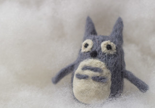
Tiny felt Totoro on Polyfill
When I want a white background, I generally use a sheet of high-quality drawing paper like Stonehenge or Rives BFK. These papers are extremely matte and, like the velvet, throw back almost no shine or glare. They fold and bend easily, but won't ever ripple or drape like fabric. For a no-horizon seamless sweep, these nice papers are great. Plus you can roll them or store them in a sleeve. They're great! Very durable, too, and if they get dirty you can generally clean them with a decent-quality eraser.

I've also found that white polyfill (fluffy stuff used to fill stuffed animals or fluffy blankets) is a great background and spacer material. You can light it from behind or underneath to get a real 'glowing cloud' effect. Plus it's very posable and supportive for light objects like jewelry and small textile crafts.

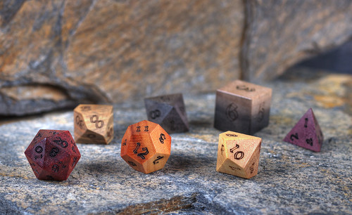
ArtisanDice polyhedrals on natural slate
The title of this post, though, comes from one of my favorite backgrounds: slate. It's a great rock and it's very cheap. There's a little food mart / home store around here (Hillbilly Produce) that sells landscaping slate and I buy natural stones there for a few cents a pound. Generally I buy rocks maybe 1-2 feet in any direction, 1-2 inches thick. They have great texture and colors. Very subdued, but nice variations of blues, greys, browns, reds and oranges. If I want something flatter and maybe brighter colored, home improvement stores like Home Depot sell slate flagstone tiles for about $7 per pack of five square foot tiles. Or you can buy them individually if you just need one or two. Not only are the tiles great by themselves, they're great for using to 'extend' the natural rocks. You can put the tiles in the background and they blend in perfectly with the more textured stones, especially if you use a low depth of field. I like using slate when I want a more visually interesting background that will be complementary to my subject, but not detract. It's also great for wood, since it provides a nice contrast. It can be used to give things a vintage, rustic feel as well.

That's all for today folks! I might be back soon with an unscheduled entry, to make up for today's rambling craziness and the lack of holiday on-time-ness. But maybe not! With Grad School Applications looming, who knows?!

Thursday, October 3, 2013

Blogging for Thor: Whittling

Hello, Internet Spiders. You're doing well? That's nice. Let's talk, shall we? Yes, I also enjoy cataloguing the internet with my artificial awareness, but onto other topics.

I've been teaching for about three years now, and each time I teach my basic photography class, I offer extra credit assignments. They're simple alternative processes: anthotypes, cyanotypes and lumen prints. This semester, because I shifted things around, scanograms will also be extra credit. Not really relevant, but they're a non-traditional approach to image making. I teach these processes because they're easy things to do at home. They don't involve complex equipment, dangerous chemicals or anything else too crazy. No need for darkrooms. Most of my students are not going to become photographers. None of them are majoring in arts, they just want to get better at taking pictures, or they have to take an art class, or they just think it'll be fun.

Even the easy processes I teach probably won't get used again. Not even really simple one (anthotypes) that doesn't require anything at all in the way of exotic supplies. So, what is it about alternative processes that even attracts people in the first place? It's not the ease, the cheapness or the lack of equipment required. It's that they're fun to do. They're a hobby. Something you have an investment in, emotionally. The process is why they're fun.

Yes, the image itself is nice, but you can get nice images digitally. Digital is faster, easier, cheaper and uses even less equipment. With only a computer and a simple editing program, you can turn any photo into a gum print or cyanotype or whatever. Apply some filters, layers, whatever. It's easy.

We do alternative processes for the same reason some people whittle their own utensils, or sew their own clothes, bake their own bread or their own cookies. It's not because your bread is manifestly better than what you can buy, or is faster or cheaper. It's probably NONE of those. You do that type of work because you enjoy doing it. And if you don't enjoy doing it, if making bread doesn't make you happy, then you won't bake. You'll go to the store like everyone else and buy your bread.

I think that's why my students don't show much interest. They've got digital cameras and cell phones that can take better photos, way faster. The process doesn't really intrigue them. I keep showing them because maybe, sometime, I'll have a student that loves it and wants to learn more. I can't make someone enjoy something, I can only teach them how it works.

Friday, March 25, 2011

Anthotype Explosion

As of two minutes ago, I've got nine (9!) anthotypes baking at the moment. Three of them have been sitting in the back of my car since Monday afternoon, so they'll be ready to come out very soon. I'm going to re-arrange the leaves on them and try double-exposure again, but with longer exposure on the first pass. Four days should be enough.

The other six are double experiments (not exposures) since first off, they're hybrid sensitizers. I've mixed together tumeric and red wine for two of them, added paprika to two more and the other two are pure paprika which in the past I had no luck with at all. It doesn't provide a red at all, instead a sort of sickly, pale yellow-orange.

I'm going to be trying some red cayenne pepper later this weekend for a red coating. I'm also doing a lot of reading on natural dyes and once I get a set of pots that I won't be bothered by boiling up all manner of things toxic and unsafe in, I'll start producing natural dyes to use as anthotype sensitizers. I've got blackberries (violet), beets (red), carrots (orange), plus some tarragon and spinach (two greens). Found some alum in the spice section that can be used as a mordant. No idea what effect a mordant will have on the anthotype process. If applied before, will it prevent the fading which causes the process to work? If applied after, will it work at all?

Thursday, March 24, 2011

Works in Progress (Sorta)

The possibility (however faint) of a show later this year for my folklore illustrations has got me turned back on to the idea of starting a few more. Well, I started them a long time ago, I just need to finish them.

Currently, I've got three illustrations in the series:
  • The Golem of Prague (Czech Republic)
  • The Fate of the Mary Celeste (Atlantic Ocean by way of America)
  • A Song of Sixpence (England)

I've started work on two more:
  • Jenny Greenteeth (England)
  • Baba Yaga (Russia)

And I've got concepts and mind-images for a few more:
  • General Winter (Russia)
  • The Lost Colony (America)
  • The Black Dog (England)
  • The Scholomance (Romania)
I really want to finish up Jenny Greenteeth (a river hag who drowns unsuspecting travelers who stray too close to the water, probably inspired by the dangers of duckweed) and Baba Yaga (a Russian/Slavic witch who appears in several stories), but the story of the Scholomance really has me going and I've got all sorts of great visuals for the Black Dog and General Winter.

Maybe I can work out some sort of collaboration with Tiffany on General Winter, since she's into military history.

Anthotypical Production

I can't decide if the prints I'm making these days are "anthotypes" at all. Certainly, they use the same process of sun-bleaching to produce a negative image via contact printing. However, an "anthotype" by definition should use flowers. Anthos means flower. Maybe a more accurate term would be Floratype or would that be Florotype? My Latin is a bit fuzzy.

I've gotten MUCH better results from spices than from flowers. Fruits and flowers I can sorta see as being under "anthotype" but it's hard for me to say a print made with a coffee sensitizer is an "anthotype." Coffee isn't a flower.

That aside, I've been having a LOT of fun this week and last working on my anthotypes (for the moment, I'll go with the established term). Some really fun results and one mind-blowing WTF moment where I still haven't figured out what happened.

Flickr, of course, has the latest results of my experimentation. See it over here?
Yeah, you see it. Ain't it cool?

Double-exposure is a pretty neat trick, I like the way it worked out. I'm going to be trying that one again, this time with a mixed tumeric-wine sensitizer.


Digital manipulation of the original anthotype images just blew me away. When I scanned the first batch, all I wanted to do was boost the colors a bit, maybe clean up some stubborn spots of plant-matter adhered to the image. This second round? Adjusting the curves of the images opened up whole new levels of detail that were recorded, but not visible. Seriously, check out the Cactus image.


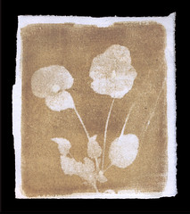
The biggest surprise came from the Red Wine print I made with fresh pansies. At first, I thought it was a failure. Hardly any bleaching had occurred after 6 days of good, strong sunlight. I could barely tell where the pansies had been, even when I was trying to pry them off the paper. On a whim, and a suggestion from Tiffany, I decided to wash the print to see if anything happened. No, it didn't. But then, for some reason, I decided to scrub the print with soapy water and a sponge. The red wine pigment started to come off very easily and underneath, there was a BLEACHED OUT IMAGE OF THE FLOWERS! The paper retained a good amount of red-brown coloration, EXCEPT where the fresh flowers had been pressed! Somehow, the flowers bleached away everything UNDER them, but it wasn't revealed until I washed away the pigment on the surface of the paper!

NO idea how it happened but... wow! It was amazing to watch. The print is pretty nice, too, but the REAL triumph of that print was just seeing it appear out of ruin and loss!


Sunday, October 17, 2010

PhotoBadger does Photography

Currently working on two different photo projects: anthotypes and cyanotypes printed on animal vellum. Next project: printing inkjets on animal vellum! Today, I'm focusing on my vellum-cyanotypes because I've been working on them more intently. It's hard to get intent on the anthotypes when each new batch of tests takes two weeks to expose, ya know?

Cyano-Vellums:
These are going pretty well, so far. I've been making simple contact shadow-prints of leaves, sticks, flowers, etc. There are some major issues:
  • Vellum does not accept cyanotype chemistry evenly all the time, leading to some coating issues that vary by piece. Sometimes I get a really, really solid coating and sometimes the vellum just repels the chemistry totally and all I get is patchy-streaky-mess. I think this depends on the type of vellum. That's what I get for starting my experiments with an un-labelled 1-pound box of scraps.
  • Vellum is not flat. Ever. I've tried pressing, stretching and smooshing. The next approach is to re-soak the vellum, then use an iron to dry it while it'd still damp and pliable. Fully dried, the stuff can get super-stiff.
  • WTF-level dry-down. There is little to no connection between what you see when the print is wet and when it's fully dry. The image can change totally, even reverse out during the drying process. Very strange, very disconcerting.
  • Highlights don't clear. I can't tell if the chemistry stains the vellum or something else is going on, but the highlights on a vellum print never fully clear. The fuzzier vellum samples tend to shift to a greenish hue while the smoother ones go yellow-cream. I've even had one go transparent. Results, again, seem to vary by type of vellum.
  • No detail. Due to the high level of texture and unreliable coating issues, vellum is not well-suited to detailed printing, so I'm not even bothering. Tried three negative prints, all of them came out muddy and bad.
Some really nifty bonuses come from using vellum, though!
  • Vellum has texture out the ass. It adds a whole new dimension to the prints and creates all sorts of great subtle (and unsubtle) effects both in the blues and the highlights. This adds a bunch of interest to the simple shadow-prints I've been doing of flowers, sticks and leaves.
  • Extra color! Related to the drawback above where the highlights don't clear, vellum seems to provide its own color once exposed to cyanotype chemistry. The whites turn greenish, yellowish or brown-gold. This tends to work very nicely with the deep, deep blues I've been getting on the exposed portions of the prints.
  • Vellum's much sturdier than paper, which may have benefits later on if I decide to start layering different processes or coatings.
So, overall, I'm really enjoying working with the cyano-vellums. It's more of a challenge than regular cyanotypes, but still just as easy and non-toxic. The unpredictable and unique results are part of the charm, as is the textural, touchable look that the vellum gives to the prints.

My real biggest problem? I'm running out of cool-looking stuff to make shadow-prints out of. Next time I post, I'll have some words on the exciting, fast-paced world of anthotypes!