Thursday, November 20, 2014

Blogging for Thor: A Reddy Success!

Success! First true-red Anthotype
Despite the weather, recent plagues and other negative influences, I've printed my first anthotypes in two years. Yeah, Spiders, it's been a long time since I printed any anthotypes myself. I've taught workshops on them, and given demos, written articles, but not actually done any printing.

Anthotypes take up contact frames for quite a while, and for the last two years I've been busy with lumen printing, cyanotyping and other techniques. Anthotypes just haven't really been on my mind.

I'm not sure what changed, but I think it was my visit to UNCC last semester, where one of the students decided to investigate the interaction of turmeric and soda ash. That sparked my interest, got me investigating on my own, and really put me back on track.

It's paid off. I finally have a red dye, which I've been crowing about quite a lot recently. More than that, it's a stable, easy to make, easy to apply, fast-acting dye that shows strong contrast. Everything I could ask for! Well, alright, it is a bit dusty, leaving behind a fair amount of solidified pigment when it dries, but I think altering the concentration of alcohol in the solution can fix that problem.

So, there you have it, Spiders. Two years, and my first anthotype is a stunning success. In red! It did take 12 days, but this is fall, so that's not un-expected. Low UV index and lots of clouds. No heat, either. Heat speeds things up quite a bit.

Pure Pokeberry dye
I also had three other prints exposing at the same time. A dried oak leaf on pure pokeberry juice, which turned out great (below), and two other prints made on red cabbage dye. I had whipped up a batch of the blue and green red cabbage dyes, getting an indigo instead of a blue this time, and decided to use some of them. Unfortunately, the red cabbage prints did not work out. They show almost no fading at all, despite the same 12-day exposure as the other two prints. I'm guessing there simply wasn't enough UV light to break down the red cabbage pigments. Those always were a bit slow, compared to raw berry dyes or turmeric/sandalwood which is what the red dye is mostly based on. Unfortunate, but unavoidable given the time of year.

When spring and summer roll around, I plan on getting back into anthotypes on a serious level. We'll have to see if I actually stick to that. I'm also very interested in working more with liquid lumen prints and chromo-lumens, but at the moment I'm focusing on my cyanotype bone prints and wearable art.

Friday, November 14, 2014

Blogging for Hel: Plagues :(

There's no blog this week, dear Spiders. At least not today. I'm sick. It sucks. Achey, fevery, sore. No fun at all, and it means I can't concentrate for very long before my brain wanders off.

I'll be back to blogging as soon as I fight off this biological invader.

Friday, November 7, 2014

STOP! In the Name of Red


TRIUMPH! 2:1:2 Pokeberry, Turmeric, Sandalwood
It's been 4.2 years since I started working with the anthotype process, and 3.5 years since I started to really hunt for a good red dye to use in the process. Guess what, Spiders? I found one! After some brainstorming and testing, detailed in the last few entries, I finally decided to try mixing together yellow, magenta and orange colors to produce a red.

As far as dyes go, that meant using turmeric (yellow), pokeberry (magenta) and sandalwood (orange) in combination. I've thoroughly documented turmeric and sandalwood as predictable, fast-fading anthotype dyes that are easy to use, easy to mix and work very well. I've got ample evidence from other artists that pokeberry shares these traits, even if it is harder to harvest and prepare (it's toxic, and it's a berry as opposed to a powder). The combination of all three should, I'm hoping very hard, be another quick exposure, high-quality anthotype dye.

A comparison of several different tests using Pokeberry
The best part? It's red. Really, really red. Not reddish-orange or reddish-pink. Nope, Spiders, not this time. It's RED. I am so excited. The only bummer is that I've discovered this in the fall, and the weather is just not my friend during the fall. Less sunlight, longer shadows, cooler temperatures, cloudier skies... it doesn't lend itself well at all to anthotype printing.

Still, I'm going to expose a test sheet starting tomorrow and see how it goes. Wish me luck, Spiders!

Oh, before I forget... the winning combination to produce a red dye was 2 parts pokeberry juice, 1 part turmeric, 2 parts sandalwood and enough rubbing alcohol to make the solution a thin liquid. It's still a bit grainy, but now that the color is tested, I can adjust the solution itself a bit to get better consistency. Ideally, I'd like a grain-free liquid that brushes on smoothly.

The last fun bit? Now my Master Test Sheet can truly be organized by color, since I have at least one strong, vibrant example for each color of the rainbow. Hurray!

Thursday, November 6, 2014

Blogging for Thor: Not Quite Red

Pokeberry (with alcohol) + Turmeric
Well, Spiders, my experiment to create a simple red anthotype dye hasn't yet succeeded. Pokeberry and turmeric together create a bright, vibrant orange. But, ya know what, so does Sandalwood. I'm hoping that I can do some further tests and see if maybe I can combine orange and magenta to get a red, since I have a lot of oranges. Or maybe just different proportions of yellow and magenta? I might also try using pure pokeberry juice instead of diluted pokeberry. This test was pokeberry juice diluted with alcohol.

Either way, it deserves further experimentation.

On another note, I've begun purchasing the materials to turn my Cyanotags and Cyanobones into wearable art. I've finished one pendant necklace, and I've got the materials for a bracelet. The rings and pendants... actually, tonight I talked with Aspen Hochalter and she suggested trying to find a local metalsmith to work with. That's a really cool idea, because it means I double my client base by including the metalsmith's. And it builds professional relationships, which is also nice. It does mean I have to share the profits, though, but I'm fairly ok with that.

More soon, Spiders!

Tuesday, November 4, 2014

Color Theory in Practice

Yellow + Magenta = ...Red?
In subtractive color theory (CMYK), reds are produced by mixing together magenta and yellow. While reviewing color theory with my students this semester, I began to wonder if subtractive color theory could be used to help me out with a long standing problem: the lack of true red anthotype dyes.

My best lead on a red dye, madder root, takes too long to fade (around three months!), plus it tends to produce dusky, rust colors instead of a true, garnet red. It can produce a true red, but so far I've only managed that hue on fabrics, and with extra mordants that further reduce fading. Fading is what I want, so most mordants are just bad news. Plus, the fabric-only limitation is annoying.

Further research has shown that other reds, like sumac, carmine, brazilwood and bloodroot are, for various reasons, not very useful. Mostly, they produce other colors un-altered and must be mordanted to make a red. As a fun bonus, none of them are as "true" a red as madder root is, which is why madder was the go-to red dye until the alizarin pigment in madder root was first synthesized.

Turmeric, a pure Yellow

What if I could sidestep all that mess, though, Spiders? What if I could combine a Magenta dye with a Yellow dye and create a Red? I just happen to have a fantastic, pure yellow dye: turmeric. It's easy to make, easy to get, exposes quickly and mixes very well.

Now, thanks to recent experiments, I've found a magenta dye as well: pokeberry. The pure pokeberry dye is an absolutely vibrant magenta color.

Pokeberry, a strong Magenta
It might be closing in on fall and winter, my Spiders, but I can still mix the dyes and test color swatches even if I can't do timely exposures. So, this week I plan to do some tests to see if Yellow + Magenta = Red. If so, I hope that the two combined will be a fairly easy to make dye. It'd certainly be nice!

I'm even considering ordering some calcium carbonate, a common dye additive called chalk, to see if that may help unlock a further variety of colors. Adding baking soda to some dye, like turmeric and red cabbage, produces very nice color shifts. It'll be interesting to see what the chalk does.

Friday, October 31, 2014

Blogging for Crom Cruach: Woodworking

Wet-Printed Cyanotag
Wouldn't it be fun, Spiders, if I could say that I'd intentionally delayed this week's blog for Halloween? That isn't what happened. I was just hanging out with friends last night and didn't get to blogging until today. I'm pretty much incapable of writing these blogs during the day, so they're always at night.

Oh well! I'm writing today about something I've been working on for a while, and really have only just started getting really nice results from. Printing cyanotypes on wood isn't terribly easy. If you coat the wood with a sealant, like gesso or primer, it works pretty well. That covers up the grain, though, and makes the final result look fairly flat. It takes away the character of the wood, and leaves you with something that might as well be printed on any other boring, flat surface.

I picked up two packs of these small wooden tags last time I was out shopping for craft supplies, about the time I received my turtle bones. I've been working on the two experiments concurrently, and actually encountered many of the same difficulties in both situations. Just like my problems with the turtle bones, the wood does not like to accept cyanotype chemistry very well. The chemistry starts turning blue as soon as it starts to dry, eventually becoming so exposed that it's useless. Wood is actually even more annoying, because I've been able to get decent results on bone with the mysteriously pre-exposed material. Not so with the wooden tags. They just don't print anything if they've turned blue. At best, I was able to get a blue-on-blue image that is... interesting, but not very visible.

Blue-on-blue dry printed tag
The other downside to wood is that the washing time is very long. Since the chemistry soaks into the wood deeply, it also takes quite a long time to wash back out. I've started just letting the tags soak in water for a few hours before oxidizing them with hydrogen peroxide, then drying them in the toaster oven. Another strike against wood is that, unlike bone, it can't be fully bleached. Even hours of soaking in a strong borax or soda ash solution retains a significant amount of blue, too much to print over. It's rather depressing, since that means each bad result is a wasted tag, instead of just wasted time. Good thing the tags themselves are cheap!

My current solution to the problems presented by the wooden tags, which seems to be working, is to do wet-printing. I had actually never tried this before, Spiders, and I was very excited to see that it works! Wet-printing a cyanotype is when you don't allow the chemistry to dry before you expose it to light. I brush on a coat of chemistry, give it a few seconds to soak in, then go ahead and contact print it. Put the leaves directly onto the fresh chemistry, stick it into the printing frame (two sheets of glass, clipped together with office clamps) and set it in the sun.

Fuzzy, low-contrast dry printed tag
Wet-printing seems to have some side-effects, like uneven development, but so far I'm enjoying the results quite a bit. I'm planning to make a big push and develop a bunch of these little things. The only problem is a lack of small leaves and plants, understandable given the current season. I might even try printing a 35mm negative.. though I wonder if the wet chemistry may bleach the negative... Obviously, I'll have to test that on a negative I'm not a big fan of, or use a digital negative.

Just like the turtle shell prints, I'm making these wood prints with the intention of eventually stringing them as wearable art. The double-holed tags might make nice bracelets. Some of the single-hole tags are sized right for pendants, or even earrings. Could be fun stuff.

Friday, October 24, 2014

Blogging for Freya: Folding Paper

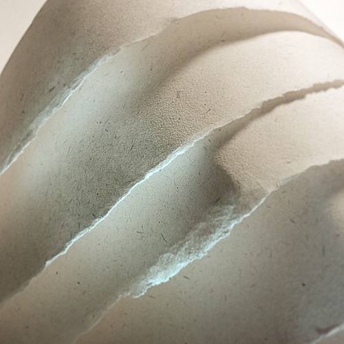
Folded Paper Project, Day 4
I've been working on a side project recently, Spiders. While attending SPESE-2014 I attended a lecture by Aline Smithson, the founder of the Lenscratch photo blog. She was talking about, among other things, about how she started her blog and how it's become one of the most popular and well-trafficked photography blogs online. She decided early on that she was going to write about a different photographer every day.

As you know, Spiders, I struggle to post a blog entry about any topic at all on a weekly basis. The idea of researching and featuring a different photographer every single day blows me away.

No, of course that doesn't mean I'm going to start posting more often. That's silly.

Still, the idea got lodged in my brain along with other things from the conference and from recent events. Finally getting an Instagram account, as I mentioned on Monday, was one such thing. It was largely motivated by the idea of getting my work "out there" via another outlet and potentially reaching other people interested in what I do. Another thing that was rolling around in my brain was the sheer amount of work being produced by some artists I keep in touch with, like Joshua White and John Fobes. I was also struggling with constantly trying to convince my students that, yes, they can make amazing photos and no, they do not have to go anywhere to do it. They can make interesting compositions right at their desks!
Folded Paper Project, Day 3

Those many things came together and I decided to start a new series: the Folded Paper Project. I started off with some rules for myself.

1) Take a new photo every day, using Instagram
2) Shoot only torn, cut or folded printer paper
3) Use only household light sources
4) Apply identical in-app adjustments to each photo

The most "advanced" tool I've used in the project so far is sticky poster tac to hold bits of paper in place for me, and a plastic ice cream bucket to act as a diffusion surface.

So far, the project has been quite fun. I haven't missed a single day yet, though for the Folded Paper Project, I'm measuring "day" by my sleep cycle rather than the 24-hour calendar. So if I don't get to the image until 2 AM, that's fine, because I haven't gone to bed and woken up the next morning yet! Honestly, Spiders, I think that is pretty much how I treat this blog, except I really do try to get it done on Thursdays so I can stop angering Thor. I just keep missing that deadline.

If you want to follow the Folded Paper Project, I'm keeping it tracked via Flickr as well as on Instagram!