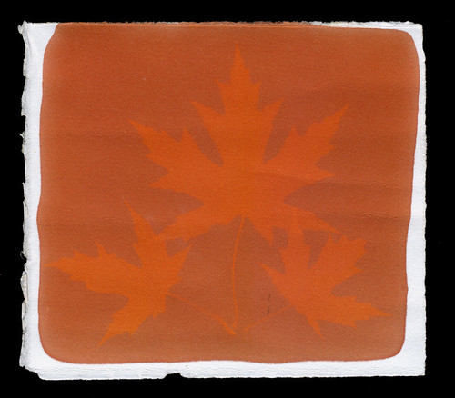
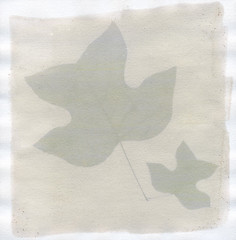
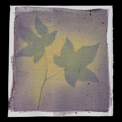
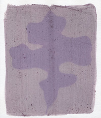
Nuts to you, madder root. According to numerous sources, this was the dye used by the British and it was the reason the "redcoats" were red. With various mordants, specifically alum and chalk, it is supposed to deliver a rich, crimson red. I think history is lying. Of course, some of that could be a result of me trying to use the dye on paper instead of fabric, but my tests on fabric didn't come out that good either.
I've tried many different methods of mixing madder root. I gave a brief over-view of the struggle in my Rainbow Reverie: Red post, but I feel the need to go more in-depth. This is an extremely troublesome dye and given all the effort I've put into it, I want to document clearly why I think it's just not worth my time to continue investigating.
My first attempt at madder root was to purchase actual roots. Following instructions from the supplier, I chopped the roots up, soaked them overnight, ran the through a blender to chop them even more and then slowly raised them to a simmer and kept the there for over an hour. The water that resulted was nice and bloody, but left virtually no stain at all on paper. It did soak into fabric pretty well and I even added some alum to that mix. However after exposing the dyed fabric for a week, I had no decent image. What is there may actually be the result of water from fresh leaves soaking in and washing off the dye. So, overall, my attempt with using the roots themselves was a bust. Still, I've decided to try again and have some roots soaking right now.
I later learned that madder root can be purchased as a concentrated powder, so I ordered some of that. It arrived and was distressingly brown. Right off, I mixed some of the powder with alcohol and tested it. Not terrible, but not red.
Further testing ensued, with the madder powder being combined with chalk (crushed sticks, not actual chalk which is on a list of things to test with later now that I know that chalk isn't chalk), baking soda (to raise the pH), citric acid (to lower the pH), cream of tartar (a suggested mordant) and alum (another mordant suggested for true reds). I tried microwaving the liquid, simmering it for extended periods of time, dripping the liquid through a coffee filter to remove the particles and applying the dye as a thick paste. I got a lot if different results (see below), but none of them are red. They're certainly reddish, but not red. At this point, I'm pretty sure that madder just isn't where I need to go for a true red in anthotypes. The problem is, I don't know where else to look.
Beet juice is supposed to be a great red food dye, but when I make the liquid, it brushes on as a bubblegum pink. I tried adding vinegar as suggested in some recipes and it gets a bit darker, but not too much. Previous experience with boiling dyes tells me that if I try reducing the liquid down, it'll ruin the pigment.. but I might have to try anyway and see what happens. I can always get more beets.
The last really well-known red dye from a natural source is cochineal, also called carmine. It's gathered from crushed insects native to south-central America. I don't want to deal with the process required to extract the dye from the bugs, and the little things are expensive. Really, really expensive. Maybe sometime in the future, or if I can figure out a way to order it through the university... but until something like that happens, cochineal is just out of my range. Plus, it seems to require some work as well and I'm not certain if it could be used for dyeing paper.
There's something called 'lac', which is from India and is related to cochineal, but it's either just as expensive as cochineal or even more expensive. I have the same concerns about if it would work on paper because as far as I can tell, lac requires chemical shenanigans to release the colors. It also seems to favor red-violets instead of true reds.
So, for the moment, I'm lacking a real red. I may just have to deal with that, but I have two last hopes before I give up on the color.
1) I am attempting to make that second batch of madder dye from the roots. I will be SURE to follow the dyer's directions as carefully as possible, not skipping any steps or shortening anything. Once I obtain the dyebath, I will then try soaking the paper in it, using it on fabric and also reducing some of it down via simmering (not boiling) to paint onto paper.
2) I'm going to try soaking some small paper samples in my current batches of madder and see if extended exposure to the dyes gives better results. I may also test this with fabric.
If you were wondering what all this experimentation yielded, well, I've got a lovely table of the results so far right here.
Just an artist talking to spiders about alternative photographic processes, cyanotypes, bones, leather, anthotypes, lumen prints and how to mix them all together. Updates weekly, for the glory of Thor.
Saturday, November 10, 2012
Rainbow Reverie: Yellow
Yellow is not a difficult color to get from nature, but I've only experimented with a few yellow dyes because the nature of the color is the same, no matter the source. Yellow is freaking bright. It makes it difficult to see the resulting images and produces low-contrast results. For any yellow anthotype, I will typically adjust the color in Photoshop by about 10%, making it more orange. Whatever my subject is, the visibility and detail jumps dramatically with this simple change.
Despite that, yellow colors are easy to get and the two main dyes I use to obtain them are very simple and straightforward. There are numerous ways to adjust them so that you won't need the Photoshop adjustment. It can, in fact, be worked right into your dye.
Paprika: While the spice itself is orange and it can be used to create an orange effect if applied to the paper as a thick paste, paprika creates yellows when diluted into a liquid. I've created two different yellows through different means of preparing the dye.
The first is a goldenrod color, gentle and creamy, which is created by using a coffee filter to drip alcohol through about 2 tablespoons of paprika. The collected liquid is pale orange and exposes in 2-4 days.
Second, you can simply add the paprika directly to the alcohol until the saturation point is reached. This liquid will still appear orange, but when painted on the paper it will only leave a few streaks and bits of residue that can be brushed off when the paper dries. The yellow created this way will be very pale, but still give decent results in 2-3 days. In order to increase your visibility, simply add a little sandalwood or madder root to your paprika. You can experiment with other
Turmeric: This is one of the easiest and most reliable dyes I've used for anthotypes. You can buy it at almost any grocery store or supermarket. If you have a local farmer's market, sometimes you can purchase it there very cheaply, too. Turmeric is a spice and perfectly safe so no worries about getting it in your mouth or on your hands or all over your kitchen. It's sold as a thick, golden powder. Diluting with alcohol forms a liquid that is your dye. Just a little alcohol will produce a yellow so bright it hurts the eyes, while high dilutions give muted, pastel shades.
Your exposures with turmeric can be as quick as 2 days (high dilution) and as long as 2 weeks (low dilution with poor light), but will average around 4 days for a good image. As mentioned above, the yellows of turmeric don't provide much contrast and I regularly sift in a bit of sandalwood to my turmeric to give more golden hues that provide better visibility. You can also do a double coat on your paper with a thin layer of blackberry first, and this will also give you more ruddy images that show up quite well.
Our next color is Green, which can be tricky, but is a lot of fun!
Despite that, yellow colors are easy to get and the two main dyes I use to obtain them are very simple and straightforward. There are numerous ways to adjust them so that you won't need the Photoshop adjustment. It can, in fact, be worked right into your dye.
![]() |
| Filtered Paprika Dye Test |
The first is a goldenrod color, gentle and creamy, which is created by using a coffee filter to drip alcohol through about 2 tablespoons of paprika. The collected liquid is pale orange and exposes in 2-4 days.
Second, you can simply add the paprika directly to the alcohol until the saturation point is reached. This liquid will still appear orange, but when painted on the paper it will only leave a few streaks and bits of residue that can be brushed off when the paper dries. The yellow created this way will be very pale, but still give decent results in 2-3 days. In order to increase your visibility, simply add a little sandalwood or madder root to your paprika. You can experiment with other
![]() |
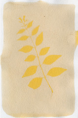
| Turmeric Dye Test |
Your exposures with turmeric can be as quick as 2 days (high dilution) and as long as 2 weeks (low dilution with poor light), but will average around 4 days for a good image. As mentioned above, the yellows of turmeric don't provide much contrast and I regularly sift in a bit of sandalwood to my turmeric to give more golden hues that provide better visibility. You can also do a double coat on your paper with a thin layer of blackberry first, and this will also give you more ruddy images that show up quite well.
Our next color is Green, which can be tricky, but is a lot of fun!
Labels:
alternative processes,
anthotype,
dyes,
Rainbow Reverie
Thursday, November 8, 2012
Rainbow Reverie: Orange
Installment 2 is here and today we're covering the color Orange! This is going to be a short entry, with some notes for the future.
I've tested two successful orange dyestuffs: Paprika and Sandalwood, both of which can be used to produce other colors. However, since this is the entry on Orange, we'll focus on preparing those dyes to create... well, orange.
Paprika: In order to produce a strong orange, you will need a lot of paprika diluted with just enough alcohol to make it a spreadable paste. You want it clumpy and full of paprika. Unlike the powdery sandalwood and turmeric, paprika is gritty and granular. It won't dissolve into the alcohol. That's alright, it will produce an absolutely brilliant orange if you use it in the grainy, paste-like form. Exposure times are pretty good, 3-5 days or so. Be sure to let the paper dry fully, then just take a paper towel or your finger and wipe off the excess paprika so you have a smooth surface to print on.
Sandalwood: This is a really easy dye to work with, and very flexible. As already noted in the Red section, if you use only a small amount of alcohol to dilute sandalwood powder it will create deep rusty, red-orange shade. Using more alcohol lowers the intensity, giving you a range from salmon pink-orange down to a pale gold-orange. Sandalwood can also be softened with a bit of turmeric to create more golden, yellow-orange shades. No matter how you prepare it, the exposure times are very fast. Expect 3 days to give a good result, with times decreasing down to 1 or 2 days if diluted with strong enough alcohol dilution.
I do suggest diluting sandalwood a good bit, or breaking its color up with another dye such as turmeric or red wine. By itself, at high concentrations, the color produced is so strong and vibrant that the resulting prints are actually hard to see. You get better contrast if the color starts out weaker.
Carrots: I tried shredding carrots and using the result to create a dye. It certainly produced a thick, bright orange liquid, but it was useless. When applied to paper, the carrot juice didn't leave more than the faintest stain. Even soaking paper in the juice didn't provide a noticeable color. Tried it with fabric, too, and still no results. Conclusion: carrots are good to eat, not to use for dye.
Annatto: Some folks that I've corresponded with on Flickr and AlternativePhotography.com have used annatto, which is a south american spice, and gotten good oranges. I just recently ordered some (it hasn't arrived yet), and will be testing it out myself. According to other artists, the spice is diluted in alcohol or water just like sandalwood or turmeric, and takes 3-5 days to expose. It produces soft, vibrant oranges that are a bit easier on the eyes than pure Sandalwood.
UPDATE: My annatto arrived very quickly, and I set to work testing it out. I purchased a powdered extract version of the plant, not the whole anise seeds. Diluted with alcohol, the annatto powder does as expected and produces a variety of oranges from a bright tangerine to a soft pastel. The powder leaves a bit more debris than sandalwood, but can be coffee-filtered so long as you don't mind losing a lot of the vibrancy. Otherwise, just wipe off the dust when your paper is dry.
Tune in again soon for YELLOW: the Happy Color!
I've tested two successful orange dyestuffs: Paprika and Sandalwood, both of which can be used to produce other colors. However, since this is the entry on Orange, we'll focus on preparing those dyes to create... well, orange.
![]() |
| Paprika Dye Test |
![]() |
| Sandalwood Dye Test |
I do suggest diluting sandalwood a good bit, or breaking its color up with another dye such as turmeric or red wine. By itself, at high concentrations, the color produced is so strong and vibrant that the resulting prints are actually hard to see. You get better contrast if the color starts out weaker.
Carrots: I tried shredding carrots and using the result to create a dye. It certainly produced a thick, bright orange liquid, but it was useless. When applied to paper, the carrot juice didn't leave more than the faintest stain. Even soaking paper in the juice didn't provide a noticeable color. Tried it with fabric, too, and still no results. Conclusion: carrots are good to eat, not to use for dye.
Annatto: Some folks that I've corresponded with on Flickr and AlternativePhotography.com have used annatto, which is a south american spice, and gotten good oranges. I just recently ordered some (it hasn't arrived yet), and will be testing it out myself. According to other artists, the spice is diluted in alcohol or water just like sandalwood or turmeric, and takes 3-5 days to expose. It produces soft, vibrant oranges that are a bit easier on the eyes than pure Sandalwood.
UPDATE: My annatto arrived very quickly, and I set to work testing it out. I purchased a powdered extract version of the plant, not the whole anise seeds. Diluted with alcohol, the annatto powder does as expected and produces a variety of oranges from a bright tangerine to a soft pastel. The powder leaves a bit more debris than sandalwood, but can be coffee-filtered so long as you don't mind losing a lot of the vibrancy. Otherwise, just wipe off the dust when your paper is dry.
Tune in again soon for YELLOW: the Happy Color!
Labels:
alternative processes,
anthotype,
dyes,
Rainbow Reverie
Monday, November 5, 2012
Rainbow Reverie: Red
Now that I've got at least a few dyes that produce each color of the spectrum, I'm going back in detail to review the properties and preparations for the most effective of the dyes and mention the ones I tried and found lacking. Color by color, I'll go through my anthotype library.
Today, we start with Red. When I say 'red' what I actually mean is pink. I've found a single deep red-orange and many shades of red-violet and pink, but none of the dyes I've tried have actually produced red. I still think that there may be one out there. I have a suspicion (listed below), but no confirmation as of yet.
Strawberry: Initially, I had high hopes for strawberries. They're so colorful, after all. The problem seems to be that when rendered down either with crushing or chopping or boiling, the resulting liquid is primarily composed of the inner, pale flesh instead of the outer skin of the berries. It gives you pale, pale pinks that show some images after 5-7 days, but at low contrast. The really annoying problem with strawberry dye is that it doesn't keep. It rapidly transforms itself into a gooey mass of green-white mold. I don't think my usual solution to mold (mixing with iso-alcohol) would work, because strawberry dye is already so pale that diluting it would just ruin the whole thing.
Raspberry: This dye comes very close to being purple, but it's also pretty pink, so I'm listing it under Red. It can be used either undiluted for stronger color, or with alcohol for pastel shades. As normal with undiluted dyes, the exposures are fairly long: 5+ days to get a good contrast in your prints. Your field will fade down into a brown-violet, leaving the red-violet object behind. Raspberry dye tends to have a big issue with seeds and bits of berry-skin being left behind in the dye, bigger than other dyes. Don't worry too much, it can be rubbed off while the paper is drying.
You can boil raspberry dye to reduce it down, or you can boil the berries themselves before blending them. You can also boil the berries and smash them in the boiling bot to extract the dye that way instead of using a blender to puree them and then straining the puree. In general, I do not recommend boiling your dyes. There will be a post going into more detail on how to prep different dyes, more detail on this there.
Beet: I've only tried canned beets, and have a suspicion that they may have been tainted with artificial colors or additives. I will be trying regular beets eventually, but the results from canned beets weren't particularly encouraging and I've seen other people work with beet juice for anthotypes and not enjoyed the results. Beet juice gives you strong, bright pinks, a few shades brighter than what I'd call "bubblegum"... maybe more like cotton candy, or strawberry frosting. It exposes fairly quickly, 3-5 days giving good results. The only reason I don't like beet juice is just that I'm averse to the color. I prefer darker, stronger colors. The pink that beet juice gives is just too... pink. Totally a personal call; the dye itself has no big problems.
Madder Root: There are two forms of madder root: a powder and actual roots. I've experimented many times with both methods, and only the powder has produced any results. I tried mixing up the dye from the roots by following various online tutorials, but the liquid produced (while a gorgeous crimson) didn't stain paper at all and was incredibly light-fast on fabric. So, I ordered some powder which arrived quite recently. No exposure results so far, but several dye swatches were produced. Consulting various online resources about madder root, I tested various additions to the dye to produce different colors. Alum, chalk (turns out I used the wrong kind of chalk), cream of tartar and baking soda (for an alkali). I ran across some suggestions to use citric acid to create oranges, but I have lots of oranges and not many good Reds. The chart above lists some of the various combinations and methods used to adjust the color of the madder powder.
Edit: Further testing has shown that it is possible to get a bright red color from madder root by soaking the paper for 1-2 full days in the dye. More details here.
Sandalwood: Primarily, sandalwood produces oranges. If used at the strongest concentrations, where the dye is almost a paste instead of a liquid, sandalwood is so orange that it turns into a dark rust. The drawback here is that the exposure times are fairly long, minimum of one week. Even at long exposures, the contrast is pretty low. Post-processing can easily adjust that, but purists may be disappointed in the results.
Red Wine: The easiest anthotype dye, bar none, because it can be used straight out of the bottle. There's no mixing or measuring or filtering required. All you need to do to create a red wine anthotype is buy some cheap cooking wine, paint it onto the paper and expose. Red wine can produce images within 3 days, but it does better with more time. Ideally, give red wine at least a week of strong sunlight. You'll get a dull, faded orange background with a very soft pink-red subject. I do not recommend red wine as an anthotype dye because of the incredibly pale colors produced. The visibility and contrast is quite poor. However, it is fairly consistent and easy, so people just starting out may want to try it for themselves before moving on to more complex dyes.
Today, we start with Red. When I say 'red' what I actually mean is pink. I've found a single deep red-orange and many shades of red-violet and pink, but none of the dyes I've tried have actually produced red. I still think that there may be one out there. I have a suspicion (listed below), but no confirmation as of yet.
Strawberry: Initially, I had high hopes for strawberries. They're so colorful, after all. The problem seems to be that when rendered down either with crushing or chopping or boiling, the resulting liquid is primarily composed of the inner, pale flesh instead of the outer skin of the berries. It gives you pale, pale pinks that show some images after 5-7 days, but at low contrast. The really annoying problem with strawberry dye is that it doesn't keep. It rapidly transforms itself into a gooey mass of green-white mold. I don't think my usual solution to mold (mixing with iso-alcohol) would work, because strawberry dye is already so pale that diluting it would just ruin the whole thing.
![]() |
| Raspberry Dye Test |
You can boil raspberry dye to reduce it down, or you can boil the berries themselves before blending them. You can also boil the berries and smash them in the boiling bot to extract the dye that way instead of using a blender to puree them and then straining the puree. In general, I do not recommend boiling your dyes. There will be a post going into more detail on how to prep different dyes, more detail on this there.
Beet: I've only tried canned beets, and have a suspicion that they may have been tainted with artificial colors or additives. I will be trying regular beets eventually, but the results from canned beets weren't particularly encouraging and I've seen other people work with beet juice for anthotypes and not enjoyed the results. Beet juice gives you strong, bright pinks, a few shades brighter than what I'd call "bubblegum"... maybe more like cotton candy, or strawberry frosting. It exposes fairly quickly, 3-5 days giving good results. The only reason I don't like beet juice is just that I'm averse to the color. I prefer darker, stronger colors. The pink that beet juice gives is just too... pink. Totally a personal call; the dye itself has no big problems.
![]() |
| Madder Root Dye Comparison |
Edit: Further testing has shown that it is possible to get a bright red color from madder root by soaking the paper for 1-2 full days in the dye. More details here.
| Sandalwood Anthotype |
Red Wine: The easiest anthotype dye, bar none, because it can be used straight out of the bottle. There's no mixing or measuring or filtering required. All you need to do to create a red wine anthotype is buy some cheap cooking wine, paint it onto the paper and expose. Red wine can produce images within 3 days, but it does better with more time. Ideally, give red wine at least a week of strong sunlight. You'll get a dull, faded orange background with a very soft pink-red subject. I do not recommend red wine as an anthotype dye because of the incredibly pale colors produced. The visibility and contrast is quite poor. However, it is fairly consistent and easy, so people just starting out may want to try it for themselves before moving on to more complex dyes.
Labels:
alternative processes,
anthotype,
dyes,
Rainbow Reverie
Friday, November 2, 2012
Crazy Cool Colors
When I first started researching anthotypes and the possible dyes used to make them, I immediately found that there are very few ways to create natural, plant-based dyes that fall into the cooler part of the color spectrum. Many plants create yellows, oranges, red-pinks, purples and browns. There are very few natural plant-based dyes that create blues or greens.
At first I thought, well that's stupid, most plants are green, why can't I just grind up their leaves? Well, most plants that I tired simply didn't produce much of a color, even ground up and reduced to a paste. While searching around Flickr, and then again reading Malin Fabbri's new book on Anthotypes, I learned that chard seems to give a good, strong green. Researching other natural dyes, I came across some ideas for using red cabbage to produce a blue and learned that an algae called spirulina is used to tint soaps and candles green.
So, I went to the local health store to buy the spirulina (it's also a herbal diet supplement) and hit the local grocery store to get the chard and the red cabbage.
Chard was a bit tricky to work with. The instructions I had run across suggested boiling it to produce a stronger color. This was in direct contrast to my earlier observations that boiling dyes seems to break down the pigment and give a weaker color. My experiments with chard basically confirmed my earlier theory: the boiled chard solution was pale and brownish. I do not anticipate strong results.
I tried putting shredded chard leaves into the blender mixed with water and got a reasonably strong solution, strained through cheesecloth to remove the plant matter. My results were far stronger, again as noted in earlier experiments, when iso-alcohol was used instead of water. Chard seems to produce a very nice, soft green that fades to brown when exposed to light. That gives a good contrast between the image and the field.
Spirulina hasn't been exposure-tested yet, but I've mixed up a solution of the algae (it's a dark green powder) and iso-alcohol that gave a good, true green. It's a bit bluer than the chard solution and a tiny bit darker. Expecting good things from the mixture.
The red cabbage was a very surprising idea. I actually found it on a blog about all-nature food coloring alternatives. The original recipe, once again, called for boiling. Already suspicious, I tried both boiling the leaves and blending them into paste. By itself, the red cabbage renders an intensely violet dye, but when applied to paper it dries from violet to a pure sky blue, a truly gorgeous color. The boiled dye produced virtually no results, but the blended (diluted with alcohol) mixture is great.
The food blog entry was about creating blue dye from red cabbage, and in a liquid form the red cabbage is violet. So the food blogger noted that adding alkalinity to the cabbage dye (baking soda) would convert the violet liquid into a deep blue solution. It does! It's amazing! Hold up, though. Just as the violet liquid dries into a sky blue, the navy liquid from the baking soda-cabbage mixture dries a different color: teal. It's an absolutely amazing blue-green and I can't wait to see what it looks like after exposure!
I am SO excited to get these mixtures into frames, but it will have to wait until after the weekend. I will be scanning the test sheets before exposure to document the colors. I'm working on a more orderly approach, with double the records, since I'm in the process of compiling together what might become a book on anthotypes.
At first I thought, well that's stupid, most plants are green, why can't I just grind up their leaves? Well, most plants that I tired simply didn't produce much of a color, even ground up and reduced to a paste. While searching around Flickr, and then again reading Malin Fabbri's new book on Anthotypes, I learned that chard seems to give a good, strong green. Researching other natural dyes, I came across some ideas for using red cabbage to produce a blue and learned that an algae called spirulina is used to tint soaps and candles green.
So, I went to the local health store to buy the spirulina (it's also a herbal diet supplement) and hit the local grocery store to get the chard and the red cabbage.
Chard was a bit tricky to work with. The instructions I had run across suggested boiling it to produce a stronger color. This was in direct contrast to my earlier observations that boiling dyes seems to break down the pigment and give a weaker color. My experiments with chard basically confirmed my earlier theory: the boiled chard solution was pale and brownish. I do not anticipate strong results.
I tried putting shredded chard leaves into the blender mixed with water and got a reasonably strong solution, strained through cheesecloth to remove the plant matter. My results were far stronger, again as noted in earlier experiments, when iso-alcohol was used instead of water. Chard seems to produce a very nice, soft green that fades to brown when exposed to light. That gives a good contrast between the image and the field.
Spirulina hasn't been exposure-tested yet, but I've mixed up a solution of the algae (it's a dark green powder) and iso-alcohol that gave a good, true green. It's a bit bluer than the chard solution and a tiny bit darker. Expecting good things from the mixture.
The red cabbage was a very surprising idea. I actually found it on a blog about all-nature food coloring alternatives. The original recipe, once again, called for boiling. Already suspicious, I tried both boiling the leaves and blending them into paste. By itself, the red cabbage renders an intensely violet dye, but when applied to paper it dries from violet to a pure sky blue, a truly gorgeous color. The boiled dye produced virtually no results, but the blended (diluted with alcohol) mixture is great.
The food blog entry was about creating blue dye from red cabbage, and in a liquid form the red cabbage is violet. So the food blogger noted that adding alkalinity to the cabbage dye (baking soda) would convert the violet liquid into a deep blue solution. It does! It's amazing! Hold up, though. Just as the violet liquid dries into a sky blue, the navy liquid from the baking soda-cabbage mixture dries a different color: teal. It's an absolutely amazing blue-green and I can't wait to see what it looks like after exposure!
I am SO excited to get these mixtures into frames, but it will have to wait until after the weekend. I will be scanning the test sheets before exposure to document the colors. I'm working on a more orderly approach, with double the records, since I'm in the process of compiling together what might become a book on anthotypes.
Labels:
alternative processes,
anthotype,
dyes
Tuesday, August 7, 2012
Time to Dye
| One day exposure! |
The problem with turmeric used by itself is that the resulting image is so yellow that it's hard to see. A slight hue shift in post-processing can make the image dramatically better simply by reducing the amount of yellow by about 10%, moving it to a more orangey hue. The same result can be achieved in the anthotype itself simply by including about 30% sandalwood in the mixture, or a light coat of blackberry juice on top of the turmeric.
| 10% more orange |
Blackberry juice with lots of alcohol (about a 2:1 alcohol to juice mix) is, as I've mentioned before, green. This green dye produces a very fast exposure; I got a perfect exposure with visible detail like leaf veins in just one day of bright light. One day. That's mind-blowing for anthotypes.
Labels:
alternative processes,
anthotype,
dyes
Wednesday, August 1, 2012
Confounding Condensation
| First! |
So, I'm fairly sure there are two culprits:
The original anthotypes were exposed outside, in the direct heat of the scorching Southern sun.
They were not in picture frames, but smooshed between two plates of acrylic, allowing air flow.
| No halo. |
I tried putting my picture frames outside, but no dice. I tried using two plates of acrylic inside, no dice. I think it needs both the airflow of an open frame and the blazing heat of the sun to produce the results I want. I will be trying this soon! I'm especially hopeful because another recent experiment with silk dyed in madder-root produced a moisture halo.
Oh, that's right, I never mentioned that test result. Why? It sucked. Maybe I picked a bad plant, because the leaf I used ended up virtually transparent by the end of the seven day exposure. Transparent leaf means there wasn't any light-blockage and the resulting image is almost invisible. Plus, the madder root stubbornly refuses to give me a good color. Also, it's transformed into a mess of green-brown-white fuzz.
I think I'm done with madder root for the time being, it hasn't been of any appreciable use yet. Maybe when I get around to my next project, where I buy raw wood and felt it down into my own hand-made cloth, then dye the cloth and make anthotypes on THAT... then I might use the madder root. Maybe. Probably not.
Labels:
alternative processes,
anthotype,
dyes,
exposure
Subscribe to:
Posts (Atom)